
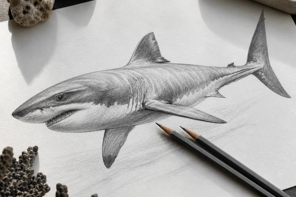

1. Graphite burnished shark with white-hot belly highlight
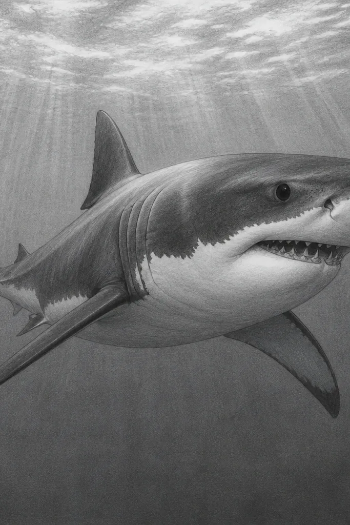
This one reads expensive because it looks polished, not textured. Graphite burnishing lets you get a silky gradient on the body, then you add a sharp “light hit” on the belly so the shark looks wet and dimensional. Keep the eye and gill line slightly darker than the mid-tones — that contrast is what makes the shape hold up in a frame. It fits best for graphite lovers who want a clean, gallery-style finish without switching mediums.
Start with a light sketch on 300 gsm drawing paper, then block the shark in three values: light belly, mid body, and dark fin edges. Use a 2B pencil for mid-tones, then switch to 6B or 8B for the darkest lines around the eye, gill crease, and the underside of fins. Burnish those mid areas with a blending stump or a clean tissue until the graphite looks smooth and reflective. Finally, lift graphite from the belly highlight with a kneaded eraser — keep it narrow and curved, like a real specular reflection.
Burnish in small passes and stop while the surface still shows faint tooth. Too much burnishing turns gradients into a chalky haze.
Don’t shade the whole body with the same pressure — flat pressure kills the “light source” effect.
2. Micron ink shark with stippled gradient seafoam background
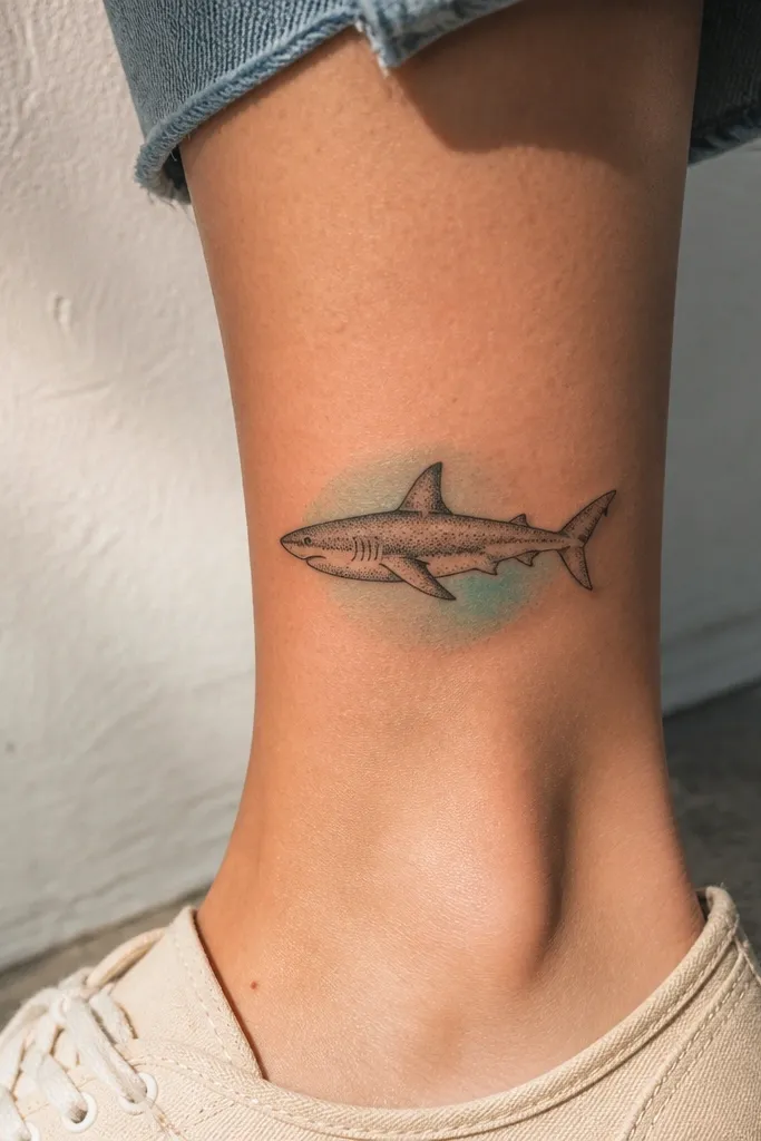
Fine ink plus stippling looks high-end when the background has atmosphere but the shark stays crisp. The stipple gradient gives you that “museum print” feel because it’s controlled, not random. Keep the shark’s contour line clean and slightly thicker than the stippled shadows. This idea is great for anyone who likes ink work but wants it to look modern and costly instead of sketchy.
Draw the shark in pencil first, then ink the outer contour with a 0.3 or 0.5 Micron so the silhouette reads instantly. For shading, use stippling only inside the body areas: under the jaw, around the gill line, and beneath the pectoral fin. Build the seafoam background by stippling around the shark in a loose gradient — denser at the top corners, lighter near the center. Finish by adding a few tiny ink “spark” dots near the highlight zone on the body to make it feel glossy.
Pro tipUse a scrap paper under your hand to avoid smearing ink while stippling for 20-30 minutes.
AvoidDon’t stipple the entire shark uniformly — that turns it into a dotty texture instead of a dimensional form.
3. Alcohol marker shark with cool-to-warm fin shading
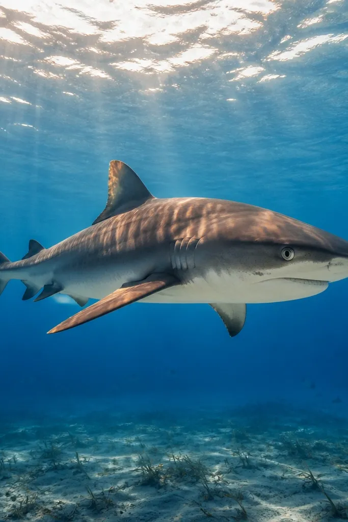
Marker work looks expensive when the gradients are smooth and the color temperature shifts where the light hits. Use cool blues/teals for shadow planes and a warmer neutral for highlights on fin edges. That contrast makes the shark look like it’s lit from above and slightly behind, which reads premium. This is a solid choice if you want color without messy blending.
Start with a light pencil underdrawing, then mark the light source — top-left or top-center works well. Base the body with a mid cool tone, then shade under the jaw and along the spine with a darker cool shade. Add warmth to fin edges using a neutral warm gray or a muted tan — keep it thin so it reads like edge light, not skin tone. Blend with a colorless marker or lighter marker tone back through the mid areas to smooth banding.
Pro tipDo the darkest values first, then blend outward. Trying to “build darkness later” often leaves patchy edges.
AvoidDon’t overwork the same spot until the paper pills — marker layering can ruin smooth gradients.
4. Colored pencil shark with burnished velvet shadow bands
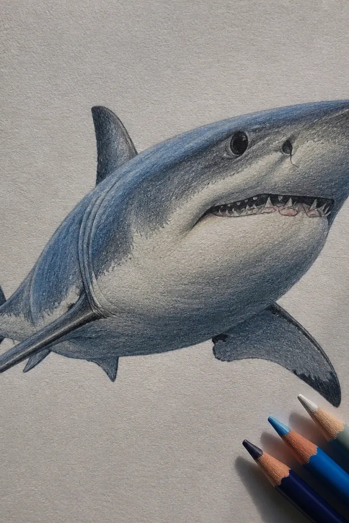
Colored pencil can look luxurious when you layer in thin, consistent passes and then burnish just the shadow bands. The luxury effect comes from velvet-like darkness that still shows subtle texture, not a muddy smear. Choose a limited palette: one cool gray-blue for shadows and one warm gray for the belly. This works well for small-to-medium sizes where you can control edges without getting messy.
Sketch the shark lightly, then map a 3-zone value plan: belly light, body mid, shadows under jaw and fins dark. Build mid-tones with a light gray-blue pencil, then deepen shadow bands with a darker gray-blue using short strokes that follow the body curve. Burnish the darkest bands with a colorless blender or a clean pencil to smooth the transitions. Finish with a sharp belly highlight using an eraser to lift slightly, then reinforce the darkest gill crease with a dark pencil.
Pro tipKeep your pencil strokes directional — follow the contour lines on the body so shading looks like it wraps, not sits on top.
AvoidDon’t use too many bright colors. Luxury shark art usually stays in a restrained cool palette.
5. Gold leaf accent shark on black gessoed paper
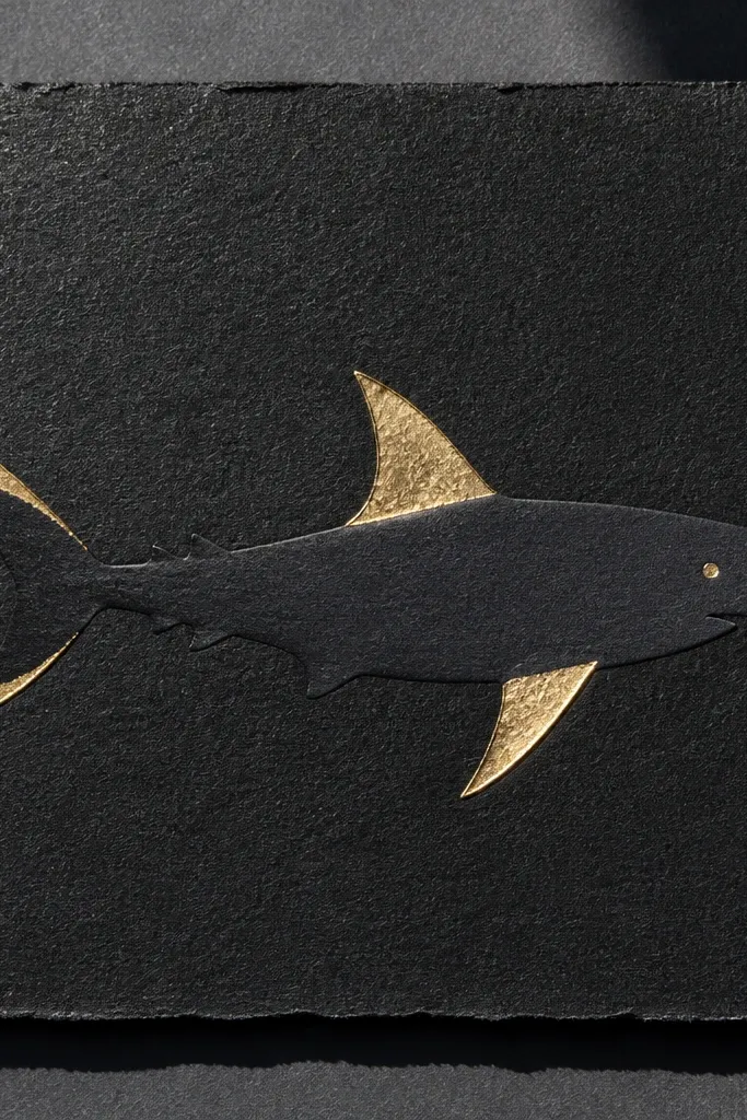
This is the fastest way to get “luxury” without relying on perfect realism. Black gessoed paper makes every mark pop, and gold leaf adds instant high-end contrast. The trick is to place gold only on high-wear light points: fin edges, the eye rim, and a thin stripe along the belly curve. It’s bold, graphic, and looks expensive in a simple black frame with a white mat.
Prime your paper with black gesso and let it dry fully, then sketch the shark in pencil very lightly. Apply transfer adhesive or a fine leaf size to only the areas you want gold, keeping shapes narrow and controlled. Lay gold leaf carefully, press gently with a soft brush, and burnish only the edges. Add ink linework afterward using a white gel pen or opaque white paint to define the gill line and highlight contours.
Pro tipCut gold leaf into smaller pieces with clean scissors. Big sheets tear and look sloppy at the edges.
AvoidDon’t cover the whole shark in gold leaf — it reads costume, not luxury.
6. White gel pen shark with black ink underwater grid
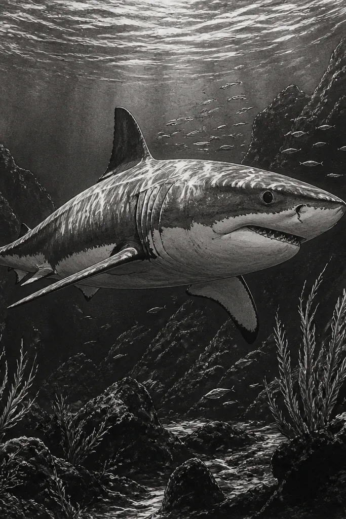
This one looks expensive because it combines a graphic structure with a clean highlight technique. A subtle grid behind the shark gives depth and makes the composition feel intentional, like a print design. Use black ink for the underwater depth lines, then let the white gel pen do the “wet” highlights on the body and fin edges. It’s modern, high contrast, and reads premium even with a simple shark pose.
Draw the shark silhouette and major fin shapes in pencil, then ink over the outline with black waterproof ink. Add a faint perspective grid in the background: light lines that converge behind the shark, then darker depth lines near the edges. Let the ink dry completely, then add highlights with a white gel pen on the belly curve, along the fin leading edges, and around the eye. Finish by adding a few short hatch strokes in white where the light hits the body texture.
Pro tipUse a fresh gel pen tip. A worn tip makes thick blobs that ruin the crisp luxury look.
AvoidDon’t draw the grid too dark. If the grid competes with the shark, it stops looking high-end.
7. Navy ink and watercolor shark with hard-edged fin silhouettes
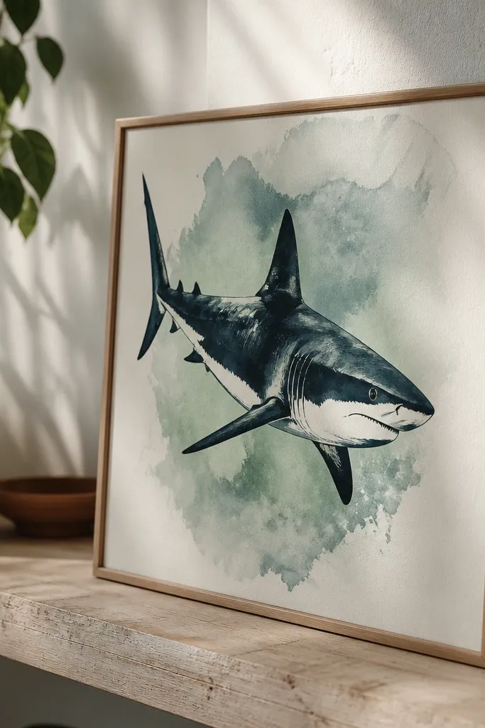
Luxury watercolor is about restraint and edge control. This style uses navy ink to lock in the fin and jaw edges, then watercolor fills only the mid-tones so you keep clean shapes. The result looks like a high-end print: soft atmosphere behind a sharp subject. It suits people who want color but hate fuzzy, uncontrolled washes on the shark itself.
Ink the shark outline and fin edges first using waterproof navy ink, then let it dry. Wet the background only, not the shark body, and lay a light watercolor wash behind it — think pale teal-gray fading outward. Add a second, slightly darker wash layer behind the spine to create depth without bleeding into the ink lines. Finally, glaze a thin watercolor shadow under the jaw and along the belly curve, leaving the highlight areas untouched.
Use painter’s tape to mask a clean border around the shark area so washes stay away from the subject.
Don’t watercolor the shark outline. If the ink feathers, the whole piece looks amateur.
8. Charcoal shark with masked highlight using frisket film
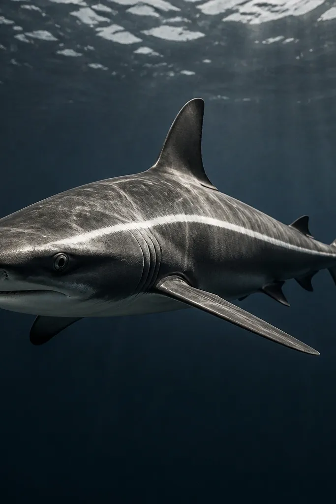
Charcoal can look high-end when you preserve highlights instead of trying to erase them after heavy smudging. Frisket film gives you a clean, sharp highlight edge that reads like a deliberate design choice. The smoky mid-tones feel dramatic, while the crisp preserved highlight makes the shark look glossy and dimensional. This is ideal for moody art, dark interiors, and large paper formats.
Sketch the shark lightly, then place frisket film over the highlight stripe on the belly and one fin edge. Shade with soft charcoal (vine charcoal for light areas, compressed for dark accents) building a gradient from mid-body to deep shadow under the jaw. Use a kneaded eraser to pull back additional highlight only in the surrounding areas, then remove the frisket to reveal a clean white edge. Fix with a workable fixative first, then a final fixative once fully dry.
Press the frisket firmly with a bone folder so the edge stays sharp when you peel it.
Don’t over-spray fixative too early. It can lock in dust and make blending harder.
9. Ink wash shark with layered glazing for depth
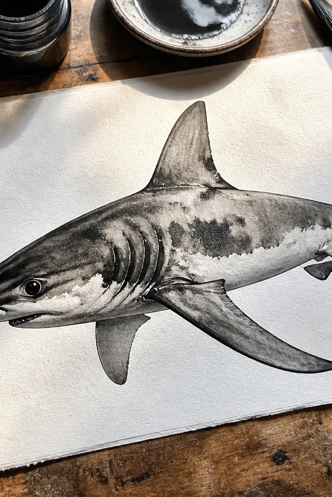
Layered ink wash looks expensive because it has depth without texture overload. You get smooth transitions and controlled darks around the gills and fin joints, which are where cheap drawings fall apart. The luxury look is in the glazing: thin, transparent layers that build slowly instead of one heavy pass. This works great if you like ink but want the softness of watercolor.
Ink the shark outline and major fin boundaries with waterproof ink, then dilute ink in water for your wash. Start with a very light wash across the body to set the mid-tone, then glaze darker areas under the jaw and along the spine in 2-3 thin layers. Keep a small dry brush area around the belly highlight so it stays lighter. Let each layer dry fully before adding the next so you don’t get muddy pooling.
Pro tipUse a flat brush and keep the edge wet — you want a clean fade, not a hard tide line.
AvoidDon’t chase dark values with one thick layer. It dries blotchy and reads low-end.
10. Monochrome screen-print style shark using stencil and spatter
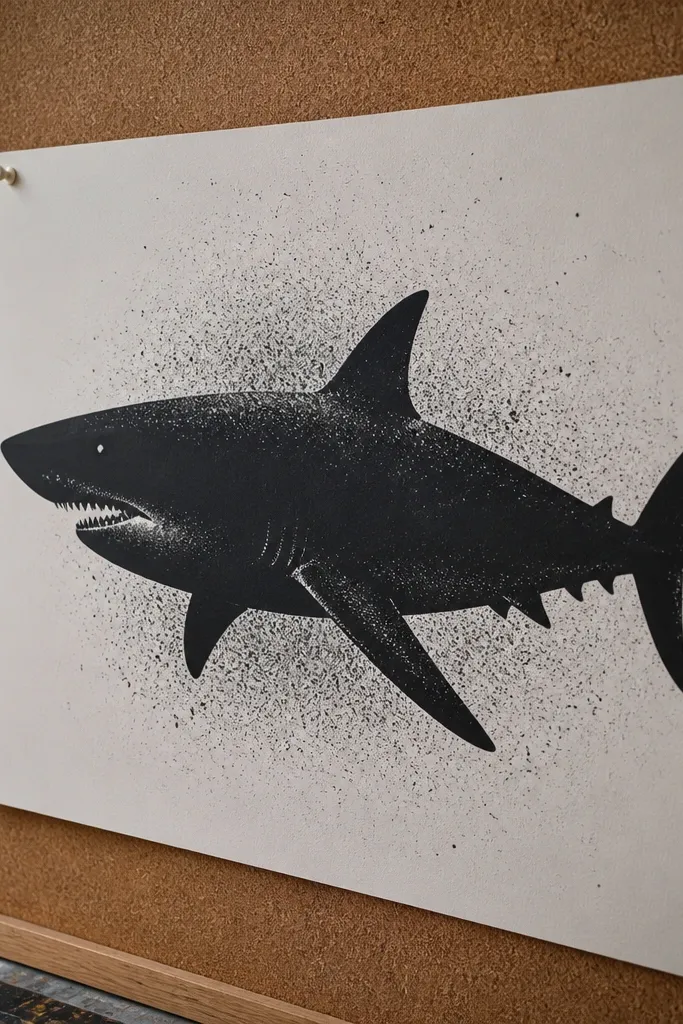
This one looks expensive because it uses design discipline: stencil edges stay crisp and the texture is intentional. Negative space matters here — the shark silhouette should be clean, while spatter sits in a controlled zone behind it. The result reads like a limited edition print, even though it’s DIY. It suits people who want graphic impact without detailed realism.
Cut a stencil of the shark silhouette from stencil plastic or cardstock, and place it on your paper. Tape the edges down so paint doesn’t creep under the stencil. Apply black or deep navy paint with a sponge dabber, then lift the stencil to keep the silhouette sharp. Add spatter with a toothbrush and a small amount of diluted paint, focusing spatter behind the dorsal fin and around the sides for depth.
Pro tipDo two light passes instead of one heavy spatter. Heavy paint makes thick dots that look messy.
AvoidDon’t freehand the stencil edges. Even a small wobble kills the premium print vibe.
11. Pastel shark with wet-on-wet sea mist and crisp eye
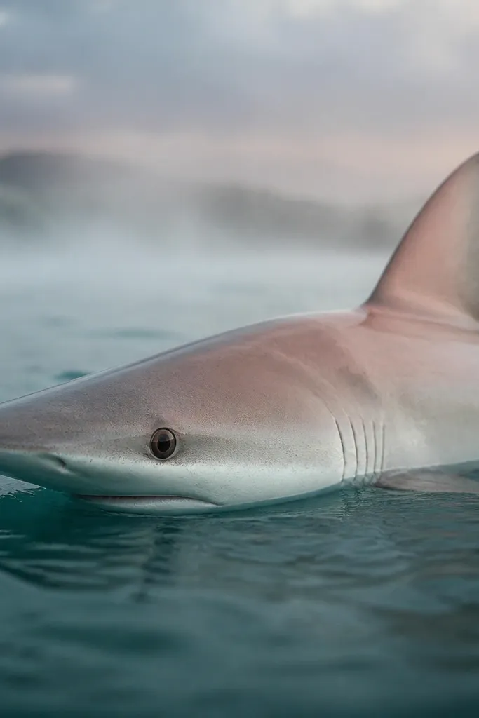
Pastels look luxury when the background is atmospheric and the focal point is sharp. The method here is wet-on-wet for the sea mist so you get smooth gradients, while you keep the shark’s eye and gill line darker and cleaner. It’s dreamy without becoming blurry because you control the edges around the face. This fits bedrooms, reading corners, and frames with textured mats.
Use a heavyweight paper and sketch the shark lightly. Wet the background area only, then apply soft pastel in thin layers, letting the color bloom into the wet wash for misty gradients. For the shark, use dry pastel to build body mid-tones, then deepen under the jaw and around fins with darker pastel. Define the eye and gill line with a dark charcoal pencil or pastel stick, and add a tiny highlight on the eye with a white pastel pencil.
Pro tipFix the background lightly first, then fix the whole piece at the end. Over-fixing too early can muddy pastel blooms.
AvoidDon’t try to make the whole shark wet. It turns the face edges soft and cheap-looking.
12. Brushed ink shark with metallic ink spine stripe
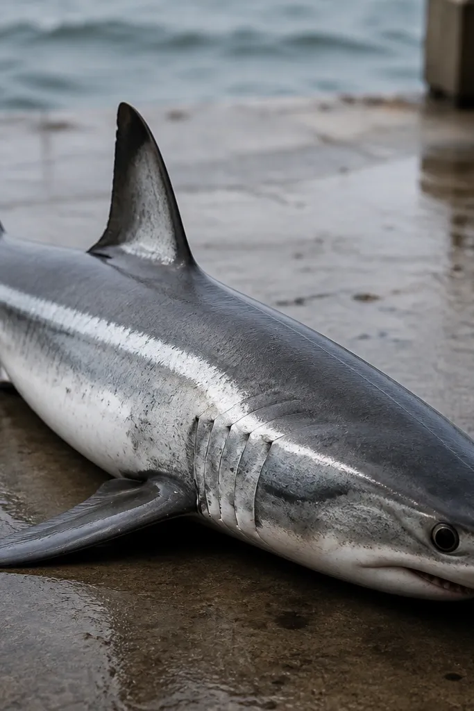
Metallic accents are luxury because they catch light in a way flat black-and-gray can’t. The key is placement: one metallic stripe along the spine or belly curve makes the shark feel engineered and premium. Use brushed ink for the body so you get natural variation in line and shading, then keep the metallic stripe narrow and clean. This is best for medium-sized drawings where the metallic detail is noticeable.
Brush ink the shark outline and major shading areas with a round brush, keeping fin edges defined. Create mid-tones with diluted ink layers, then add darker brushed strokes under the jaw and fin bases. Let the ink dry completely, then paint a thin metallic ink stripe along the spine curve using a fine liner brush. Finish with a few white gel pen highlights along fin leading edges to tie it back to the light source.
Pro tipUse a fine liner brush and wipe excess metallic ink off the rim before you touch paper. That prevents blobs.
AvoidDon’t add metallic to the whole body. One stripe gives the luxury effect; more turns it gimmicky.
13. Sumi ink shark with wet bleed edges and restrained dry-brush
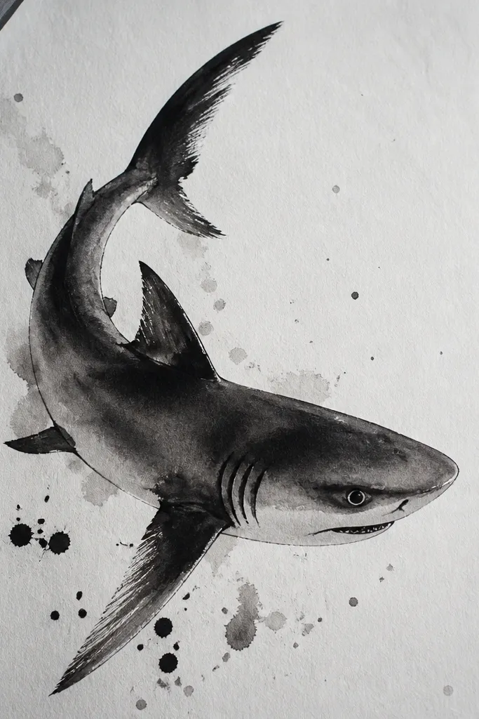
Sumi ink looks expensive when you control the bleed — you want edge drama without losing the shark’s silhouette. The approach here mixes two textures: wet bleed for soft underwater mood and dry-brush for sharp fin highlights. That contrast makes the shark read as a subject, not a stain. It’s a great choice if you want a traditional ink look but with modern control.
Sketch the shark, then ink the outline with sumi ink using a brush with steady pressure. For underwater mood, wet the background lightly and touch sumi ink in a few places to let it bleed outward, keeping it away from the shark edges. Build body mid-tones with diluted ink, then use dry-brush technique on fin tops — load a nearly dry brush and lightly drag to create pale highlight streaks. Add a dark accent under the jaw and at the eye socket once everything is dry.
Practice bleed control on scrap. The same ink behaves differently on different paper textures.
Don’t wet the entire paper. Whole-page bleed makes the shark disappear.
14. Ink outline with faux emboss using embossing paste and stencil fins
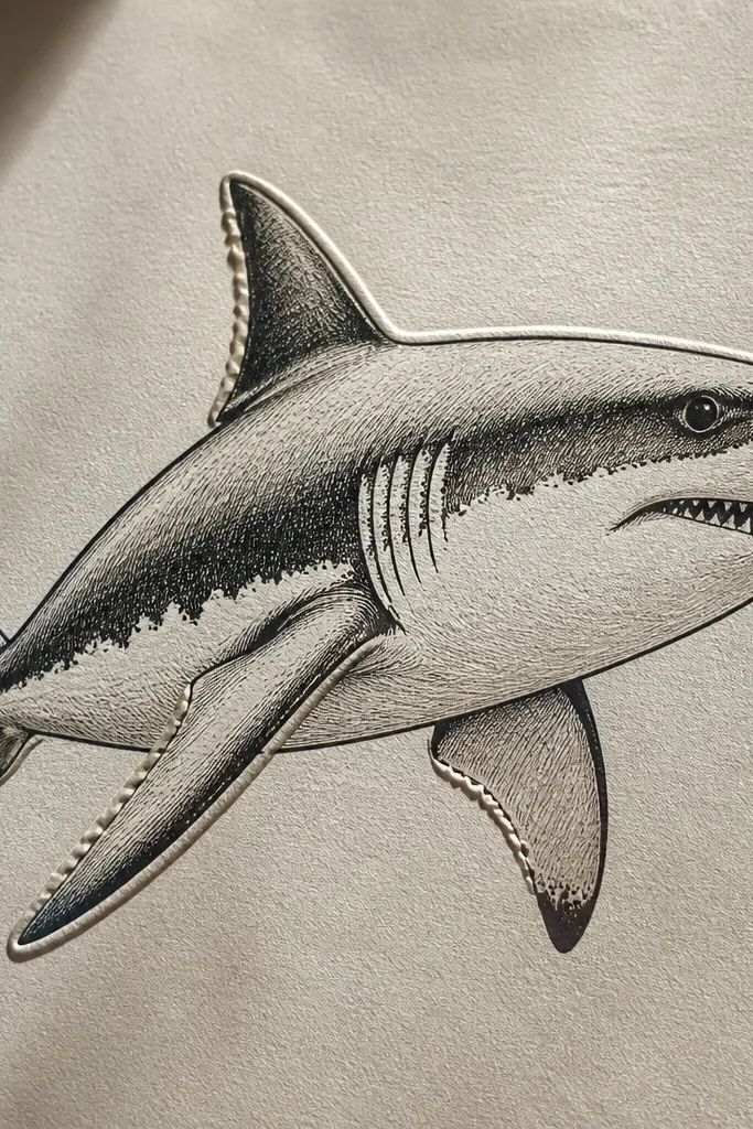
Raised texture makes a drawing feel high-end because it creates real shadow and light play. You can do it without complicated tools: embossing paste plus a stencil for the fin areas. Keep the ink outline crisp so the raised texture supports the shape instead of looking decorative-for-no-reason. This is ideal for framed wall art where you want the shark to feel tactile.
Ink the shark outline and main shading plan on 200-300 gsm paper using waterproof ink. Tape a fin stencil over the fin zones and spread embossing paste with a palette knife, keeping it thin (about 1-2 mm thickness). Let it dry fully — embossing paste needs time to harden. Once dry, lightly sand the raised ridges with very fine sandpaper for a smooth edge, then re-ink any lines that got covered. Finish with a wash of gray ink or watercolor in the recessed areas to deepen contrast.
Use a small amount of paste. Thick paste cracks more easily and looks cheap in close-up.
Don’t emboss over the eye. Texture there makes the focal point look blurry.
15. Nail-polish marbling background with inked shark silhouette
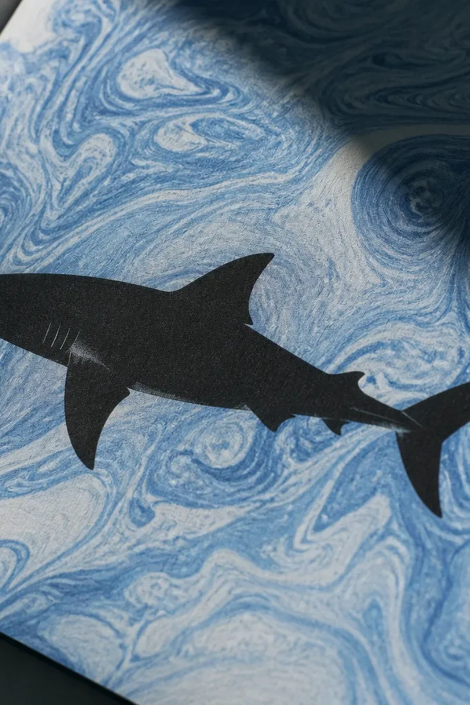
Marbling is a luxury trick because it produces complex patterns that look expensive without you drawing every detail. Keep the shark simple and solid — inked silhouette with minimal internal lines — so the marbling stays the star behind it. This gives you a premium, high-contrast poster feel. It’s also a fun DIY method that makes each piece unique.
Create a marbled background using nail polish in a shallow tray with water and a skewer tool for swirls. Transfer the pattern to thick paper, then let it dry completely. Draw the shark silhouette on top with pencil, then ink over it with waterproof black ink or acrylic ink. Add one small highlight line on the belly with a white gel pen so the silhouette looks wet, not flat. Frame it with a mat because marbling edges can look messy if they touch the frame.
Pro tipChoose a limited polish palette: deep navy, teal, and a touch of silver. Too many colors look chaotic.
AvoidDon’t add internal shading to the shark. With a busy background, internal details read cluttered.
16. Two-tone silk-screen look with offset shadow layer
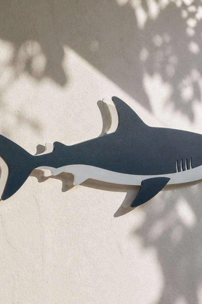
A two-tone print look reads expensive because it adds design depth without complexity. The luxury move is an offset shadow layer that looks like the shark is floating above a textured surface. Use one main color for the shark and a slightly different dark tone for the offset, so the shadow layer creates dimension. It’s clean, modern, and looks great in bold frames.
Create a stencil of the shark silhouette. Place it on your paper and spray or sponge-paint the main color, then let it dry. Reposition the stencil with a tiny offset (about 3-6 mm down and right), and add a darker tone for the shadow layer. Finish by adding thin white highlight lines along the fin leading edges using a paint pen or white gel pen. Optional: add a thin signature-style mark in the corner with white ink for print-like polish.
Pro tipMeasure the offset with a ruler. Eyeballing it makes the shadow look accidental instead of designed.
AvoidDon’t use similar tones for both layers. The offset needs a noticeable contrast to look premium.
17. Ultramarine ink shark with fine gold linework on contours
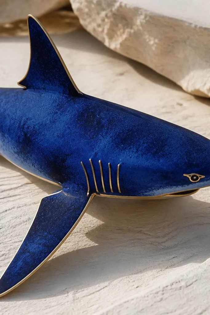
This idea looks high-end because it mixes rich color with delicate linework. Ultramarine ink gives you depth, while gold linework on contour lines makes the shark feel like a luxury illustration. Keep the gold only on the most important edges: around the eye, gill line, fin leading edge, and a curved belly highlight. Done right, it looks like a premium tattoo flash sheet or boutique print.
Sketch the shark and ink it in ultramarine using a fine brush or dip pen for consistent lines. Shade with diluted ultramarine wash using 2-3 tones: light wash on the body, darker wash under jaw and fins. Let everything dry, then use a gold acrylic paint marker to draw thin lines along the contour points. Add a small gold dot highlight in the eye area. Finish with a very light gray wash around the background to keep focus on the gold accents.
Pro tipGold linework looks best when it’s slightly thicker on curves and thinner on straight lines. Follow the form, not your pen’s default pressure.
AvoidDon’t flood gold over wet ink. It smears and looks cheap fast.
18. Sepia ink shark with handmade paper deckle edge framing
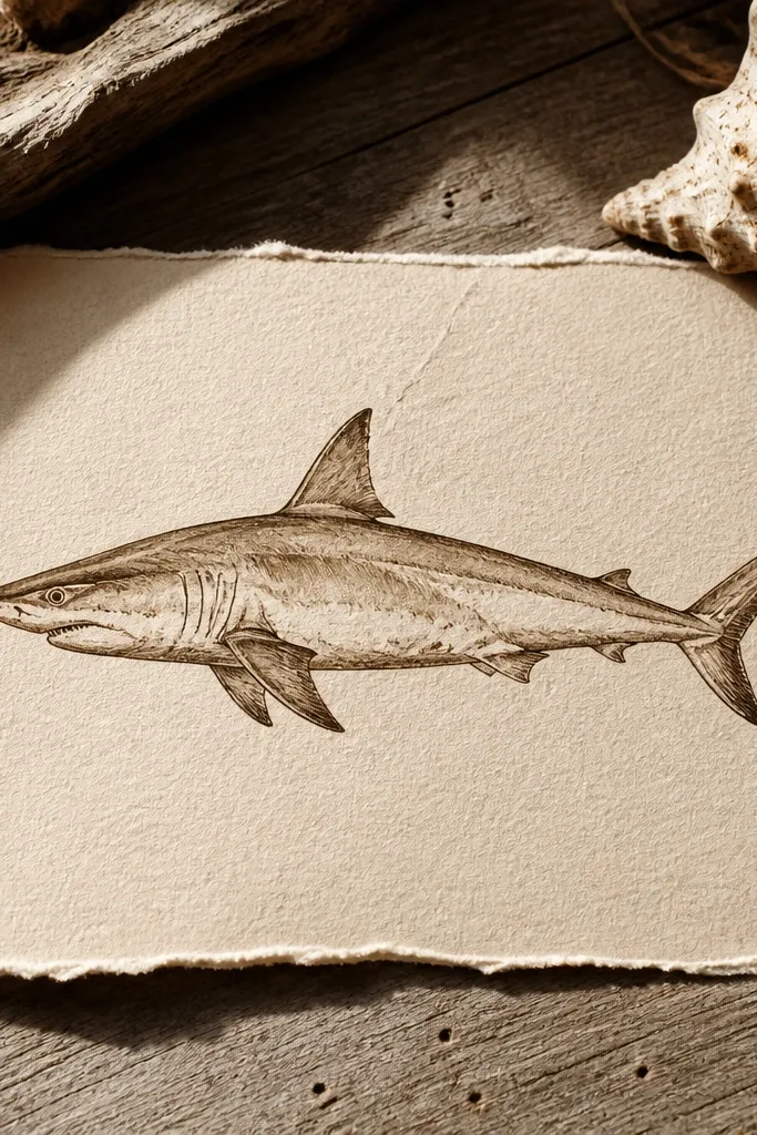
Luxury can be quiet. A sepia ink shark on handmade paper with deckle edges looks like an old-world print, but it still feels modern when the drawing is crisp. The expensive part is the negative space: keep the background mostly clean so the sepia values stand out. Add a tiny amount of darker ink only at the eye socket and fin joints so the shark has depth without looking overworked. This is for people who want premium with minimal color.
Choose handmade paper with a visible deckle edge and sketch the shark centered. Ink the outline in sepia using a brush pen, then add a few controlled shadow hatches under the jaw and along the spine. Leave the belly and some body planes mostly unshaded for that gallery print calm. Add one thin highlight line with white gel pen on the belly curve. Mount the piece with a mat so the deckle edge stays visible and the drawing has breathing room.
Use a single sepia tone plus one darker sepia for shadows. More colors make it look like a craft project.
Don’t add heavy crosshatching across the whole body. It kills the premium negative space effect.



