
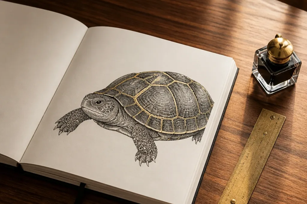

1. Gold-Edge Shell Outline with Waterproof Ink
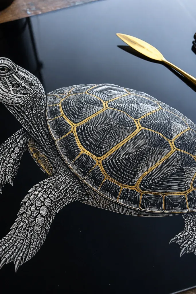
This is the fastest way to get high-end Turtle Drawing luxury without complicated rendering. You draw the turtle in crisp waterproof ink first, then run a thin gold accent along the shell’s outer ridges so the form looks edged and lit. The black ink gives structure; the gold reads like a highlight stripe. Use this style for greeting cards, small prints, or anything that needs to look “finished” even when the turtle is simple. Skill level is beginner-friendly because the luxury comes from the edge treatment, not from heavy shading.
Pro tipDo the gold last and wipe the nib on scrap paper first — it prevents blobs that kill the luxe look.
Start by sketching lightly with a 2H pencil so you can erase without tearing paper. Ink the silhouette and the deepest shell grooves with a waterproof fine liner (0.3 or 0.5). Let it dry fully, then use a metallic gold gel pen or fine gold paint marker to trace only the top edges of 4-6 shell ridges, keeping the line thickness consistent. Finish by adding 2-3 white gel pen highlight dots on the shell to keep it from looking like it’s just outlined.
AvoidDon’t gold every line; too many gold strokes flatten the contrast and make it look decorative instead of polished.
2. Monochrome Charcoal Turtle with Soft Fog Shading
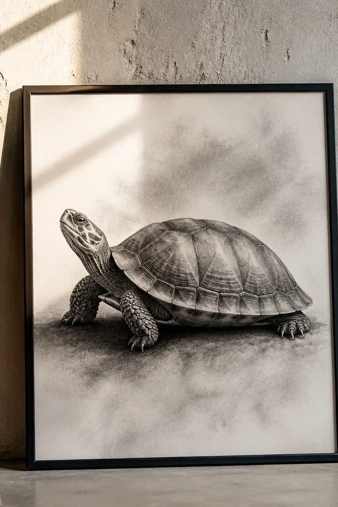
This style reads expensive because charcoal can create smooth gradients that look like studio lighting. The luxury move is fog shading: you soften transitions so the shell doesn’t look carved from hard blocks. Keep the turtle monochrome so the viewer’s eye stays on shape and value range. It works great for framed wall art because the matte blacks and gray midtones feel gallery-like. It takes more patience than ink-only work, but the steps are straightforward and repeatable.
Pro tipFixative lightly after the first pass keeps smudging controlled; use short spray bursts from a distance.
Begin with a light graphite underdrawing, then switch to charcoal pencil for the silhouette and shell ridge angles. Press harder only on the darkest grooves and the underside flippers, using a kneaded eraser to lift midtones for the fog. Use a blending stump or folded tissue to smear the charcoal lightly, but stop before the paper goes shiny. Finally, sharpen the darkest lines again with charcoal pencil and add a few white charcoal highlights or a white gel pen on the shell ridges.
AvoidAvoid fully smudging everything — if you erase the texture, the turtle turns into a gray blob.
3. Prussian Blue Wash Turtle with Ink Skeleton
A Prussian blue wash gives instant high-end Turtle Drawing luxury because it looks like depth, not just color. You keep the line structure in ink, then let watercolor do the atmosphere on the shell and neck. The ink skeleton keeps details sharp while the wash creates a premium, layered look. This is a strong choice when you want the turtle to feel calm and “museum print” polished. It’s mid-skill because watercolor requires control, but you can still keep it simple by limiting the palette to blue and a neutral shadow tone.
Pro tipUse a smaller round brush (size 2 or 3) for shell segment lines so the wash doesn’t creep into edges.
Draw the turtle in waterproof black ink first, focusing on shell segment boundaries and the neck contour. Mix Prussian blue with water to a transparent wash, then paint the shell in 2-3 thin layers, letting each layer dry before the next. Reserve the brightest ridge areas as paper white so they stay crisp. For shadows, add a slightly darker blue mix along the shell grooves and under the head, then finish with a white gel pen highlight on 3 ridge points.
AvoidDon’t flood the page; watercolor blooms ruin luxury by making edges fuzzy everywhere.
4. Sepia Ink Turtle with Faux Leather Texture
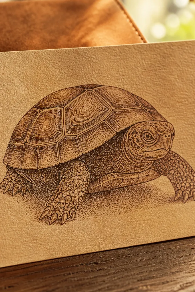
Luxury isn’t always smooth. Faux leather texture makes a turtle drawing feel like a printed product on thick paper. You’ll get a premium look by combining sepia ink lines with dense stippling that mimics leather grain. The turtle stays readable because the outline and major ridges are still clean. This works especially well for bookmarks, bookplates, and stationery sets. It’s also forgiving: texture hides small sketching imperfections.
Pro tipStipple in clusters, not evenly — uneven density reads more realistic and more expensive.
Start with a sepia pigment ink pen for the main shell ridges, then add lighter lines for segment boundaries with a finer tip. Build the leather grain using stippling with a small round brush or stipple sponge, concentrating dots heavier in the lower shell and neck folds. Leave a few ridge highlights as bare paper, then deepen the darkest grooves with a second round of stippling. Add final highlights with a white gel pen on the top ridge edges and a tiny dot pattern near the head’s highlight area.
AvoidAvoid a uniform stipple everywhere; even texture makes it look like a coloring page.
5. Copper Wash Highlights with Warm Brown Linework
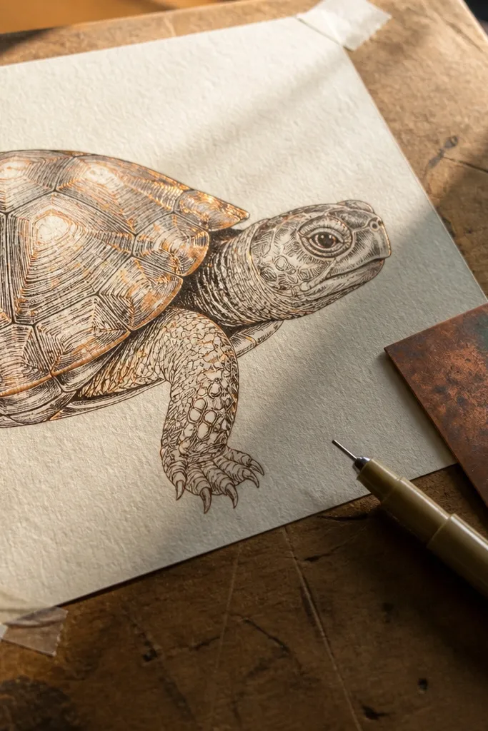
Copper-toned highlights scream “high-end Turtle Drawing luxury” because they imitate metallic light. Instead of painting the entire turtle in metallic, you only tint the ridges and edges so it looks like a subtle sheen. Warm brown linework keeps it grounded and prevents the copper from turning flashy. This style looks great for seasonal prints and gift tags. It’s beginner-friendly because you can control the metallic effect with a light wash and a couple of controlled highlight strokes.
Pro tipTest the copper mix on a scrap first; metallic washes vary a lot in opacity.
Sketch the turtle in a warm brown pencil, then ink with a brown waterproof pen so the lines are softer than pure black. Make a thin copper wash using a watercolor mixture (burnt sienna + a touch of gold or metallic watercolor), and paint it only on the top ridge edges and along the shell “rim.” Keep the underside neutral with light warm gray or unpainted paper. Finish by tracing 2-4 ridge highlights with a fine copper marker and adding 1-2 crisp white gel pen points.
AvoidDon’t cover the whole shell with copper; the luxe look comes from selective sheen.
6. Botanical Frame Turtle with Tight Negative Space
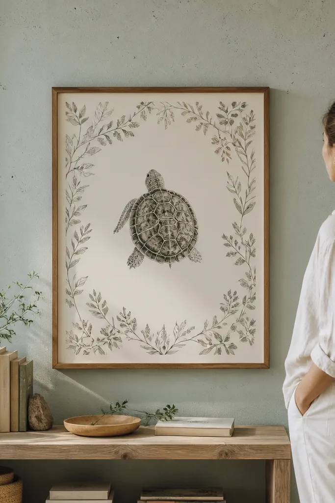
A turtle drawing looks expensive when it’s treated like a designed object, not a free-floating sketch. This idea wraps the turtle in a botanical frame made of thin leaves and minimal linework, leaving intentional negative space around the art. The turtle becomes the “hero,” and the frame adds the editorial finish. Use this when you want luxury without heavy shading. It takes some layout discipline, but the drawing skill is the same as basic illustration.
Pro tipUse a ruler for the outer frame line, then draw the leaves freehand so the piece still feels hand-made.
Decide on a margin: leave at least 1 inch (2.5 cm) around the turtle for print-style breathing room. Draw the turtle in the center with clean mid-weight ink lines, then add a thin rectangular frame made of single-line botanical stems in the corners. Keep the leaf details small and consistent; you’re framing, not filling the page. After the ink dries, add a soft gray wash under the turtle feet for grounding, then reinforce the frame line with a slightly darker pen.
AvoidAvoid over-illustrating the frame; if the border competes with the turtle, it stops reading luxe.
7. Fine Crosshatch Shell with Inked Grid Shadows
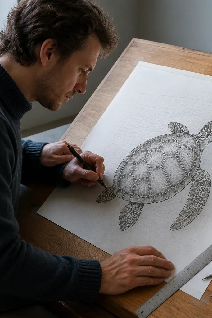
Crosshatching can look cheap fast, but it turns high-end when you control spacing and direction. This approach uses fine crosshatch for the shell planes and a subtle grid shadow behind the turtle to add a print-like structure. The result is crisp, controlled, and premium because the texture is consistent and the lighting direction is clear. It’s ideal if you like detailed work and want a turtle drawing that looks like a finished illustration plate. Skill level is intermediate because you’ll build value gradually.
Pro tipWork in sections: finish one shell quadrant at a time so hatch density stays even.
Start with ink outlines for the turtle and shell segment boundaries. For shading, create a light hatch direction following the shell curvature, then add a second hatch direction that crosses it only in the shadow halves. Keep line spacing tight and consistent by using a 0.3 pen for most texture. For the background shadow, draw a very light grid of lines (faint graphite), then darken only the grid area directly behind the turtle. Finish with white gel pen highlights on the top ridges and one small highlight on the eye.
AvoidDon’t change pen sizes mid-shading; that switch makes the texture look patchy.
8. Graphite Realism Turtle with Polished Edge Highlights
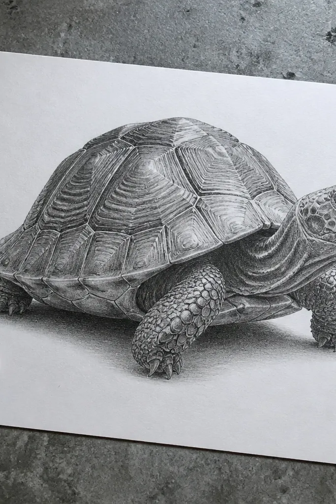
If you want high-end Turtle Drawing luxury that still feels understated, go full graphite with polished edge highlights. The luxury cue is sharp highlights where the shell ridges catch light, plus clean transitions between values. You’ll get that “expensive print” look by blending smoothly but keeping the ridge edges crisp. This style fits home decor, plain backgrounds, and minimalist cards. It takes careful value planning, not fancy color.
Pro tipKeep a kneaded eraser corner reserved just for ridge highlights so you don’t smear across the whole shell.
Lightly sketch the turtle with HB, then map the darkest grooves with a 2B before you blend. Blend midtones using a blending stump, keeping the ridge boundaries slightly darker so they don’t disappear. Use a kneaded eraser to lift highlights along the shell ridges, then sharpen those edges again with a graphite pencil. Add final pinpoint highlights with a white gel pen (use it sparingly) and deepen the darkest grooves with a soft 4B.
AvoidAvoid heavy smudging across the ridge lines; blurred edges make graphite look dirty.
9. Ink and Wash Turtle with Wet-on-Wet Glow
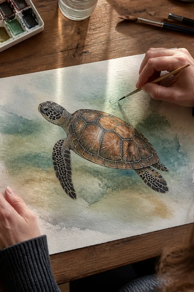
Wet-on-wet glow gives a premium softness around the shell while keeping the main structure in ink. The turtle looks luxury because the transitions are atmospheric, like light passing through pigment — not because the drawing is overly detailed. This style is great for relaxing art prints and for people who hate heavy texture. You’ll still get crisp edges where it matters: the silhouette and the major ridges. It’s intermediate because watercolor timing matters, but the method is repeatable.
Pro tipUse fewer pigment colors; two shades of the same hue look more expensive than five random tones.
Ink the turtle outlines and shell ridge boundaries with waterproof ink, then let it dry completely. Load your brush with a diluted wash (one color family only), and paint a soft area around a few shell segments while the paper is still damp. While it’s wet, add a slightly darker wash at the lower edge of those segments to create a glow gradient. Let everything dry, then add a few crisp ridge highlights with a white gel pen and a darker ink pass on the deepest grooves.
AvoidDon’t keep repainting the same wet area; repeated passes kill the glow and create blooms.
10. Turtle in Gold Leaf Style Borders with Dark Center
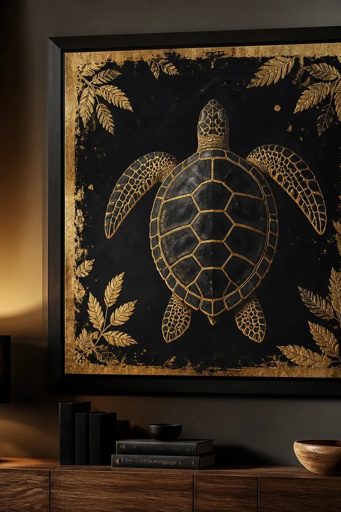
Dark center with gold border accents reads instantly luxe. Instead of trying to make the turtle itself metallic, you print the luxury on the frame: gold lines and leaf-like strokes against a dark background make the turtle pop. This style also hides mistakes because the background carries the visual weight. It’s a strong choice for art cards and wall prints where you want high contrast and a “finished piece” feel. You’ll need the right supplies, but the build order is simple.
Use toned paper (matte charcoal-gray or deep navy) as your base so the white highlights have something to stand out. Draw the turtle with a light pencil, then ink with a waterproof pen in near-black or dark brown. Add gold border accents using a gold paint marker: trace a thin inner border line and add 4-6 leaf-like strokes in the corners. For the turtle, keep shading minimal: use a soft gray pencil for under-shell shadows and white gel pen for ridge highlights and eye shine.
Choose a matte gold marker, not glitter; glitter looks craft-store cheap in small areas.
Avoid using glossy gold on textured paper; it can look uneven and patchy.
11. Velvet Shadow Turtle with Soft Pastel Grade
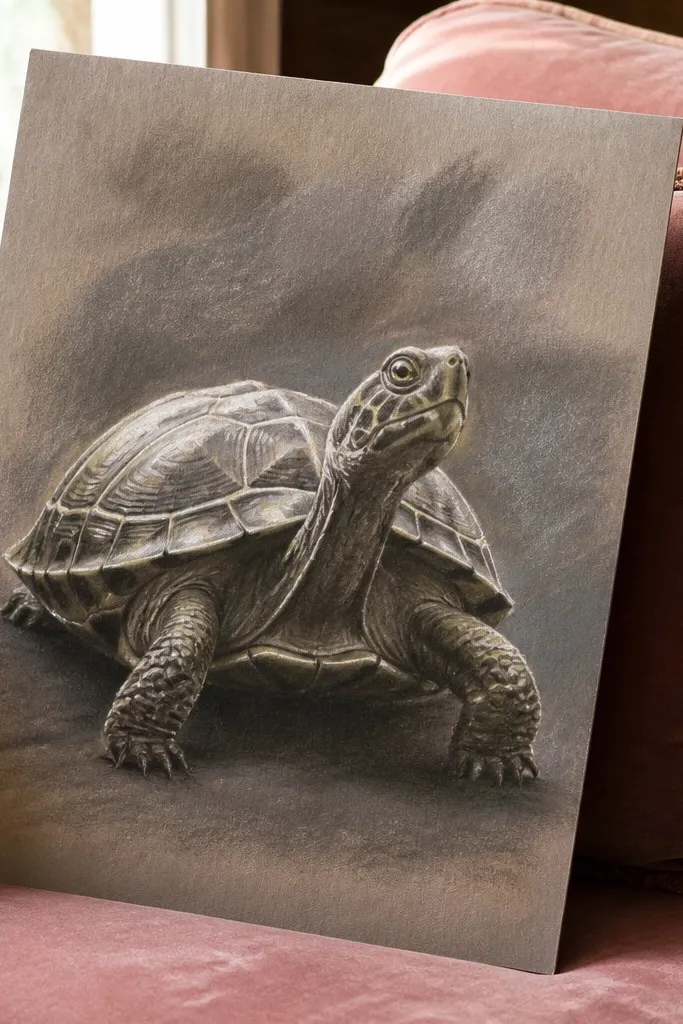
Pastel velvet shadows make a turtle look luxurious because the surface reads like soft fabric, not dry pencil. The secret is value grading: smooth transitions in the shell shadow areas and sharp highlight interruptions. You also keep the linework minimal so the pastel texture does the heavy lifting. This style works for art prints and cozy home decor pieces. It’s intermediate because pastel can get messy, but with a clean layering plan you get a premium finish.
Sketch the turtle lightly with a graphite HB so you can see the form. Use a soft pastel stick in a dark neutral (warm gray or deep umber) to block the shadow shapes first, then blend gently with a paper blending stump. Add midtones with a lighter pastel shade, then protect highlights by leaving them untouched. Finish with a white gel pen or white pastel for ridge highlights and a dark pencil for the deepest grooves only after blending is done. If you have fixative, spray lightly from a distance.
Use a kneaded eraser lightly on pastel highlights instead of rubbing — it reduces smudges.
Avoid heavy blending over the highlights; they turn gray and lose that luxe contrast.
12. Ink Dot Eye and Shell Micro-Details Luxury Pass
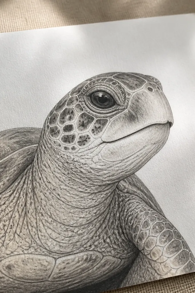
This one is pure polish. The turtle stays mostly clean, then you add micro-details: dot highlights in the eye, tiny shell pores, and a few micro ridges that catch light. High-end Turtle Drawing luxury comes from those small, deliberate touches, not from covering the whole shell in texture. It’s great for line-art lovers and for small-format drawings where heavy shading would clutter. Skill level is beginner to intermediate because most of the work is careful observation and controlled dot placement.
Pro tipUse a magnifier for dot placement; spacing mistakes show up fast at luxury level.
Draw the turtle with waterproof black ink using a 0.5 pen for outlines and a 0.3 pen for shell segment boundaries. Keep the shell mostly smooth — only shade with 5-8 small shadow marks to define grooves. Then add micro texture: place tiny dots along a few ridge edges and add 2-3 dot clusters near the head where skin folds catch light. For the eye, draw a crisp oval, then add a tiny white gel highlight dot and a micro dot near the lower lid. Finish by reinforcing the outer silhouette with the thicker pen.
AvoidDon’t add micro details everywhere; concentrate them on 1-2 shell zones and the eye.
13. Two-Color Shell Tint with Crisp Watercolor Edges
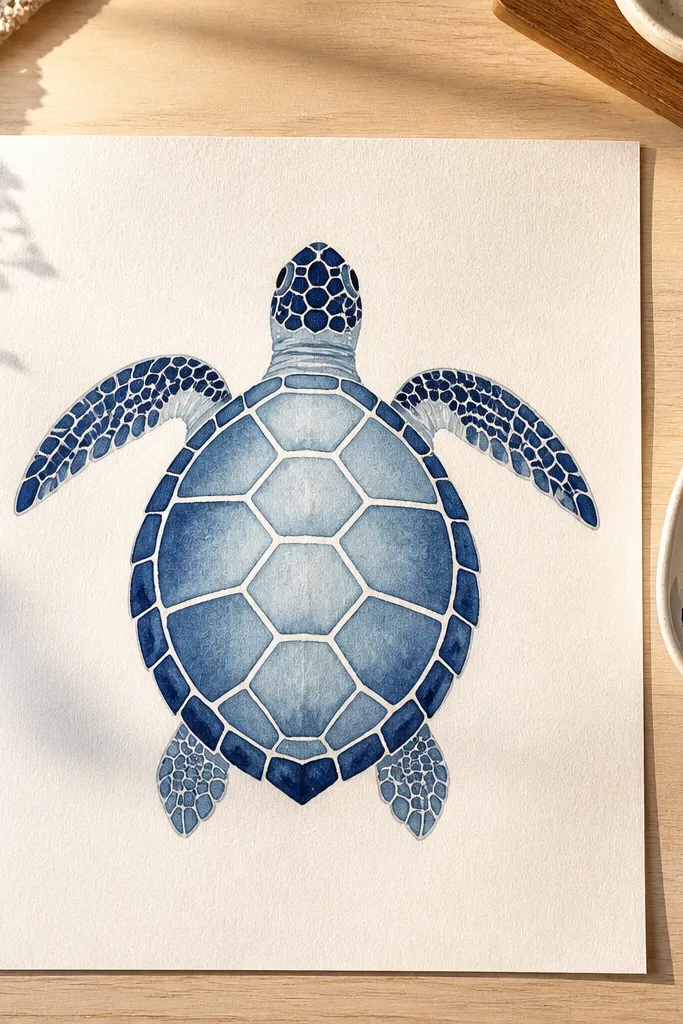
Two-color tinting looks expensive when your edges stay crisp. You use one mid-tone and one shadow tone, then keep the boundary lines clean so the turtle reads like a printed design. This approach avoids the muddy look that happens when people mix too many colors in shell grooves. It’s a good fit for modern, minimal decor because the turtle stays graphic. Skill level is intermediate due to edge control, but you can get it with the right brush habits.
Pro tipLet the first wash dry completely before the second tone; wet layering kills crisp edges.
Sketch and ink the turtle outlines first, then erase pencil lines. Paint only the shell with two watercolor tones: a base mid-tone wash across most segments and a darker wash restricted to groove lines and underside areas. Keep edges crisp by using a smaller round brush and painting up to the ink line, not over it. After drying, add a thin glaze of the shadow color to deepen 3-4 grooves. Finish with a white gel pen highlight on ridge edges and a light gray pencil under the chin for grounding.
AvoidAvoid mixing your shadow color directly into the base on the page; it ruins the clean two-tone look.
14. Gold and Black Shell Segment Marbling
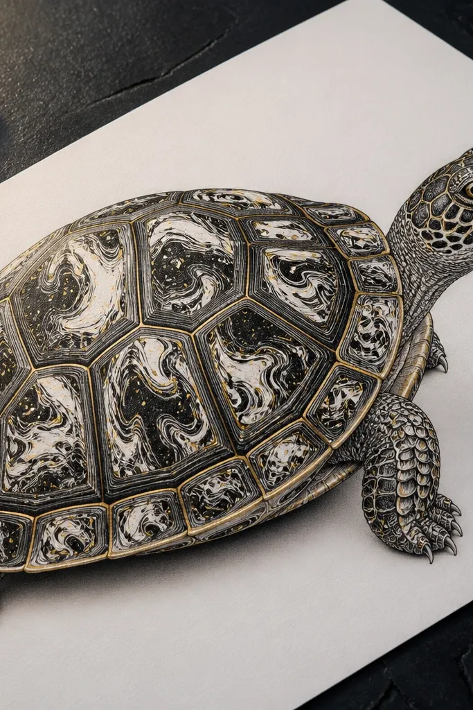
Marbling inside shell segments feels high-end because it adds controlled randomness. You get luxury by keeping the marbling contained to each segment and finishing with gold accents on the segment borders. The black ink keeps everything sharp; the marbling provides texture depth without heavy shading. This is ideal when you want the turtle to look like a premium print or stationery set. Skill level is intermediate because marbling needs timing, but you can keep it simple by using ink and a single marbling medium technique.
Ink the turtle and shell segment boundaries in waterproof black, then keep the segments unpainted. Prepare a marbling setup with a marbling medium on a palette (or use a controlled ink marbling method with a dropper and comb). Drop black ink into the medium, then drag a comb lightly to create swirls. Transfer the marbled color onto a single shell segment at a time using a small brush, keeping the paint inside the ink boundaries. After it dries, trace the segment borders with a thin gold paint marker and add two white gel pen highlights on the top ridges.
Practice on scrap paper to learn how fast the ink spreads on your exact paper.
Don’t fill all segments at once; you’ll lose control and it turns into a single muddy blob.
15. Shell Rim Dry-Brush with Graphite Core
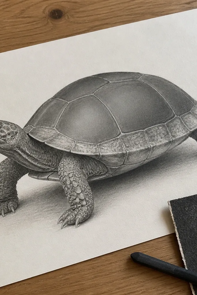
Dry-brush texture looks premium because it creates a soft, worn edge that mimics natural materials. Here, you keep the shell core in graphite (smooth and controlled), then dry-brush a thin layer on just the rim and groove edges. That contrast gives luxury without turning the turtle into a speckled mess. This style works well for prints that need a tactile feel. It’s intermediate because you have to manage paint dryness and placement.
Pro tipIf the paint looks wet, stop and wipe more off the brush; dry-brush luxury is about scratchy texture, not puddles.
Sketch the turtle lightly and shade the shell core with graphite pencils, blending to smooth midtones. Load a small dry brush with a neutral paint (warm gray or deep umber) and wipe most paint off on scrap until it looks like dust. Then lightly sweep the dry brush along the shell rims and groove edges, following the curvature. Add a second pass only on the darkest grooves. Finish with white gel pen highlights on the top ridge edges and a dark pencil pass on the outer silhouette.
AvoidAvoid dry-brushing the entire shell; it makes the turtle look unfinished.
16. Ink Stained Glass Turtle with Lead-Line Look
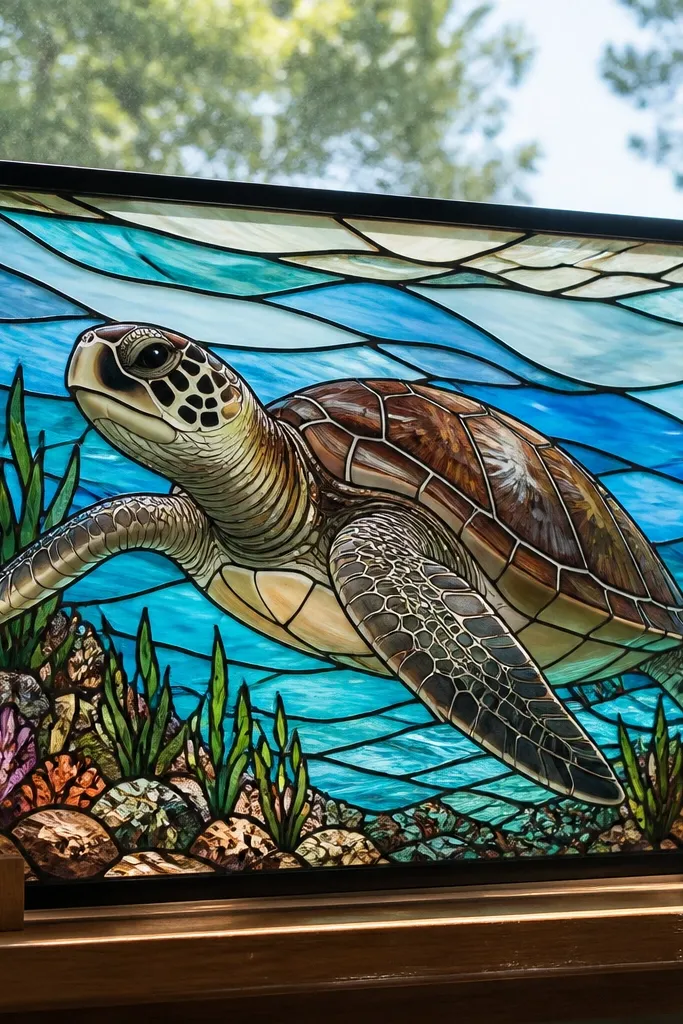
Stained glass style can look genuinely high-end when you treat the lines like lead and keep the color panes semi-transparent. Your turtle reads like a decorative panel, not a flat drawing. This style is also perfect for luxury because it’s structured: each shell segment becomes a “pane,” and the viewer sees clear boundaries. Use it for framed art, sun-catcher designs, or cards. Skill level is intermediate because you need clean boundaries and controlled tint density.
Pro tipUse watercolor pencils first for control, then activate with a damp brush for cleaner pane edges.
Ink the turtle with waterproof black, making the shell segment boundaries thick and consistent like lead lines. Mix two or three translucent watercolor colors and paint each shell segment lightly so you can still see the paper tone through. Keep color away from the ink boundaries by leaving a small gap, then let it dry. Add darker tinted glazing only in groove areas for depth. Finish with white gel pen highlights on a few ridge intersections and a light gray wash under the chin for grounding.
AvoidAvoid opaque paint; opaque coloring kills the stained-glass feel.
17. Luxury Minimal Line Turtle with Single Shadow Stripe
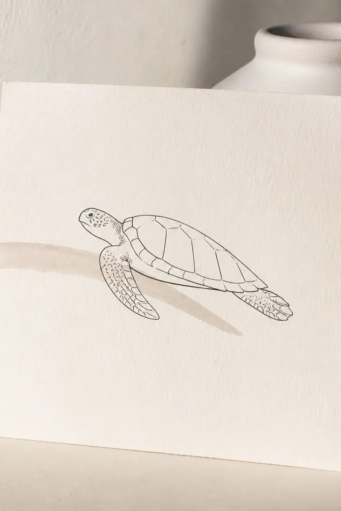
This is the “expensive restraint” option. The turtle is mostly line art, but you add one deliberate shadow stripe that gives form depth and makes the whole drawing look designed. Luxury comes from negative space and one strong value move. This style is great when you want a clean, modern look for prints, bookmarks, or planner inserts. It’s beginner-friendly because you’re not fighting shading across the whole shell.
Pro tipChoose the shadow stripe direction first, then build every line weight decision around it.
Sketch the turtle with a light pencil, then ink the silhouette and shell segment lines with a 0.5 waterproof pen. Keep interior shading minimal — just 3-4 short groove marks. Add one shadow stripe behind the turtle using a gray pencil or ink wash: draw a single curved stripe following the turtle’s contour and darken it near the shell base. Leave the rest of the background blank. Finish with a white gel pen highlight on the shell ridge tops and a tiny highlight dot in the eye.
AvoidAvoid adding multiple shadow patches; the moment you add two, it stops looking intentional.
18. Marble Paper Turtle Transfer Look with Pencil Lift
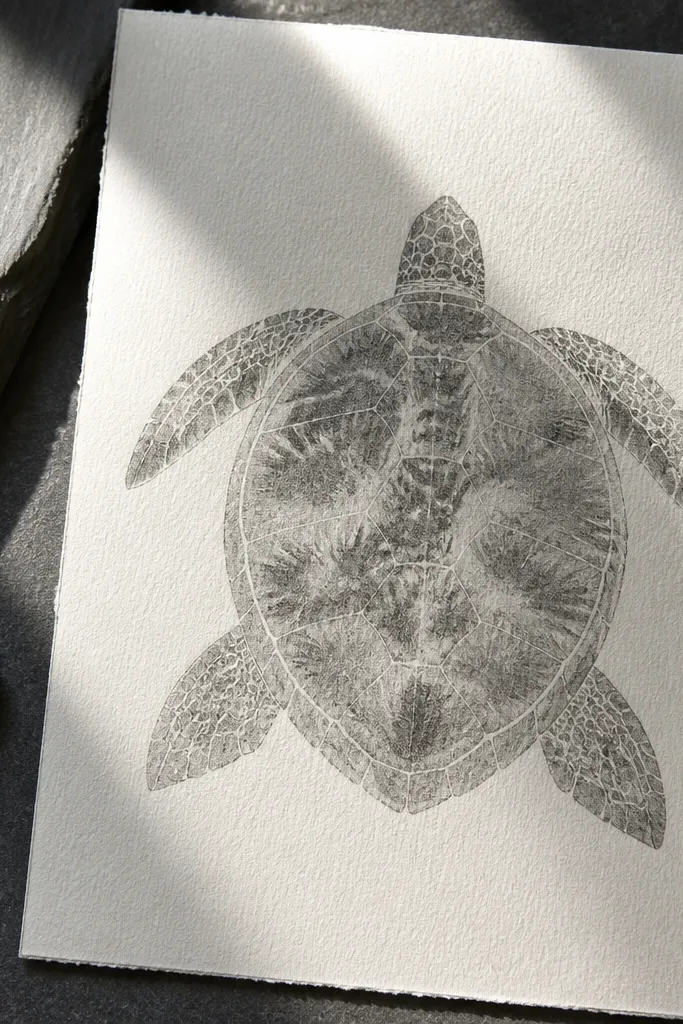
This gives a luxe, print-ready texture without complicated tools. The idea is to create a marble-like effect in the shell by layering graphite and then lifting it in controlled areas. You end up with soft veining and natural variation that reads like high-end paper art. It’s great for people who want texture but hate stippling time. Skill level is intermediate because you have to learn how much graphite to lay down before lifting.
Pro tipLift in stages. Two light lifts look cleaner than one aggressive lift that tears the paper surface.
Lay down a light graphite base across the shell using a B pencil, keeping it even. Add darker graphite in groove bands, then blend lightly so it becomes a uniform soft layer. Now lift textures: use a kneaded eraser to pick out ridge highlights and a few “vein” streaks, rotating the eraser to create different shapes. Repeat with a lighter graphite layer if you need more variation. Finish by sharpening the darkest grooves with a 4B pencil and adding crisp white gel pen highlights on ridge edges.
AvoidDon’t over-blend after lifting; it smears the lifted texture into gray haze.



