
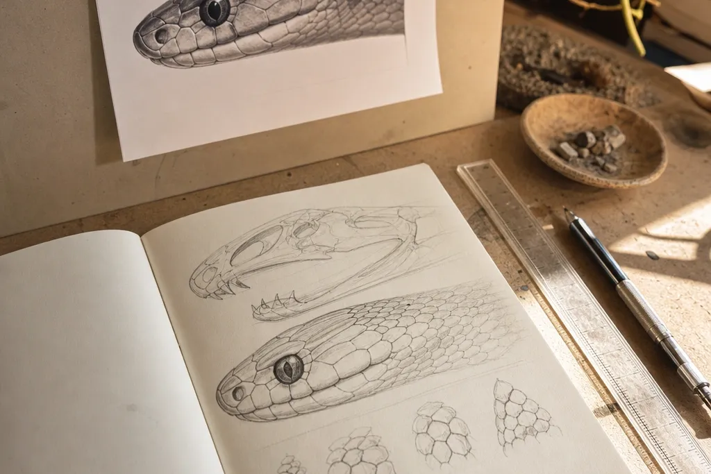

1. Half-lidded side profile with a raised snout ridge
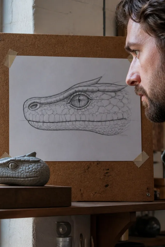
This reference is perfect when your snake heads look too round or too “button-eyed.” The half-lidded eye gives you a clear eyelid curve to draw, and the raised snout ridge tells you where the top plane turns into the face plane. The mouth line in this angle is easy to track because it arcs cleanly from the jaw hinge toward the front lip. You get a modern, intimidating look without having to render every scale — the important parts are the ridge, the eye shape, and the mouth opening contour.
Start by sketching the head silhouette as one smooth shape, then place the eye slightly forward of the center. Mark the snout tip and jaw hinge first, then connect them with the mouth line curve. Block the top ridge as a single thick band, and only after that add scale rows as short segments that follow the ridge direction.
Draw the eye lid as a single curved stroke, then add the pupil last so the expression stays calm and modern.
Don’t center the eye perfectly in the middle of the head — that instantly kills the believable skull angle.
2. Front-facing mouth-open head with visible jaw hinge
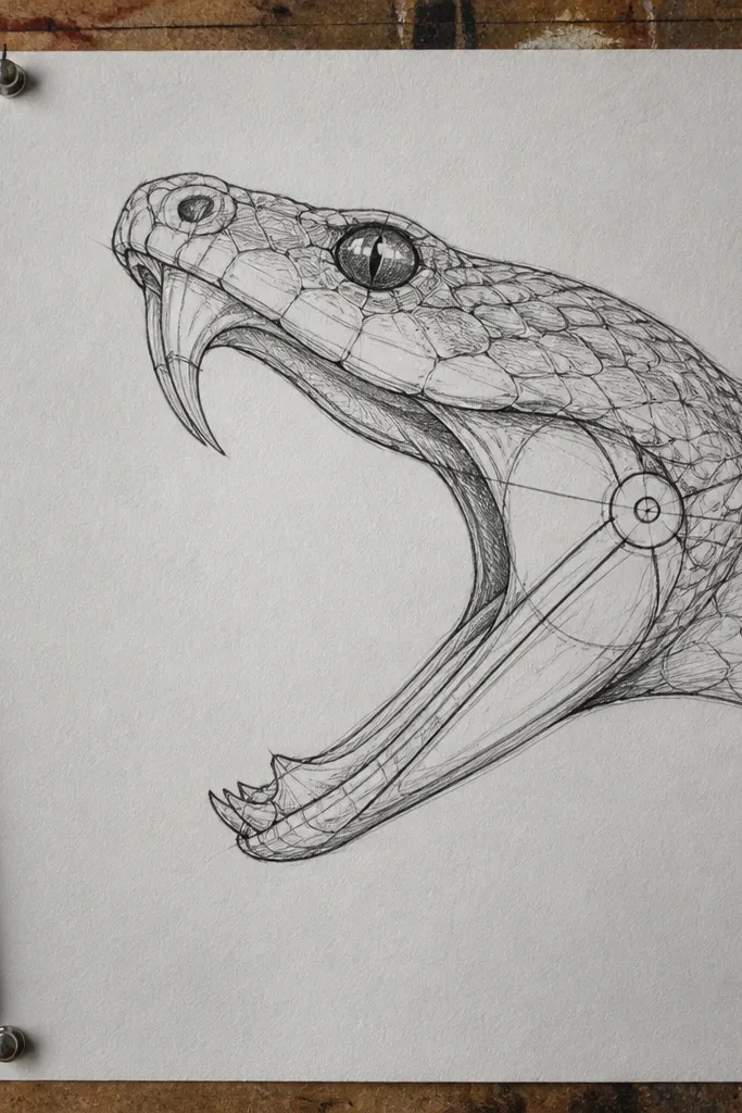
Draw the skull as a slightly wider oval at the back and narrower toward the snout. Place both nostrils and the eye sockets, then sketch the mouth opening as a curved cutout that connects to the jaw hinge. Add the inner mouth shadow as one smooth shape under the upper lip, then place a few scale blocks around the lip edges to frame the opening.
If your snake mouths look like a generic oval, this is the reference that fixes it. The jaw hinge shows you where the lower jaw pivots, so the mouth opening has depth instead of looking pasted on. Front-facing heads also force correct symmetry, which makes your drawings look more “designed” and modern. Focus on the inner mouth shadow and the lip edge line — those two give you the strongest realism with the least extra work.
AvoidDon’t draw the mouth opening as a perfect circle — the jaw hinge needs an off-center anchor.
Pro tipUse a darker value under the upper lip than under the lower lip to make the mouth read as a cavity.
3. 3/4 view head with crisp scale checker on the cheek
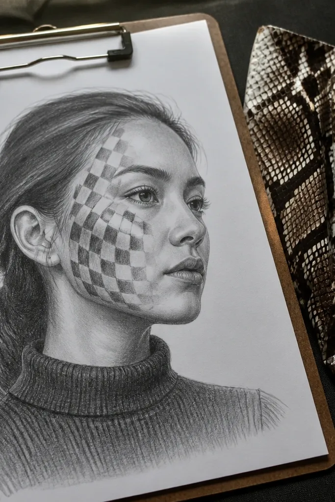
Start with a construction sketch: a head wedge for the snout and a broader mass for the skull. Place the eye and then draw the cheek boundary line where scale rows start wrapping. Block in the cheek scales as a checker of small shapes, then extend the pattern backward toward the jaw hinge with fewer, larger blocks.
This style reads modern because the scale pattern is organized, not chaotic. A 3/4 view shows you how the cheek scales wrap around the face, which is where most drawings collapse. The cheek pattern gives you a rhythm you can repeat, and the eye stays clearly separated from the surrounding scales. The result looks designed even if you keep your scale detail simplified, because the pattern placement is the whole point.
AvoidDon’t let the cheek pattern drift into the eye area — the eye must stay clean and readable.
Pro tipKeep each scale block the same height for the cheek — that consistency is what makes it look modern.
4. Top-down angled head with strong nostril placement
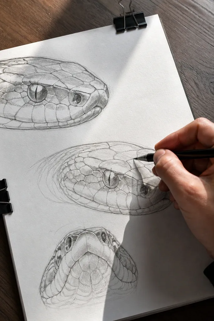
Top-down angles make your head structure look more advanced because they show the top plane of the snout. Nostril placement becomes a reference anchor: if you get the nostrils right, the whole face reads correctly. This reference also helps you draw the forehead plane and how it slopes into the snout, which is a common weak spot in side profiles. The look is clean and graphic when you keep the top plane highlight narrow and the under-jaw shadow soft.
Sketch the head as two planes: a top plane for the forehead and a slanted plane for the snout. Place nostrils on the slanted plane, then set the eye socket slightly behind them. Add the jaw line as the underside curve, then draw a few scale rows along the top plane only, leaving the underside less detailed.
Use a single highlight stroke along the top plane instead of shading the whole forehead — it keeps the drawing crisp.
Don’t put nostrils too far forward; they should sit on the snout plane, not on the very tip.
5. Backlit head with bright lip edge and soft under-jaw gradient
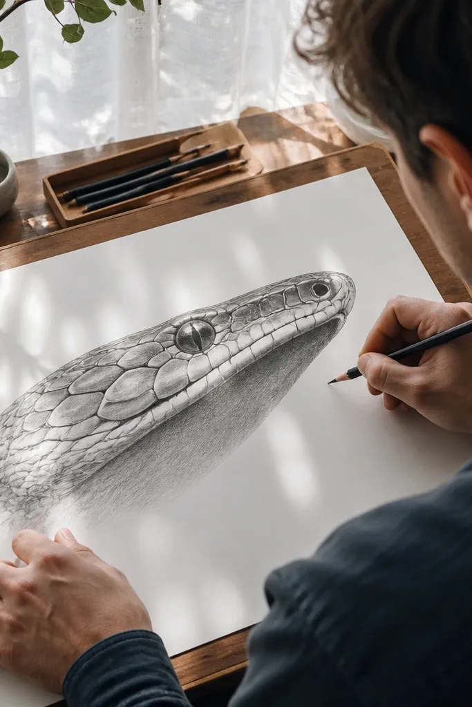
Backlit references look good fast because the lip edge becomes a natural design line. This is a modern look that doesn’t require ultra-detailed scales; you just need correct shading separation between top face, lip edge, and under-jaw cavity. When you copy the bright rim along the mouth line, your drawing instantly looks intentional. The under-jaw gradient also helps your head feel three-dimensional even with simple scale marks.
Start with a clean outline of the head and mouth opening, then block the face into three value zones. Paint or shade the underside with a soft gradient that fades toward the jaw hinge, and keep the top face lighter. Add the bright lip edge as a thin band following the mouth curve, then place scale separations only where they catch the light.
Keep the brightest edge narrow; if you widen it, the head looks flat and cartoony.
Don’t add heavy black outlines everywhere — only the outer contour and lip edge should feel bold.
6. Snout-forward striking pose with stretched scales
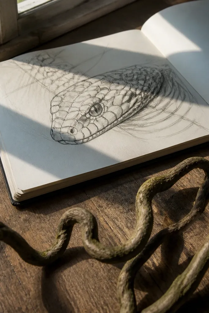
Draw the head in three big shapes: skull block, snout block, and jaw opening wedge. Sketch the mouth corners and show the slight pull toward the snout tip. Then draw scale rows as stretched lines that converge toward the front, keeping the spacing slightly tighter at the snout ridge.
This reference is built for energy. The snout-forward angle stretches the scales naturally, so your drawing looks dynamic without inventing motion lines. You also get strong tension lines around the mouth corners, which keeps the jaw from looking limp. It’s modern because the scale direction is obvious — they flow toward the snout tip instead of sitting flat. Copy the flow first, then add only enough scale segmentation to suggest texture.
AvoidDon’t keep scale spacing identical from skull to snout; the snout angle stretches the pattern.
Pro tipUse fewer scale rows than you think — the convergence does the work.
7. Close eye detail reference with eyelid seam and scale border
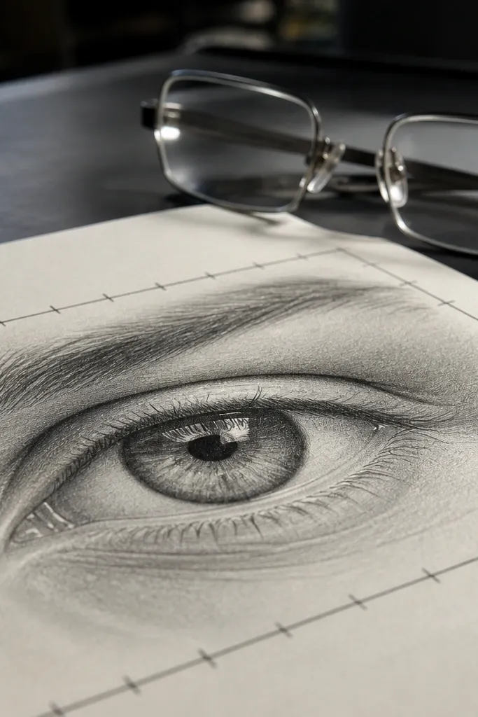
Start by drawing the eye shape and then add a curved border around it that follows the face contour. Sketch the eyelid seam as a line that arcs over the top of the eye, leaving a small gap for the highlight. After that, block in two or three scale shapes around the eye border to anchor the surrounding texture.
If your snake eyes look like stickers, this reference gives you the missing structure. The eyelid seam and the border scale around the eye create a frame, so your eye sits in a believable socket. Use this to learn how the scale border curves — it’s not a straight ring; it follows the face plane. Even if you keep the rest of the head simple, a correct eye socket makes the whole drawing read as modern and serious.
AvoidDon’t outline the entire eye with a thick black line; keep the border thinner than the outer head contour.
Pro tipPlace the highlight slightly off-center toward the upper edge to make the eye look awake.
8. Mouth corner curl with visible lip scales
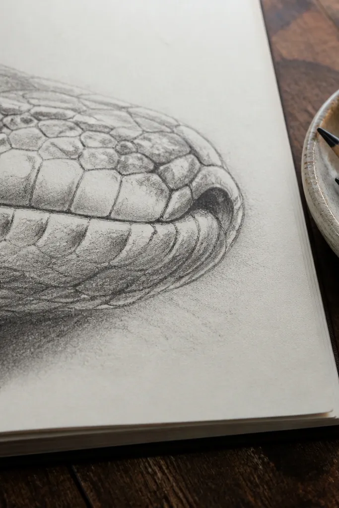
Sketch the head outline and mark the mouth opening as a simple curved cut. Then focus on the mouth corner: draw a small wedge shape where the lip curls upward. Add lip scale blocks as short overlapping rectangles that follow the curl direction, and keep the rest of the face less detailed so the mouth corner becomes the focal point.
This is the reference for clean mouth corners. Most drawings fail because the mouth corner is just a curve with no lip scale logic. Here, the lip scales stack in a direction, creating a subtle curl that makes the jaw look flexible. It’s modern because it reads as design detail: the lip edge is crisp, and the scales are placed with intention rather than full coverage. Copy the lip scale direction and the mouth corner opening shape.
AvoidDon’t erase the mouth corner into the cheek; leave a clear separation line.
Pro tipDraw three lip scale blocks maximum — too many turns the corner into clutter.
9. Monochrome sketch reference with clear scale row rhythm
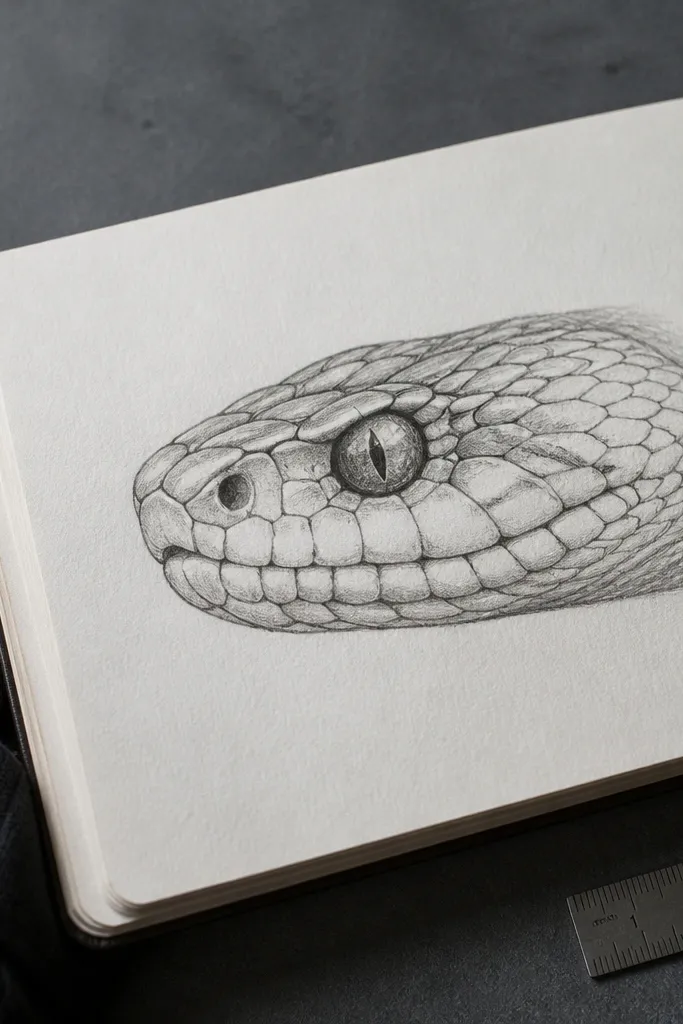
Monochrome references are underrated for modern drawing because they teach spacing. You’re not distracted by color, and you can see how scale rows wrap across planes. This one makes your head look sharp even in pencil because the scale boundaries are simplified into consistent row lengths. Copy the rhythm: the scales get slightly larger near the eye frame and tighten toward the snout ridge.
Start with a light construction outline and place the eye socket and jaw hinge first. Then draw 4 to 6 scale row boundaries across the face, keeping them parallel to the snout ridge direction. Fill only a few rows with scale blocks; leave gaps so the head silhouette stays readable.
Use a ruler for the first two scale row boundaries, then switch to freehand — that keeps the structure steady.
Don’t shade every scale — modern pencil work looks better with selective detail.
10. High-contrast ink head with split-tone shading planes
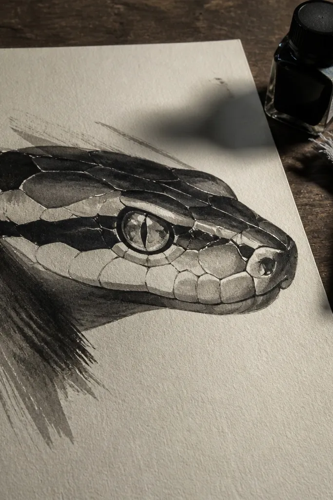
Draw the head outline with thicker outer contour lines. Block in three value planes using a pen or brush: top face light, cheek mid, under-jaw dark. Add scale separations only along the plane boundaries, then fill a few cheek scale blocks for texture without covering the whole surface.
This reference is designed for bold, modern linework. The face is split into planes — top face, cheek plane, and under-jaw plane — with hard value separation. That means you can get a clean look without rendering individual scales everywhere. If your drawings look muddy, this will fix it by giving you a structure for shading. Copy the plane edges and keep scale detail only where it crosses the boundary lines.
AvoidAvoid cross-hatching across the entire head; it erases the plane structure.
Pro tipLet the plane edge be the “highlight” instead of adding lots of white — it keeps the ink style clean.
11. Patterned head with alternating dark stripe and pale scale bands
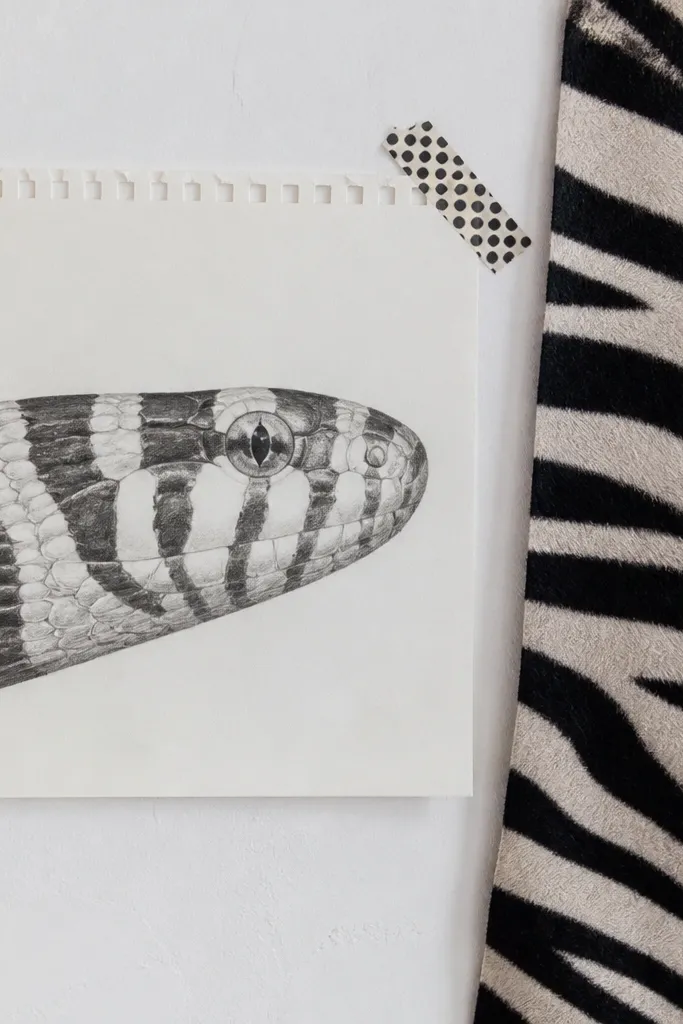
Pattern heads look modern because they give you a repeatable system. Alternating dark stripe bands force you to draw the underlying skull planes correctly, or the stripes will look warped. The trick is that the stripes don’t follow the jaw line randomly; they wrap with the face curvature. Copy the stripe start and end points relative to the eye and jaw hinge. Once you get that, you can simplify the stripe edges and still keep the look sharp.
Sketch the head silhouette and place the eye and mouth opening. Mark the stripe boundaries as two or three curves that run from above the eye toward the jaw hinge. Fill stripe shapes as clean bands, then add only a few scale separators where the stripe edges meet the lip and cheek.
Keep stripe edges straight on the top plane, then curve them on the cheek plane — that matches how the face bends.
Don’t add stripe detail to the eye border; keep the eye frame clean.
12. Sleek side profile with single highlight stripe on the snout
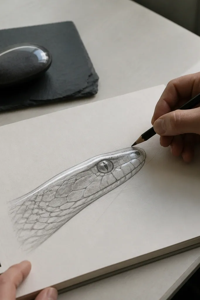
Outline the head in one smooth pass, then add the eye socket shape and pupil. Draw the snout highlight as a narrow stripe that follows the ridge and fades near the mouth corner. Add a few scale separations under the highlight and along the lower lip curve, leaving the rest as clean mid-tone shading.
This reference gives you a minimalist modern look. One highlight stripe tells the viewer where the snout ridge is, so you don’t need heavy shading or dense scale rendering. It’s also great for learning how the snout plane turns into the lip plane — the highlight ends where the face curvature changes. The eye is kept simple and crisp, which makes your linework look confident even if you’re still learning scale placement.
AvoidDon’t blend the highlight into the surrounding tone — keep a clear edge.
Pro tipUse one pencil value only for the mid-tone, then reserve the darkest value for the under-jaw cavity.
13. Stylized angular head with sharp jaw geometry
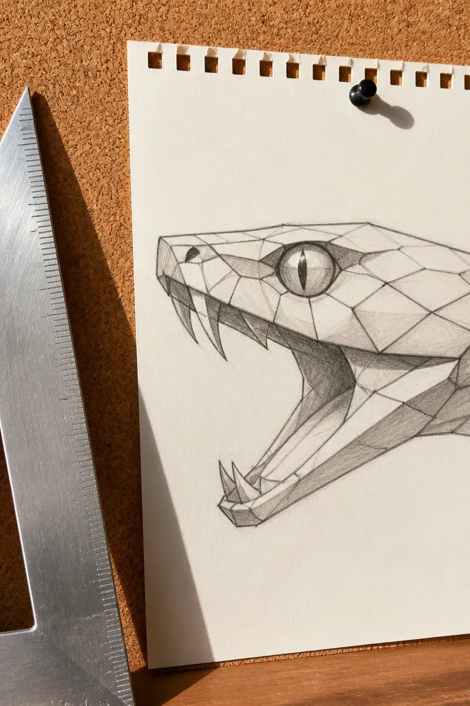
Block the head as a polygon: a top wedge for the skull, a front wedge for the snout, and a lower wedge for the jaw. Place the eye on the upper wedge near the front, then carve the mouth opening as a negative shape between wedges. Add scale shapes only at the edges of planes to suggest texture without clutter.
If you want modern graphic drawings, this is the reference that trains your brain. The head uses angular planes, so you learn to place the jaw hinge and cheek planes with sharper edges. Even with simplified scales, the face reads because the geometry is clear. This style is photogenic because it has strong silhouettes and contrast — your drawing will look good on a plain background and in a social post thumbnail.
AvoidDon’t round the jaw hinge after you draw it angular; that breaks the whole geometry.
Pro tipKeep your angles consistent: if one plane edge is sharp, all major plane edges should match the same sharpness.
14. Soft watercolor wash head with crisp line scale borders
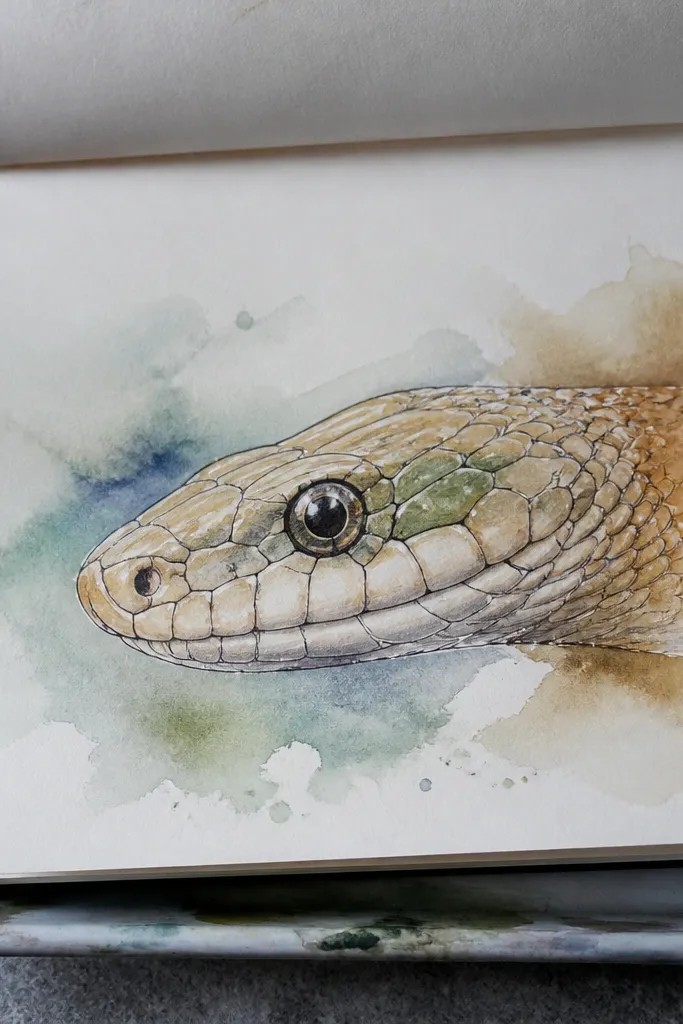
Sketch the head with clean pencil lines and lightly mark the eye and mouth opening. Wet the cheek and under-jaw areas first, then apply diluted wash in two tones: mid cheek and deeper under-jaw. After it dries, ink only a few scale borders near the eye frame and along the lip edge, then add a tiny highlight on the snout ridge.
This reference is about contrast control. The watercolor wash gives you modern softness, while crisp line borders on a limited number of scales keep the head readable. The best version has soft transitions on the cheek and under-jaw, but the scale borders stay sharp around the eye and mouth. That combination makes your drawing look intentional, not messy. Copy the amount of detail: only border the scales that sit near the focal points.
AvoidDon’t ink the entire head — you’ll lose the modern softness and it turns into heavy cartooning.
Pro tipInk after the wash is fully dry so the line borders stay crisp and don’t bleed.
15. Moody low-light head with sharp specular highlights on scales
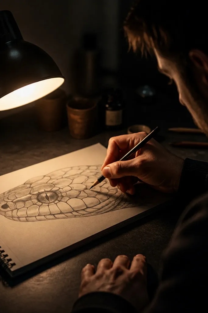
Start with a dark base tone over the head, leaving the eye area slightly lighter. Block the snout ridge and cheek planes with mid-tone shapes, then add highlights as small, curved strokes that follow the scale direction. Finish by drawing a few scale borders in darker gray around the ridge and lip, not across the whole face.
Low-light references make scales look expensive when you copy the highlights correctly. Instead of drawing every scale, you place a few specular highlights that sit on the scale planes facing the light. This teaches you where the face curvature catches light, which improves realism fast. The eye remains the brightest focal point, with smaller highlights along the snout ridge and upper lip. It’s modern because the lighting is dramatic and the detail is selective.
AvoidDon’t use pure white for every highlight; reserve the brightest white for the eye and one ridge highlight.
Pro tipKeep highlights small and grouped — scattered tiny dots look random and cheap.



