
1. Single Hibiscus with Blush Watercolor Petals
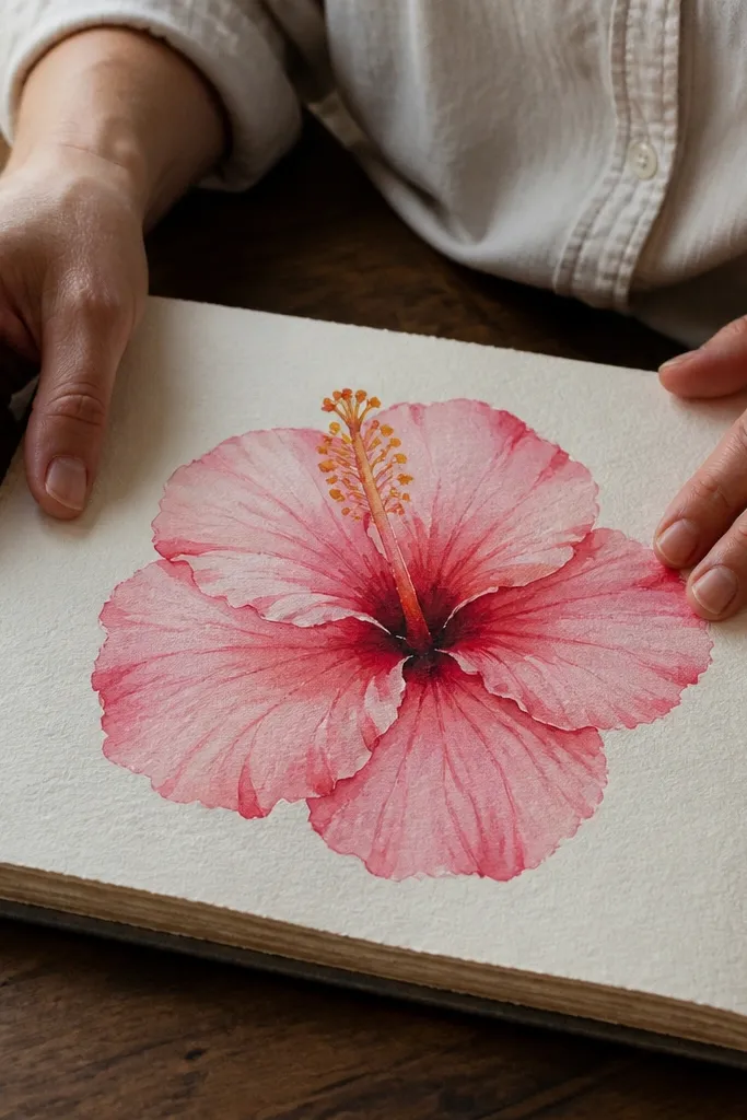
This is the “pretty and forgiving” option. You draw the hibiscus outline first, then let watercolor do the heavy lifting for smooth petal gradients. The trick is to keep the petal edges slightly darker than the centers, so the bloom looks like it has a light source from above. Use a warm yellow-orange for the stamen and add a thin pink wash around the center to connect it to the petals. This one looks great on white paper and photographs cleanly because the background stays calm.
Start by sketching 5 large petals in a loose flower shape, then add 2 smaller petals behind the front ones for overlap. Outline the stamen with thin lines and place 3-5 tiny anthers in the center. Wet the first petal area lightly with water, then paint blush pink in the middle and let it fade toward the edges; add a darker pink line at the petal base. Finish by coloring the anthers yellow-orange and glazing a faint pink shadow just under the center.
Pro tipUse a tissue to dab watercolor edges while they’re still damp — it makes the petal fade look natural.
AvoidDon’t flood the whole petal with the same pink — you need darker edges for shape.
2. Hibiscus Line Art with Bubble Pink Highlights
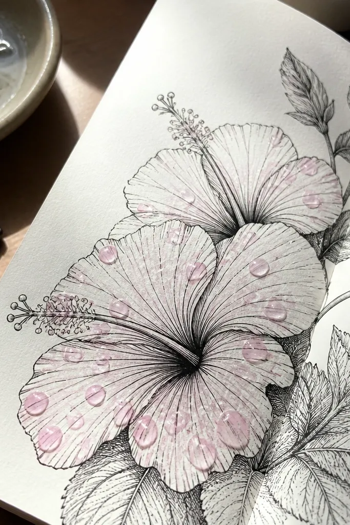
If your drawings look too flat, this gives you texture without complicated shading. You keep crisp black linework, then add controlled highlight spots that mimic light catching on the petal surface. The result looks graphic and cute, like a sticker sheet, but still reads as a real hibiscus because the petal overlap stays accurate. Use bright bubble pink for the highlights so the flower pops against the white page. It’s also easy to scan or photograph because the contrast is strong.
Draw the hibiscus with fineliner, focusing on petal overlap and a clearly defined center opening. Add the stamen as narrow curved lines, then place small anther tips in a warm yellow tone. Color the petals lightly with a pale pink pencil or watercolor pencil, leaving the brightest areas uncolored. Finally, dot bubble-pink highlights along the upper half of each petal and add a tiny pink rim where petals overlap.
Pro tipKeep highlight dots clustered near the top edges — scattered dots make it look random.
AvoidAvoid fully coloring the petals in solid pink — leave white pockets so the highlights read.
3. Angled Hibiscus with Dark Rose Shadowing
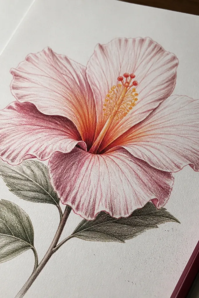
This one fixes the “my flower looks pasted on” problem. By angling the hibiscus and adding shadows under each overlapping petal, your drawing gains depth instantly. Use a dark rose pencil or soft charcoal for shadows — not black — so it still feels delicate. The center gets a warm glow with yellow-orange and a small dark pink ring around the opening. This looks best on slightly warm-toned paper because the pink and rose shades blend more naturally.
Sketch the hibiscus at a tilt by drawing the top petal slightly higher and the bottom petal larger. Block in 5 front petals with overlap, then add 1-2 petals behind so the flower has depth. Choose one direction for light (top-left works well), then shade under each petal where it overlaps using dark rose pencil. Color the stamen anthers yellow-orange, then add a thin dark pink ring around the center opening to frame it.
Pro tipBlend shadows with a blending stump or folded tissue — stop before it turns gray.
AvoidDon’t shade every petal the same way — shadows only go where one petal sits over another.
4. Hibiscus and Leaf Duo in Blush + Leaf Green Wash
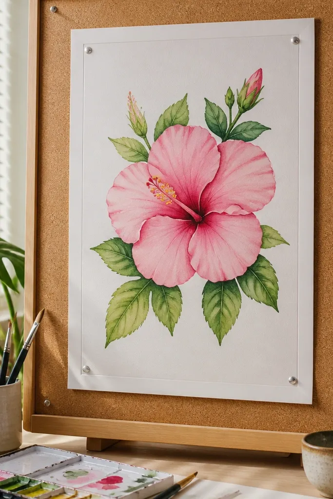
Pairing the hibiscus with leaves makes the whole page look finished. The leaves give you extra color rhythm and help the viewer understand the flower’s scale. Use a blush pink wash for petals and a fresh leaf green wash for leaves, then add darker edges for both so they don’t look flat. This idea is great for wall art because it has a natural composition: flower sits on a diagonal with leaves balancing the space. It also photographs better than a lone bloom because there’s a clear visual anchor beyond the petals.
Lightly sketch the hibiscus outline, then draw two leaves — one behind the flower and one in front — with a simple teardrop shape and a center vein. Paint the hibiscus petals with blush pink, keeping the edges darker. Paint the leaf shapes in leaf green, then add a darker green at the vein and near the leaf edges. Finish by glazing a tiny warm shadow under the flower where it touches the leaves.
Pro tipLeave leaf veins a bit lighter by painting around them instead of coloring over them.
AvoidDon’t let the leaves compete with the flower — keep leaf green less saturated than the hibiscus pink.
5. Hibiscus Center Focus with Stamen Detail Study
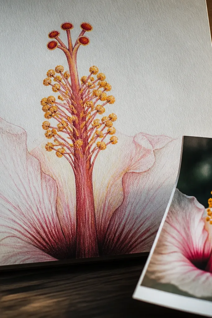
If you love the hibiscus look but struggle with the center, this zoomed composition makes it teachable. You draw the stamen and pistil first, then only hint at the surrounding petals. That keeps the drawing photogenic even if your petals aren’t perfect, because the viewer’s eye lands on the detailed center. Use warm yellow-orange for anthers, pale yellow for highlights, and a small shadow in pink around the opening. This is also a great way to practice without filling the whole page.
Draw a small circular center and sketch the pistil as a slightly curved line going upward. Add 5-8 stamen strands that fan out, then place tiny anther tips at the ends. Around the center, draw just 3 petals with partial overlap so the bloom still reads as a hibiscus. Color the anthers yellow-orange, then add a faint orange-red shadow near the base of each anther and a pink glaze under the pistil base.
Use a ruler edge for the center circle lightly, then erase it before coloring.
Avoid heavy shading on the stamen — keep it mostly line + color blocks for clarity.
6. Pink Hibiscus in a Polka Dot Frame
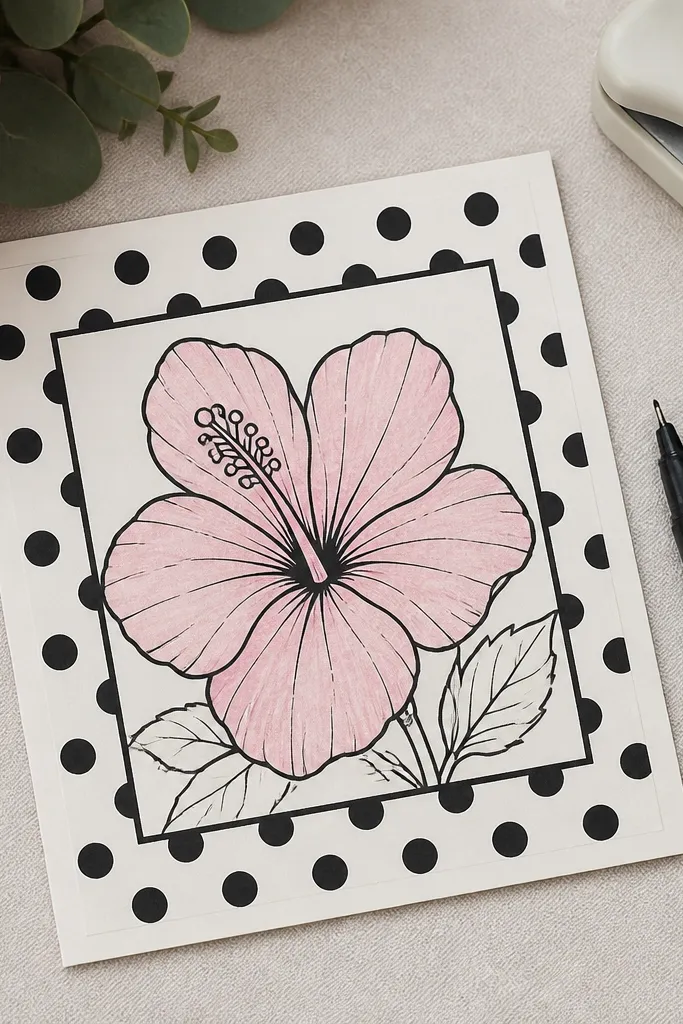
This is the “card-ready” layout. The frame makes the drawing look designed instead of just sketched, and it gives you a background pattern that makes pink petals look crisp. Use black outlines for both the hibiscus and the border, then color petals in soft pink. The polka dots act like visual rhythm — they also hide minor unevenness in your watercolor edges. Keep the dots small and consistent so the flower stays the focus. The finished look is cheerful and easy to post because it reads instantly.
Draw a hibiscus centered on the page, leaving at least 1 inch of space around it for the frame. Add a rectangular border and fill it with evenly spaced polka dots in a light pink or gray-pink. Outline petals with fineliner, then paint petals in diluted blush pink, leaving highlights unpainted. Finish by coloring the stamen yellow-orange and adding a tiny dark pink shadow at petal bases where they overlap.
Pro tipMake the polka dots with a stylus or the tip of a colored pencil — it keeps dot size uniform.
AvoidDon’t make the dots too dark — if the border is strong, the hibiscus loses its spotlight.
7. Watercolor Hibiscus with Wet-on-Wet Petal Edges
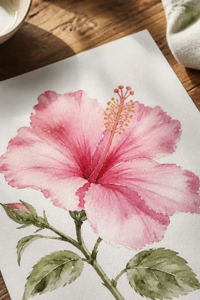
This idea is for the painterly look. Wet-on-wet edges give you that natural petal softness you can’t get with pencil alone, and it makes the flower feel airy. You still control the shape with an outline sketch, but the color transitions do the beauty work. Use two pink tones: pale blush for the main petal area and a deeper rose for the base. The center stays crisp with yellow-orange anthers so the whole piece doesn’t turn into one pink blob.
Sketch the hibiscus in pencil and trace the outline lightly with fineliner if you want crisp edges. Wet one petal area lightly with clean water, then drop in blush pink and add rose pink near the base while it’s still damp. Repeat for each petal, keeping overlap lines visible by painting around them. Color the center with yellow-orange and add a tiny rose shadow at the opening, then let everything dry flat before adding any extra details.
Pro tipWork from top petals to bottom petals so you don’t smear damp paint while you reposition your hand.
AvoidAvoid re-wetting a petal after it’s dry — reworking makes muddy edges.
8. Hibiscus Botanical Illustration with Marker + Pencil Texture
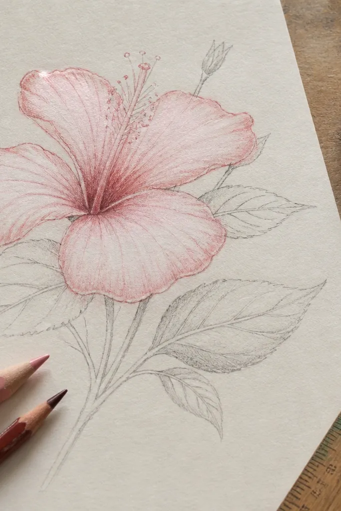
This gives you a clean botanical look without needing expensive watercolor paper. Marker lines define the petal edges, and pencil texture adds realism where the petals curve. Choose a light pink marker for base color and a darker rose pencil for shading ridges near overlap points. Add small leaf veins with a fine pencil so the drawing feels intentional. It’s great for sketchbooks and tight spaces because marker color blocks are fast and readable. The result is detailed but still airy, so it stays photogenic.
Sketch the hibiscus and leaves lightly, then go over the main outlines with a fine marker in black or deep brown. Fill petals with light pink marker, leaving a few highlight zones uncolored. Use a rose pencil to shade where petals overlap and to add subtle texture lines that follow the petal curve. Finish by adding leaf veins and tiny shadow accents under the flower center.
Test marker bleed on scrap paper — some markers feather and need thicker paper.
Don’t over-texture every petal — a few shading ridges look more realistic than full hatching.
9. Hibiscus Silhouette with Neon Pink Gradient Backdrop
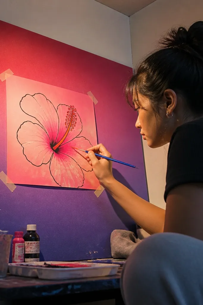
This is the bold aesthetic option. You draw the hibiscus as a clean silhouette or near-silhouette outline, then let a neon pink gradient background create the drama. The flower reads as graphic art, and neon pink photographs really well because it creates strong contrast with the center details. Keep the hibiscus outline dark brown or charcoal so it doesn’t disappear into the background. Add only minimal stamen color so the eye stays on the gradient shape.
Draw the hibiscus outline with a dark fineliner and simplify the petal interiors into clear shapes. Create a background gradient by blending neon pink and hot pink watercolor pencil or ink from one corner toward the opposite corner. Leave a small lighter halo around the hibiscus outline so it pops. Add yellow-orange to the anthers and a thin warm shadow at the center opening, then let the background fully dry before touching the outline.
Pro tipUse masking tape to protect the hibiscus outline area while you blend the gradient.
AvoidDon’t color the flower fully — the silhouette + gradient contrast is the point.
10. Hibiscus Bloom with White Gel Pen Glow Veins
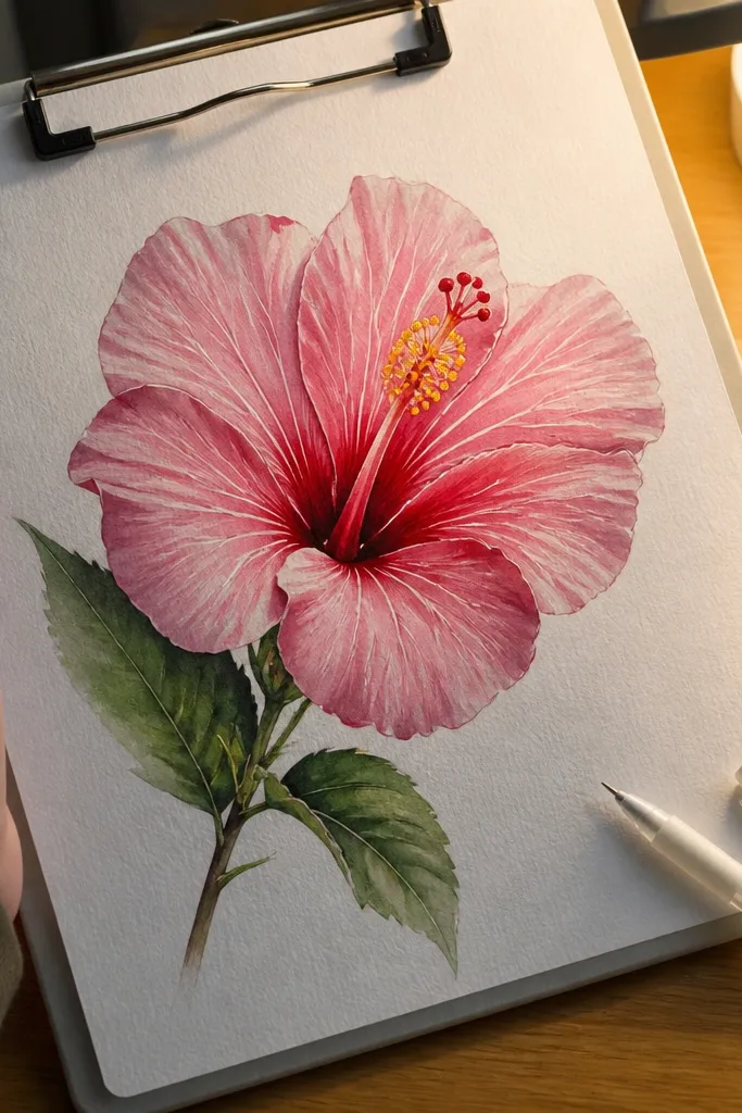
White gel pen veins make pink petals look lit from within. The method is simple: color petals in soft pink, then draw vein lines and highlight streaks with a white gel pen once the color dries. It’s photogenic because the white catches light and creates crisp separation between overlapping petals. This works especially well on darker paper or colored cardstock, where the white really pops. If you want a polished, poster-like look without heavy painting, this is the move.
Sketch the hibiscus petals and stamen lightly, then color petals with a soft pink medium (colored pencil or diluted paint). Let it dry completely so the gel pen won’t smear. Add vein lines from the petal base toward the tip using a white gel pen, then trace a few highlight edges where petals overlap. Color the anthers yellow-orange lightly, and add a small pink shadow at the center opening to anchor the glow.
Press gel pen firmly for the first pass, then do a lighter second pass for crisp edges.
Avoid layering gel pen on wet color — it turns gray and looks messy.
11. Hibiscus Corner Bouquet on Soft Pink Paper
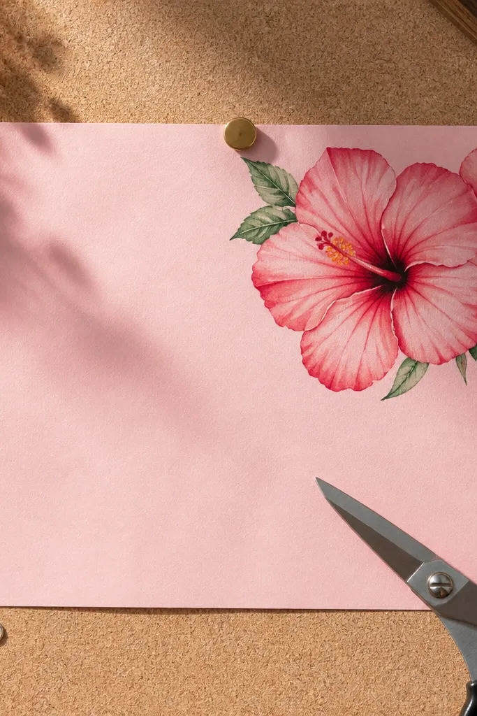
Corner placement gives you a clean, design-y composition that feels intentional. Draw one main hibiscus and one smaller bloom tucked behind it, then add a couple of green leaves to fill the negative space. Light pink paper makes the petals look cohesive and reduces harsh contrast, which is flattering for imperfect lines. The green leaves bring balance and keep the drawing from turning into a monochrome blob. This one is great for greeting cards and prints because the corner bouquet style looks finished fast.
Choose a light pink or blush paper and sketch the main hibiscus in the top corner area, leaving margins around it. Add a smaller hibiscus slightly behind the main one and draw 2-3 leaves that point toward the center. Outline petals with fineliner in deep brown, then color petals in a slightly darker blush pink than the paper. Add leaf color in light leaf green and shade under overlaps with a darker green pencil. Finish by coloring the anthers yellow-orange and adding white gel highlights on the top edges of petals.
Use brown outlines instead of black — they look softer on pink paper.
Don’t cram the bouquet into the corner — leave a clear margin so it reads cleanly.
12. Hibiscus Pattern Repeat Tile for Scrapbook Pages
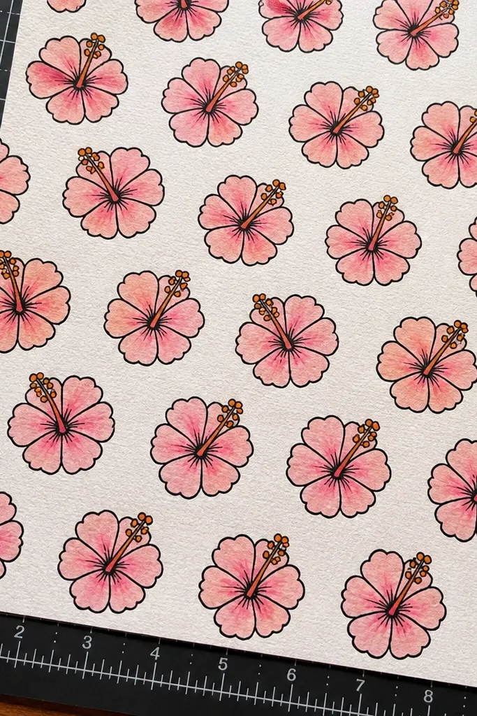
Pattern repeat tiles make your hibiscus drawings look like they belong in the same set. You create one hibiscus unit that’s quick to draw, then repeat it in a grid with slight rotation. This is excellent for scrapbook pages and printable backgrounds because it looks consistent and intentional. Keep each hibiscus simple: 5 petals, a small center, and a minimal stamen detail. Use two pink tones and a tiny warm center color so the pattern stays readable and not muddy.
Draw a tile boundary, like a 4x4 inch square, and place one hibiscus centered inside it. Simplify the petals with clear overlap shapes and add a small warm center with just 3-4 stamen tips. Color petals with pale pink, then add rose shading at petal bases. Repeat the tile across the page, rotating every other tile 15-30 degrees so the pattern looks lively. Finish by adding tiny leaf dots or short leaf stems to connect the repeats.
Pro tipKeep the stamen count consistent in each tile — it makes the repeat look designed.
AvoidAvoid full-detail hibiscus in every tile — patterns need clarity over realism.
13. Hibiscus with Ombre Petals and Charcoal Edge Definition
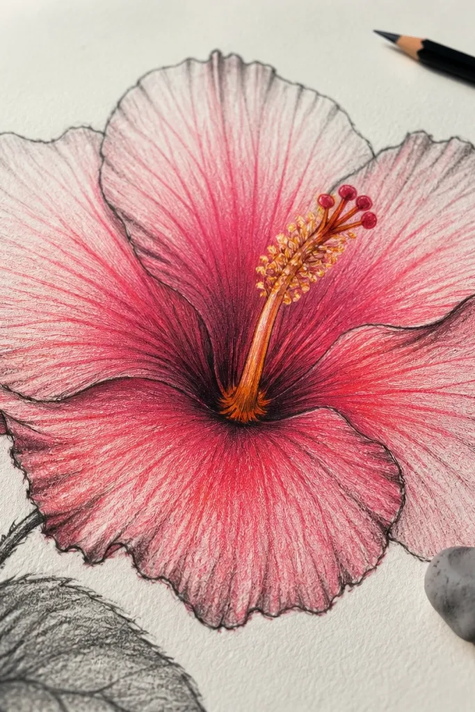
Ombre petals give you that “grown-up” look that still stays doable. You fade the pink from deeper rose at the base to pale blush at the tips, then define edges with charcoal or a soft dark pencil. The charcoal edge makes the flower look crisp even if your color fades. Add a warm center and a tiny dark ring around the opening, and the whole hibiscus reads instantly. This one works well for framed art because it has clear contrast and a clean silhouette.
Sketch the hibiscus petals and overlap structure, then lightly erase guide lines. Color each petal with an ombre gradient: start rose at the base and fade to pale blush toward the tip using watercolor pencil or diluted paint. After it dries, use charcoal pencil to trace the outer petal edges and add small shadow pockets where petals overlap. Color the anthers yellow-orange and add a faint pink shadow around the center opening to make the depth read.
Pro tipUse a kneaded eraser to lift highlights on petal tips for extra contrast.
AvoidDon’t outline every overlap line — keep edge definition for the outer contours and shadow pockets.
14. Hibiscus Flower Study with Three Pink Values
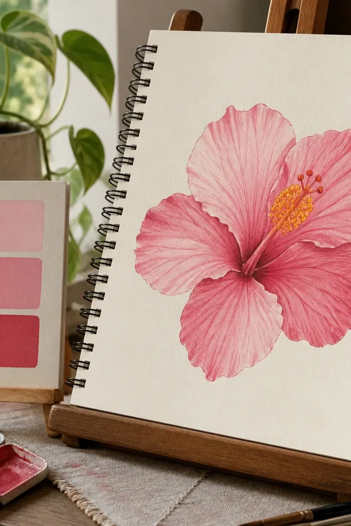
This is the practice plan that turns into pretty results. Instead of trying to blend everything, you use three pink values: pale blush, mid pink, and deep rose. That limited palette makes your shading look intentional, even if you’re new to drawing. The stamen stays bright with yellow-orange, so it’s the pop color that balances the pinks. This idea is great for learning the petal form because you can clearly see where each value goes. It also photographs well because the value changes show up clearly.
Sketch the hibiscus with light lines and mark where each petal overlaps. Fill petals with mid pink first, then add deep rose only at petal bases and under overlap edges. Use pale blush to leave highlight areas on the top halves of each petal. Color the stamen yellow-orange and add a tiny deep rose shadow at the base of the center opening. Finish by sharpening a few outlines with a dark pencil or fineliner once the shading is dry.
Pro tipDraw a quick value map on the side: base shadow, mid tone, highlight — it keeps you consistent.
AvoidAvoid adding a fourth pink shade — it makes the shading look smudgy instead of structured.
15. Half Hibiscus on White Space with Pink Wash
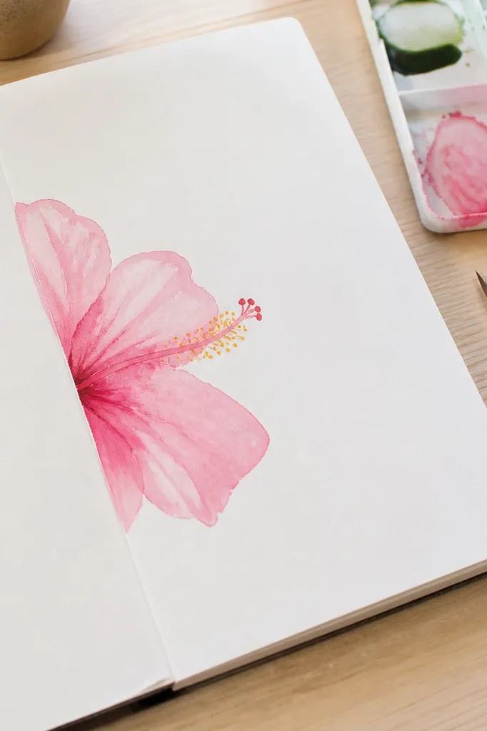
Half-flower compositions are a cheat code for looking artsy. You draw only one side of the hibiscus so you use the page edge as part of the design. White space makes the petals look airy, and the soft pink wash keeps the mood gentle. This is ideal when you want something pretty but don’t want to spend time perfecting every petal. The center still needs attention, though — keep it bright with yellow-orange and add a small pink shadow so it doesn’t vanish into the wash.
Sketch the hibiscus so it’s cut by the left or right edge of the page, leaving about half the bloom visible. Draw 3-4 main petals on the visible side with overlap, and keep the hidden petals minimal. Apply diluted blush pink wash to the visible petals, letting the edges fade slightly. Color the center anthers yellow-orange and add a darker rose line right where the visible petals overlap the center. Let everything dry, then add fineliner accents on the outer petal edges for clarity.
Use a larger brush than you think — a too-small brush makes washes streaky.
Don’t outline the entire wash heavily — keep linework mostly on outer edges and center.



