
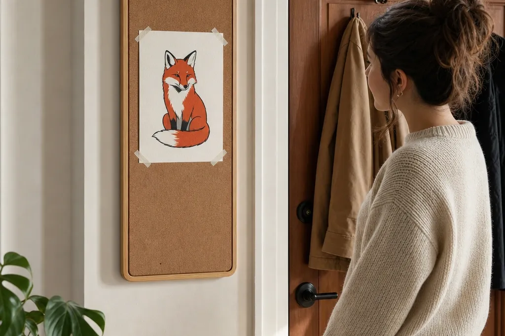
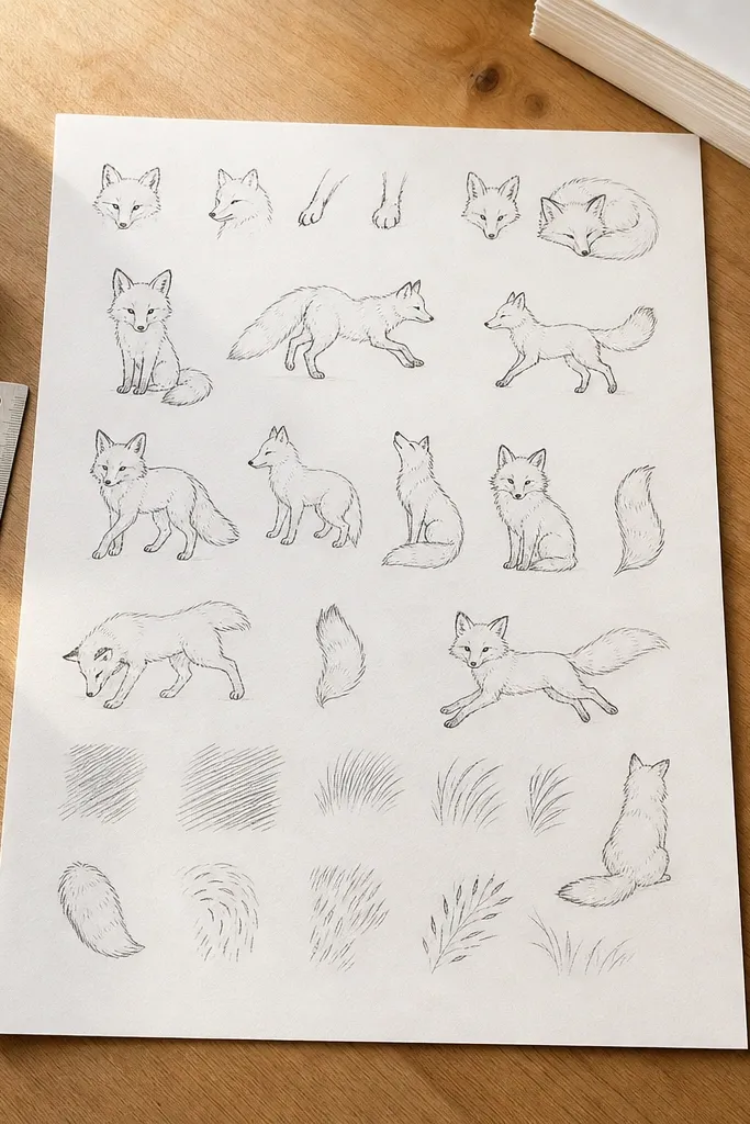
1. Ink Outline Fox in a Rounded Frame Shape
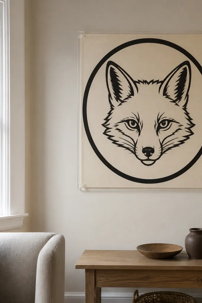
Start by sketching the fox head in proportion: ears sit slightly above the midline, and the muzzle takes up about one-third of the face height. Ink the outer silhouette with a 0.8-1.2 mm pen, then add short fur strokes on the cheeks and forehead. Lightly color the fox with a warm red-orange (light layer first), then leave the background untouched. Finally, trim straight and mount using removable tape only at the four corners so the paper stays flat.
This is the safest “pretty but renter-friendly” fox drawing because it relies on bold lines instead of heavy shading. Draw the fox face and upper body inside a thick rounded border, then keep the background blank or lightly tinted. The thick outer contour makes the fox pop against any wall color, and the open background keeps it clean when mounted with tape. Use it when you want minimal effort with maximum visual punch.
AvoidDon’t shade the whole fox gray — it kills the bright fox look and makes it harder to read.
Pro tipIf your lines look shaky, draw the border first and treat it like a “window” so the fox stays centered.
2. Minimal Red Fox Face with One-Color Wash
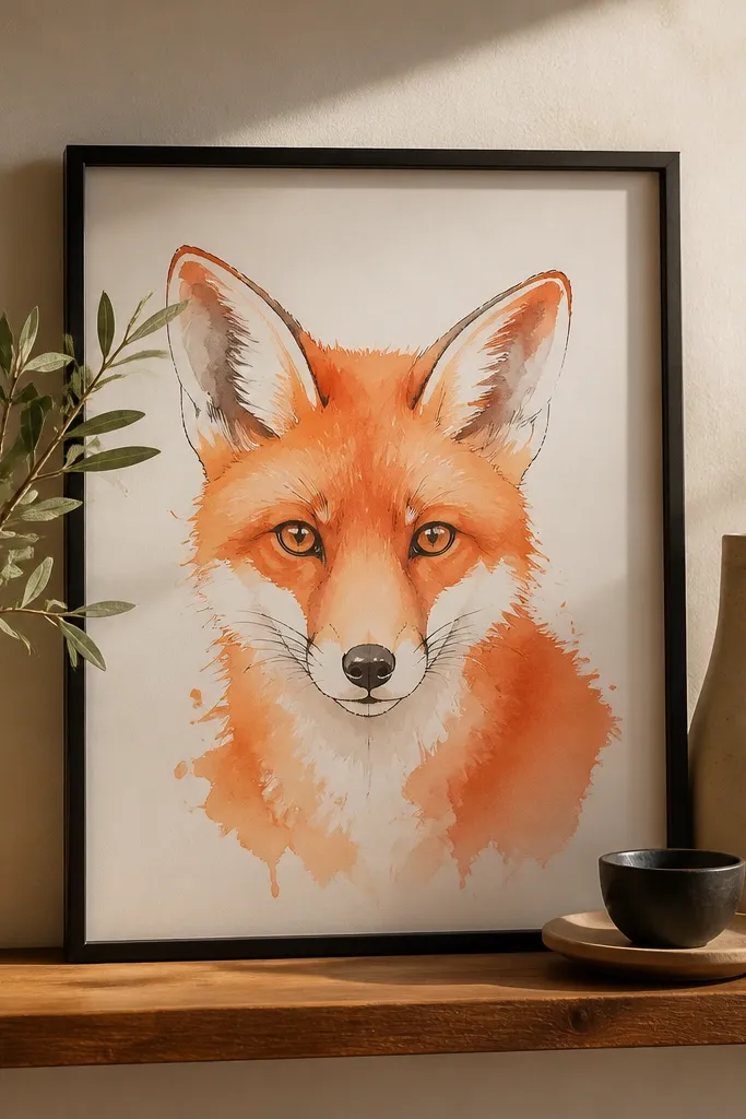
Sketch the fox face with a simple triangular ear shape and an oval muzzle, then keep the fur markings to 8-12 short lines total. Use watercolor or watered-down gouache to create one wash: start light near the cheeks and fade toward the border. Add darker accents only to the nose and inner ear using a darker red-brown. Let it fully dry flat under a book for 30-45 minutes, then mount with a clip frame or corner tape.
This one looks airy and modern because it uses one color family and leaves lots of white paper showing. You draw the face with crisp features, then add a single diluted red-orange wash behind the muzzle and around the ears. The white paper becomes the highlight, which makes the eyes and nose look glossy even in a flat drawing. It’s ideal for small spaces like entryways or a rental hallway where you want calm, not clutter.
AvoidDon’t overwork the wash — repeated passes make edges muddy and the fox loses clarity.
Pro tipMix your wash slightly darker than you think, then dilute — you want visible color, not a stain.
3. Marker-Filled Fox with Crisp White Fur Highlights
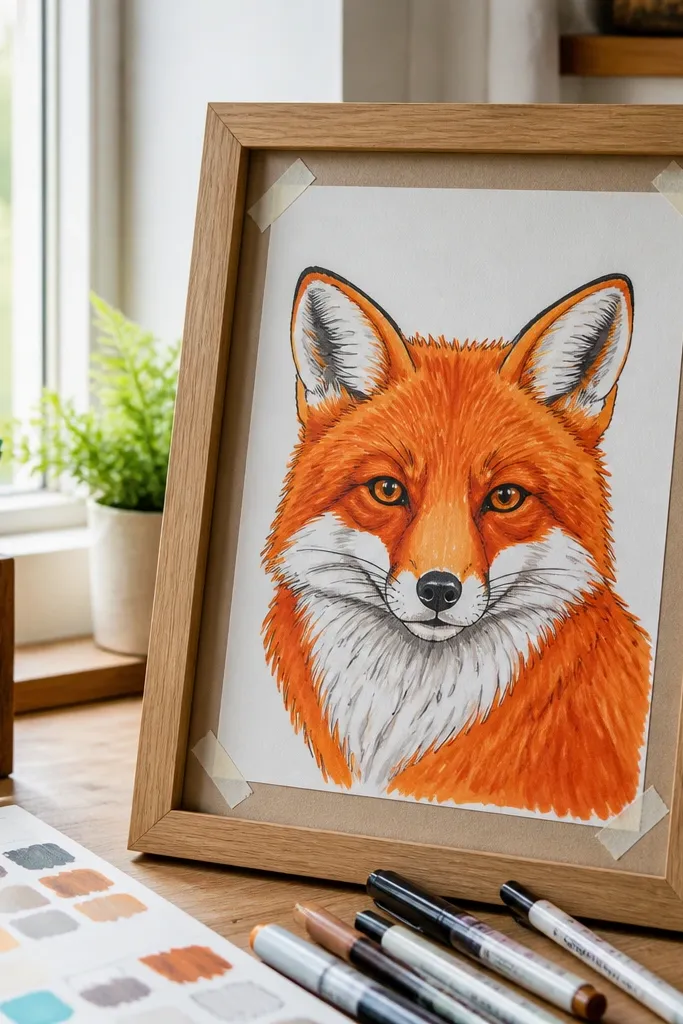
Start with a clean pencil sketch, then outline the face and body using a fine black marker or pen. Fill the fur areas with a red-orange marker, using 2-3 light passes rather than one heavy coat. Add white gel pen highlights on the cheeks, forehead, and tail tip, then deepen the shadows under the muzzle and behind the ears with a darker red-brown. Let everything dry, then trim and mount using four small pieces of removable tape at the corners.
If you want a fox drawing that looks bold in photos and from across the room, marker fill is the easiest win. You block the fox body in smooth color areas, then carve fur texture with white highlights. The contrast is built-in: red-orange shapes against white paper, plus dark ink for the eyes and nose. This style also forgives minor sketch lines because the marker shapes do the heavy lifting.
AvoidDon’t blend everything — marker-heavy gradients blur the fox silhouette and look flat.
Pro tipTest marker coverage on scrap paper first so you know how many passes your color needs.
4. Colored Pencil Fur Stripes on a Dark Charcoal Background
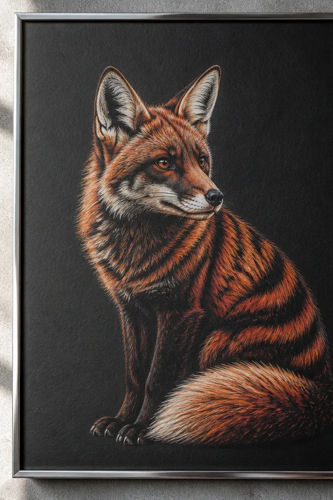
This drawing looks dramatic and “gallery” without needing a complex scene. The trick is starting with a dark charcoal background so your red fur colors pop and your stripe lines look crisp. Use colored pencil to build fur in short, directional strokes, keeping the brightest highlights on the chin, inner ears, and tail tip. It’s perfect for renters because the contrast makes it readable even under low light.
Tone the paper with charcoal or dark pencil first, then lightly sketch the fox silhouette so you can place stripes accurately. Use warm red and orange colored pencils to draw fur stripes, keeping strokes consistent in direction. Add a darker brown for shadow stripes under the jaw and along the tail curve. Finish with a white pencil for highlights, then fix lightly with workable fixative after the drawing is fully dry.
Use a kneaded eraser to lift tiny highlight spots before you add white pencil — it makes the fur look more dimensional.
Don’t use too much white pencil everywhere — concentrate it on the face and tail tip.
5. Vintage Woodcut Fox with Crosshatch Shadows
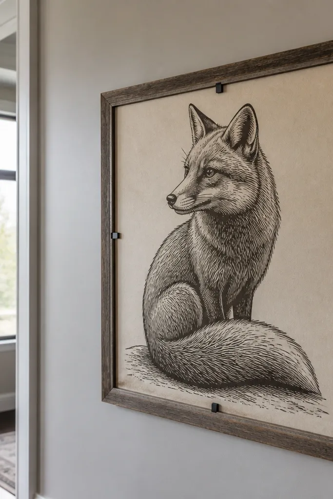
Sketch the fox in strong shapes first: ears as triangles, face as a rounded wedge, tail as a thick curve. Use a pen to draw the main contours, then add parallel line texture across the body. Build shadows with crosshatching in 3 zones: under the muzzle, around the inner legs, and on the tail underside. Add a thick border rectangle, then trim and mount with a poster frame that uses clips.
Woodcut-style fox art looks textured and intentional, even when it’s just paper and ink. You create the “carved” look with careful line direction and crosshatching that forms shadows under the jaw and around the tail. The result is a fox that feels sturdy and old-school, not flimsy. It’s also great for renters because a simple border makes it look finished and easy to mount.
AvoidDon’t chase every fur detail — woodcut works because the texture is patterned.
Pro tipKeep your crosshatch lines at one angle per shadow area so it looks like printmaking, not random scribbles.
6. Fox Head Silhouette with Negative Space Stars
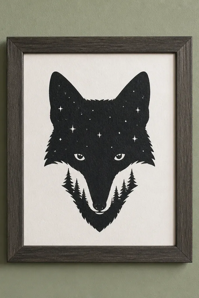
This looks sharp and modern because the fox is mostly silhouette, and the “fur” is implied by shape. The negative-space stars add a playful, photogenic detail without cluttering the page. Use this when you want a fox drawing that reads instantly even from a distance. It also pairs well with simple frames and matte paper because the background can be one flat color.
Draw the fox head silhouette first, focusing on ear angles and the muzzle curve. Choose a flat background color (light cream, soft teal, or warm beige) and color it evenly. Use a white gel pen or paint marker to add small stars, or mask them before painting if you want clean cutouts. Outline the silhouette edge with a thin black pen so the fox stays crisp after mounting.
Keep star sizes consistent — mix only two sizes so the pattern feels designed.
Avoid a busy star field — too many stars makes the fox lose focus.
7. Red Fox in Profile with Watercolor Gradient Tail
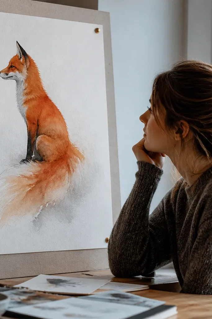
Sketch a side-profile fox with the nose pointing slightly up, then block in the tail as a long curve that takes up about one-third of the drawing height. Paint the tail with watercolor in 3 bands: dark base, mid orange, pale highlight. Add darker watercolor along the belly line and under the tail to anchor the shape. Finish with a fine pen for eye, nose, and ear outline, then dry flat and mount with corner tape.
Profile fox drawings look elegant because the face shape is clear and the tail curve creates movement. The beauty here is the watercolor gradient in the tail: start darker near the base, fade to lighter at the tip, and let a few pigment blooms happen for texture. Keep the background minimal so the gradient tail becomes the focal point. This is a renter-friendly win because the composition fits common print sizes and reads well when taped at corners.
AvoidDon’t paint the entire background — gradient tails look messy when surrounded by noise.
Pro tipUse wet-on-wet for the tail fade — it gives smoother transitions than repeated dry brushing.
8. Fox and Simple Branch Frame with Two-Tone Leaves
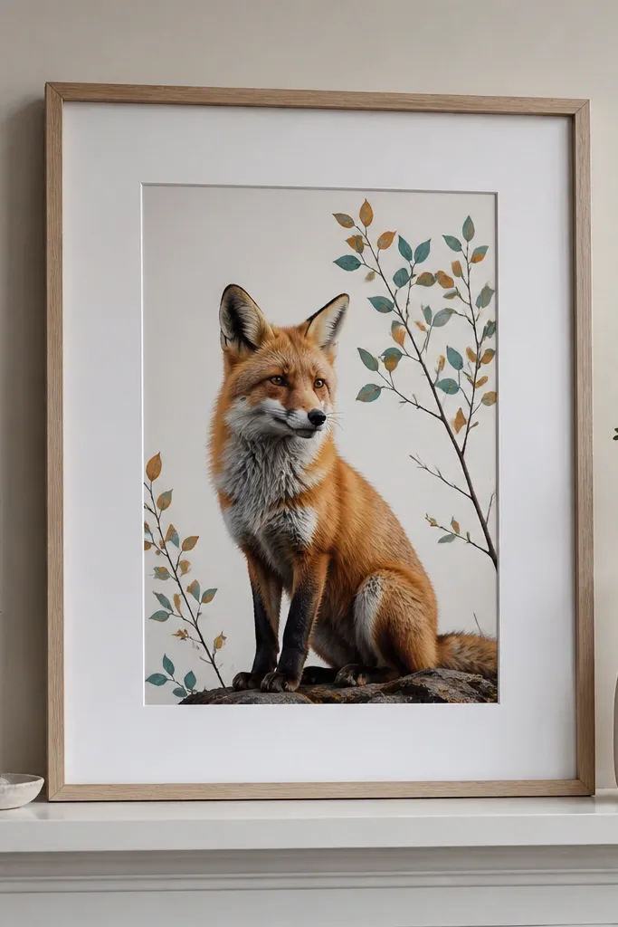
Draw the fox perched on a single branch line that arcs slightly upward. Use a darker red-brown for shadow areas under the chin and along the tail underside, and a lighter orange for highlights. Add only 6-10 leaf shapes around the top and sides, using two greens: one muted and one darker. Outline the branch and fox silhouette with a fine black pen, then mount using a frame with clips so you don’t need screws.
This project looks complete without being complicated. A thin branch and a few leaf shapes frame the fox, and the two-tone leaves give you color harmony without turning into a full scene. The fox stays the main subject because everything else is scaled smaller and uses fewer values. It’s great for renters because a branch-and-frame composition makes the drawing look intentional even with a simple clip frame.
AvoidDon’t add a full forest background — it makes the fox feel small and harder to read.
Pro tipKeep leaves smaller than the fox face so the viewer’s eye lands on the eyes first.
9. Chalky Pastel Fox on Kraft Paper
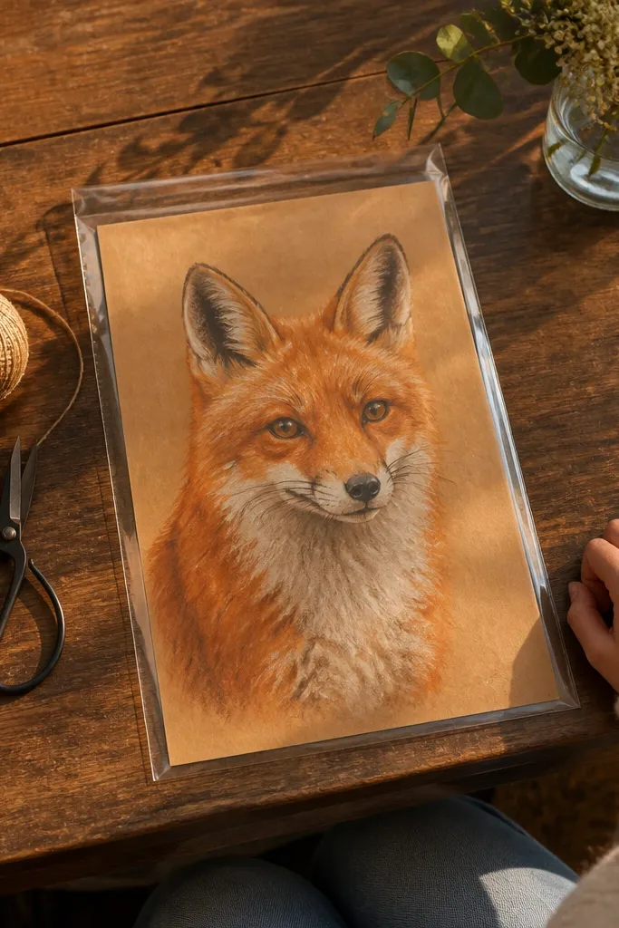
Kraft paper gives you instant warmth, so your fox looks cozy and aesthetic without heavy coloring. Pastel-like coloring also photographs well because it has soft edges and visible texture. Draw the fox with light-to-dark layering: base orange, then red-brown shadows, then pale cream highlights on the muzzle and forehead. This style is perfect for renters who want a warm, natural look and like the “handmade” vibe.
Use a kraft paper sheet and lightly sketch the fox with a soft pencil. Apply an orange base first, then build shadow with red-brown using short strokes that follow fur direction. Add cream or light beige highlights on the chin, inner ears, and tail tip. Fix gently if your medium smudges, then place it in a mat frame that covers the edges for cleaner mounting.
Rub color in with a paper stump or folded tissue for smoother pastel texture.
Don’t press hard — kraft paper dents and makes the drawing look uneven.
10. Monochrome Fox Portrait with Red Accent Eye
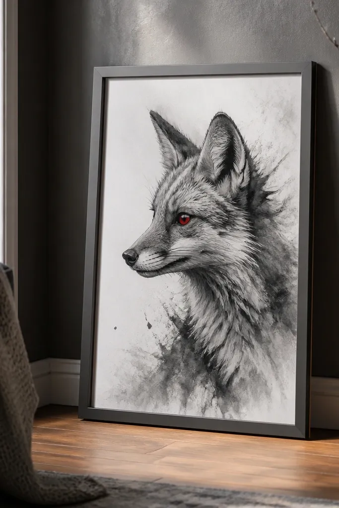
Sketch the fox face and block the darkest areas: under the jaw, around the nose, and the inner ear. Use charcoal or graphite to shade in layers, keeping edges sharper around the eye and muzzle. Leave the rest of the face grayscale, then add a tiny red accent in the iris with colored pencil. Add a thin black line around the border to frame the portrait, then mount using a clip frame to keep edges protected.
This drawing looks high-end because it uses restraint. The fox is monochrome in charcoal or graphite, and the only color is a bright red accent in the eye. That single pop gives it a strong focal point and makes it look intentional in photos. It’s also a smart renter choice because monochrome art works on almost any wall color, while the red eye ties it together.
AvoidDon’t erase back to gray too many times — charcoal smears and the portrait looks gray-brown.
Pro tipKeep the red accent small — if you color more than the iris, the impact drops.
11. Geometric Fox Head with Triangles and Clean Lines
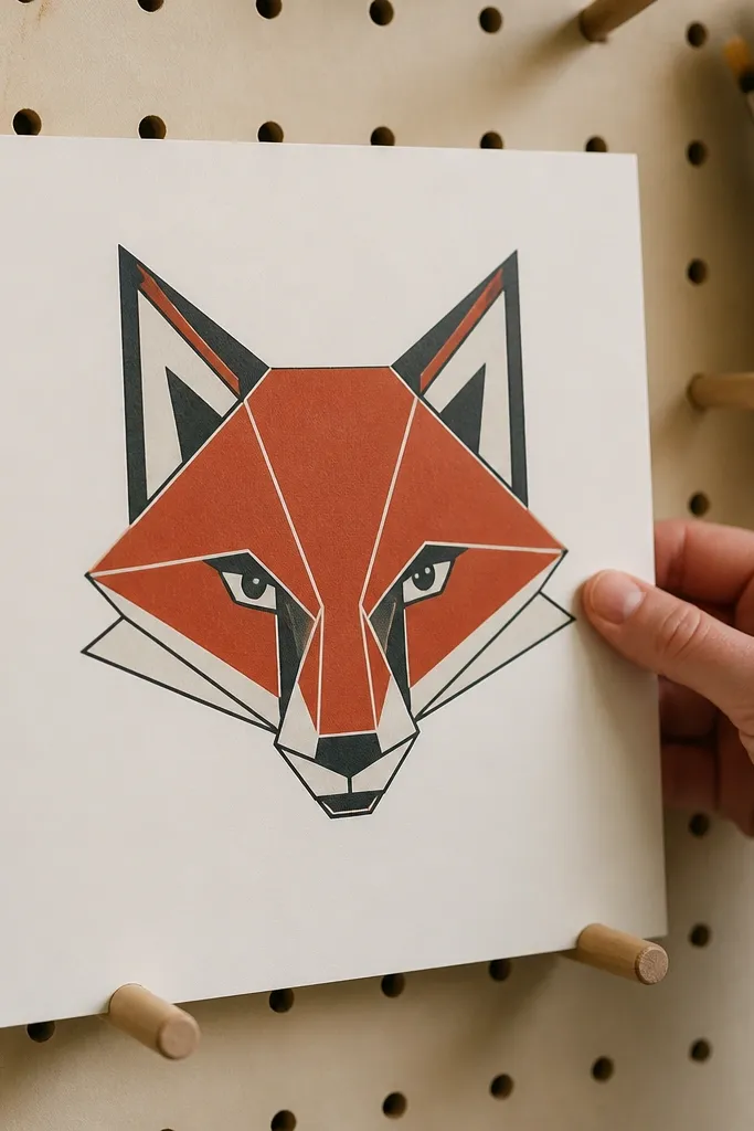
Start with a pencil grid: lightly mark a few horizontal and vertical lines so triangle shapes stay even. Sketch the fox head as a set of polygon pieces: ears as two triangles each, muzzle as a wider polygon. Use 3 colors max: orange, dark brown, and a warm beige. Trace key outlines with a fine black pen, then add a thin border and trim clean.
Geometric fox drawings look crisp and modern, and they handle small print sizes well. You build the fox head from triangles and angled shapes, then color each piece with a limited palette so it stays readable. The result is a fox that looks designed, not sketched. This is the best style if you want a renter-friendly fox drawing that looks good even when you only have wall space for one small piece.
AvoidDon’t add extra colors — more than three makes it look messy and less photogenic.
Pro tipUse the same black pen weight for all outlines so the triangles look uniform.
12. Fox in a Circle Badge with Gold-Tone Highlights
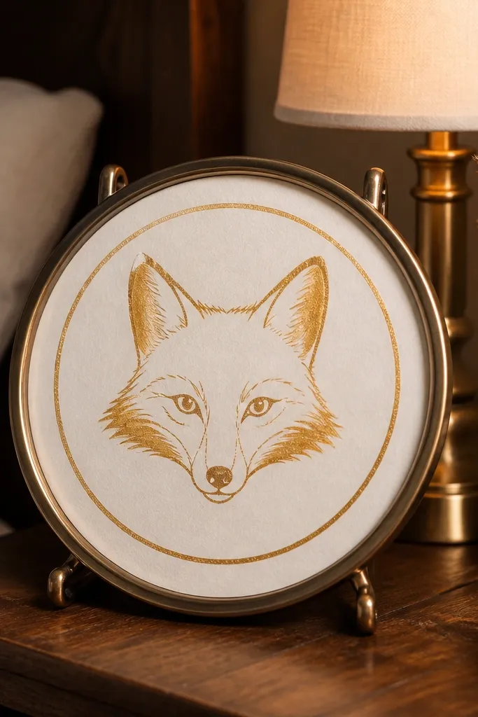
Draw a circle as your boundary and sketch the fox face inside it, keeping the ears near the circle edge. Color the fox body with orange-red and red-brown shadows, leaving the highlight areas lighter. Add gold-tone highlights using metallic gel pen or metallic paint markers on the forehead stripes and ear edges. Outline the circle with a thicker pen, then mount with a frame that has a backing so the paper doesn’t curl.
Badge-style art has that “sticker but framed” look, and it’s perfect for renters because it reads as finished even with a simple frame. The circle shape also makes the fox feel centered and collectible. Add gold-tone highlights on the ears and cheek lines to make it pop under warm indoor lighting. Keep the background flat and clean so the badge doesn’t compete with your decor.
AvoidAvoid metallic on the whole face — it turns the fox dull and grainy.
Pro tipMetallic highlights look best in small strokes — dot or line, not full coverage.
13. Soft Gouache Fox with Blurred Background Wash
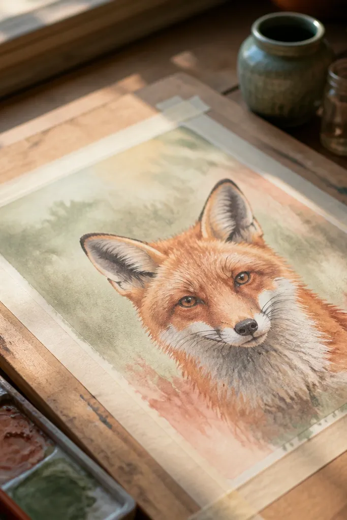
Sketch the fox face and place it slightly above center so it feels airy. Paint the background first with a light wash, then let it dry just enough that it won’t smear when you paint the fox. Apply gouache to the fox in layers: base orange, shadow red-brown, then small highlight strokes with lighter orange or cream. Outline the eyes and nose with a fine pen for crisp focus, then mount with removable tape on corners or a clip frame.
Gouache gives you that matte, painterly look that feels expensive in a cheap frame. This design keeps the fox face sharper and lets the background wash blur slightly so the fox stands out. Use muted colors in the background — dusty peach, pale gray, or light sage — so the fox stays the star. It’s a strong choice for bedrooms because it looks gentle, not loud.
AvoidDon’t paint the background too dark — it steals contrast from the face.
Pro tipKeep the fox edges crisp by using a smaller brush for the eye and ear outlines.
14. Fox Tail Fan Pattern with Orange Ombre Lines
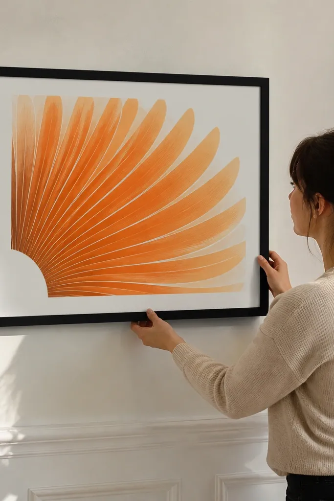
A tail-forward drawing looks bold and graphic, and it’s easy to make it photogenic. The fan shape fills the frame, and the ombre lines give it rhythm. You’re not drawing every fur strand — you’re drawing a pattern that implies fur. This is ideal for renters who want a statement piece without a complicated scene.
Sketch the tail fan first so it takes up most of the page — about 60% of the width. Divide the tail into 8-10 curved sections with light pencil lines. Use colored pencil or marker to create an ombre: each section slightly lighter than the one below it, keeping the deepest color at the base. Add a simple head silhouette at one side so the fox reads even when the tail is the focus. Finish with a clean border and mount with a frame that protects the edges.
Draw the tail divisions lightly, then ink over them so the sections look intentional instead of sketchy.
Don’t over-detail the head — the tail pattern is the point.
15. Fox in Snow with Limited White Space and Red Highlights
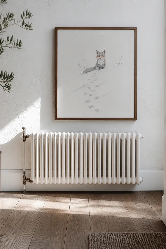
Sketch the fox sitting low on the page with the tail curled. Create the snow background with light gray washes or pencil shading, leaving most of the paper white. Add darker accents under the body and paws, then use red-orange for the fox fur and a deeper red-brown for shadows. Add tiny paw prints with a fine pen, then trim and mount so the edges are straight and flat.
Snow scenes look great in small drawings because white space does the work for you. Keep the ground pattern simple: a few snowdrift shapes and footprints or paw marks, then let the fox’s red fur provide the contrast. Use red highlights sparingly on the cheeks and ears so the rest stays muted and cold. This style is visually striking but still renter-friendly because you can print it small and it stays readable.
AvoidDon’t fill the background with lots of snow marks — it makes the fox feel lost.
Pro tipUse a gray wash for snow instead of fully coloring the page — the highlights stay crisp.
16. One-Line Fox Portrait with Hidden Fur Texture
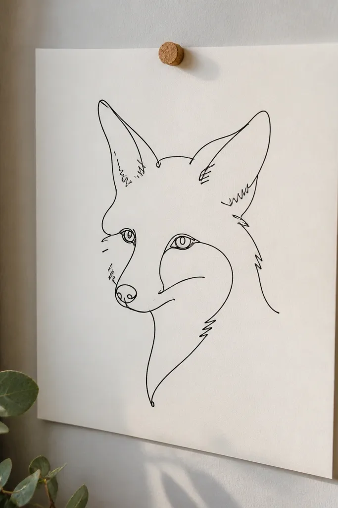
Use a single continuous pencil line to map the fox face: start at the ear, sweep around the forehead, down the muzzle, and back up through the neck. Then trace over the final pencil line with a fine pen. Add tiny hatch marks on the cheeks, forehead, and tail edge to suggest fur without filling the whole shape. Color only the nose and a small strip of ear inner fur with a warm red-brown. Trim and mount with a clip frame to keep the line crisp and flat.
One-line art looks clever and modern, and it’s easier to make look clean than people think. You draw the fox face and neck as one continuous line, then add fur texture using tiny hatch marks that break the line in select spots. The result looks intentional and stylish, with a “design” feel rather than a messy doodle. This is a good pick if you want renter-friendly fox drawing ideas that look polished even with minimal color.
AvoidAvoid adding full shading — one-line art looks best when it stays graphic.
Pro tipKeep hatch marks small and consistent — vary only their placement, not their size.
17. Fox and Moon Cutout Look with Color Blocking
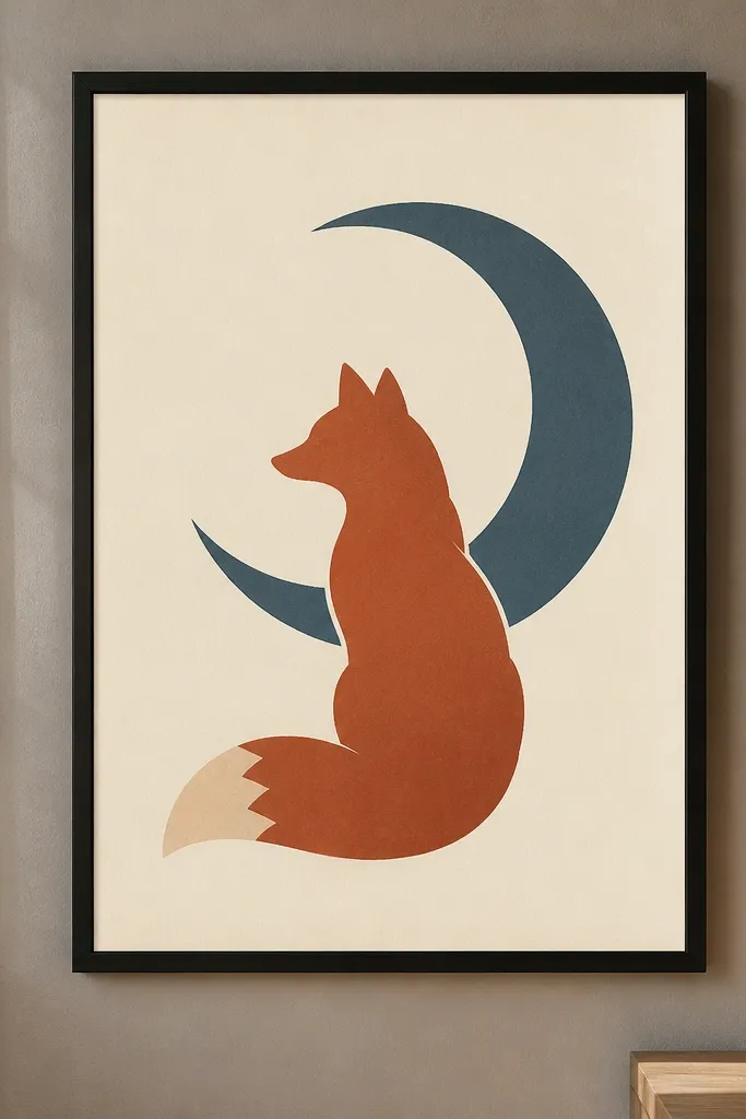
This is the “wall-ready” fox drawing because the shapes are bold and the design is easy to read. A fox silhouette next to a moon shape with two or three flat colors makes it look like a poster. Keep the background clean and let the silhouette edge be crisp so it looks good in a small frame. It’s renter-friendly because color-block prints handle removable tape without showing wrinkles as easily as detailed watercolor.
Sketch a simple fox silhouette in profile and a large moon circle to one side. Choose a 3-color palette: background, moon, and fox. Fill shapes with markers or acrylic gouache in flat coats, keeping edges sharp. Add a thin black outline around the fox and moon for separation. Let dry flat, trim clean, then mount using removable tape at corners or a clip frame.
If you use markers, let each color dry before outlining so ink doesn’t bleed at the edges.
Don’t blend colors together — soft edges make the poster look unfinished.
18. Red Fox Portrait with Tiny Dots and Soft Halftone Shadow
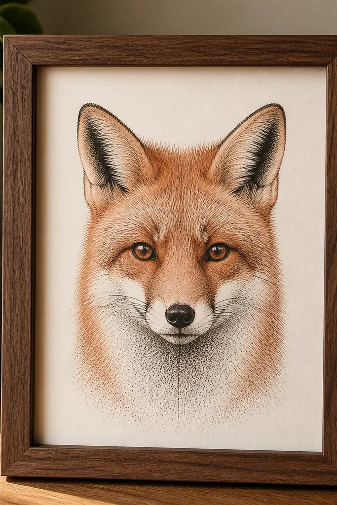
Sketch the fox face and keep the outlines thin. Color the fur base lightly in orange-red, then add shadow using dot clusters with a fineliner and a dotting tool or pen tip. Build the darkest areas with denser dots under the muzzle and at the tail base. Add small white highlight dots on the forehead and inner ear, then draw a simple border. Mount with a mat and removable tape on the corners only.
Dot shading makes fox fur look textured without turning into a full rendering. This idea keeps most of the face clean, then uses a halftone dot cluster under the jaw and around the cheeks where shadows naturally sit. The eyes stay bright because you don’t over-shade them. It’s photogenic because the dot pattern catches light and looks crisp on camera.
AvoidDon’t dot the entire page evenly — it makes the fox look flat and noisy.
Pro tipUse fewer dots near the eye edge — leave a clean highlight strip for a glassy look.
19. Fox with Hanging Tag Label Style and Clean Typography
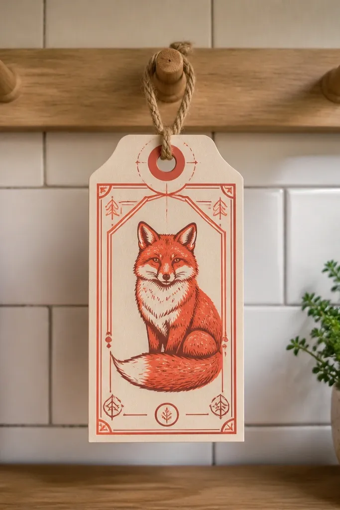
Draw a tag shape with rounded corners and a small hole at the top for a string line. Sketch the fox inside the tag, then ink the fox face and outline. Add two small icon marks, like a tiny star or paw, and leave a blank text area for a simple number or short word space. Color the fox with a warm orange and a darker shadow color, then add a thin black line around the tag. Mount using a clip frame so the tag shape doesn’t curl at the edges.
Label-style art looks like a product tag, which makes it automatically tidy and aesthetic. The fox is framed inside a tag shape, with clean faux typography and a couple of small icons. This style works well for renters because the “label” border hides minor paper imperfections and makes the piece feel designed. Keep the typography minimal and the fox face expressive so the whole thing reads instantly.
AvoidDon’t add paragraphs of text — it turns the tag into clutter.
Pro tipMake the fox face bigger than you think — tag art looks best with a bold focal point.
20. Soft Pastel Fox with Blended Background and Sharp Eye Detail
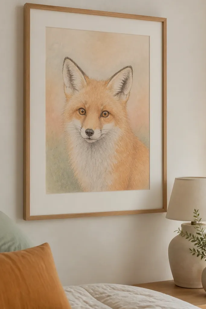
Sketch the fox face lightly, then apply a pastel orange base across the cheeks, forehead, and muzzle. Blend the background with a muted gray or sage using a soft brush or blending stump, keeping it behind the face edge. Add red-brown for shadows, then use a darker pencil to sharpen the eye outline and nose details. Finish with a small white highlight on the lower eyelid and a few fur strokes at the forehead. Trim and mount with a matte frame and removable tape at corners.
This is a comforting, cozy fox look that still photographs clean because the eye stays sharp. The background is blended and muted, while the face features have crisp edges. Use soft pastels or chalky colored pencils for the fur base, then sharpen only the eye, nose, and ear outline with a darker pencil. It’s renter-friendly because the soft background reduces glare and the fox reads even in matte frames.
AvoidAvoid full blending on the eyes — blurry eyes make the fox look tired.
Pro tipWork in layers: base first, then shadows, then only the final sharp lines on the face.



