
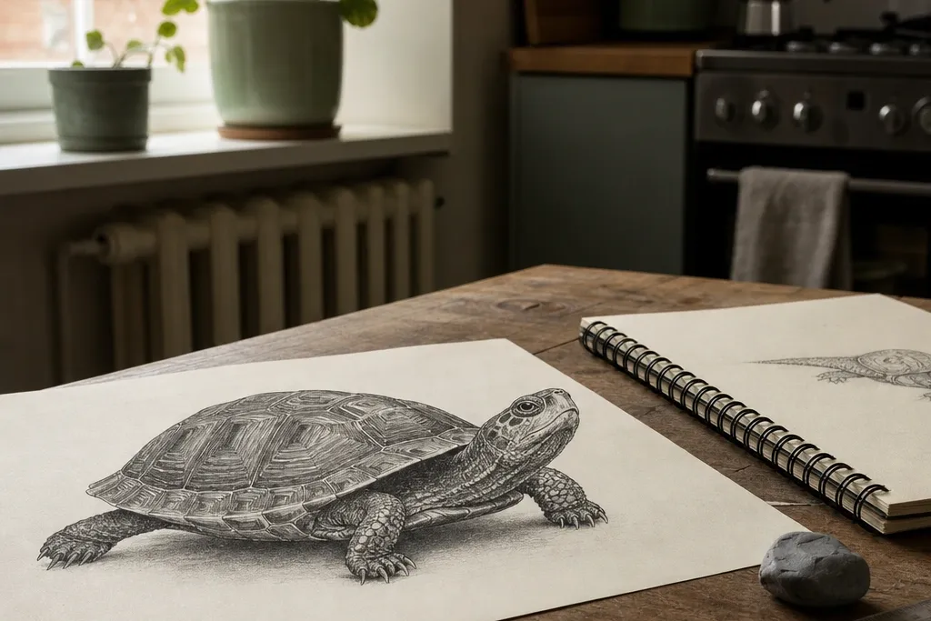
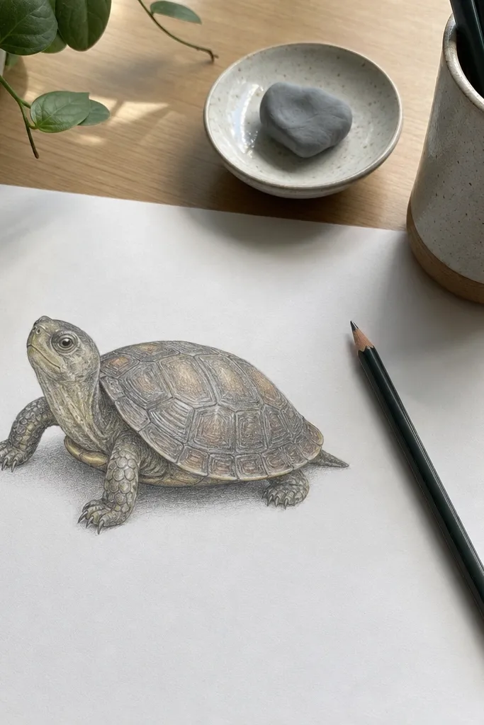
1. Graphite Dome Shell Turtle with Soft Rim Light
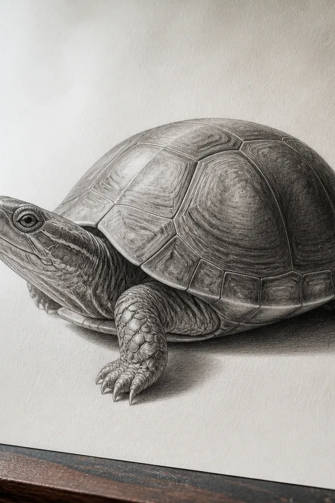
This drawing works because a dome shell forces you to show curvature, and rim light makes the shell read as three-dimensional even if the background is simple. You get a clean, gallery-like look that photographs well in daylight because graphite gradients stay smooth and forgiving. The turtle’s head and front leg stay slightly darker, while the shell edges catch a thin highlight — that contrast is what sells “real.” It’s a great first realistic turtle project if you want accuracy without color mixing.
Pro tipUse a kneaded eraser to lift a razor-thin highlight line instead of trying to “draw” highlights with the pencil tip.
Start with a light sketch of the shell as an oval dome, then add shell plate outlines that follow the curve (no straight, evenly spaced rows). Shade the shell with a 2B-to-H pencil range: build midtones first, then deepen the plate borders using the side of the pencil. Add rim light last by leaving a narrow unshaded strip along the shell’s top edge, then softly blend outward with a tissue. Finish with darker graphite under the chin and where the legs tuck into the shell so the turtle feels grounded.
AvoidDon’t outline every plate with hard lines — realism needs plate edges to fade into shading.
2. Colored Pencil Shell Plates with Warm Sand Background
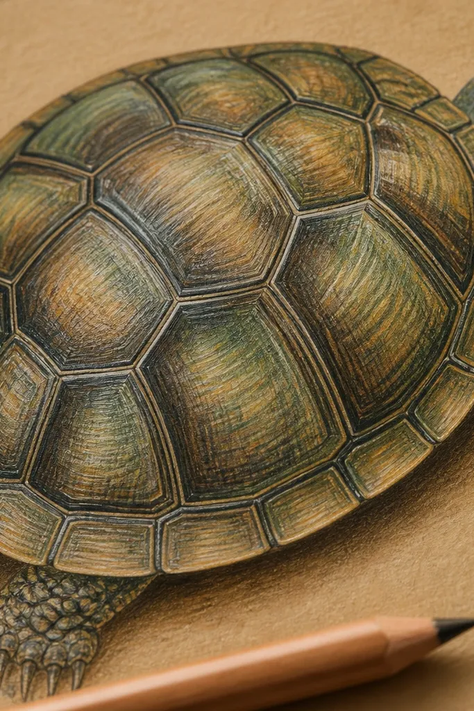
A warm sand background makes the green-brown shell look richer and more natural, and it gives your photo that cozy aesthetic renters like. Colored pencil is the right tool here because shell plates need crisp edges paired with subtle color transitions inside each plate. The trick is to treat plates like separate “tiles” that still share one light direction. This project is visually striking because the shell pattern stays sharp while the skin around it softens.
Pro tipBlend plate centers with a light, circular motion so the texture stays controlled and doesn’t look smudged.
Choose midtone paper first — tan or warm beige. Block in the shell shapes with a light tan and muted olive, then layer darker olive and brown along each plate border. Use a light pressure pass for plate centers, then increase pressure only at the borders and under the head. Finally, add a simple shadow under the shell using a cool gray-brown to keep the light believable.
AvoidDon’t use black for borders — it flattens the plates and makes the turtle look like a cartoon.
3. Ink Pen + Ink-Wash Turtle Head Study
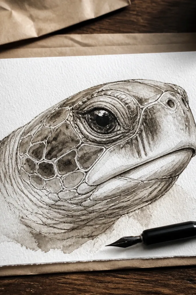
If you want something that looks impressive fast, this head study does it. Pen line gives you that crisp, realistic contour, and the ink-wash adds soft value without the heavy time cost of full graphite shading. The head is where realism is most noticeable: the eye shape, the beak curve, and the skin folds around the jaw. This piece is also easy to display renter-friendly because you can keep the background clean and frame it without worrying about lots of color matching.
Pro tipUse two pens — one for thin line (0.3-0.5) and one for slightly thicker contour (0.8) so the head has depth.
Sketch the head with a light pencil, then ink the major contours first: jawline, beak edge, and neck curve. Add crosshatch only where you want deeper shadow, keeping the lines thin. Mix ink-wash with water to a pale gray-brown, then paint it into the neck and under the chin in gentle layers. Let each wash dry before adding the next so edges stay crisp.
AvoidDon’t flood the paper with wash — wet edges blur the skin folds and ruin the “real” look.
4. Marker Realism Turtle with One-Color Background Fade
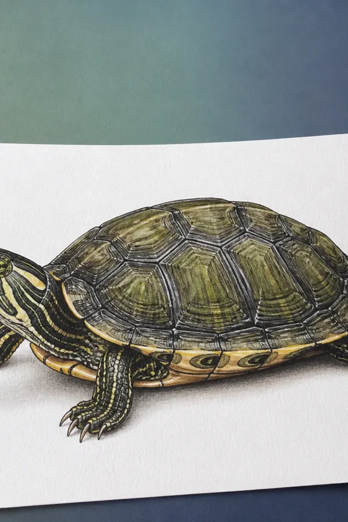
Markers can look surprisingly realistic when you limit the palette and control value. This idea uses one background color fade so the turtle pops without fighting the shell pattern. The shell still gets detail through layered marker tones, but the background stays simple — that’s why it looks good in photos. It’s renter-friendly because you can finish the piece quickly and mount it in a clip frame without thick paint layers.
Pro tipTest your marker blending on a scrap first — some pens streak if you blend too soon.
Start with a light pencil sketch, then outline the turtle with a fine marker line to lock proportions. Shade the shell with 3-4 marker tones from light to dark, using light pressure for plate centers and darker tones along borders. Blend between tones with a colorless blender or a light marker pass, working from light to dark. For the background, color a soft gradient behind the turtle using light strokes that stop before the shell edge.
AvoidAvoid black outlines everywhere — keep outlines for contours only.
5. Colored Pencil Turtle in Wet Grass Scene (No Mess Background)
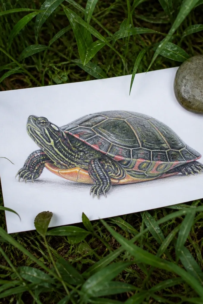
This one looks like a nature photo, but it stays renter-friendly because the background is contained and doesn’t require paint spills. The “wet grass” effect is the aesthetic hook: tiny highlights and darker blades around the shell make the turtle feel like it’s really in the world. Colored pencil shines here because you can create crisp blade edges and then soften them just a little near the turtle for depth. The result is photogenic because the highlights catch light when you photograph from above or at an angle.
Pro tipUse a sharp pencil for the highlight blades — dull tips make the shine look like smudges.
Sketch the turtle and the grass line first, keeping the turtle slightly above the grass horizon. Lay a medium green base for grass using light pencil pressure, then add darker green in the shadow side behind the legs. For wet shine, add tiny off-white highlights on a few blades and deepen the surrounding shadow so the highlight reads. Finish by sharpening the closest grass blades around the turtle feet while fading blades farther back.
AvoidDon’t draw every grass blade the same way; the nearest area should be sharpest, the rest should blur with tone.
6. Graphite Shell Plate Pattern Grid (Then Curved Realism)
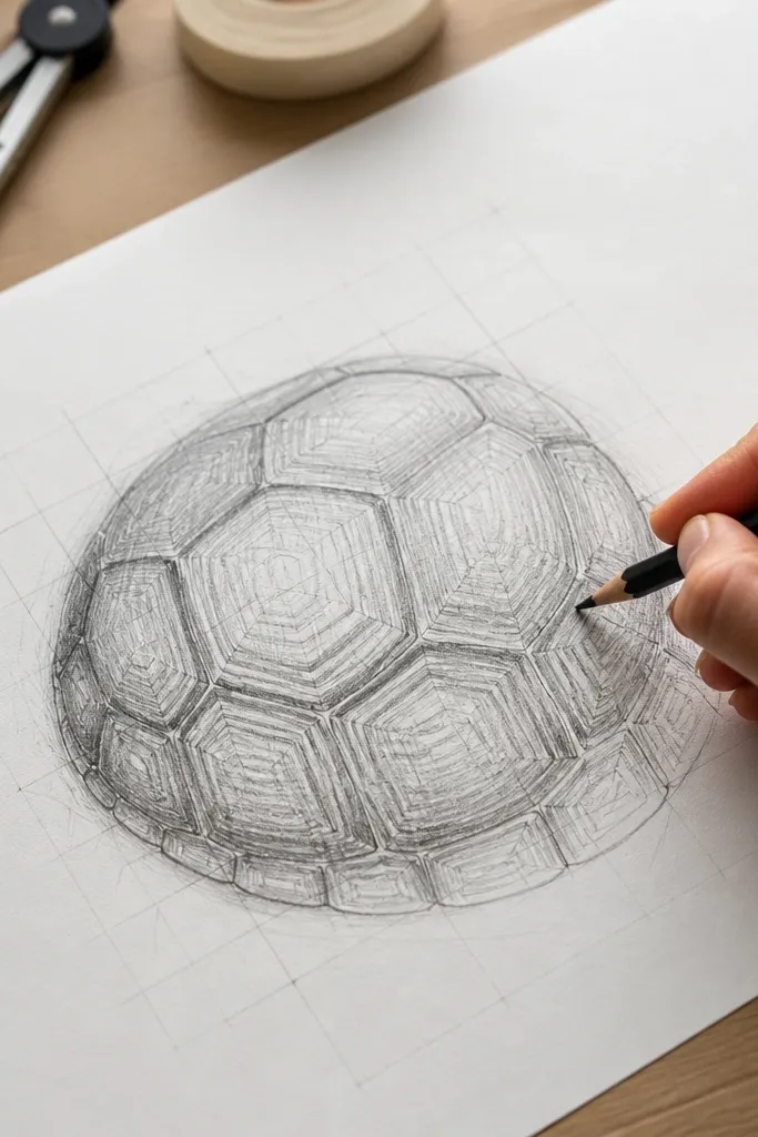
This is a realism cheat that also looks cool. The shell pattern starts structured — almost like you’re planning tiles — then you translate it into curved plates with shading. It’s visually striking because the pattern looks intentional, not random, and the curvature makes it feel real. This is a strong renter-friendly project because the background can be plain and still look finished; the shell does the heavy lifting. It’s also great if you struggle with symmetry.
Pro tipKeep the plate shapes slightly different sizes as they wrap — exact repeats look fake fast.
Lightly draw a perspective grid over a dome-shaped oval shell sketch, then place plate boundaries along the grid lines. Erase most of the grid after you transfer the plate layout, leaving only the plate outlines. Shade each plate with a consistent light direction: lighter on the top face, darker along the bottom edge. Blend plate borders slightly so the plates look like they’re connected, not boxed.
AvoidDon’t keep the shell as a flat pattern; if the shading doesn’t curve, it will never look real.
7. Sepia Ink Turtle with Old Paper Texture
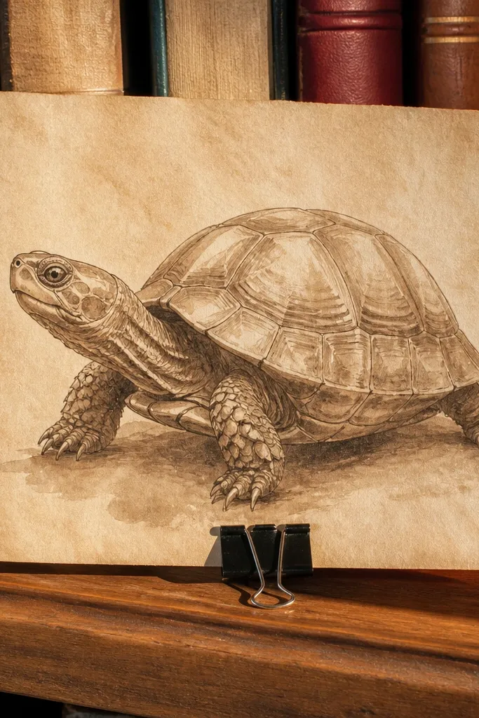
Sepia ink gives you that warm, antique look that renters love because it hides small imperfections in the paper and still reads polished. The turtle’s shell plates become beautiful when you use diluted sepia washes for midtones and leave some paper showing for highlights. This idea is also photogenic because the texture of the paper becomes part of the art. It’s a good option if you want realism without spending hours rendering every micro detail.
Pro tipUse a paper towel to lift highlights in the wash — it gives natural-looking light breaks.
Pick a warm off-white or light tan paper and lightly sketch the turtle silhouette. Ink the shell plate outlines with a fine pen, then add diluted sepia wash to build midtones across the shell. Add darker sepia in the plate borders and under the chin using a small brush. For texture, tap a nearly dry brush lightly in the background and let it stay uneven.
AvoidDon’t overwork the wash — repeated passes can turn the shell muddy.
8. Graphite Turtle Side Profile with Cast Shadow on Paper
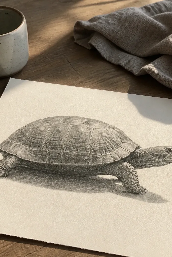
Side profile is the fast lane to believable proportions. You only have to manage one set of leg shapes, and the shell still reads as a dome because the silhouette does most of the work. Adding a cast shadow is what makes it look expensive in a photo — it anchors the turtle and gives the page depth. This is renter-friendly because it looks finished even with a minimal background, and you can frame it with a slim mat.
Pro tipDraw the shadow edge with a kneaded eraser lift — it creates a cleaner, softer boundary than blending everything.
Sketch the turtle in side profile with a long oval shell and a slightly forward head. Block the cast shadow shape first as a soft oval under the shell, then shade the turtle so the darkest values match the shadow direction. Use graphite blending for the shell midtones and keep skin lines slightly softer than shell plate borders. Finish by sharpening the outline and adding a thin highlight edge where the light hits the shell curve.
AvoidSkip the hard black around the silhouette; a thin graphite edge looks more realistic.
9. Watercolor Pencil Turtle with Controlled Bleed Edges
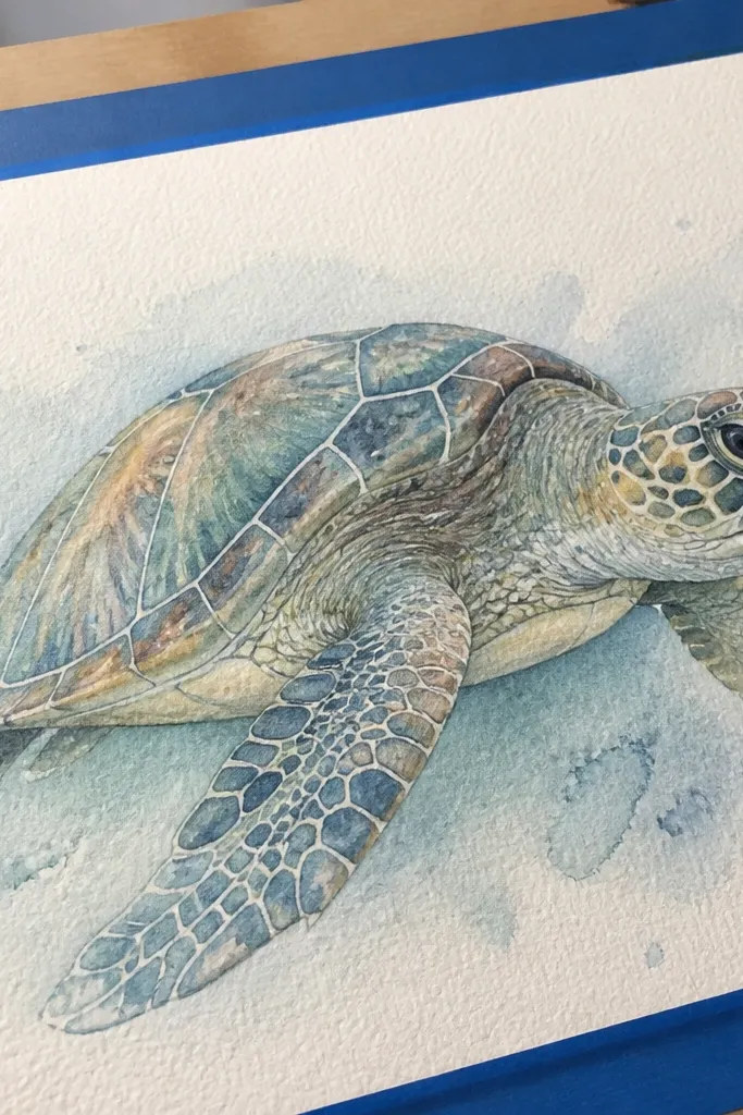
Watercolor pencil gives you the best of both worlds: pencil control for shell plates and watercolor softness for skin transitions. The aesthetic here is controlled bleed — edges that feather slightly, but not so much that the turtle turns into a blob. This makes a renter-friendly piece that looks airy and modern, especially when you leave some paper white in the highlight areas. It also photographs well because the wash creates gentle value changes.
Pro tipWork in small sections so only the areas you want bleed — misting the whole page ruins plate clarity.
Sketch the turtle and shell plates with light pencil pressure, then color with watercolor pencils in olive, moss green, and warm brown. Lightly mist the paper with clean water until the pigment begins to bloom, then stop before everything spreads. Add a second wash layer only to shadow areas — under the head, between legs, and along plate borders. Let dry flat, then use a dry pencil pass to sharpen a few plate edges back into focus.
AvoidDon’t saturate the paper — too much water collapses plate edges and kills realism.
10. Colored Pencil Turtle with Split Light and Color Temperature Contrast
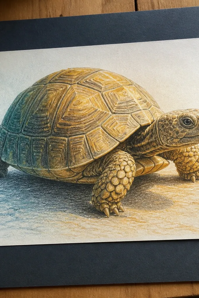
This looks striking because it uses temperature contrast: warm highlights on one side, cooler shadows on the other. Real turtles have that subtle shift, and your drawing will look more lifelike when shadow values lean blue-green instead of just darker brown. The shell plates also look more dimensional because the color change follows the dome curvature. It’s renter-friendly because you can keep the background neutral and still get a strong aesthetic.
Pro tipUse a colorless blender sparingly — pencil texture should stay visible in plate centers.
Choose a neutral gray or warm cream paper for smoother layering. Sketch the turtle and decide the light direction — mark it lightly. Color highlight plates with warm olive and yellow-green, then shadow plates with cool blue-green and muted gray-brown. Blend the transition with light pressure so the dome shape shows, not a hard line. Finish by glazing a thin warm layer over highlights and a thin cool layer over shadows.
AvoidDon’t shade shadows with only brown; you lose the “alive” look.
11. Fine Liner Turtle with Dot Shading Shell Plates
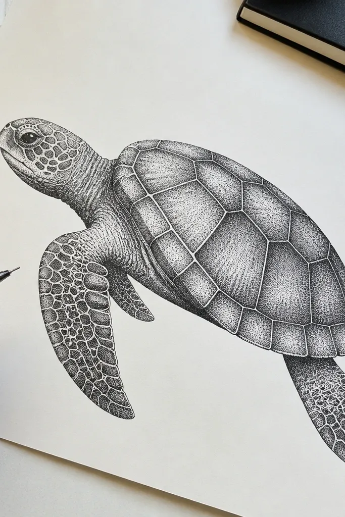
Dot shading makes the shell texture feel tactile without needing heavy smudging. It also creates a clean, graphic look that stands out in a small apartment because the lines stay crisp. This style is photogenic because the dots catch light and build value gradually. It’s renter-friendly because the whole piece stays dry and flat, so it’s easy to clip or frame without warping.
Pro tipUse a consistent dot size and change value through spacing, not by making random dot sizes.
Sketch the turtle lightly, then ink the shell outlines with a fine liner. Build midtones with dots — higher dot density means darker value, and spacing changes the shape of each plate. Keep the darkest areas under the chin and along plate borders as tight clusters, not solid ink fills. Add a few larger highlight dots left as paper white so the shell looks glossy instead of flat.
AvoidDon’t fill the whole shell evenly; value should follow the dome and light direction.
12. Graphite Turtle with Realistic Scute Edges and Micro-Texture
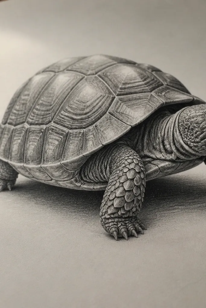
This is for realism nerds. The difference between “cute turtle” and “real turtle” is often the edge behavior of the scutes — the borders look slightly raised and uneven, not perfectly clean. Graphite can do that with careful pressure changes and tiny dark flecks in shadow pockets. The aesthetic is calm and high-end, and photos look sharp because graphite micro-contrast gives the shell depth. It also works well with a simple neutral background.
Sketch the shell plates with a light outline, then shade the overall dome with a midtone graphite layer. Darken plate borders using the pencil tip to create thin, slightly irregular lines, not a uniform stroke. Add micro-texture by tapping the pencil lightly in shadow recesses, then blend lightly with a tissue only in the midtone areas. Finish by sharpening a few highlight edges with a kneaded eraser lift so the shell reads as raised.
Switch pencils mid-project: start with a softer grade for blocking, then use a harder grade (HB) for edge definition.
Don’t blend everything; if the texture disappears, it stops looking real.
13. Acrylic Ink Wash Turtle on Black Paper (Glowing Highlights)
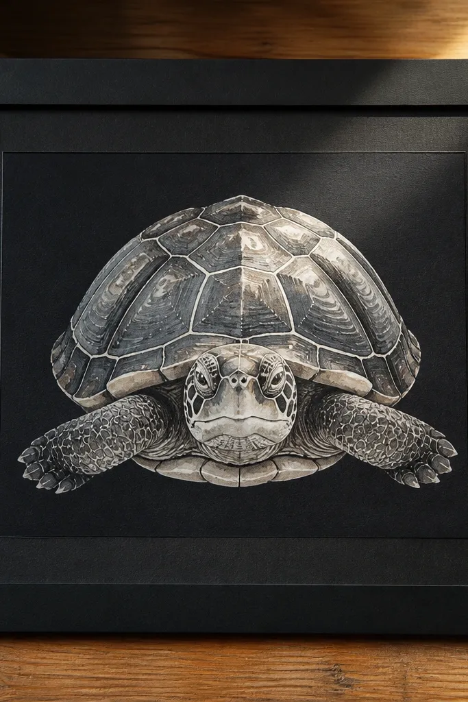
Black paper instantly makes the turtle look dramatic, and the shell plates become luminous where you add opaque highlights. This style is absolutely photogenic because the contrast is baked in. The renter-friendly part is display: black-paper art looks finished even without a busy background, and you can frame it with a bright mat that doesn’t require wall mounting. It’s still realistic because you build values through soft washes and then add controlled white highlights.
Pro tipAdd white highlights in two passes: a broad one for glow, then a thin one for edge definition.
Use black drawing paper or black mixed-media paper. Sketch the turtle lightly with a white pencil or very faint chalk, then apply diluted acrylic ink for greens and browns in shadow areas. Keep the highlight areas mostly untouched at first, then add opaque white acrylic ink to the brightest shell edges, chin, and eye highlight. Use a small brush to soften wash transitions, and let it dry fully before adding the final crisp highlight lines.
AvoidDon’t cover the whole page with wash — leaving black in the shadows gives you the glow effect.
14. Colored Pencil Turtle with Transparent Layering and Glossy Shell
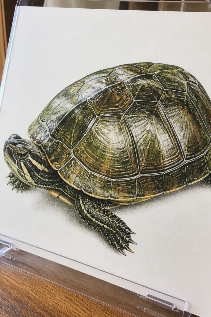
Glossy shell is hard to fake, and colored pencil layering is one of the cleanest ways to do it. The look comes from transparent-ish layers: you build color gradually, keep highlight areas light, then add a few sharp edge lines where the light hits the scutes. This gives a realistic sheen without turning the page greasy. It’s renter-friendly because it stays flat, dries fast, and frames beautifully with a mat that keeps it from touching the glass.
Pro tipUse a lighter pressure for highlight glazing so you don’t dent the paper or muddy the shine.
Sketch the turtle and shell plates, then apply light base color for the shell using a few muted greens and browns. Build value by layering: first midtones, then darker borders, then glaze lighter highlight tones back over the top of plate centers. Add a glossy effect by leaving narrow highlight channels on each plate and sharpening their edges with a light, hard pencil. Finish with a thin shadow under the shell and a slightly darker line at the shell-skin boundary.
AvoidAvoid heavy burnishing across the whole shell; it makes the texture look plastic.
15. Pastel + White Gel Turtle on Matte Kraft Paper (Frosted Scutes)
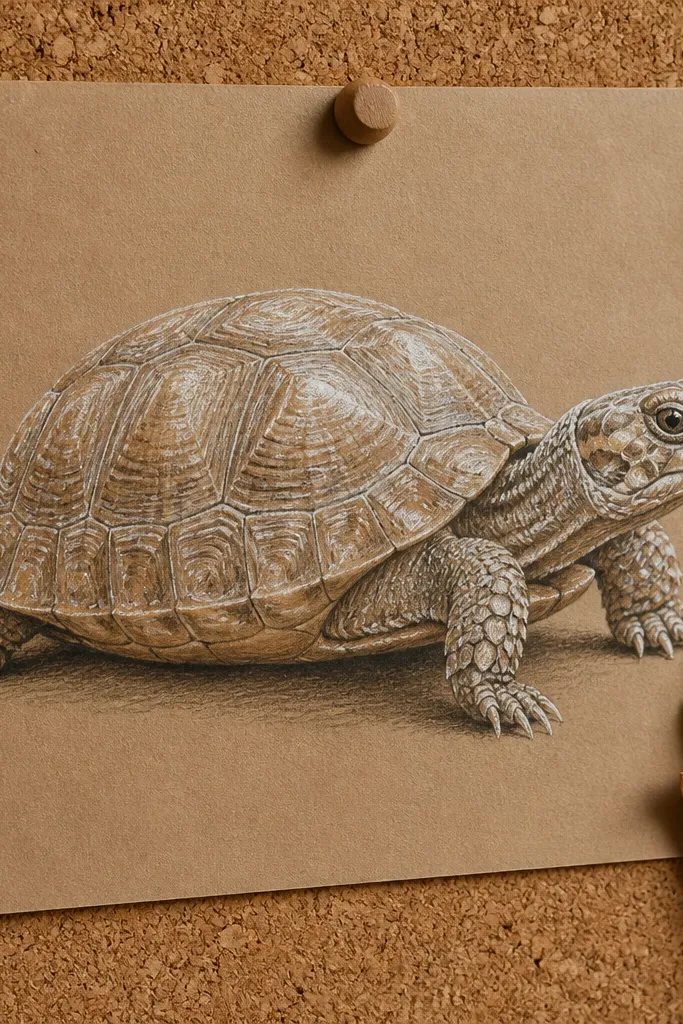
This one gives you that “real photo” shell texture without needing fancy tools. Matte kraft paper has a warm tooth, so pastel grips and looks dusty in the right places — especially around the scute edges. The white gel pen makes the highlights look like dried enamel, which is what makes turtles feel glossy and alive instead of flat. It’s renter-friendly because you can use low-odor materials, and you can tape the paper down so nothing smears while you work. Plan on about 60 to 90 minutes if you’re careful with layering. It fits small desks, dorm rooms, and any space where you want a clean setup with minimal mess.
Start with a sheet of matte kraft paper cut to 8 x 10 inches, then tape it to a board with painter’s tape so it cannot slide. Lightly sketch the turtle head and shell using a hard pastel stick or a very light graphite guide, then block in the shell base with a muted green-gray pastel. Build scutes by drawing thin, slightly irregular lines for each plate, then soften the edges with a tissue or blending stump so the marks look embedded in the paper. Add shadow under each scute line with a cooler brown-green pastel, keeping the darkest parts near the center seams. Finish by tracing select scute ridges and the rim of the shell with a white gel pen, pressing lightly for crisp highlights and harder for thicker “frosted” ridges. Let it sit flat for 10 minutes so the pastel settles before you erase any loose dust.
Press a scrap of kraft paper against your blending tool first to remove extra pastel. Use the gel pen only after the pastel layers are dry to avoid dragging pigment into the highlight lines.
Don’t blend the entire shell smooth — keep the scute lines visible so the texture reads as realistic.



