
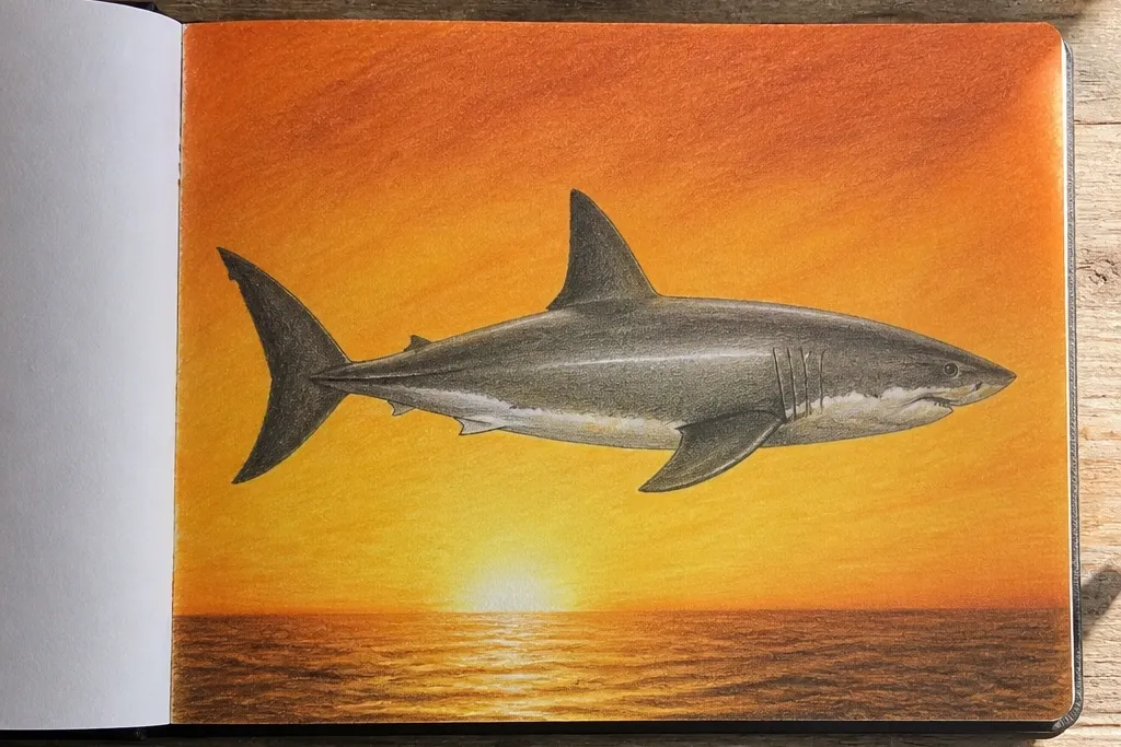

1. Citrus Sunset Shark Profile
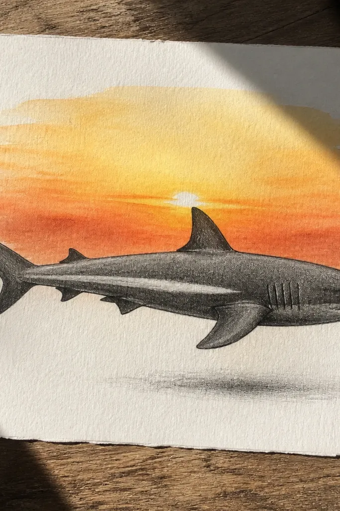
This one is a dependable “pretty on the page” shark because the profile shape is strong and the background does the heavy visual lifting. Draw the shark in clean silhouette, then add a thin fin shadow and one highlight stripe on the body. Use a sunset gradient that goes from bright yellow near the horizon to burnt orange higher up, so the shark edges stay crisp. It looks great in a photo because the contrast between the dark body and warm sky is instant.
Start by sketching a side-profile shark with a wedge head, a smooth belly curve, and a dorsal fin that has a clear angle. Block in the shark as solid dark with a brush pen or thick marker, leaving a tiny gap where your highlight stripe will go. Then blend the background using colored pencils or watercolor: yellow at the horizon, orange above, and a darker orange band behind the dorsal fin. Finally, add a few fin and gill line accents in a medium gray so the silhouette stays clean.
Pro tipTape the page corners to keep your background gradient from smearing when you blend.
AvoidDon’t add lots of scale texture before the silhouette and background values are locked.
2. Neon Bubbles Over Midnight Teeth
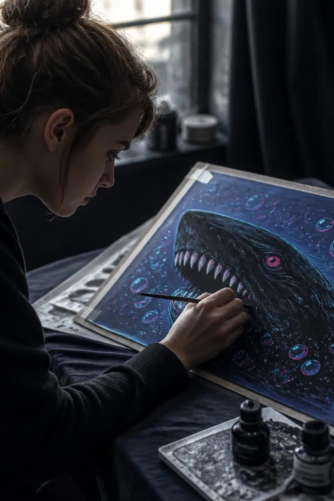
This idea is photogenic because it’s controlled chaos: a near-black shark face plus bright bubble highlights. The trick is to keep the shark body mostly dark and focus your detail on the mouth and eye. Draw small teeth as short, clean triangles, then surround the head with bubbles that vary in size and opacity. The neon bubble dots make the drawing look like it has motion even though it’s still.
Begin with a front-facing or slightly angled shark head, using a single jaw curve and one strong eye position. Fill the head and upper body with near-black, then leave two small highlight spots: one on the eye and one on the lower jaw. Add teeth using a thin white gel pen or very light pencil marks, then reinforce the mouth line with a dark pen. Finally, scatter neon green and cyan bubble circles around the head, leaving some bubbles blank for shine.
Use a white gel pen for teeth and bubble highlights so they pop in photos.
Don’t outline every bubble — too many outlines makes it look like a sticker sheet.
3. Graphite Realism With One Color Wash
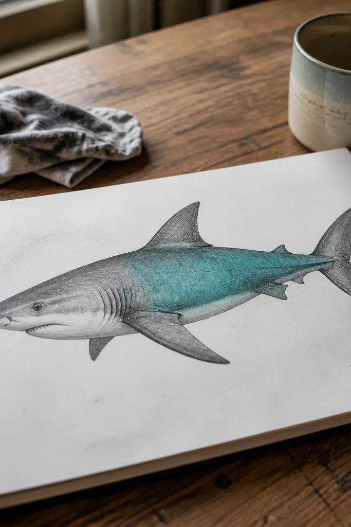
If your drawings look “pretty but unfinished,” this format fixes that. Build the shark in graphite with careful edge control, then add one color wash to the flank for a clean aesthetic contrast. Keep the wash limited to the midsection so the head stays graphite-gray and the body looks dimensional. It’s worth doing because graphite gives you smooth value transitions, and the single color pop gives you that editorial look.
Sketch the shark with light construction lines: head wedge, torso curve, tail paddle. Shade in graphite using a 3-value plan: light belly, midtone flank, dark underside and fin shadows. Pick one wash color like soft ultramarine or teal and apply it only to the body flank with a small brush, keeping edges feathered. After it dries, add a few scale marks with a mechanical pencil and reinforce the fin silhouette with a darker pencil.
Let the wash dry fully before adding scale marks; otherwise the lines turn muddy.
Don’t wash over the eye — keep that edge sharp for realism.
4. Japanese Wave Pattern Hammerhead
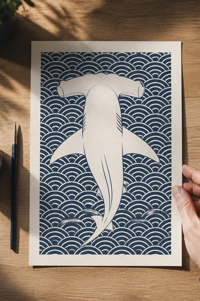
Hammerheads are basically graphic design already, so this idea leans into that. The wide head shape reads instantly, and the wave pattern gives you an aesthetic rhythm. Keep the shark head outline clean and minimal, then fill the background with repeating wave arcs. Use a limited palette: deep navy lines and off-white negative space so your drawing looks crisp.
Draw the hammerhead head as a wide oval with a flat-ish front edge and two eye placements. Outline the head and add the gill line as a simple curved stroke, then keep the rest of the body minimal. For the background, draw repeating wave arcs across the page using a ruler or a freehand rhythm you can repeat. Color the waves with navy pencil or ink lines, leaving the paper tone as the off-white space. Finish by adding a thin shadow under the head to anchor it.
Pro tipMark the wave spacing lightly with a faint pencil guide so the arcs stay even.
AvoidDon’t crowd the shark with extra details when the background pattern is already busy.
5. Paper Cutout Shark Collage
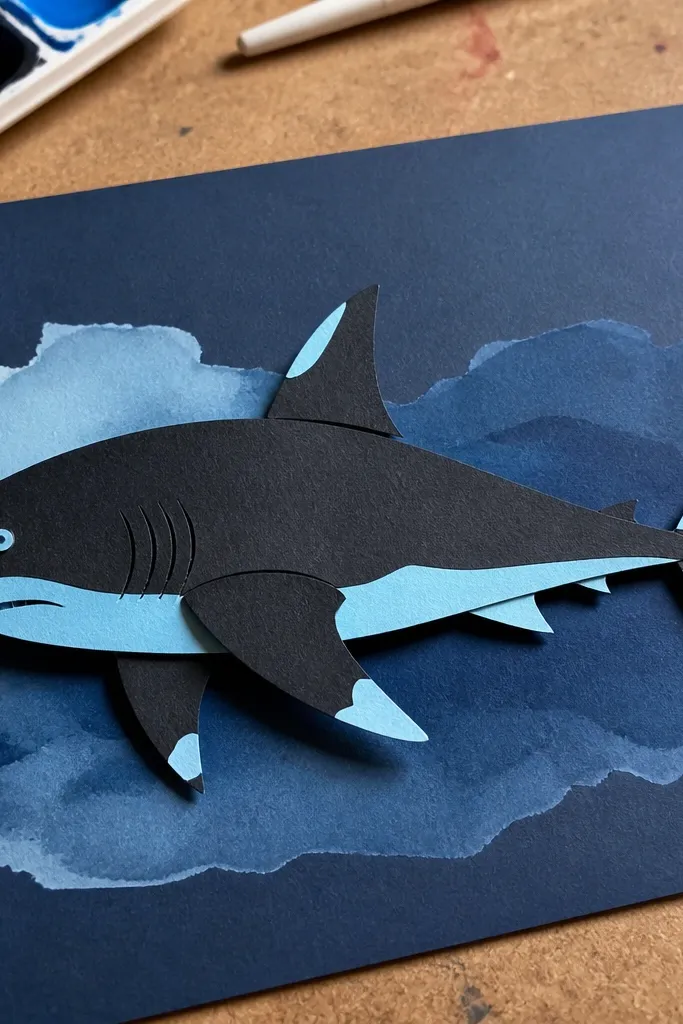
This is an easy way to get that “designed” look without rendering every scale. Layered paper cutouts give you crisp edges that camera phones love, and the overlap creates natural shadows. Use a dark paper for the shark body, a lighter paper for fin highlights, and a blue paper or watercolor wash for the water. It looks good because the layers create depth without complicated shading.
Cut a shark silhouette from dark paper first, using a simple profile or front head shape. Cut a second fin and a thin belly highlight strip from a lighter gray or off-white paper. Layer the lighter pieces on top of the main silhouette with glue, then press flat under a book for 10 minutes. Add a background wash or blue paper behind it, then draw a few bubble dots with a white gel pen for sparkle.
Use a craft knife and a cutting mat so the fin edges stay sharp.
Don’t use thick foam tape everywhere; it makes the drawing look messy instead of intentional.
6. Minimal Line Shark With One Heavy Shadow
This is for when you want something stylish without spending hours on texture. The line work stays clean and calm, and the single heavy shadow shape gives it weight. The aesthetic comes from restraint: one dark mass under the shark, plus a tiny highlight line on the belly. It photographs well because the contrast is simple and readable.
Draw the shark outline with one consistent line weight, keeping the dorsal fin and tail edges crisp. Add minimal inner lines: jaw curve, one gill slit, and a simple eye dot. Then block in one large shadow under the body using a black marker or ink, leaving a clear gap between shadow and belly edge. Finish by adding a thin highlight line on the flank with a white gel pen or a kneaded eraser highlight.
If you’re using pencil, trace your final outline with a 0.3 or 0.5 fineliner for clean photo edges.
Don’t add multiple small shadows — one big shadow is the look.
7. Ink Splash Shark on Textured Background
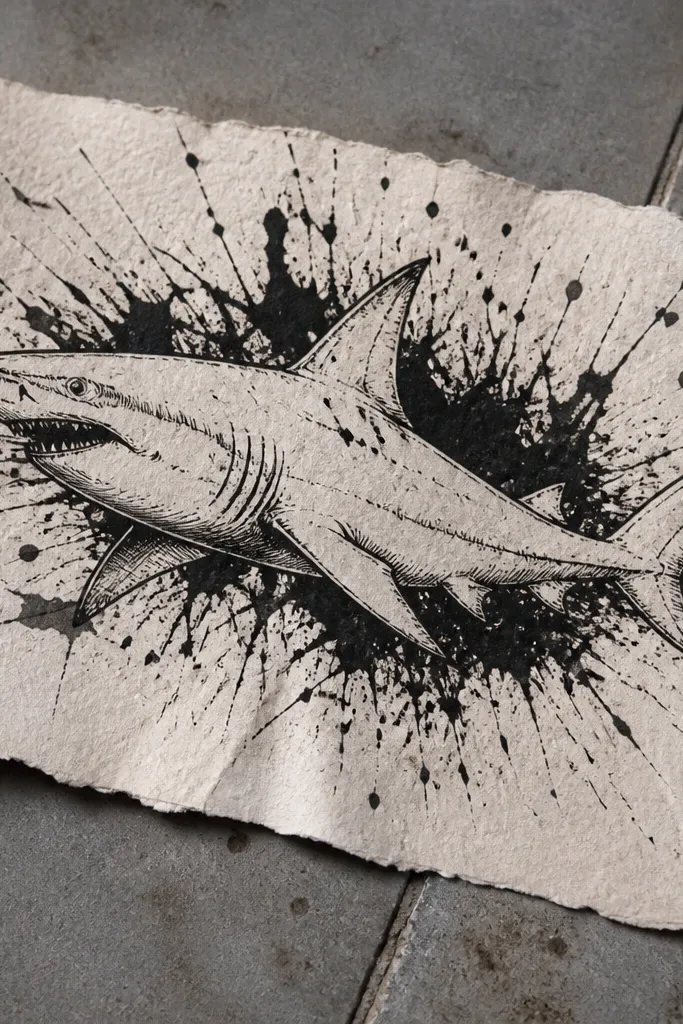
This one looks energetic and modern because the shark stays controlled while the background splashes. Use ink for the shark outline so the edges stay dark and confident, then add splatter and splash marks behind the body. The contrast between smooth shark lines and chaotic background specks gives it that poster vibe. It’s great for sketchbooks because you can reuse the same shark shape and change the splash pattern.
Sketch the shark in pencil, then ink the outline with a fineliner or brush pen. Keep the inside details minimal: eye, gill slit, and a couple of fin shadow lines. Wet the background area lightly with clean water using a flat brush, then flick ink with a toothbrush or a splatter tool to create controlled splashes. Let it dry, then add a few tiny white highlights on the splash with a gel pen so it doesn’t look muddy. Finally, reinforce the tail and fin edges with extra ink.
Practice one flick on scrap paper; you want droplets, not blobs.
Don’t flick ink onto the shark body — keep the subject edges clean.
8. Calm Ocean Grid Shark
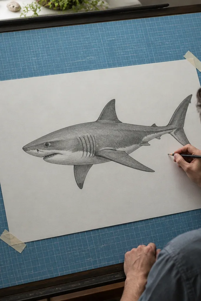
Grid backgrounds make drawings look intentional and graphic, even when the shark is simple. This idea uses a calm blue grid plus thin wave lines so the shark looks like it’s floating in clean water. Keep the shark in a mid-dark tone so it doesn’t disappear against the grid. It’s a smart choice if you want that “aesthetic planner page” look.
Draw a grid lightly with a ruler, spacing around 1 cm squares, then color the background with a light blue wash or blue pencil shading. Sketch a shark silhouette or profile on top, using the same silhouette-first approach: head wedge, torso oval, tail paddle. Add thin wave lines following the grid diagonals, then darken the shark outline slightly so it stays readable. Finish by adding a highlight stripe on the flank and a tiny fin shadow under the dorsal fin.
Pro tipUse a lighter blue for the grid lines and a darker blue/black for the shark outline.
AvoidDon’t let the grid compete with the shark; keep grid lines lighter than the subject.
9. Retro Comic Shark With Halftone Dots
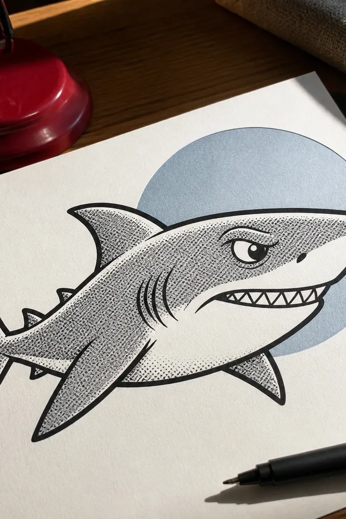
Comic sharks look great because they use strong line weight and graphic shading. Halftone dots are a clean way to add texture without drawing every scale, and they look amazing in photos. Use a thick outline for the shark and keep the mouth expression simple. Add one speech-bubble-style bubble shape behind the head for extra pop.
Ink the shark outline with a thick marker, keeping the dorsal fin and jawline crisp. Shade the body with halftone dots: use a stencil or a dotting tool to place dots more densely in the underside and less on the top. Leave a highlight stripe by not placing dots there. Add a few comic-style speed lines behind the tail, then finish the eye with a white gel highlight and a dark pupil.
Pro tipIf dots blur, use colored pencil for dot shading and a pen for the outline.
AvoidDon’t shade the whole shark with full-density dots — vary density for shape.
10. Seafoam Green Fin Silhouette
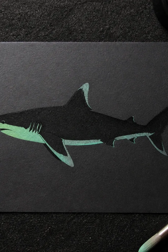
This one is striking because it uses one accent color. A black shark silhouette is readable instantly, and the seafoam green fin and belly highlight make it look modern and clean. Keep the rest monochrome so the accent color stays the focal point. It’s a great “fast but looks expensive” idea.
Draw the shark profile and fill it with black marker or ink. Leave the fin and a thin belly highlight strip uncolored during the fill step. Color the fin and highlight strip with seafoam green pencil or marker, staying inside the silhouette edges. Add a few tiny scale marks on the belly highlight using a gray pencil so the green doesn’t look flat.
Color the accent areas last so you don’t accidentally smear them while filling the silhouette.
Don’t add extra colors; the accent color is the whole look.
11. Chalk Pastel Shark on Dark Paper
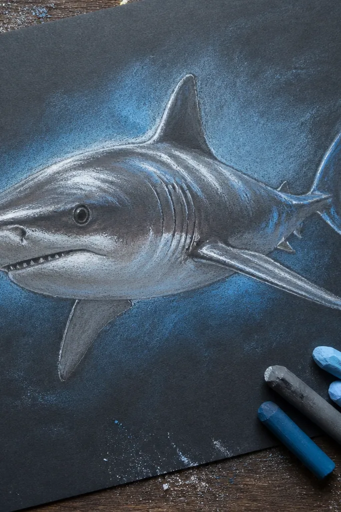
Dark paper makes sharks look dramatic fast. Chalk pastel or soft pastels let you build smooth gradients for the body, and white highlights look like real reflections. This is the move when you want a high-contrast, gallery-ish look without detailed scale rendering. The water background can be a soft blue haze that frames the shark instead of competing.
Choose black or very dark gray paper. Sketch the shark lightly with white pencil, then block in the body with gray and deep blue pastels. Add a bright white highlight stripe on the flank and a few white fin edge highlights. Blend the background with soft blue and a little purple so it fades outward. Finish by sharpening the dorsal fin outline with a darker pastel and adding one darker shadow under the jaw.
Pro tipUse a kneaded eraser to carve crisp highlight edges on the body.
AvoidDon’t overblend the fin edges; keep them sharper than the body.
12. Blueprint Shark With Measurement Labels
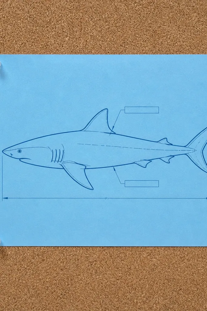
Blueprint aesthetics make sharks feel like a design object, not just an animal drawing. The clean lines and measurement marks give you structure, and the monochrome palette keeps it photogenic. This works best when you keep the shark outline simple and let the “engineering lines” do the visual work. Add one or two label callouts for interest, but keep them small.
Start with a shark profile on light paper, drawn with a single clean line. Add thin ruler-like lines across the page and a few diagonal construction lines behind the shark. Use a dark blue pen or pencil for the outline, then add measurement ticks near the tail and dorsal fin. Add two small callouts with tiny text labels — keep the text short and neat. Finish by shading the underside with light blue pencil so it reads as depth.
Pro tipUse a straightedge for the blueprint lines so the whole page looks intentional.
AvoidDon’t fill the page with too many labels; two callouts are enough.
13. Watercolor Shark With Salt-Resist Texture
Watercolor plus salt-resist gives you skin texture without you drawing every scale. You paint the shark shape, sprinkle salt while it’s wet, and the salt creates natural speckles that mimic rough skin. This looks good because the texture is organic and the edges can stay soft or sharp depending on your brush control. It’s best when your shark is in a simple pose so the watercolor doesn’t get chaotic.
Wet the paper lightly and paint the shark silhouette with a dilute mix of gray-blue watercolor. While the paint is still glossy, sprinkle table salt over the body area, focusing on the flank and tail. After it dries, brush off the salt to reveal speckled texture. Add a darker fin shadow with a stronger paint mix, then paint a simple water background wash behind the shark. Use a fine liner to add the eye and one jaw line so the face stays readable.
Pro tipUse salt sparingly; too much makes a grainy mess instead of skin texture.
AvoidDon’t add salt over the eye or mouth — you want those edges clean.
14. Geometric Shark in Tangram Blocks
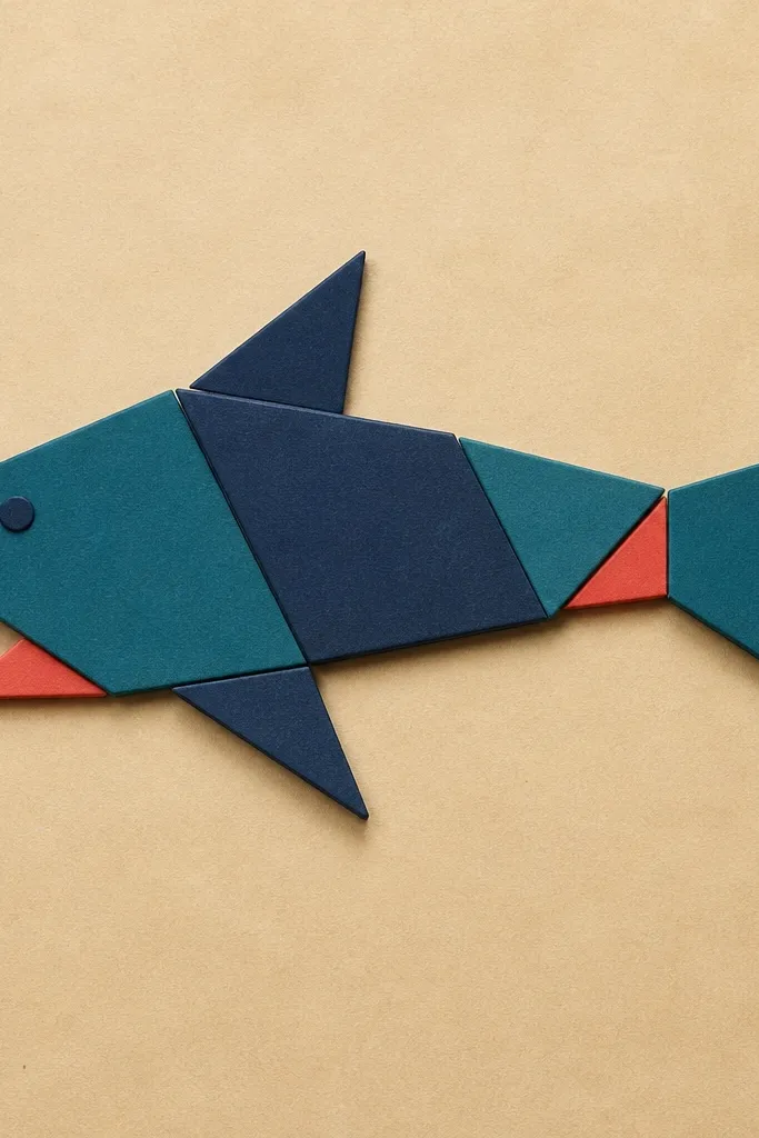
This is the cleanest way to get a “designed” shark that still looks like a shark. Break the shark into big geometric pieces: head triangle, body trapezoid, fin shapes, and tail paddle. Photogenic factor is high because every edge is crisp and the colors stay flat. Use a limited palette like teal, navy, and warm beige for a modern look.
Decide your shark pose first — a side profile is easiest. Sketch the silhouette, then trace it into 6-10 geometric shapes with straight edges. Fill each shape with a solid color using marker or gouache, keeping boundaries sharp. Add a thin dark outline between pieces for definition, then place a simple background rectangle in a lighter shade behind the shark. Finish by adding one highlight strip on the body using a light pencil or white gel pen.
Pro tipPrint a reference grid on your paper so shape proportions stay consistent.
AvoidDon’t use too many colors; it kills the geometric clarity.
15. Kelp Forest Shark Frame
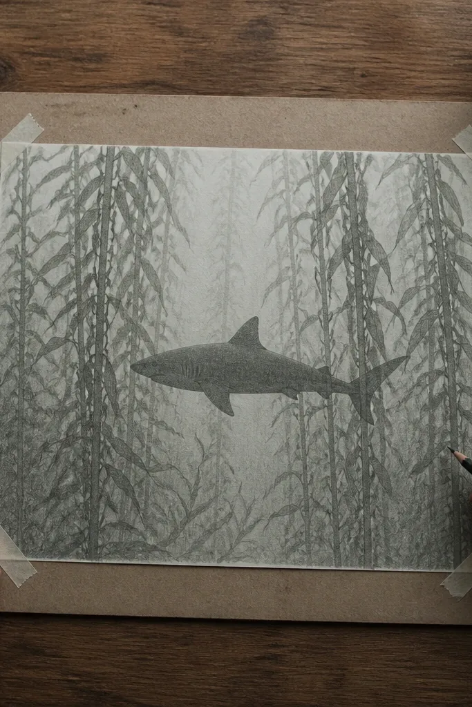
A kelp forest background makes your shark look like it’s in a real scene without needing a detailed reef. The aesthetic is vertical rhythm: tall kelp blades create framing and motion, while the shark stays the focal point. Keep the kelp slightly lighter than the shark so it doesn’t steal the contrast. This idea works especially well for front-facing or three-quarter shark angles.
Draw the shark in the center with a clean outline and a simple 3-value shading plan: light belly, mid flank, dark fin shadows. Then draw kelp blades around it — use varied lengths and taper each blade to a point. Color kelp with green pencils or marker in 2 values: light and dark green. Add a few bubble dots around the mouth area so the scene feels alive. Finish by darkening the shark outline slightly and adding a soft shadow under the belly to anchor it.
Pro tipStart kelp first, then draw the shark on top; it keeps composition balanced.
AvoidDon’t turn kelp into a full reef background — keep it blade silhouettes only.
16. Sepia Shark Portrait With Vignette
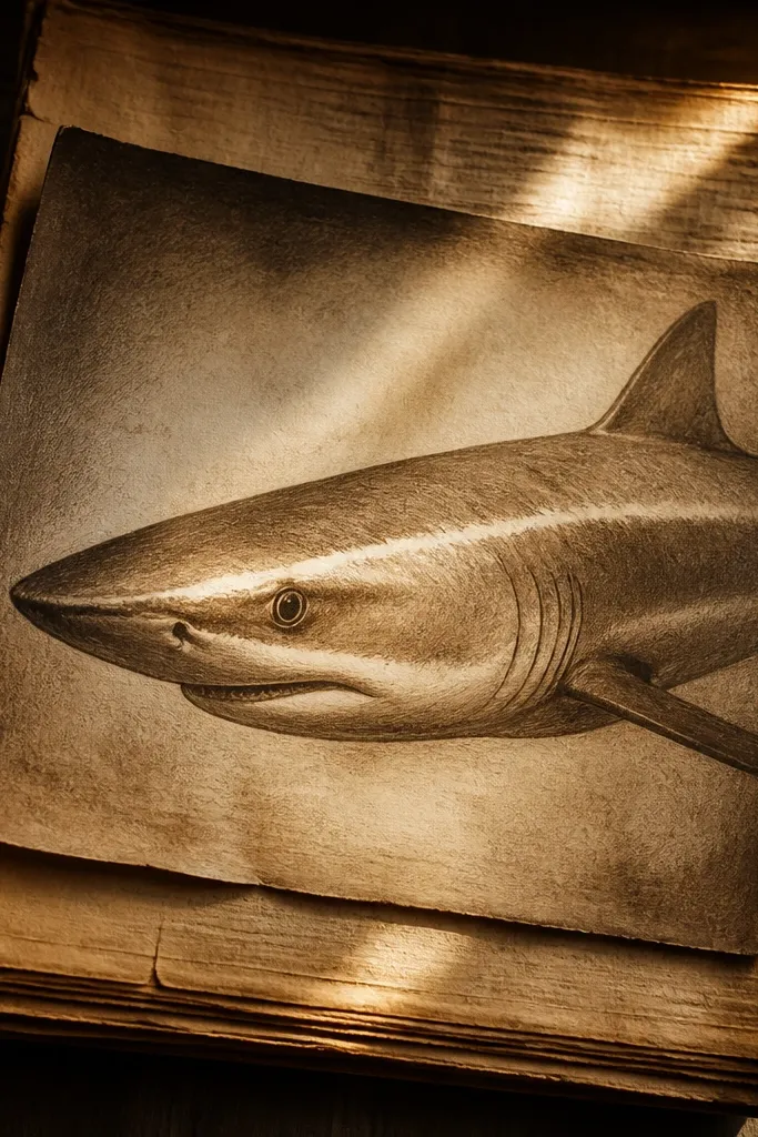
A sepia portrait looks instantly vintage and clean when you keep the values controlled. The vignette corners pull attention to the eye and highlight stripe, which makes the shark look focused. This is a great choice if you want a single subject drawing that still feels finished. It’s also forgiving — sepia hides tiny line imperfections.
Sketch a three-quarter view shark face and outline it lightly. Shade the body in sepia tones using a warm brown pencil, keeping the belly lighter. Add a bright highlight stripe on the flank and one small highlight on the eye. Create a vignette by shading darker brown around the edges of the paper, leaving the center lighter. Finish by adding a darker jaw line and a simple fin shadow under the dorsal fin.
Pro tipUse a paper stump or tissue to blend sepia background smoothly, but leave the fin edges sharp.
AvoidDon’t over-darken the whole body — keep the center readable.
17. Chisel-Tip Marker Shark With Clean Edge Highlights
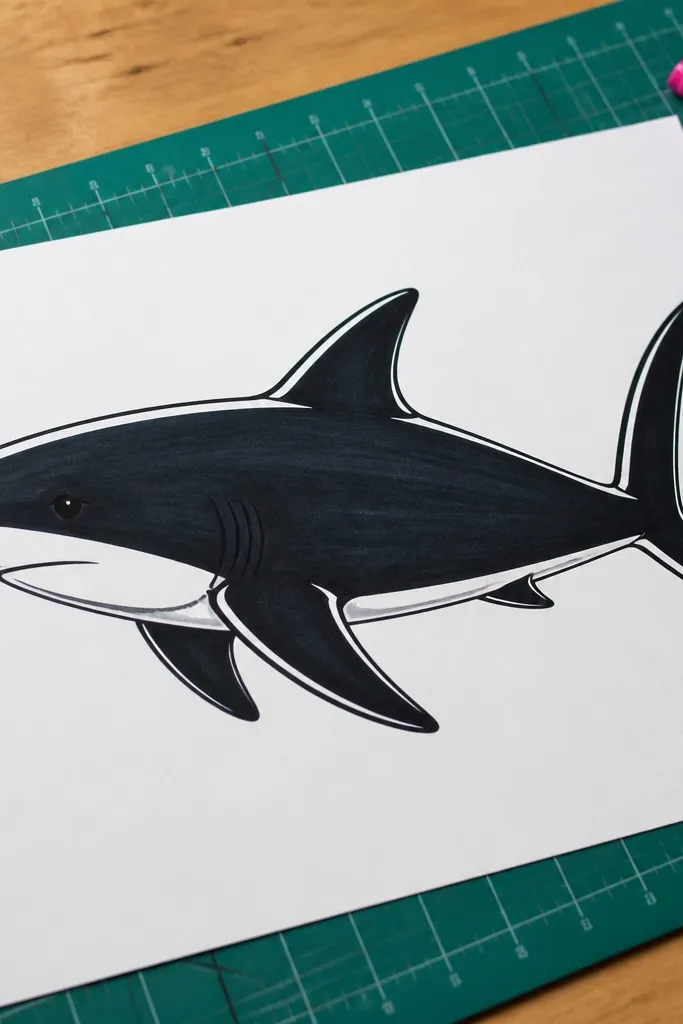
Chisel-tip marker work looks crisp because it creates consistent line thickness and smooth fills. This idea is all about edge control: dark body, clean fin silhouettes, and narrow white highlight lines that trace the shape. It’s fast, and it looks good in photos because the lines are bold and the highlight lines catch light. You can do this with a single pose and repeat it with different backgrounds.
Sketch the shark profile with light pencil, then trace the outline with the chisel tip marker. Fill the body with marker, using the chisel angle to keep the fill edges sharp. Leave a thin highlight stripe uncolored on the flank and a small highlight line near the fin base. Add fin shadows with a slightly darker tone or a second pass of the marker. Finally, add a simple background — a flat light blue band or a few wave lines.
Pro tipKeep a scrap paper test of your marker value so you know when it’s too light to look crisp.
AvoidDon’t blend marker with water — you’ll get fuzzy edges.
18. Suminagashi Water Pattern Shark
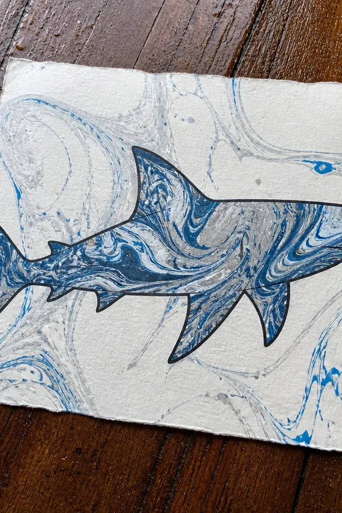
Marbled fills look expensive, and a shark outline is perfect for turning that pattern into a design. You’re not drawing texture by hand; you’re using a swirling pattern inside a controlled shape. The result is photogenic because the marbling creates movement across the body while the outline keeps it readable. This is best when you keep the outside of the shark simple and let the fill do the work.
Draw a clean shark outline on watercolor paper, then trace it with ink so the edges are sealed. Create or use a marbling pattern on paper using acrylic inks and a marbling tray method, then transfer the pattern onto the shark shape area. If you’re doing it DIY without a tray, you can paint a marbled background with swirling ink drops and then cut or mask the shark area. Once the marbling dries, reinforce the shark outline with ink and add two small highlight lines on the flank. Add a plain background wash so the marbling doesn’t compete.
Pro tipUse watercolor paper so the ink pattern holds and doesn’t bead up.
AvoidDon’t leave the outside background busy; the marbling needs breathing room.
19. Minimal Tattoo Style Shark Flash
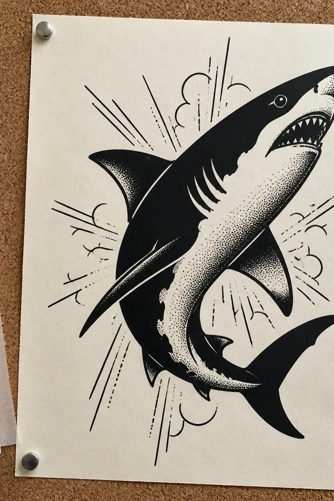
Tattoo flash style is clean, graphic, and always looks good in a photo because it’s high contrast and intentionally simple. Use dotwork and a couple of ornamental lines around the shark to frame it. Keep the shark body mostly solid black with a few dot patches for depth. This idea helps you practice a “flash-ready” approach: one strong silhouette, one texture method, no clutter.
Draw a shark silhouette with a clear dorsal fin and tail curve, then ink it with solid black. Add dotwork only in 2 places: under the jaw and along the belly curve, keeping dot sizes consistent. Add one small ornamental element behind the shark, like a thin curved banner line or a tiny starburst. Finish with a clean negative space highlight stripe on the flank by leaving the paper uninked. If you want a flash card vibe, draw a simple border rectangle around the whole piece.
Pro tipUse a 0.3 fineliner for dots so they stay crisp and round.
AvoidDon’t spread dotwork across the whole body; it flattens the shape.
20. Tidal Moon Shark Under a Single Light
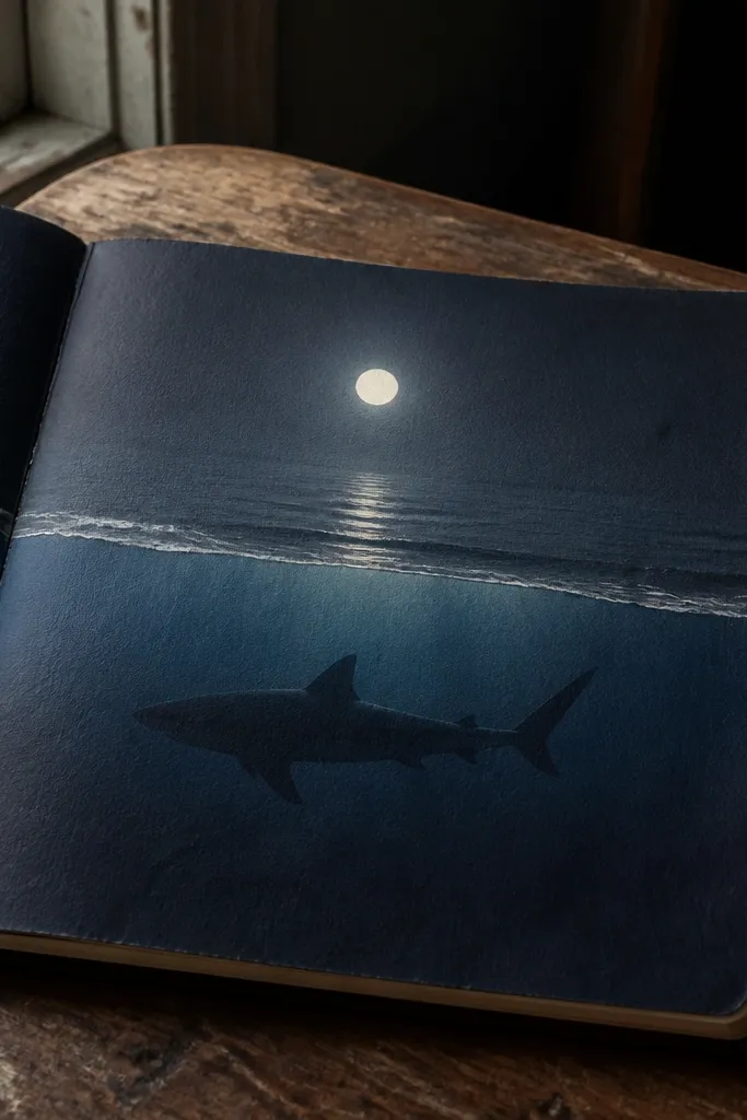
This is a mood drawing that still stays clean. You put one bright light source — a moon — and let it shape the values on the shark and water. The shark silhouette stays dark, then you add a thin foam band and a reflection line under the moon. It’s photogenic because the composition is simple: moon, water, shark — nothing else competes.
Draw the moon as a bright circle near the top, leaving a crisp edge. Sketch the shark silhouette in the lower third, facing left or right, with a dorsal fin that stands out. Shade the water with 2-3 wave lines and a darker band near the horizon. Add a thin reflection line from the moon down to the water surface, then add a foam band at the shark’s mouth and along the belly curve. Finish by reinforcing the shark outline and adding a tiny highlight notch where the moon glow hits.
Pro tipUse a white gel pen for the foam band so it stays bright after the page dries.
AvoidDon’t clutter the sky with extra stars if you want the moon to stay the focus.



