
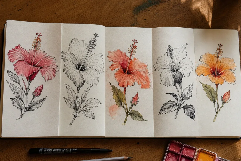
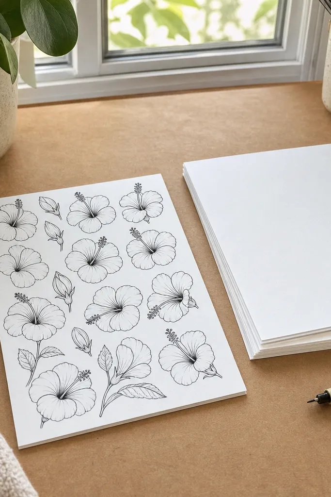
1. One-Flower Marker Hibiscus with Thick Center
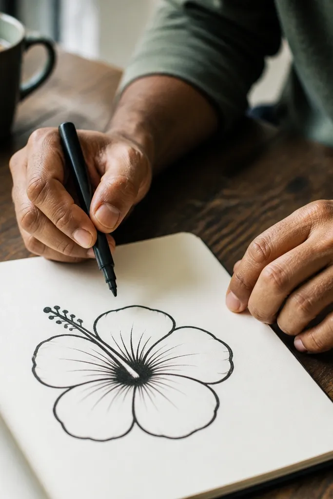
This is the easiest hibiscus that still looks like a finished illustration. You draw the petals as five large teardrops, then hit the center with darker, thicker lines so the flower feels grounded. Marker-friendly drawings look best with clean edges and minimal internal detailing, so the petals stay smooth and the hibiscus reads from far away. Use a limited color plan: one pink-red for the petals, one warm orange for the inner shading, and yellow-orange for the stamens. It fits sketchbooks, printable cards, and simple wall art because the contrast is high and the shapes are clear.
Start by sketching a small circle guide for the center, then draw five petal teardrops around it with a slight notch on each outer edge. Add the center stigma as a narrow teardrop column and draw 10-12 stamens as short curved lines radiating outward. Color the petals with a solid pink-red pass, then blend a warm orange tone only on the inner half of each petal. Finally, darken the petal outlines on the outer edge and add a thin stem line under the flower.
Pro tipWhen you color, leave a tiny white gap along the petal notch so the shape stays crisp.
AvoidDon’t add veins to every petal — one or two lines in the inner half looks intentional, too many looks busy.
2. Pencil-and-Ink Hibiscus with Soft Petal Veins
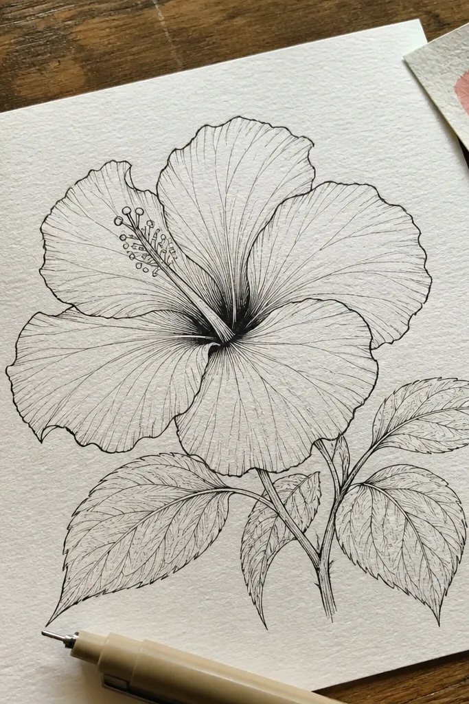
This version looks airy and “artsy” without becoming complicated. Pencil construction keeps the proportions calm, and ink outlines give you the contrast that makes hibiscus pop on paper. The trick is keeping the veins soft: only a few curved strokes inside each petal, starting near the center and fading as they reach the outer edge. Because the lines are delicate, it photographs beautifully on light backgrounds and works great for a minimalist aesthetic. This is a good choice if you want something you can print as a set of botanical cards.
Lightly sketch five petal teardrops and a center guide using HB pencil, keeping the petals slightly uneven in size for realism. Ink the outer contour of each petal with a 0.5 fineliner, then add 2-3 vein arcs per petal starting from the inner half. Draw stamens as short, curved lines that tuck behind the stigma column, not perfectly straight lines. Shade the deepest petal folds with a light pencil wash or tight graphite strokes, then erase any stray pencil marks after the ink is dry.
Pro tipErase after inking, not before, so you don’t smear graphite into wet ink.
AvoidDon’t outline the veins — draw them as lighter pencil marks or thin ink strokes so they don’t overpower the flower.
3. Hibiscus Bud Half-Open on a Skinny Stem
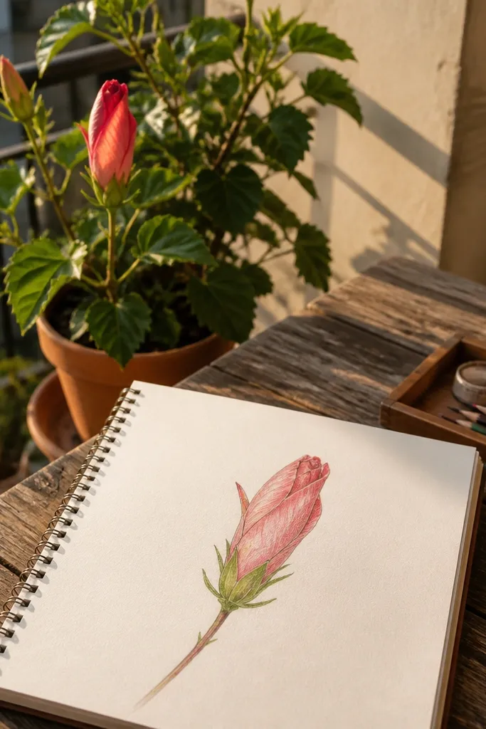
Half-open hibiscus looks dramatic with very little work. You only need two or three main petal layers, plus the center hints, and the flower still reads as hibiscus. The bud shape creates natural depth: inner petals look tucked and slightly darker, and the outer edge stays lighter. This is ideal for small spaces like margins, sticker sheets, or journal pages where you don’t want a large centered bloom. The thin stem also makes the drawing feel delicate and intentional.
Draw a skinny stem line, then sketch a teardrop bud shape at the top with two overlapping petal outlines. Add one outer petal loop and one inner petal loop, leaving a small opening gap where the center will show. Create a simplified stigma column and 6-8 short stamens that curve inward toward the opening. Color the outer petal with pink-red and shade the inner petal with a warmer orange, keeping the opening area lighter for depth.
Pro tipKeep the opening gap clean — it’s the detail that makes the bud look alive, not flat.
AvoidDon’t make the bud fully round — a hibiscus bud has an open side that shows the center.
4. Three-Flower Cluster with Staggered Sizes
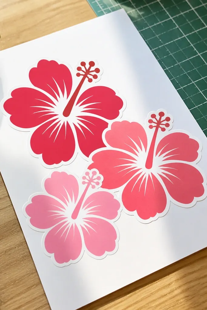
A cluster is the fastest way to get a “page full of art” look. By staggering sizes and placing one bloom slightly behind another, you get depth without shading complexity. You’ll keep the petals simple, but the arrangement does the heavy lifting visually. This style works for greeting cards, printable stickers, and background patterns because the shapes repeat nicely. The center details can be minimal since the petals and composition still read as hibiscus.
Plan three centers on your page: one big front flower, one medium off to the side, and one smaller behind. For each bloom, draw five petals with notches and add a simple stigma column plus 8-10 stamens. Overlap petals intentionally: for the back flower, draw its petals lighter and let the front petals cover part of it. Add two leaf shapes under the cluster and finish with a thin stem line connecting them.
Use one consistent line weight for all outlines, then only thicken the outlines on the front flower for depth.
Don’t align all three centers on the same horizontal line — the cluster turns flat immediately.
5. Single-Line Hibiscus in One Continuous Loop
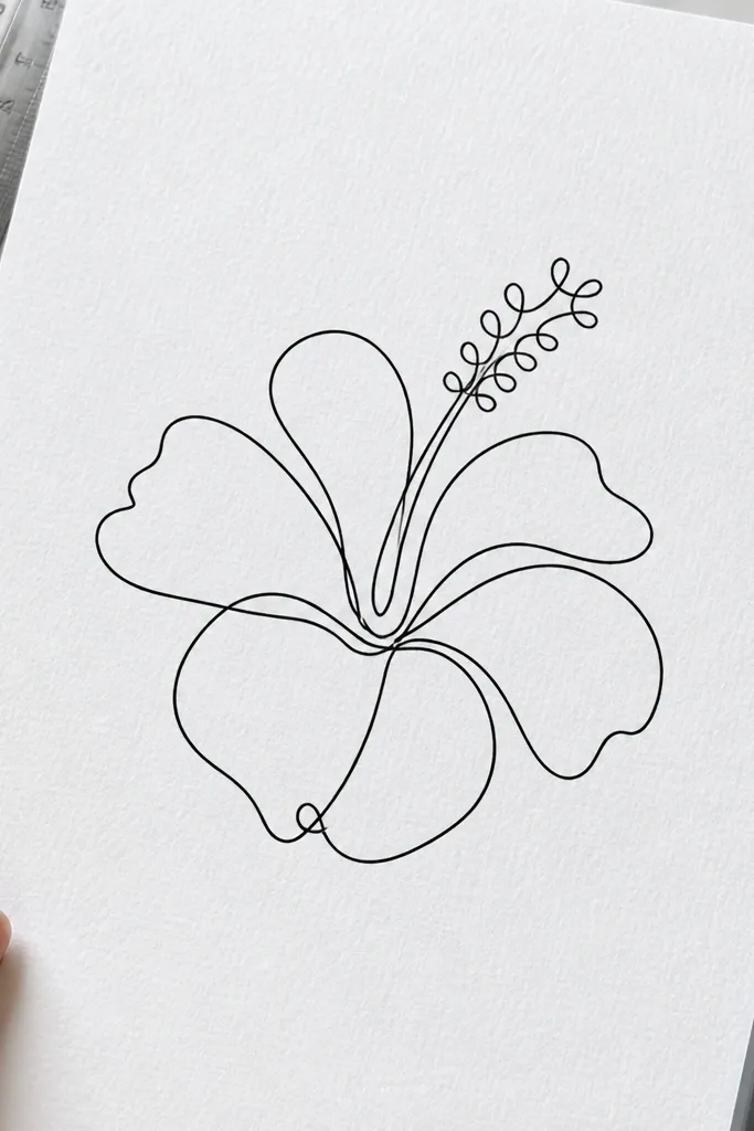
This is the “minimal but striking” hibiscus. A single-line approach forces clean shapes and makes the flower feel modern. You’ll still get hibiscus identity by keeping the petal teardrops and adding a center column and curved stamens. Because there’s no heavy coloring, the drawing looks good on plain paper and is easy to scan or photograph. It’s also a great warm-up if your hand feels shaky — you’re training control, not perfection.
Start at the center stigma, draw a narrow teardrop column, then loop out into the first petal teardrop. Continue in a single path around the flower, forming five petals with a small notch on each outer edge. As you pass the center again, add short inward curves that represent stamens. Finish by sweeping a thin stem line downward and add one leaf outline with a single curved stroke.
Slow down at each petal notch — the notch is what tells the viewer it’s hibiscus, not a generic flower.
Don’t add extra loops inside every petal. One center detail is enough.
6. Watercolor Look Hibiscus with Salt Speckle Texture
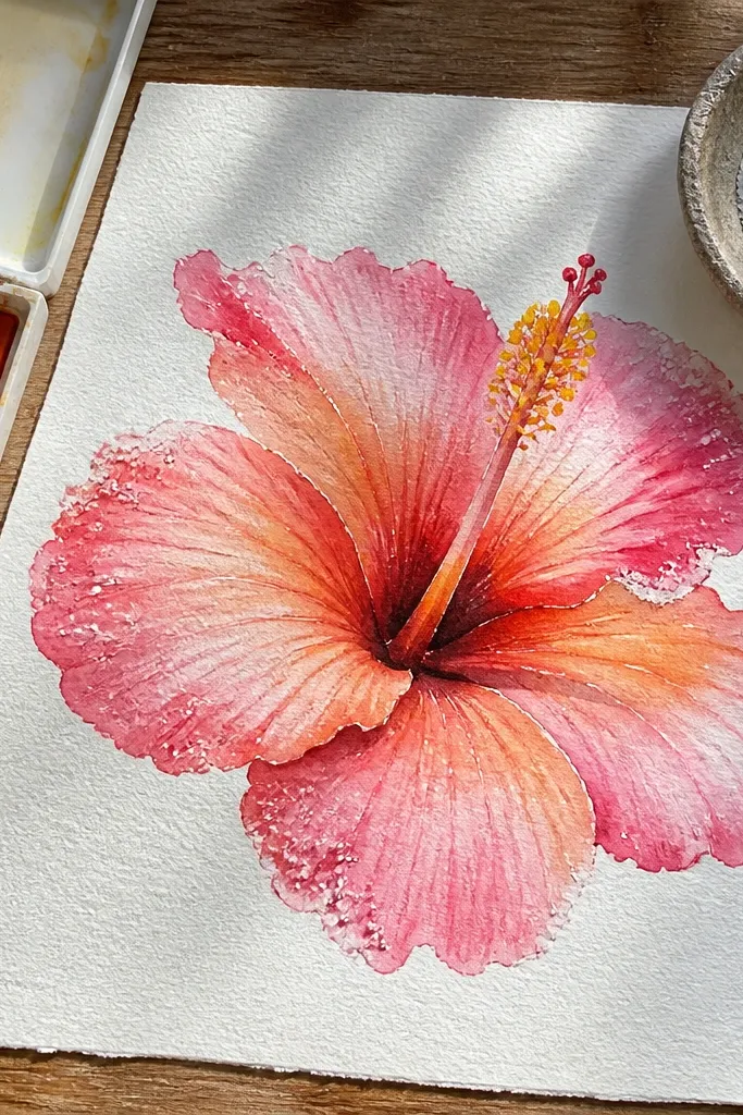
If you want photogenic color without hours of blending, salt texture is your friend. Hibiscus petals love watercolor because the edges look soft and natural, and the salt speckles create a lively skin-like texture. Keep your palette tight: one diluted pink-red wash for the petals, a warm orange for inner folds, and yellow-orange for the stamens. This style looks fantastic for phone wallpapers and printable art because the texture catches light. It also still counts as “simple” because the texture does the work.
Lightly draw the hibiscus outline in pencil, then paint the petals with a wet-on-wet pink-red wash. While the paint is still glossy, sprinkle a small pinch of salt on the petal areas and let it sit until the paint dries. Brush off the salt gently and add warm orange on the inner half of each petal. Finally, paint the stigma and stamens in yellow-orange, then add a thin dark outline only where you need crisp edges.
Use fewer salt grains than you think — too much turns the petals grainy instead of delicate.
Don’t outline everything in ink before watercolor. Wet ink can bleed and kill the clean hibiscus edges.
7. Crayon-Resist Hibiscus on Color Paper
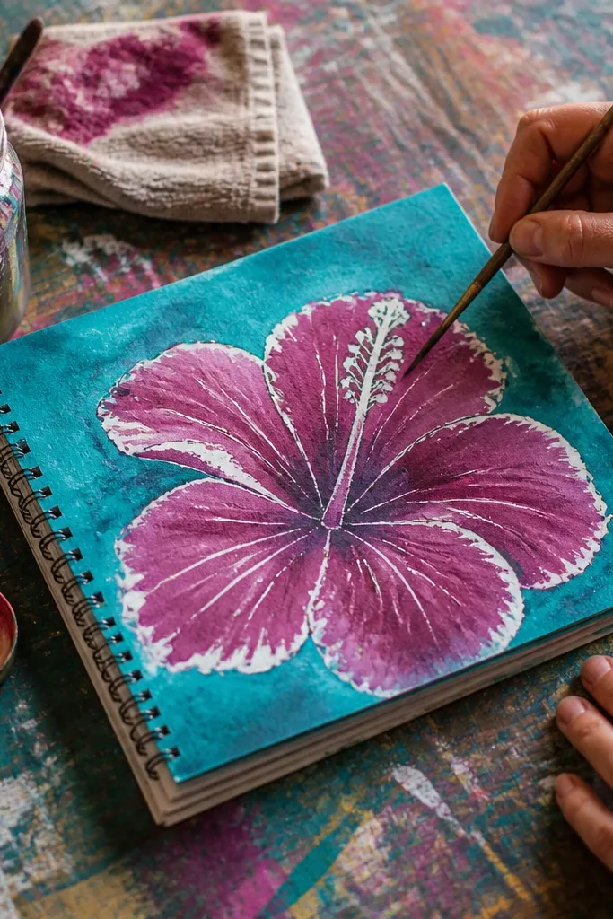
Crayon-resist gives you a bold, kid-friendly look that still looks good in a grown-up sketchbook. You draw the hibiscus details in white or light crayon, then wash over the page with watercolor or liquid paint. The crayon repels the paint, so the petal outlines and center details stay bright. This is great when you want a high-contrast look without careful linework. It also works beautifully on teal, cream, or pale gray paper because the color background makes the hibiscus feel like a poster.
Choose colored paper (teal, pale gray, or cream). Use white crayon to draw five petal teardrops with notches and a center stigma column with curved stamens. Paint over the entire flower with a diluted pink-red wash, leaving the crayon lines visible. Add a second pass of warm orange only inside the petals, then let it dry flat and add a tiny touch of dark pencil or fineliner to sharpen the outer edges.
Pro tipPress harder with the crayon on the petal notch area — that’s where the white line needs to survive the wash.
AvoidDon’t use too much water in the first wash or the paint will creep and blur the crayon-resist edges.
8. Black Paper Hibiscus with White Gel Pen Highlights
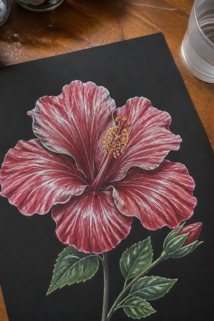
Black paper makes even a simple hibiscus look intentional. You’ll draw the shapes in colored pencil or soft marker, then add bright white gel pen highlights to create the glossy petal effect. Hibiscus petals have natural shine along the inner curve, and gel pen marks look like that shine instantly. This style is ideal for bold, graphic art and for sticker designs where the contrast needs to be strong. It’s also quick because you don’t need heavy shading when the paper is already dark.
Sketch the hibiscus in pencil lightly, then color the petals with pink-red colored pencil or soft marker, staying a bit darker near the inner fold. Color the center stigma and stamens in yellow-orange. Add white gel pen highlights along the inner half of each petal and along the edges of the notches. Finish with a thin white outline around the outer contour and draw one simple leaf shape in green-gray.
Use the gel pen for short, curved highlight strokes, not long lines. Short strokes look like light catching the petal.
Don’t try to erase colored pencil on black paper — it creates muddy patches.
9. Pastel Soft Hibiscus with Blended Center Gradient
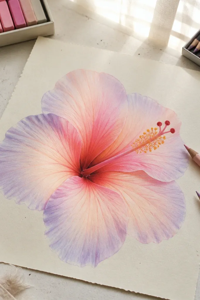
This one is for a gentle, dreamy look without losing hibiscus identity. Pastels blur naturally, so you need a strong center design to keep it recognizable. Make the stigma column clear and paint the stamens as small curved marks, then let petal color fade outward. The result looks like a botanical print and photographs well with window light. It’s also forgiving if your lines aren’t perfect because the soft blending hides rough edges.
Use light pencil to place the center and draw five petal teardrops with notches. Color petals with pastel pink-red, then blend outward using a fingertip or blending stump. Create a clear stigma column by pressing a warmer orange-yellow pastel into the center and blending only a little at the edges. Add stamens as tiny curved strokes in yellow-orange, then lightly shade one or two inner petal folds with a deeper rose pastel.
Blend the petal edges lightly, then stop. Over-blending turns the notches into mush.
Don’t skip the center — the stigma and stamens are what prevent pastel hibiscus from looking like generic petals.
10. Patterned Hibiscus with Dot and Dash Petal Texture
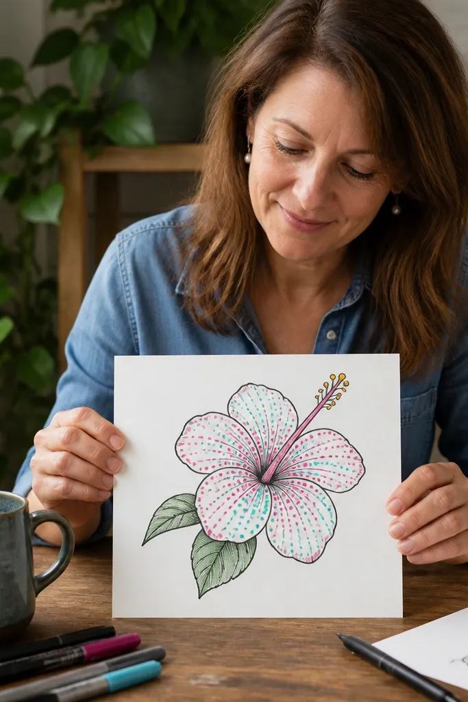
Texture makes a simple hibiscus look designed. This version uses dots and short dashes inside the petals instead of detailed veins, so it stays beginner-friendly but still looks interesting in photos. The key is placing texture only in the inner half of each petal where the light would hit. You keep the outlines clean and let the pattern do the visual work. This is perfect for planners, journaling backgrounds, and sticker sheets because it creates a decorative repeat.
Draw the hibiscus outline in pencil, then ink it with a 0.5 fineliner. Add five petals with clear notches and a centered stigma column with curved stamens. Fill the inner half of each petal with a pattern: small dots near the center, then switch to short dashes toward the outer edge. Color petals lightly with pink-red, then use a warm orange only as a base under the dot/dash pattern.
Keep dot sizes consistent. Use the same pen pressure for every petal so the pattern looks intentional.
Don’t pattern the outer edge of every petal. Leave a clean outline area so the flower stays readable.
11. Hibiscus Outline Only with Watercolor Wash Behind
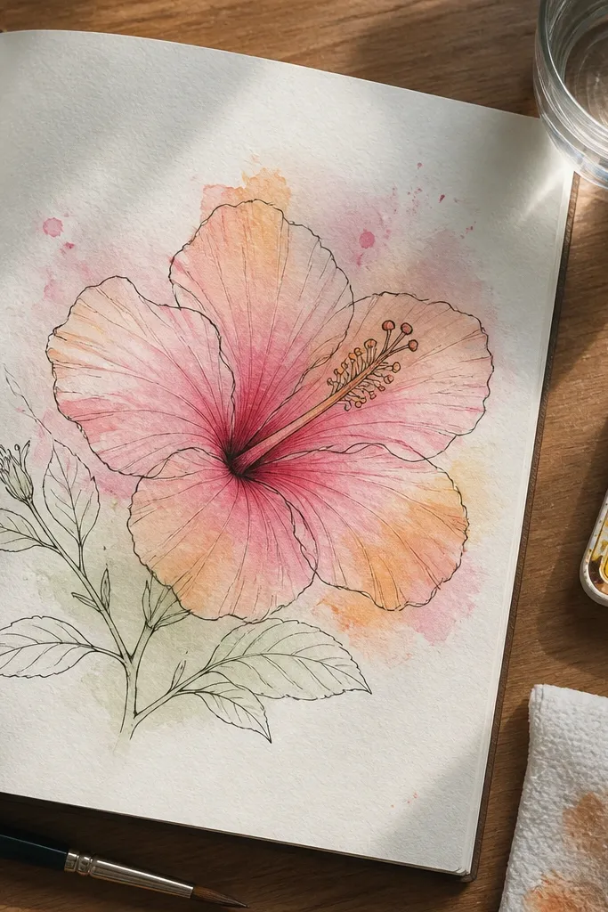
This style gives you the best of both worlds: crisp linework and soft color. You draw a clean outline first, then paint behind it so the petals look tinted rather than fully shaded. It’s simple because you’re not blending each petal fold — you’re laying a wash and letting the paper texture do the rest. The result looks graphic and photogenic, especially when you use a strong pink-red wash and a tiny yellow center accent. Great for prints, bookmarks, and quick decorative art.
Sketch hibiscus petals and notches lightly, then ink the entire outer contour and the center stigma with a 0.5 fineliner. Leave the interior mostly white at first so you can control the wash. Paint a diluted pink-red wash behind the petals, keeping it inside the outline. Add warm orange in a few small patches near the inner folds, then paint only the stigma and stamens in yellow-orange.
Pro tipUse watery paint for the wash, not thick paint. Thin wash keeps the petal edges soft and photo-friendly.
AvoidDon’t overwork the wash after it dries. Repainting creates hard edges and kills the soft watercolor look.
12. Hibiscus on a Curved Frame Border
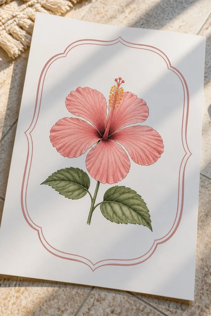
If you want your hibiscus drawing to look like a finished illustration, frame it. A curved border turns a simple flower into something you’d actually print, and it gives the eye a place to land. Keep the flower simple inside: five petals with notches, a clear center, and one leaf pair. Then make the border the star with a clean arc and small ticks or dots. This style is especially good for printable wall art and for making cohesive sets of botanical drawings.
Draw a curved border around your page area using pencil, like an oval or rounded rectangle with space at the bottom for a stem. Place the hibiscus center in the middle of the frame, then draw five petals and the stigma column with curved stamens. Add two leaf shapes under the flower, one on each side of the stem. Finally, ink the hibiscus outline and border, then add a pink-red wash to petals and a small yellow-orange center highlight.
Make the border lines thinner than the flower outline. The flower should read first.
Don’t crowd the border with extra doodles. One border detail is enough.
13. Hibiscus with Perspective Stem and Leaf Pair
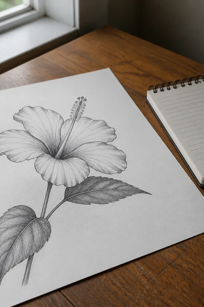
A hibiscus drawing looks more “real” when the stem and leaves have direction. This idea keeps the flower simple but adds a diagonal stem line and two leaves that angle differently, so the whole piece feels placed in space. You’ll draw the hibiscus petals as teardrops with notches and keep the center crisp, then focus your effort on leaf shapes. The leaf pair is what makes the drawing feel designed instead of floating. It’s great for journaling pages where you want a focal flower plus natural supporting elements.
Sketch a diagonal stem line from the lower left to the flower center, then draw two leaf shapes on opposite sides of the stem. For each leaf, use an almond outline with one central vein line and a slightly pointed tip. Draw the hibiscus petals and notches around the center, then add the stigma column and curved stamens. Color petals pink-red, leaves green-gray, and add a warm orange inner petal shading with light pencil or marker blending.
Angle the leaves so their tips point toward the flower. That tiny direction cue makes the whole drawing feel cohesive.
Don’t draw leaves as perfect symmetrical ovals. Hibiscus leaves look more natural with a slight tilt and pointed ends.
14. Hibiscus with Embossed Look Using Colored Pencil Lift
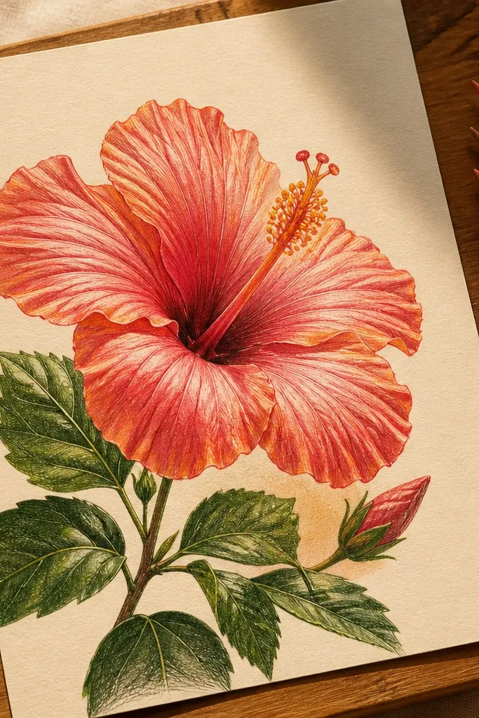
This one gives you an embossed, print-like look without special tools. You lay down a base color on the petals, then lift small highlights to create glossy shine and depth. It’s visually satisfying because the hibiscus looks layered even though the drawing stays simple. The technique works best with colored pencil because you can control where the pigment stays and where it fades. This is perfect if you like clean, graphic botanicals with a slightly tactile feel in photos.
Sketch the hibiscus petals with notches and the center stigma column in pencil. Color petals with a medium pink-red colored pencil, pressing lightly at the inner half and less at the outer edge. Use a kneaded eraser to lift small highlight patches along the inner curves of each petal and near the notch edges. Add warm orange shading inside the petals and a yellow-orange center for the stamens, then lightly re-layer pink-red where you lifted too much.
Pro tipLift highlights in small shapes, not one big blob. Tiny lifted areas look like light reflections.
AvoidDon’t over-press the base color. If the pigment is too heavy, you can’t lift highlights cleanly.
15. Hibiscus Border Sticker Style with Die-Cut Outline
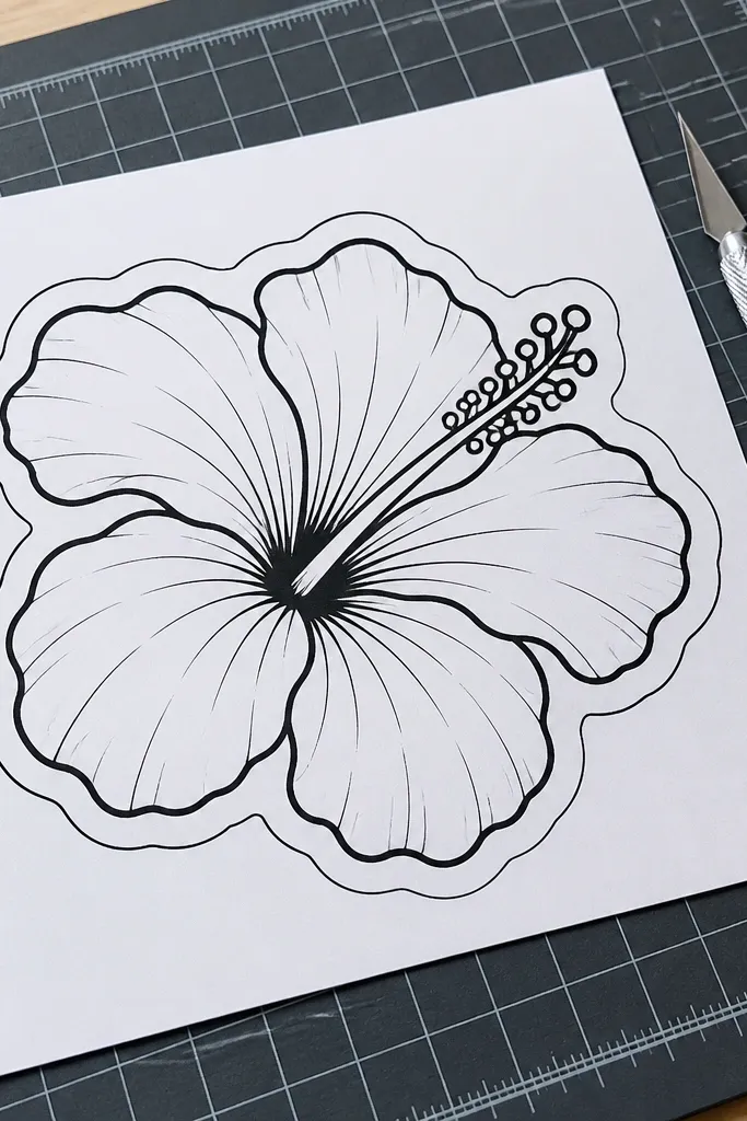
Sticker-style hibiscus drawings look great online because they read clearly against different backgrounds. The “die-cut” outline is the secret: you add a second contour line around the flower that follows the outer petal edges, creating a bold sticker boundary. Keep the interior simple with petal teardrops, a clean center stigma, and a few stamens. Color with one strong pink-red and a warm orange inner shading so the sticker pops. This is ideal for making a printable sticker sheet or a set of small art cards.
Draw the hibiscus petals and center in pencil, keeping petal notches visible. Ink the flower outlines, then draw a second outer contour line around the flower edges at a small distance (about 2-4 mm) to create the sticker border. Color petals pink-red, add warm orange to the inner half, and paint the stamens yellow-orange. Finish by adding a thin leaf and stem line that sits inside the sticker outline so it looks like one unit.
Keep the sticker border line consistent thickness. Uneven thickness makes it look hand-drawn in a messy way instead of sticker-clean.
Don’t let the sticker border overlap the petal notches. The notch should still look like a notch.



