
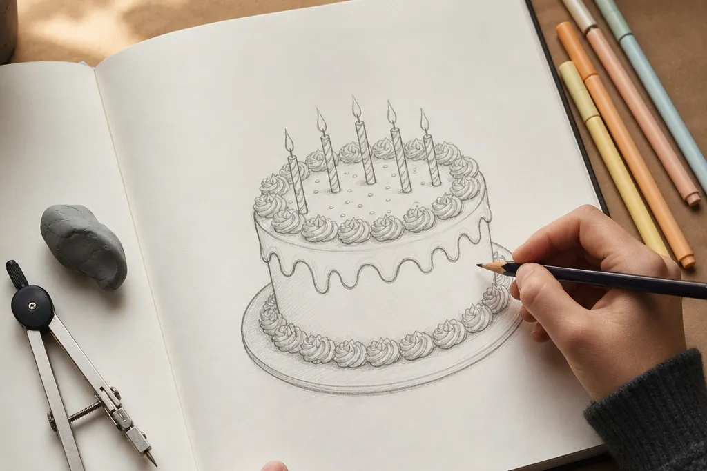
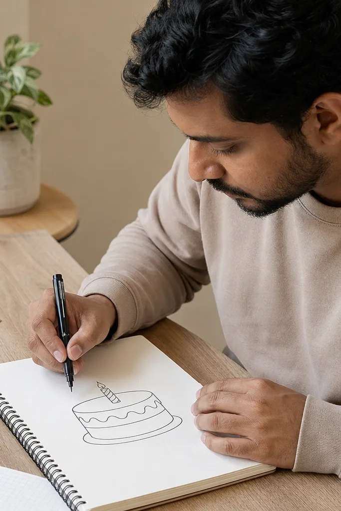
1. Two-Tier Cake with Wavy Frosting Rim
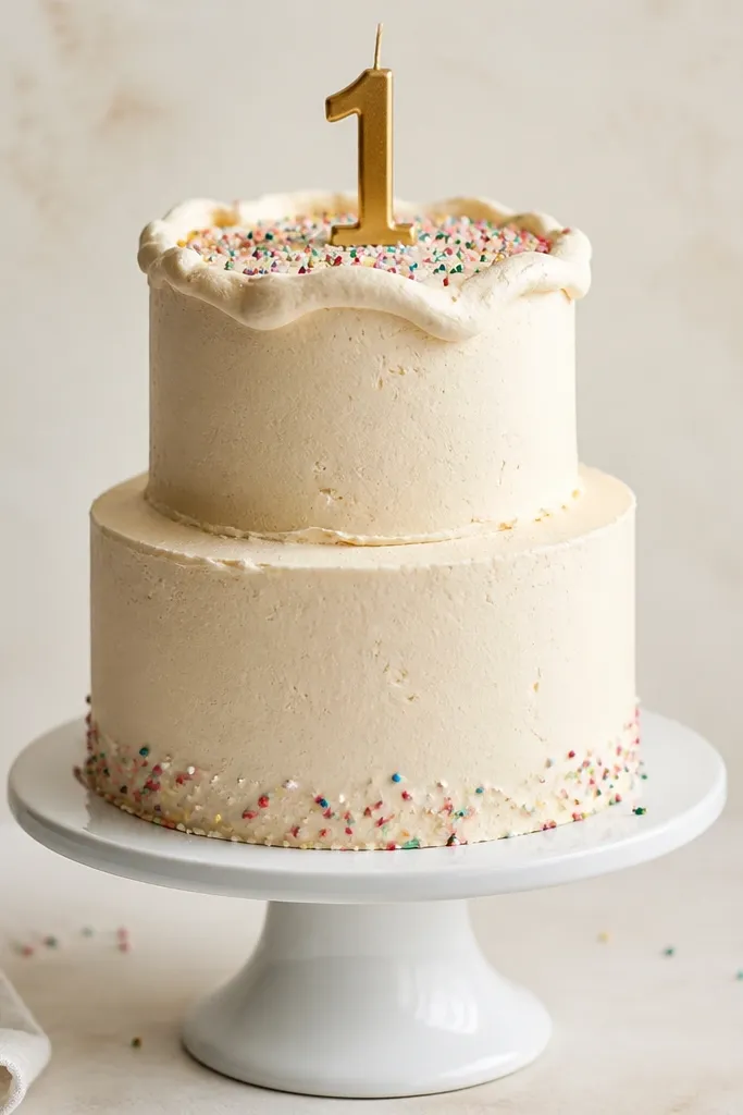
This is the most reliable “cake reads as cake” layout because two tiers give you clear height and a natural place for frosting texture. You draw the tiers as stacked rounded shapes, then build a frosting rim that looks slightly lumpy and soft. Keep the frosting rim uneven by using small waves, not a straight line. Add a handful of sprinkles across the top and you instantly get a birthday signal without overworking the page. This one suits quick cards, classroom art, and anyone who wants an aesthetic drawing without heavy coloring.
Pro tipUse a kneaded eraser and lift the construction lines instead of scrubbing — it keeps the frosting texture clean.
Start by sketching two stacked cylinders: the top tier is narrower and centered, the bottom tier is wider. Then draw a wavy line along the top tier’s edge and repeat it as the frosting thickness by adding a second wavy line inside. Add a simple base line for the cake stand and draw 10-20 sprinkles as short curved strokes pointing outward. Finally, darken the outer cake outline and gently erase construction lines so the frosting rim stays crisp.
AvoidDon’t make the frosting rim perfectly smooth; it kills the “soft frosting” look.
2. Single-Tier Cake with Center Swirl
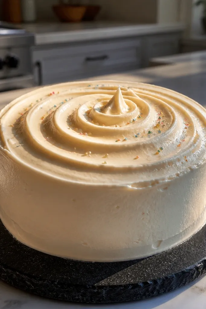
A single-tier cake is the easiest way to practice frosting texture without worrying about tier alignment. The center swirl gives you a clear focal point, so the drawing looks styled even with minimal decorations. Draw the swirl as a thick frosting mound with a spiral path, then add a few tiny dots around it to read as sprinkles or sugar pearls. This style is great for small pages, minimal greeting cards, and anyone who wants a clean, modern look.
Pro tipMake the swirl thicker at the outer edge — it reads as piped frosting.
Sketch one rounded cake tier with a slightly wider base and a flatter top. Draw a frosting swirl by starting near the center and spiraling outward with a thick line, then add a second line to show frosting thickness. Place 8-12 sprinkle dots around the swirl, keeping them mostly near the center so the composition stays balanced. Shade the lower right of the cake tier lightly with pencil, then darken the outline on the left and top edges.
AvoidSkip random shading on every side; pick one light direction and stick with it.
3. Chocolate Drip Cake with Rounded Drips
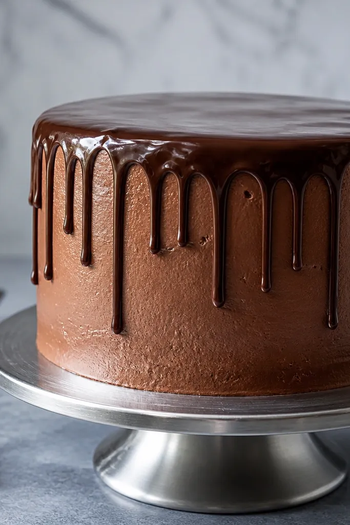
Chocolate drip frosting instantly makes a birthday cake look dramatic, and it’s surprisingly simple to draw if you treat drips as rounded sausages. The key is drawing drips with curved sides, not straight lines, so they look thick and glossy. Use a darker outline for the top edge and keep drips mostly vertical with a little wobble. Add a few bright sprinkles on top and the contrast makes the drawing pop. This one looks great in black-and-white pencil because the drip shape does the heavy lifting.
Draw a single tier or two tiers, then outline the top frosting edge as a smooth curve. From that top edge, sketch 7-10 drips as rounded shapes that widen near the top and taper near the bottom. Add a second line inside each drip to show thickness, then connect the drip bottoms to the frosting surface line. Shade around the drip areas on the lower right with light pencil so the drips feel dimensional.
Vary drip lengths by at least 1/2 inch (or roughly 1-2 cm) in your drawing so it doesn’t look like a pattern.
Don’t draw drips as identical lines; sameness makes it look like a stencil.
4. Buttercream Ruffles Cake with Vertical Texture
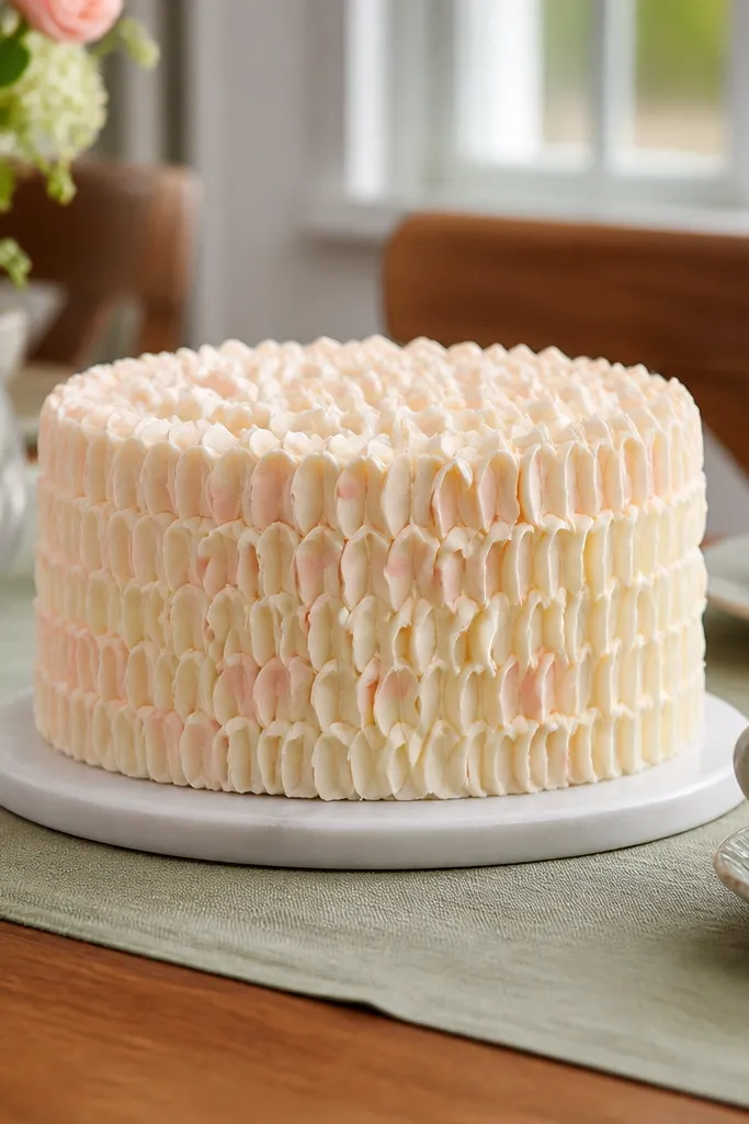
Ruffle frosting is pure texture, and texture makes drawings look finished even when you keep color minimal. This style looks best when you draw the ruffles as short, curved bands that follow the cake’s contour. You’ll get an aesthetic, fashion-illustration vibe without needing fancy tools. It’s also forgiving — if some ruffles aren’t perfectly spaced, it reads as hand-piped buttercream. Great for sketchbooks, printable birthday cards, and anyone who likes “pretty details” more than heavy shading.
Pro tipUse the side of your pencil for ruffle shading — it gives softer, buttercream-like edges.
Sketch your cake tiers as rounded rectangles with a slightly wider base. On the sides, draw vertical frosting bands: start at the top edge and curve each band outward or inward following the cake shape. Darken the ruffle edges on the left side, then leave the right side lighter for a simple light source. Add a clean piped top edge and a few sprinkles or a single ribbon bow shape on top.
AvoidDon’t cross ruffle lines over the cake outline; keep them inside the cake shape.
5. Fondant-Look Cake with Smooth Panels
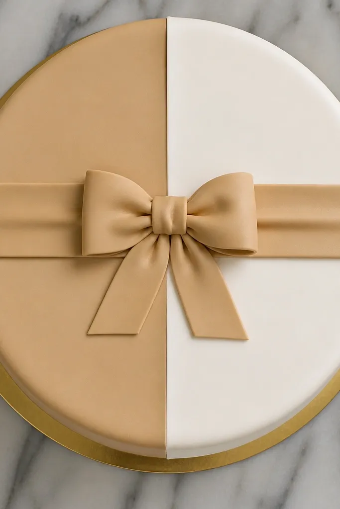
If you want a crisp, modern birthday cake drawing, fondant-style panels do it. Smooth frosting means your outline and panel lines need to be clean, which makes the drawing look intentional. Add a simple band across the middle and one small decoration like a bow or a star. This style is photogenic because it’s graphic — big shapes, minimal chaos. It suits ink pens, markers, and people who hate messy textures.
Pro tipUse a ruler for the middle band line so the graphic look stays sharp.
Draw two rounded tiers with clean outlines and a flat top surface for each tier. Add panel lines as gentle arcs that wrap around the sides, then draw a horizontal band across the middle tier. Shade only the lower right edge of each tier with light pressure, keeping the top surfaces mostly white. Finish by outlining the cake edges darker and adding one small top ornament centered.
AvoidDon’t add lots of sprinkles — smooth frosting panels need space to look clean.
6. Pastel Sprinkle Confetti Cake
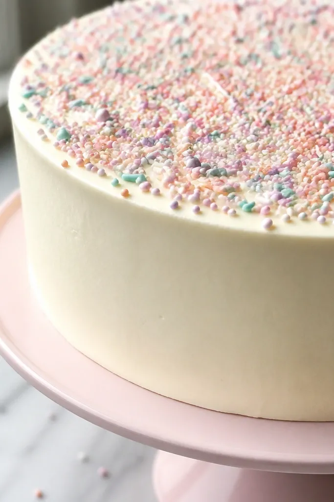
Confetti sprinkles make a cake feel celebratory fast. The trick is to draw sprinkles as different shapes — short lines, tiny dots, and small curved bits — so they don’t look like one repeated pattern. Use light shading under the frosting edge so the sprinkles sit on top instead of floating. This style is perfect for colored pencils or markers because the sprinkles become the color plan. It also works in black-and-white if you vary thickness and spacing.
Pro tipGroup sprinkles in 3 clusters across the top instead of scattering evenly — it looks designed.
Sketch a two-tier cake with a simple frosting edge and a flat top. Add sprinkles in layers: first place 20-30 main sprinkles as short strokes, then add smaller dots and curved bits in the gaps. Color the frosting lightly and keep sprinkles darker or brighter so they stand out. Shade the cake tiers on the lower right and keep the top highlights clean by leaving paper white.
AvoidDon’t outline every sprinkle with dark lines; too much ink makes the top messy.
7. Minimal Cake Icon with One Candle
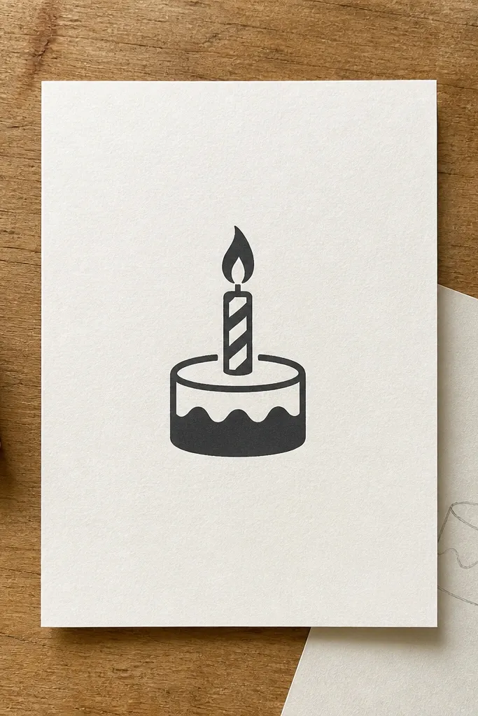
Minimal drawings look good because they’re bold. This style is built from simple shapes: a rounded cake base, a single frosting stripe, and one candle that anchors the composition. Add a small flame shape and a tiny flame flicker line — that’s all it needs. It’s fast, clean, and perfect for digital stickers or quick birthday notes. If your hands shake or your lines get messy, minimal style hides that and still looks cute.
Pro tipMake the candle taller than you think — it balances the cake and improves readability.
Draw a rounded rectangle for the cake base and a slightly narrower rounded top. Add a single frosting stripe across the top edge as a thick line. Place one candle centered on top with a rectangular body and a small wick line. Draw the flame as a teardrop with a thinner inner curve, then outline the cake and candle thicker than the construction lines.
AvoidDon’t add sprinkles around the whole cake; keep them off so the icon stays clean.
8. Candle Set with Wax Drips and Flames
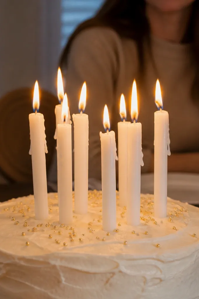
Candles are where birthday drawings become instantly recognizable. This design uses multiple candles with wax drips to add realism without drawing a complicated cake. Wax drips are easy: draw a few rounded drops on the candle sides and keep them thicker near the top. Flames look better when you draw a clear outer teardrop and a smaller inner flame line. This style is great for people who can draw cakes but struggle with the “party” part.
Start with a simple two-tier cake and a frosting top edge. Sketch 3-5 candles spaced evenly across the center, then add small wax drips as rounded blobs on each candle. Draw each flame as a teardrop with a thin inner curve and a short highlight line. Shade the candle bodies lightly on the lower right and darken the outline around flames and candle bases.
Use a consistent flame direction so the flames look like they’re lit from the same air current.
Don’t make flames symmetrical; slight variation makes them look alive.
9. Ribbon Bow Cake Topper
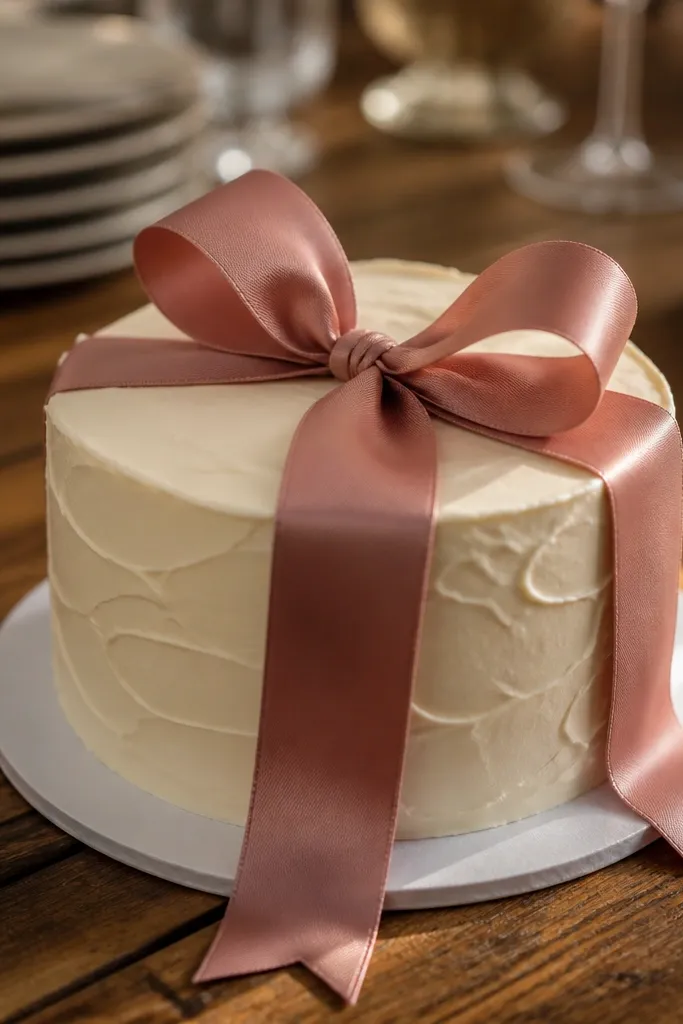
A ribbon bow gives you a strong top decoration that reads clearly in a sketch. It also gives you curves to practice: two bow loops, a knot in the center, and a ribbon tail that drapes over the frosting. Keep the bow lines clean and slightly thicker than frosting lines so it stands out. This style is photogenic because it adds a fashion-like element, not just sprinkles. It’s a good pick for drawing on smaller paper where details need to be bold.
Draw a single-tier cake with a smooth top frosting edge. Place two bow loops centered: each loop is a rounded teardrop shape that curves inward toward the knot. Add the knot as a small oval and connect it to two short ribbon tails that angle down onto the frosting. Shade only the lower edges of the bow loops and darken the cake outline for contrast.
Make the ribbon tails end in a slight point — it makes the bow look intentional.
Don’t shade the entire bow; keep highlights on the top edges so it looks like satin.
10. Signature Number Cake Slice Style
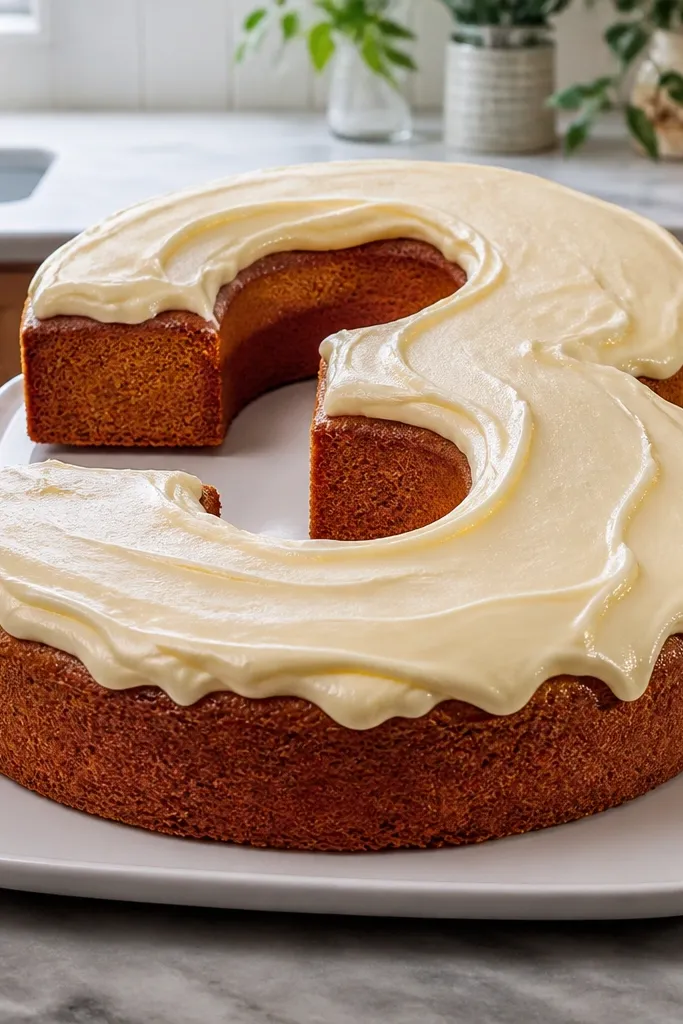
Number-style cakes look cool because they break the usual tier rules. Instead of drawing stacked circles, you draw a big numeral base, then wrap frosting around the edges. This is a great option for birthdays because it naturally personalizes the drawing. Keep the frosting edge wavy and thick so it looks like poured frosting on a flat shape. Add sprinkles only where the numeral has flat top sections so it stays readable.
Pick a number shape (like 1, 2, or 3) and sketch it in a bold rounded style. Draw a frosting border around the outer edge as a second offset line, leaving a small gap for frosting thickness. Add a top frosting surface line inside the numeral and create a few drips or a wavy rim only along the top edges. Shade the lower right side of the numeral and add 15-25 sprinkles on the top where there’s space.
Round all corners of the numeral; sharp corners make frosting look messy.
Don’t sprinkle everywhere; place sprinkles only on the top surface so they don’t blur the numeral.
11. Ombre Frosting Cake with Soft Pencil Bands
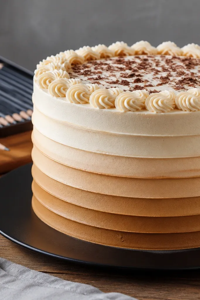
Ombre frosting looks fancy because shading does the work. You draw horizontal frosting bands on the sides, then blend lightly so it shifts from light to darker. This style is perfect for pencil because you can control the gradient with pressure and blending. It also makes the cake feel dimensional without heavy realism. If you want an aesthetic cake drawing that looks “designed,” this is one of the best routes.
Pro tipLeave tiny paper highlights between bands — that’s what makes the ombre look like frosting, not a smudge.
Sketch a two-tier cake with smooth outlines and a clean top frosting edge. Add 5-7 horizontal frosting bands across the sides, each band slightly curved to follow the cake shape. Shade the bands gradually: start with light pressure near the top and increase pressure toward the lower right. Use a blending stump or tissue to soften the gradient, then darken the cake’s outer outline.
AvoidDon’t blend too hard; you want smooth frosting, not a gray blur.
12. Marble Cake Top with Vein Lines
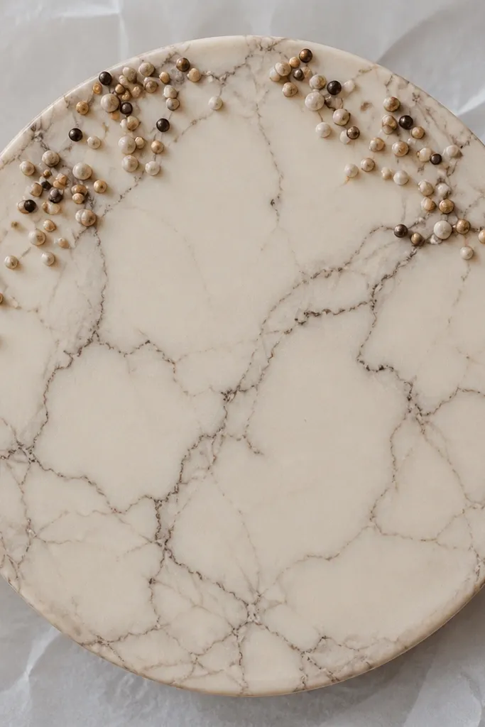
A marble top turns a simple cake into something visually interesting without adding lots of tiny objects. Draw the top frosting as a smooth shape, then add thin vein lines that branch and curve. Keep the veins light and varied in thickness so it looks organic. Add a few sprinkles near the edges of the top for contrast. This style is great for pencil and marker because the pattern is the decoration.
Pro tipUse a light hand for veins, then go back with a darker line only on 2-3 veins.
Draw a single-tier cake with a rounded top and a frosting thickness line. Shade the frosting top lightly, leaving white spots for highlights. Add marble veins by drawing 10-15 thin curved lines that branch, with some lines thicker and some faint. Outline the cake edges darker and place a small cluster of 8-12 sprinkles at the top edge.
AvoidDon’t draw veins as perfect parallel lines; marble needs irregular branching.
13. Frosting Rosettes Border Around the Top
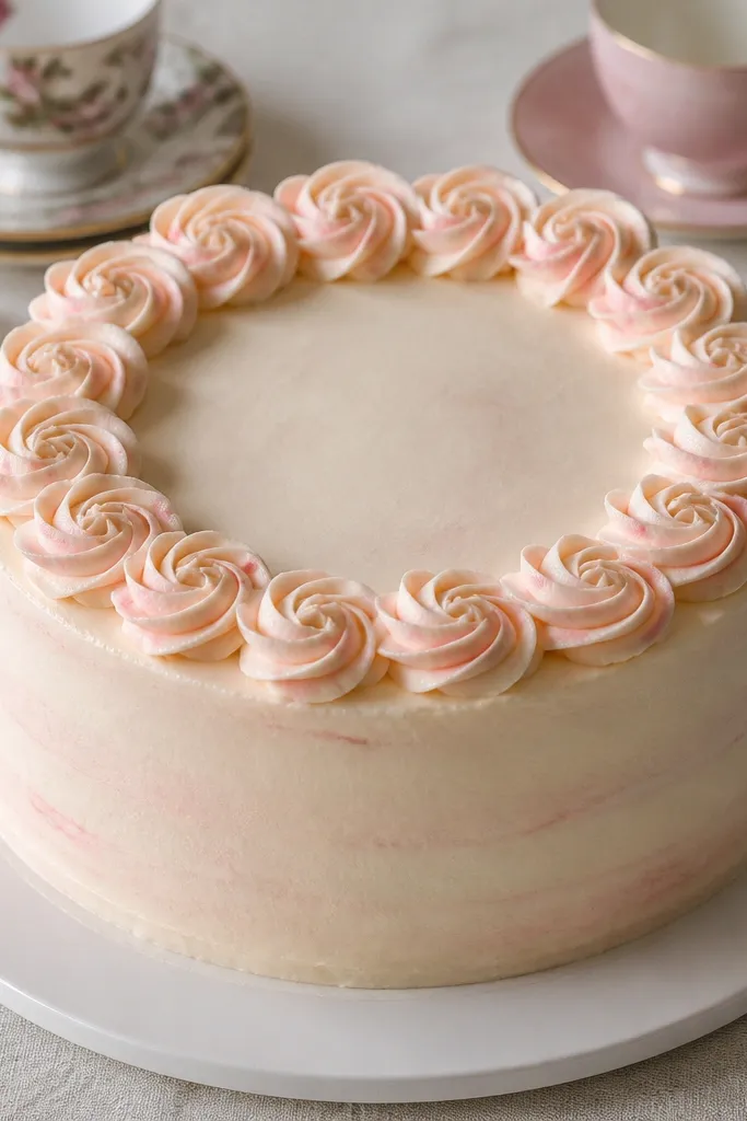
Rosettes are a clean way to add detail without clutter. You draw small swirl mounds around the top edge like tiny flowers, which makes the cake look bakery-made. The rosette border also frames the center, so even a plain cake looks styled. This works well in black-and-white line art because the rosettes create shape and rhythm. It’s a solid choice for people who want a “pretty but not busy” birthday cake.
Pro tipVary rosette sizes slightly — 2-3 smaller ones make the border look natural.
Sketch a two-tier cake with a thick frosting rim on the top tier. Along the top edge, draw rosettes as small circles with a spiral inside — each rosette is about the size of a pencil eraser mark. Space them evenly, then connect the rosette base to the frosting rim with a gentle curve. Add one centered decoration like a bow or a single star and darken the outer outline.
AvoidDon’t make every rosette identical; tiny variation is what keeps it from looking mechanical.
14. Cake with Texture Lines Using Crosshatch
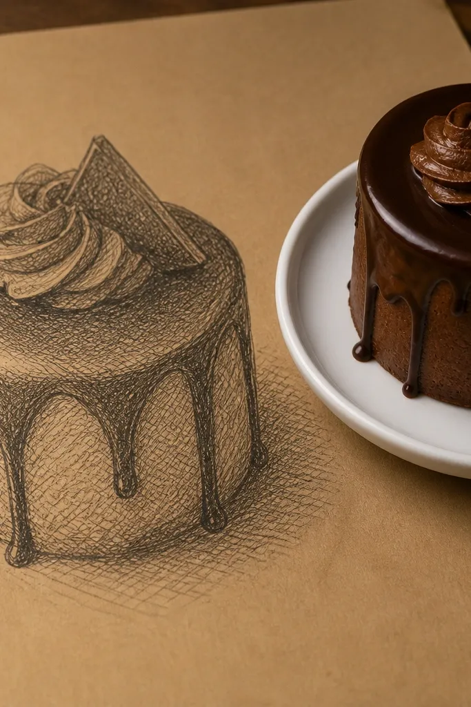
Crosshatch shading makes a sketch look finished even without color. This design uses crosshatch only in shadow zones — under the frosting rim, the lower right sides, and around drips if you add them. The result looks like thicker frosting and adds depth. It’s a great style for pencil-only art and for readers who want the cake to look dimensional without complicated gradients.
Pro tipStart with parallel lines first, then cross only the darkest strip under the frosting rim.
Draw a two-tier cake with a simple frosting rim and a clean outline. Decide your light direction and leave the upper left mostly white. Shade the lower right side using short parallel lines, then add a second set of lines crossing them to form crosshatch. Keep crosshatch denser near edges and lighter toward the center of each shadow area.
AvoidDon’t crosshatch everywhere; it should live in shadow zones or the cake turns flat.
15. Sugar Pearl Cake with Tiny Dots
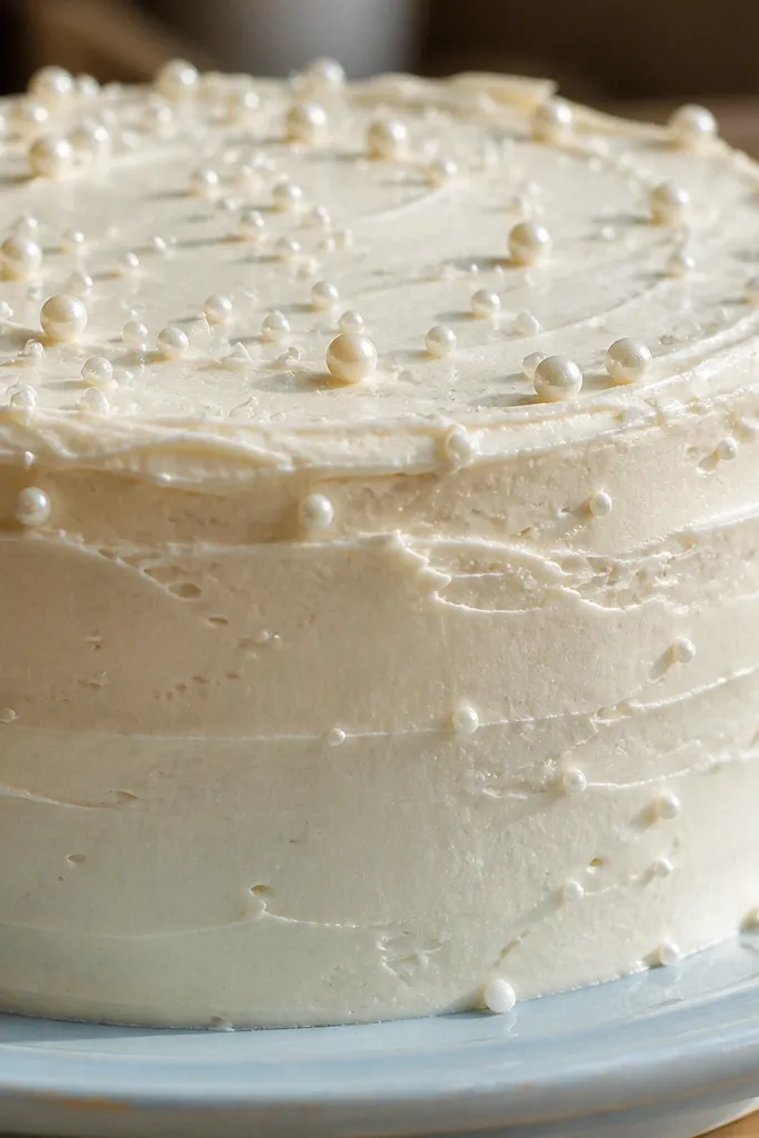
Pearl sprinkles look classy and cute because they’re simple circles with highlights. This style uses lots of tiny dots but keeps them organized so the top stays clean. Draw each pearl as a small circle with a tiny white highlight dot or short highlight line. Add a few pearls on the frosting rim and a couple near the bottom edge for balance. This is a good pick when you want an aesthetic cake that doesn’t require colored sprinkles.
Pro tipKeep pearl circles the same size, then vary only the spacing for a tidy look.
Sketch a single or two-tier cake with a thick frosting rim. Place pearls on the top surface by drawing circles in clusters of 5-8, leaving gaps between clusters. For each pearl, add a tiny highlight mark on one side of the circle. Shade the cake tiers lightly on the lower right, then outline the rim and top edges darker.
AvoidDon’t turn pearls into messy blobs; keep each one a separate circle.
16. Layered Wafer Cake with Pattern Strips
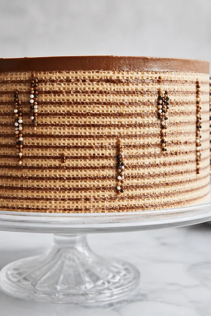
Wafer-pattern sides add a bakery feel because the eye reads layers and texture. You draw the cake tiers normally, then add repeating horizontal stripes or tiny rectangles around the sides. Keep the pattern aligned with the cake curve so it looks wrapped. Finish with a simple top frosting edge and a few vertical sprinkles to tie it together. This style is great for readers who like clean, graphic textures more than messy frosting.
Pro tipUse consistent spacing between stripes; uneven spacing makes the pattern look accidental.
Draw a two-tier cake with rounded sides and a frosting rim on top. Add a patterned band on the side by drawing 6-10 horizontal stripes, each stripe slightly curved to match the tier. Then add small notches or tiny rectangles on alternate stripes to create a wafer effect. Shade the lower right side lightly and darken the outer outline so the pattern stays readable.
AvoidDon’t add pattern on the frosting top — keep it only on the cake side.
17. Paper-Cut Look Cake with Bold Outline
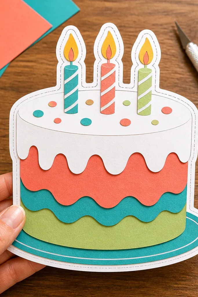
A bold outline with minimal shading gives that crisp paper-cut vibe. You draw thick outer lines, then add a second thin line offset inward to simulate a cut edge. This style is easy to replicate and looks great for thumbnails and social posts. It’s also forgiving if you’re not confident with realistic shading. Pair it with a simple topper like a single candle or a bow.
Pro tipIf lines wobble, re-trace once only; multiple passes thicken the cake unevenly.
Sketch the cake shape with light pencil, then trace the outer silhouette with a pen or darker pencil. Add an inner outline by offsetting the frosting rim line slightly inward, creating a cut-edge feel. Keep shading to one small shadow area on the lower right using a few short strokes. Add one topper and keep it simple: flame teardrop and candle body rectangle.
AvoidDon’t add heavy crosshatch shading; it clashes with the cut-paper look.
18. Colored Marker Birthday Cake with Hard Highlights
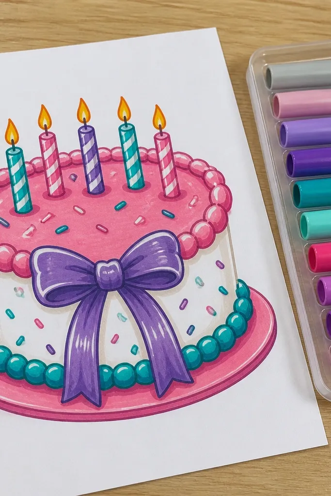
Marker coloring looks best when you leave deliberate white highlights. This cake style uses bold frosting color blocks, then adds darker outlines or shadow shading on one side. The frosting rim should stay slightly darker so it reads as thickness. Keep decorations limited — 20 sprinkles max, a few candles, and one bow or star. This is a strong aesthetic choice because it looks clean and “finished” quickly.
Pro tipUse the marker tip for edges and the side of the marker for filling — it prevents streaks.
Sketch the cake and decorations lightly, then outline with a dark marker. Color the frosting with a medium tone, leaving a thin white highlight strip on the upper left side of each tier. Add shadow tone on the lower right by coloring lightly and then going one more pass near the edge. Add sprinkles as small marker strokes in contrasting colors and keep candle flames bright with a lighter inner line.
AvoidDon’t fully fill every area; white highlight gaps make it look glossy frosting.
19. Sprinkle Cascade Down the Side
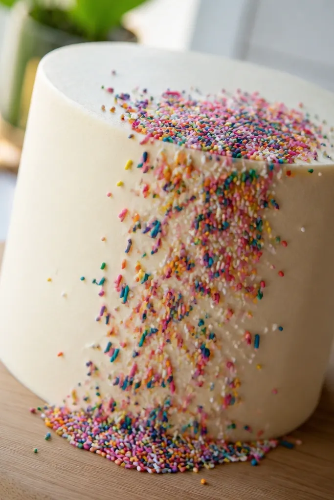
A sprinkle cascade gives motion to the drawing, which is what makes it feel like a real birthday moment. Instead of sprinkling the top evenly, you draw a cluster at the top edge and let the sprinkles spill down. This guides the viewer’s eye and makes the cake look dynamic. The trick is to draw sprinkles as short strokes that start at the rim and lean outward or downward. It still looks good in pencil because the direction of the strokes sells the effect.
Pro tipAngle sprinkles so they all point away from the rim — it looks intentional instead of random.
Draw a two-tier cake with a wavy frosting rim on the top tier. At one side of the top edge, place 10-15 sprinkles as short strokes radiating downward, then add a second layer of 8-12 shorter strokes that stop mid-side. Add a few larger sprinkles near the rim to make the cascade feel thicker. Shade the lower right side lightly and darken the cake outline for clarity.
AvoidDon’t scatter the cascade across the whole cake; one side is enough for the motion.
20. Cake Stand Base with Soft Plate Shadow
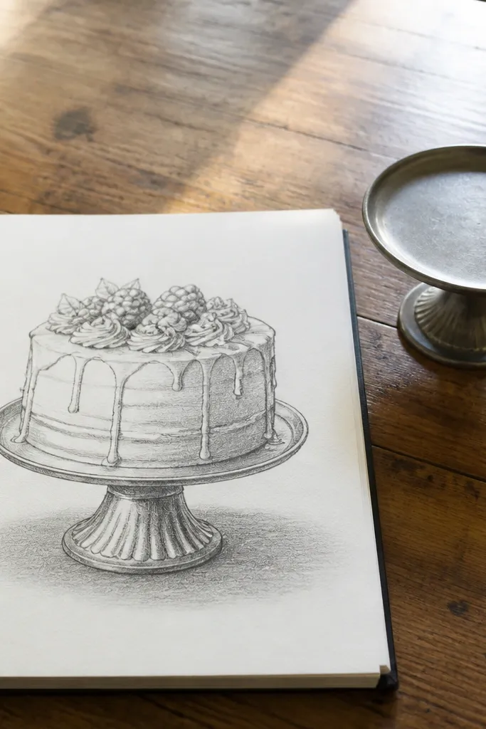
A cake drawing looks more believable when it has a ground contact point. This design adds a simple cake stand and a soft shadow under the plate, so the cake stops floating in the page. The cake itself can stay simple; the stand and shadow do the aesthetic work. This is a great choice for beginners because it’s one of the fastest ways to improve “readability.” It also makes your drawing look more polished for cards and posters.
Pro tipKeep the shadow edge softer than the stand outline; sharp shadows make it look cut out.
Sketch your cake tiers and keep the bottom frosting edge clean. Add a plate or stand: draw a wide oval under the cake with a slightly thicker rim line. Then draw a soft shadow as a faint oval beneath the plate, leaving a highlight gap at the top of the shadow. Shade the cake’s lower sides slightly to connect it to the stand, then darken the stand rim.
AvoidDon’t draw a shadow directly under the center only; use an oval to match the plate shape.
21. Birthday Banner Across the Cake Top
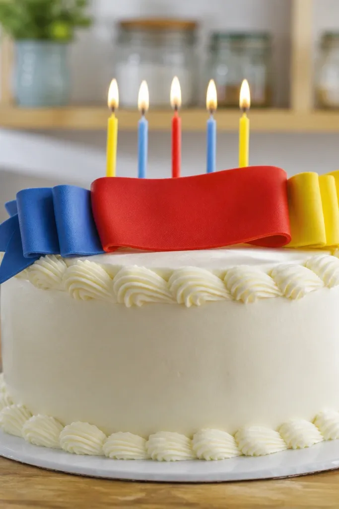
A banner transforms a cake sketch into a celebration scene. You draw a ribbon strip that wraps across the top tier, then add small folds and tails so it looks like fabric. Keep the banner lettering simple shapes if you can’t freehand text cleanly — letters can be implied with blocks and curves. The banner also creates a natural horizontal composition line, which makes the cake look balanced. This is ideal for greeting card drawings and for anyone who wants a strong theme without heavy coloring.
Pro tipMake the banner slightly wider than the top tier so it feels anchored, not pasted on.
Sketch a two-tier cake with a top frosting rim. Draw a ribbon banner across the top: a curved strip with a slightly thicker edge and small fold lines. Add 2-3 small flag ends or tails that drape down onto the frosting. Shade the ribbon folds on the lower right and outline the banner edges darker than the cake frosting.
AvoidDon’t clutter the banner with tiny details; keep folds minimal and readable.
22. Glitter Look Cake with Tiny Star Confetti
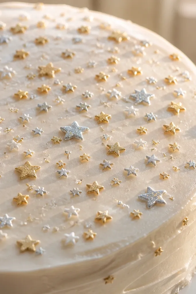
Star confetti looks like glitter without needing metallic ink. You draw small 4- or 5-point stars on top and let a few sparkle marks float near them. Keep the cake frosting simple so the stars remain the hero. This style is photogenic because stars catch the eye even in black-and-white sketches. It’s also a nice option if you want something different from round sprinkles but still easy to draw.
Pro tipVary star size by 2-3 sizes only; too many sizes looks messy.
Sketch your cake tiers and a thick top frosting edge. Add star confetti by drawing 15-25 tiny stars in clusters across the top surface. For each star, add a tiny highlight dot near one point, then lightly shade the cake tier under the frosting rim. Darken the outer cake outline and add 3-5 small sparkle marks (short star-like crosses) near the densest star cluster.
AvoidDon’t draw stars with perfectly even spacing; let clusters form naturally.
23. Cake with Chocolate Shavings on Top
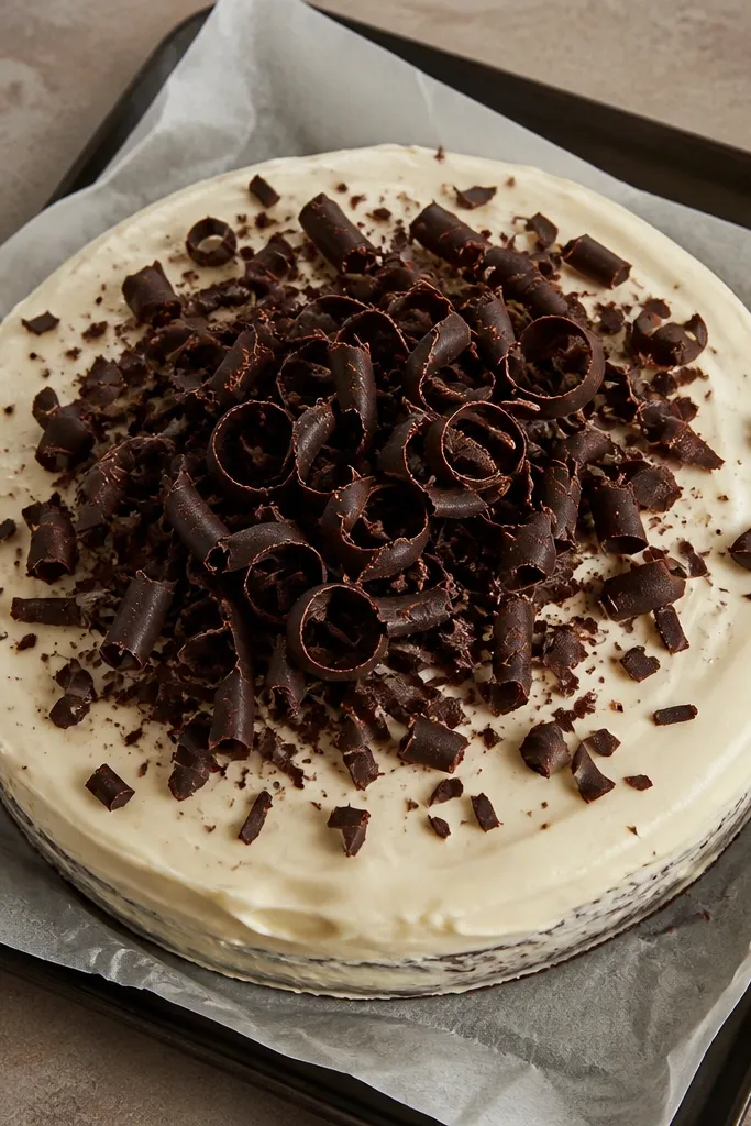
Chocolate shavings add texture that looks good even when you keep the rest of the cake simple. Draw shavings as short curled ribbons with curved edges, and pile them near the center or slightly off-center. The curls create highlights and shadows naturally, so you don’t need heavy shading. This style is great for realistic pencil drawings and for anyone who likes texture that doesn’t require color.
Sketch a two-tier cake with a smooth top surface. Outline a frosting mound in the center and then add shavings: draw 20-25 short curved strips that curl at the ends. Shade the undersides of the curls lightly to create depth, leaving highlights on the top edges of each shaving. Finish by darkening the cake outline and adding a few tiny dots around the shavings for sparkle sprinkles.
Keep shavings mostly in the same direction so the pile looks intentionally arranged.
Don’t make shavings too thick; they should look like thin curls, not ropes.
24. Birthday Cake with Heart Sprinkle Border
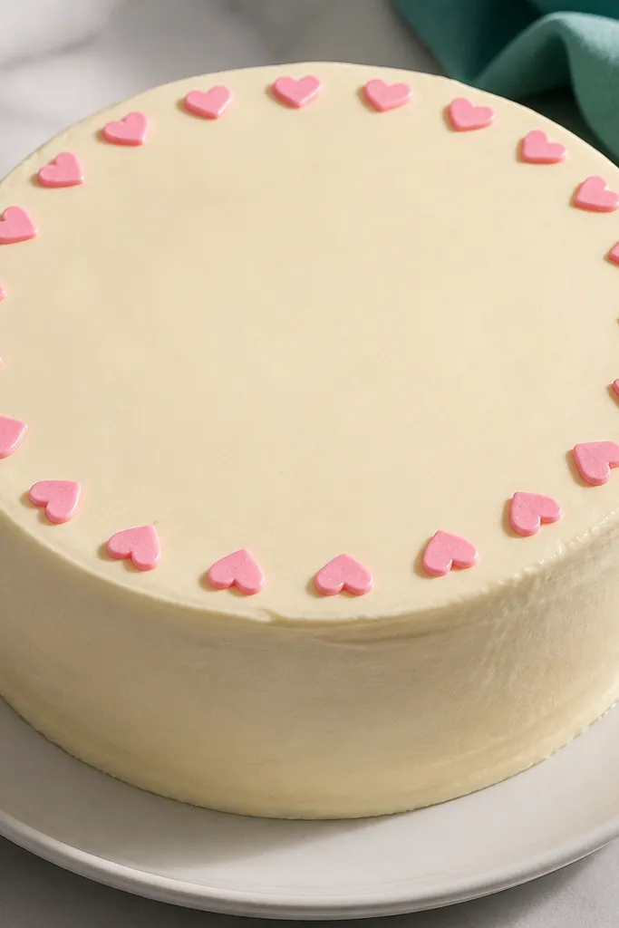
Hearts make birthday cakes feel sweet and personal, and a border keeps the design neat. Draw hearts slightly tilted and spaced so they form a rhythm around the top rim. The hearts act like a frame, so you don’t need lots of extra decorations. This style looks cute in pencil, marker, or colored pencil because hearts are readable at small sizes. It’s a strong choice for anniversaries and kids' birthdays too.
Pro tipMake every heart the same height, then vary only the tilt angle.
Draw a two-tier cake with a thick top frosting rim. Along the rim, draw 20-25 tiny hearts: each heart is a simple V curve with two rounded lobes meeting at a point. Add a small dot highlight inside a few hearts to suggest sugar shine. Shade the cake tiers lightly on the lower right and darken the outer outline for contrast.
AvoidDon’t add hearts on the entire top surface; a border looks cleaner.
25. Frosting Shells Cake with Shell Pattern
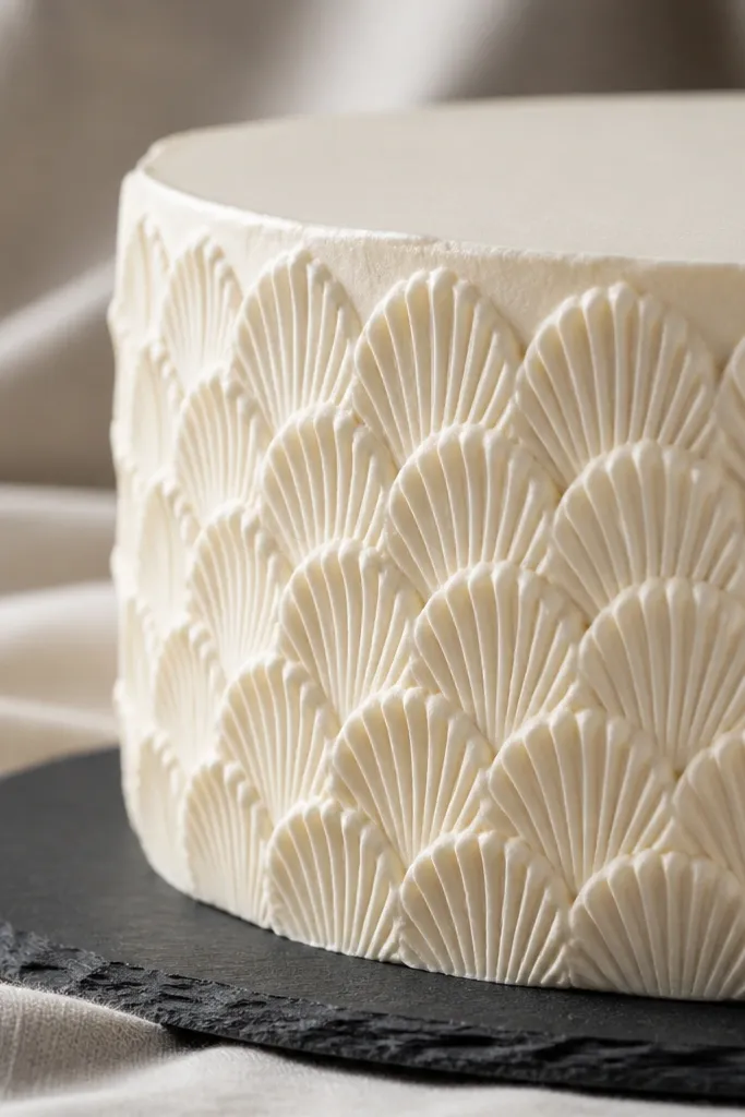
Shell patterns look bakery-pretty because they repeat in a structured way. You draw small scallop-like shapes around the side of the cake, and it instantly turns a basic tier into a decorative piece. This style is photogenic because the pattern catches light and creates texture without needing color. It also helps beginners because the pattern gives your hand a guide for consistent drawing.
Pro tipUse a light pencil for the pattern, then darken only a few shell edges so it doesn’t look over-inked.
Sketch a two-tier cake with a clean outline. On the sides of the bottom tier, draw scallop shells: curved U shapes that stack in rows, each one touching the next. Leave the top frosting edge smooth and separate from the shell pattern. Shade the lower right edge of each shell with light strokes, then outline the cake silhouette darker.
AvoidDon’t extend the shell pattern onto the frosting top; it should stay crisp and simple.



