
1. Wide-Gap Construction Shark Head Wedge
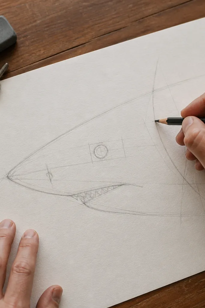
Start with a head wedge that’s wider at the front than you think. Draw it as a tapered triangle that flattens slightly near the mouth, so the snout doesn’t look pointy like a dolphin. Keep the construction lines light because you’ll reuse them when you place the eye and gill line. This step makes the whole shark look anatomically believable before you add any shading. If your head feels right, the rest of the body proportions fall into place faster.
1) Sketch a horizontal centerline, then block a wedge head that’s about 1/4 of your shark’s total length. 2) Add a short vertical tick where the eye will sit — roughly one third back from the snout tip. 3) Lightly mark the mouth corner with a small dot on the lower edge of the wedge. 4) Keep the jaw line as a gentle curve, not a straight line.
Pro tipUse a kneaded eraser to pull the wedge outline thinner — it keeps the head from looking heavy later.
AvoidDon’t lock the snout into a single outline before you place the eye and mouth corners.
2. Body Taper Ladder for a Realistic Torpedo Shape
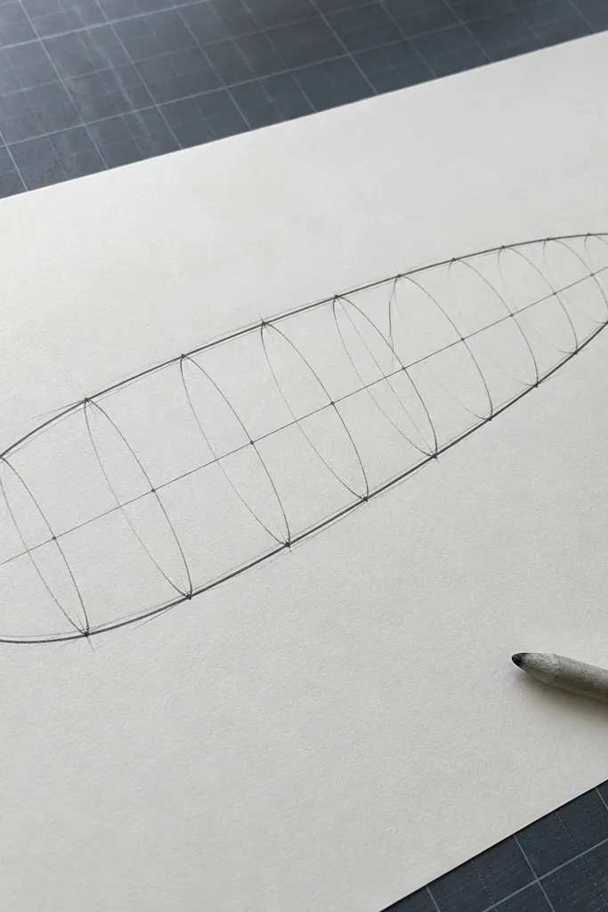
A realistic shark body is a taper, not a cylinder. This step gives you a torpedo silhouette by using a ladder of widths along the centerline, so your shark doesn’t balloon at the midsection. Draw the top and bottom body edges with small width checks, then connect them with smooth curves. The result looks fast and streamlined, even if the shading is simple at first. This is the step that makes your shark read as a living animal instead of a fish-shaped blob.
1) From the head wedge base, draw a centerline and mark 5 points down the body length at equal spacing. 2) At each point, sketch the half-width: slightly thicker near the gill area, then gradually narrowing toward the tail. 3) Connect top points and bottom points with two smooth curves. 4) Lightly extend the taper into the tail section so it doesn’t suddenly change shape.
If your curves wobble, draw them in two passes: one light guide curve, then a firmer line over it.
Don’t make the mid-body the same thickness as the head — sharks narrow as they approach the fins.
3. Tail Base Hook and Upper-Lower Fin Planes
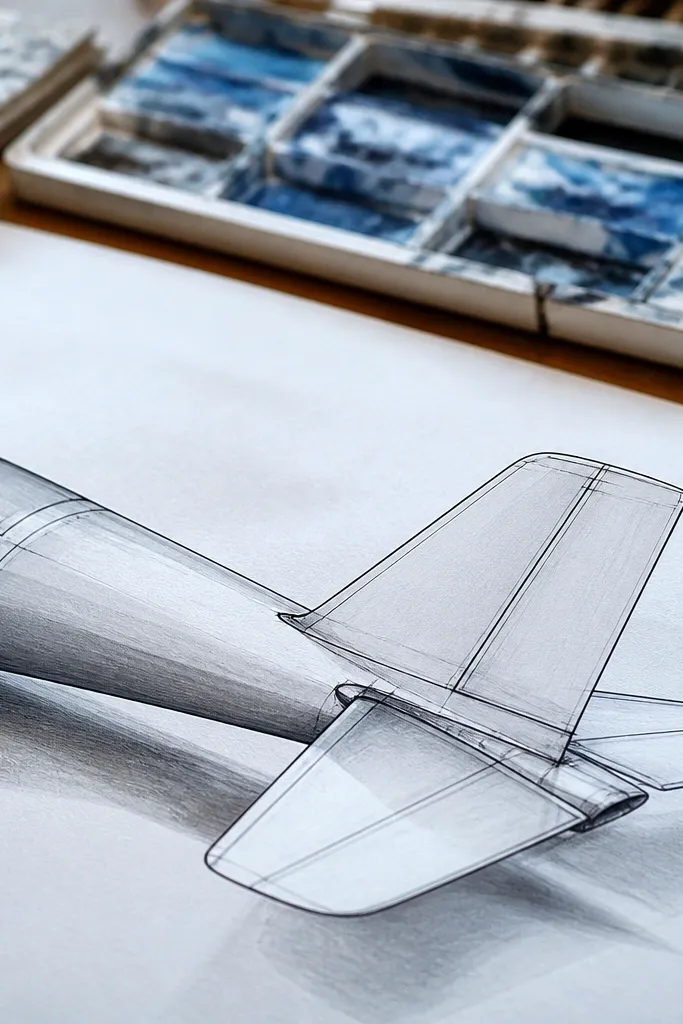
Real sharks have a tail base that sits like a hinge, not a simple triangle attached to the body. This step sets the tail base with a hook-like transition and separates the upper and lower tail planes. When those planes are placed correctly, the tail looks like it has volume and direction. You’ll shade more easily because you know where the underside shadow starts. Even a minimal shark drawing looks sharper once the tail structure is correct.
1) At the last body width mark, draw a small curved hook where the tail begins, following the taper. 2) Sketch two slightly different angles for upper and lower tail fin planes so the tail isn’t perfectly symmetrical. 3) Add a short center notch line where the tail fork will appear. 4) Keep these lines light; they are guides for the final tail outline.
Pro tipUse a ruler for the tail base angle only. Then freehand the fin edges so they look organic.
AvoidDon’t attach the tail tip directly to the body outline without a base transition.
4. Pectoral Fin Oval With a Tilted Leading Edge
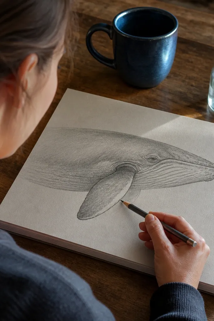
The pectoral fin is a simple shape that sells realism when it’s tilted correctly. Draw it as an oval with a slightly sharper leading edge, because the front of the fin meets water first. This guide prevents the common problem where fins look like flat paper cutouts. Once the fin plane is set, you can shade one side darker and keep the other side lighter. That small value difference makes the fin feel like it’s moving through water.
1) Place the fin about halfway down the body length, slightly behind the gill region. 2) Draw an oval that tilts back, with the leading edge on the forward side. 3) Add a short spine line through the oval to show fin thickness. 4) Connect the fin base to the body using a gentle curve, not a sharp corner.
Keep the fin outline darker than the construction lines, but don’t press hard yet.
Don’t draw the fin as a perfect circle or a flat triangle.
5. Dorsal Fin Triangle That Sits on the Spine
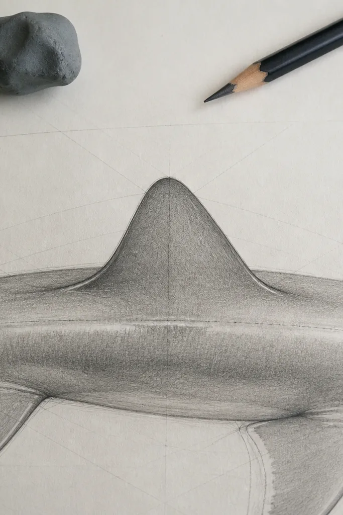
The dorsal fin anchors the shark’s silhouette. This step places it where it naturally sits on the spine line so the top contour looks right. Draw it as a triangle with rounded corners, then soften the base so it blends into the body. When the dorsal fin sits correctly, the entire drawing reads as a single silhouette from across the room. You’ll also get better shading because the fin creates a natural shadow wedge on the body.
1) Mark the dorsal fin position slightly forward of the body’s midpoint. 2) Sketch a triangle with a rounded tip and a base that matches the body’s width at that point. 3) Add a short line from the base toward the tip to guide the fin’s interior planes. 4) Blend the fin base into the body curve with a smooth connector line.
Pro tipErase the sharpest construction points at the fin base so it looks like it grows from the skin, not glued on.
AvoidDon’t place the dorsal fin too far back — it ruins the shark’s balance and silhouette.
6. Second Fin and Pelvic Fin Placement Marks
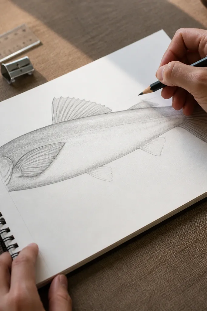
Most beginners draw only the dorsal and pectoral fins. That makes the shark look incomplete. This step adds the smaller fin forms with placement marks, so the belly isn’t empty. You don’t need heavy detail here — just correct anatomy spacing. Once those fin positions are right, you can shade around them and the shark looks finished. It’s a quick realism upgrade because your viewer’s brain reads the missing anatomy instantly.
1) On the lower side of the body, mark a fin placement point slightly behind the pectoral fin area. 2) Draw a small rounded fin shape using a curved capsule outline. 3) Add a second tiny fin guide if you’re using a reference that shows it, but keep it lighter than the dorsal and pectoral. 4) Connect each fin base to the body with short curves, then erase extra guide lines.
Pro tipUse softer pencil pressure on these smaller fins so they don’t steal attention from the head and dorsal fin.
AvoidDon’t make the pelvic fin the same size as the pectoral fin.
7. Eye Placement With Eyelid Ridge and Corner Shadow
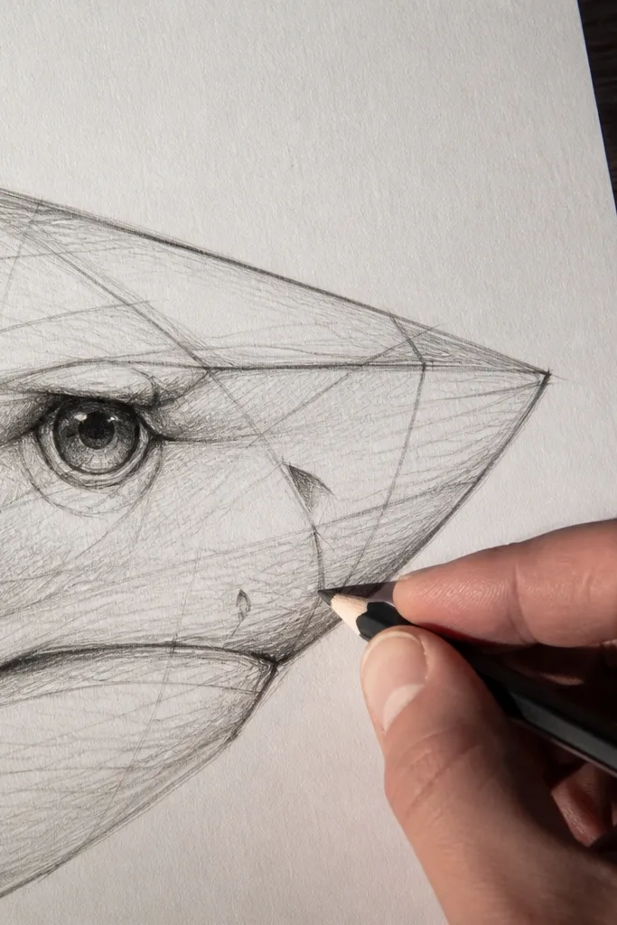
A shark’s eye is small, but it’s one of the fastest ways to make the drawing look real. This step places the eye correctly relative to the snout wedge and sets a subtle ridge above the eye. That ridge creates a corner shadow that gives the eye depth. You’ll also control the gaze by aligning the eye with the head centerline. When the eye sits right, even rough shading looks believable.
1) Use your earlier eye tick and lightly draw an almond-shaped eye. 2) Add a thin eyelid ridge above the eye — a short curved line that follows the head wedge. 3) Shade a small triangular corner under the eyelid ridge with a 4B pencil. 4) Keep the pupil and highlight tiny; too big makes it look cartoony.
Pro tipLeave one clean highlight spot unshaded. It sells the wet surface instantly.
AvoidDon’t center the eye too far forward — it makes the snout look wrong.
8. Gill Line as a Soft S-Curve, Not a Spiky Row
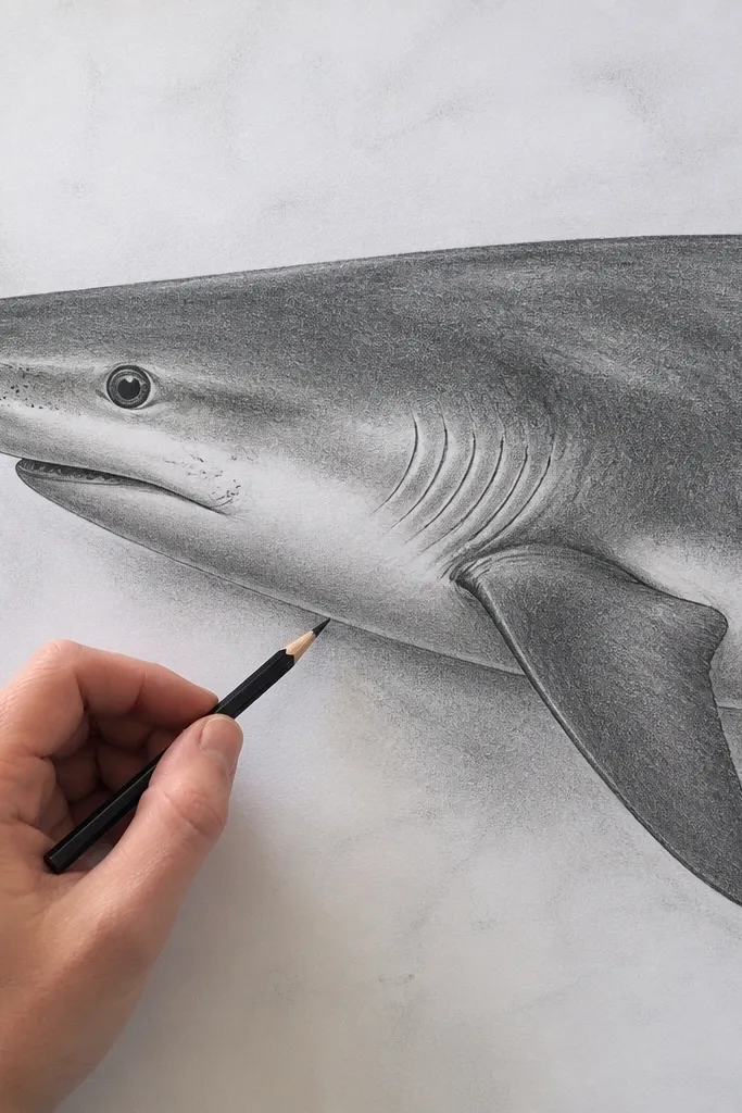
Gill lines are not a barcode. A realistic shark shows gill openings as a soft S-curve that fades into the body. This step teaches you to draw fewer, cleaner marks with consistent spacing. Then you add value underneath to make the gill area recede. That combination — clean line plus shadow underneath — makes the gills read as anatomy, not decoration. It also helps you place the underside shadow band correctly.
1) Starting near the lower side of the head wedge, draw an S-curve line following the body contour. 2) Add 3 to 5 short curved gill lines branching from that S-curve, each lighter than the last. 3) Shade a soft shadow band beneath the gill region using a midtone pencil (HB or 2B). 4) Blend lightly with a stump so the gill shadows don’t look like separate stickers.
Keep gill lines thinner on the front and slightly thicker toward the back so they feel layered.
Don’t draw lots of tiny spikes across the whole side of the head.
9. Mouth Corner and Lower Jaw Curve
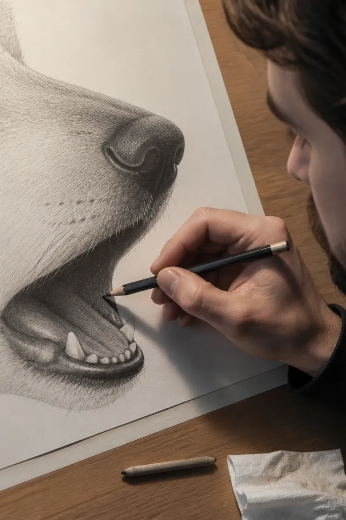
The mouth area is where a shark becomes unmistakably a shark. This step builds the mouth corner and lower jaw curve so the snout doesn’t look like a rounded muzzle. Shade the mouth interior darker than the surrounding snout so the opening reads as a cavity. You’re not drawing teeth for realism in this step — you’re creating a believable opening. Once that cavity is there, later shading and line work make sense.
1) Connect your mouth corner dot to the lower snout edge with a gentle curve. 2) Draw an upper mouth line that meets the lower curve at the corner, forming a narrow opening. 3) Shade inside the mouth interior with 4B to 6B, leaving the outer lip lines lighter. 4) Add a tiny dark line where the jaw meets the snout to define the cavity edge.
Use the side of your pencil for the mouth interior so it fills smoothly without harsh texture.
Don’t outline the entire mouth with a heavy line — it kills the sense of depth.
10. Nasal Flap and Snout Ridge for a Wet Look
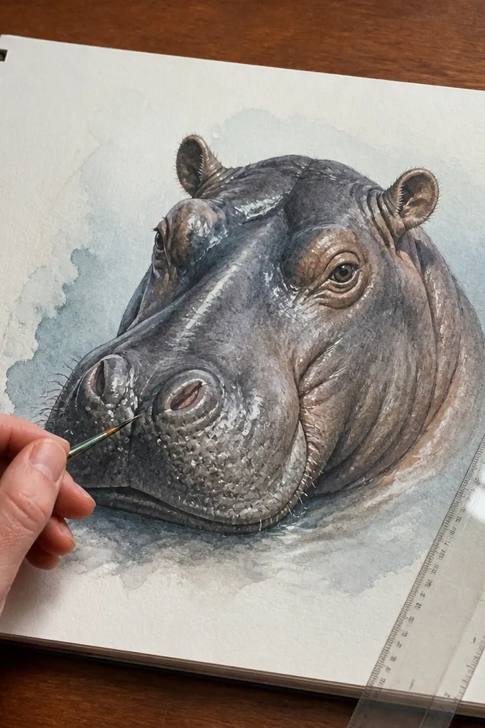
A realistic shark snout has subtle ridges that catch light and create form. This step adds a nasal flap shape and a snout ridge line so the snout isn’t just a flat wedge. The ridge gives you a clean highlight edge and a shadow edge. That’s what makes the head look like skin with thickness. Even if your body shading is basic, good snout form makes the drawing look finished.
1) On the lower front of the snout wedge, sketch a small curved flap shape using a light oval or comma curve. 2) Add one ridge line that runs from near the flap toward the eye area. 3) Shade under the ridge lightly with HB or 2B, then blend softly. 4) Leave one narrow highlight strip along the ridge by erasing lightly with a kneaded eraser.
Pro tipIf your highlight disappears, press less on the ridge line and lift instead of blending harder.
AvoidDon’t add too many lines on the snout — one ridge and one flap read better.
11. Value Map: Dark Side Band and Light Belly Strip
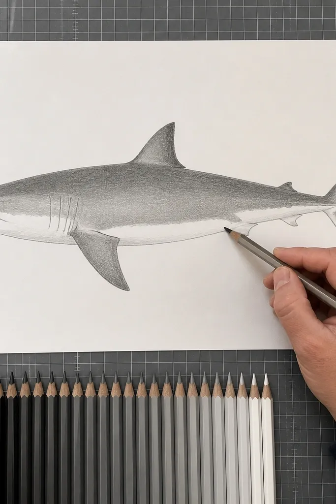
This is the realism engine. You set a dark side band on the upper body and a lighter belly strip so the shark looks three-dimensional. Sharks have countershading — darker on top, lighter underneath — and your drawing needs that exact contrast pattern. This step gives you a clear value plan before you add texture. If you skip it, the shark looks flat even with good linework.
1) Lightly shade a midtone band across the upper sides of the body, leaving the belly area untouched. 2) Strengthen the upper band with darker pencil (4B) and keep the belly as a light gray. 3) Leave a clean highlight path along the side where light hits, then blend edges softly. 4) Use a kneaded eraser to carve out the belly strip if it gets too dark.
Use fewer pencil strokes and more blending. Big smooth value shapes beat tiny scribbles.
Don’t shade the belly to the same darkness as the back.
12. Fin Edge Darkness Hierarchy for Shape Clarity
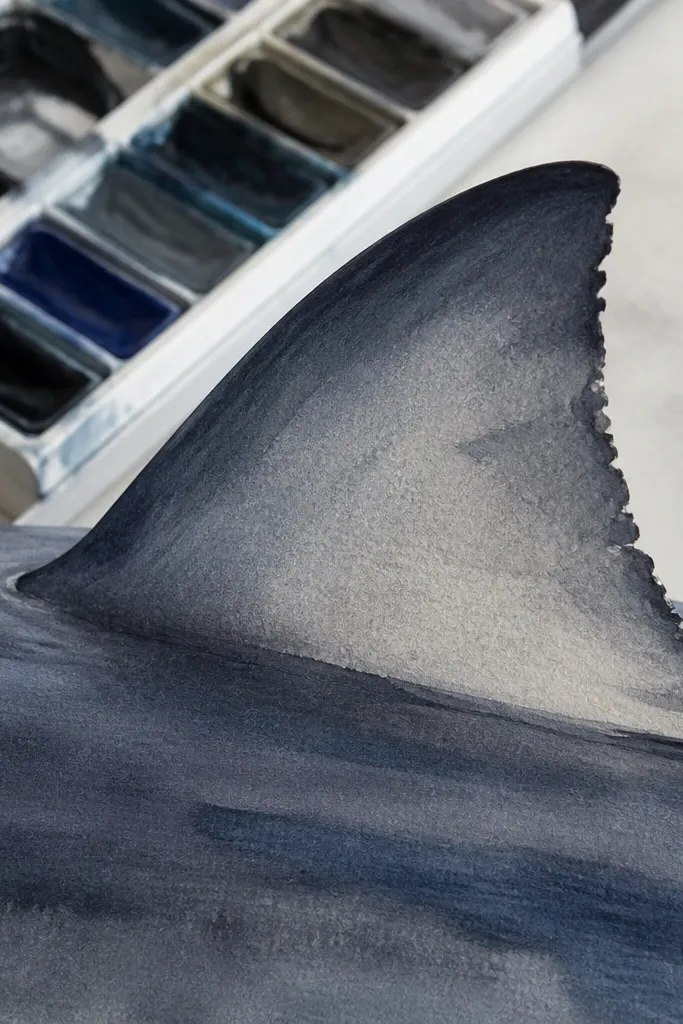
Fins look real when their edges have a hierarchy: darker rim, lighter center planes, and small shadow pockets near the base. This step teaches you to shade fin edges first so the viewer reads the fin shape instantly. It also prevents the fin from blending into the body like a smudge. You’ll use a darker pencil at the rim and a lighter one inside the fin plane. That contrast makes the fin feel like it has thickness.
1) Choose 4B for fin rims and 2B for interior planes. 2) Shade along the leading edge and outer rim of the dorsal fin, keeping the center lighter. 3) Add a small darker pocket at the fin base where it meets the body. 4) Repeat on the pectoral fin with the same approach: rim dark, center lighter, base pocket shaded.
Use the pencil edge, not the tip, for rim shading so the line stays smooth.
Don’t outline every fin with a single dark contour line — shade edges, not just outlines.
13. Gently Blended Body Gradients With Harder Edge Lines
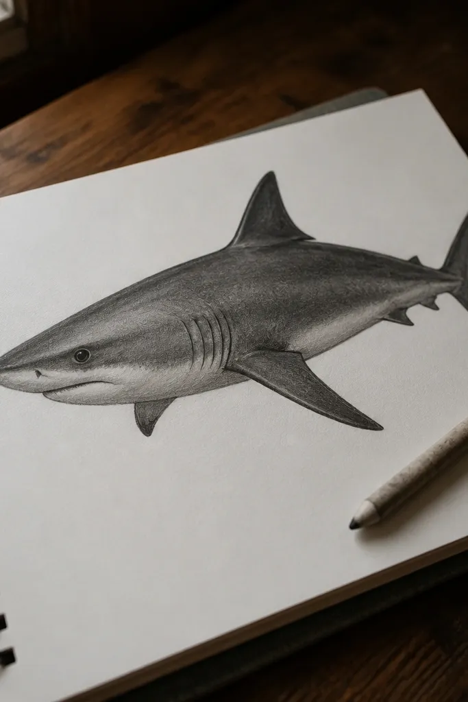
Sharks have smooth shading transitions on the body, but they still have clear boundaries. This step blends your midtones on the side band while keeping the top contour and major fin boundaries slightly harder. That contrast between soft and sharp edges is what makes realism pop. If everything is blended, it turns mushy. If everything is outlined, it turns graphic. This step balances the two.
1) Blend the side band with a stump using light circular motions, stopping before the belly strip. 2) Re-draw the top silhouette contour (the upper curve) with a softer line using HB or 2B. 3) Keep fin boundaries firmer by darkening just the outer edge with 4B. 4) Re-check the belly strip — lift any accidental darkening with kneaded eraser.
Pro tipStop blending while you still see pencil direction. That texture helps the skin look alive.
AvoidDon’t over-blend everything into one flat gray.
14. Scale Pattern as Micro-Texture, Not Spotty Dots
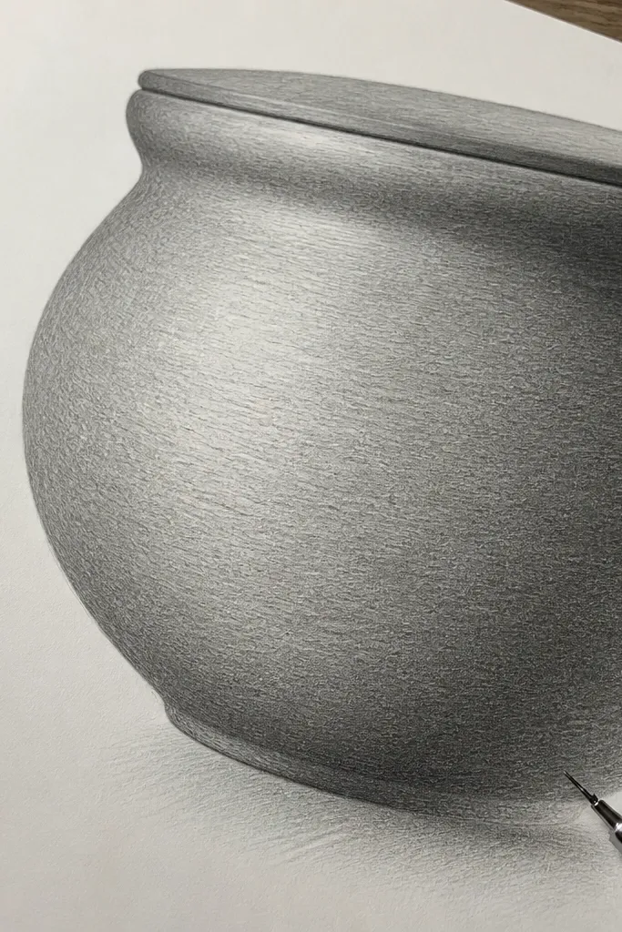
You don’t need to draw individual scales. You need a micro-texture that catches light differently across the side band. This step uses short, directional strokes that follow the body curve, so the texture looks like skin. It stays subtle enough that your values still lead the realism. Done right, the shark looks like it has a natural pattern without turning into a speckled mess.
1) Pick a midtone area on the side band and lightly map a direction — strokes should angle slightly backward toward the tail. 2) Use a 2B pencil to add tiny repeating marks, each short and consistent in length. 3) Keep the belly strip smoother — only add texture on the darker side band. 4) Blend lightly over the texture with a stump if it looks too harsh, then re-darken a few marks to keep the pattern readable.
Use consistent stroke length. Texture is about rhythm, not quantity.
Don’t fill the whole body with heavy dots — that kills the skin sheen.
15. Under-Jaw Shadow and Neck Fold Line
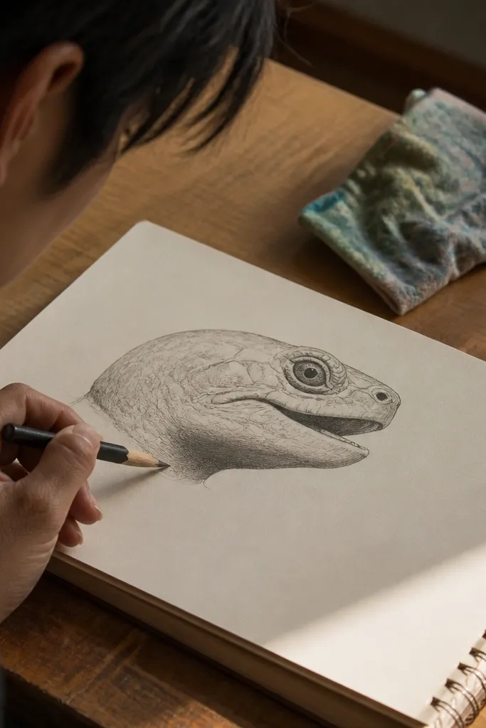
The underside under the jaw creates depth instantly. This step adds a shadow wedge that tucks under the mouth and fades back toward the neck. It’s a small shape, but it anchors the head to the body so the shark doesn’t float. You’ll also place a neck fold line — a faint curve that helps the head/body transition read as one form. This is the difference between a shark that looks drawn and a shark that looks assembled.
1) Shade a triangular shadow under the lower jaw using 4B, with the darkest point near the mouth interior. 2) Feather the shadow edges with HB or a stump so it fades smoothly. 3) Draw a faint neck fold curve where the head meets the upper body band. 4) Lift highlights on the jaw edge with kneaded eraser so the boundary looks wet and rounded.
Pro tipIf the shadow looks too dark, erase it back and rebuild in thin layers.
AvoidDon’t leave a hard gap between mouth area and belly shading.
16. Countershading Sweep From Gill to Belly
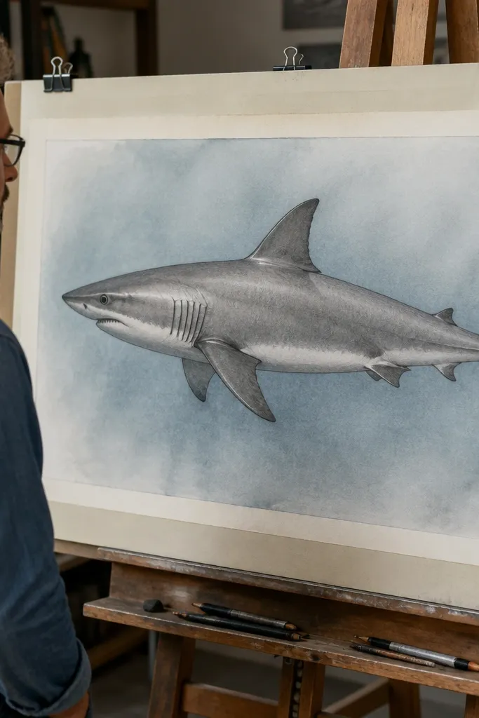
Countershading is more than a dark top and light bottom — it has a sweep that transitions across the body. This step creates a smooth value sweep from the gill area down toward the belly so the shark looks rounded. You’re aiming for a gradual change, not a sharp boundary. When the sweep is right, the shark’s body volume feels obvious even without heavy texture. It’s also a fast way to clean up earlier rough shading.
1) Starting at the gill shadow area, lightly shade a diagonal gradient toward the belly strip. 2) Blend the transition with a stump until it becomes a smooth sweep. 3) Add a darker midtone band just above the sweep line so the body has structure. 4) Re-lift the belly highlight edge if blending darkens it.
Use long strokes for the sweep, not short scribbles. Long strokes keep gradients clean.
Don’t create a straight dividing line between dark side and light belly.
17. Nose Tip Highlight and Snout Rim Contrast
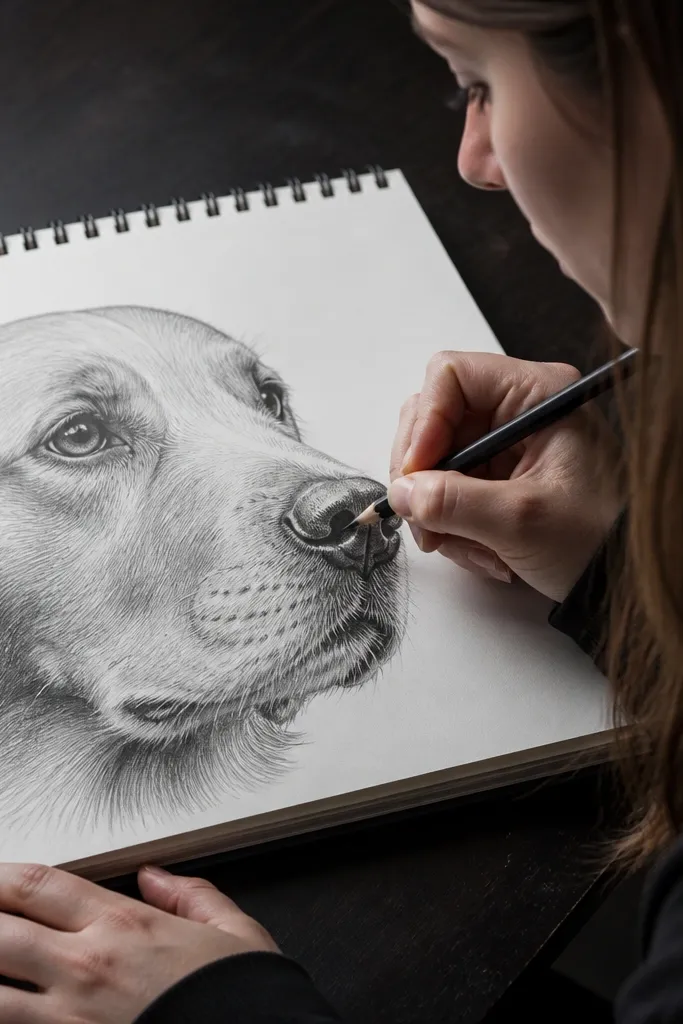
A tiny highlight at the nose tip sells the wet surface. This step places one clean highlight shape and balances it with rim contrast along the snout edge. If you only shade without lifting, the snout looks matte. If you only highlight without rim contrast, it looks like a sticker. This step makes the snout look slick and dimensional through careful value separation.
1) With a kneaded eraser, lift a small highlight area on the snout tip, keeping it narrow. 2) Shade around it with 2B to 4B, focusing on the lower snout rim and the side edge. 3) Blend the transition lightly so the highlight edge is soft, not fuzzy. 4) Re-check symmetry — the highlight should sit slightly off-center toward the light direction you chose.
Lift first, then shade around the lifted area. It’s easier than trying to add highlights later.
Don’t put a big white highlight patch — sharks have small, tight specular spots.
18. Mouth Interior Depth With Dark-to-Mid Gradation
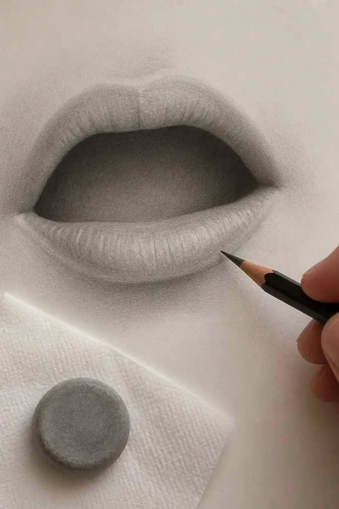
Mouth realism comes from depth — not from drawing teeth. This step builds a dark interior that fades to midtones near the lip edge. That gradient tells the brain the mouth is a cavity. You’ll also keep the outer lip line lighter so it doesn’t flatten the opening. When you nail this, the head looks more anatomical and less like an outline with shading.
1) Use 6B to pack the darkest interior area right under the upper mouth line. 2) Gradually lighten the shading as you move outward using 4B then 2B. 3) Leave the lip boundary slightly lighter than the interior, then blend just the transition. 4) Add one tiny dark line at the corner to define the cavity edge.
Press less than you think on the midtone transition. The gradient should look controlled, not smudged.
Don’t shade the lip edge darker than the mouth interior.
19. Tail Fin Fork Line and Directional Shading
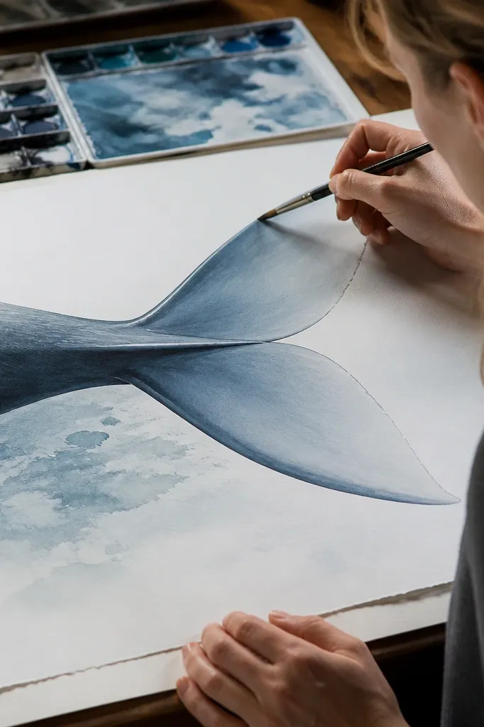
The tail fork line and directional shading create motion and volume. This step adds the fork separation and shades each side of the tail plane differently. The upper plane usually gets darker depending on your light direction, and the lower plane stays lighter with a softer edge. When the tail has a clear fork and value split, the shark looks like it’s moving, not posed. It also prevents the tail from blending into the body shape.
1) Draw the tail fork line as a curved V that follows your tail base notch. 2) Shade the upper tail plane darker with 4B, keeping the lower plane lighter with 2B. 3) Use a stump to smooth the gradient across each plane, then stop before the outer rim. 4) Darken the outer rim edges for both planes so the silhouette stays crisp.
Match your tail shading direction to your body shading direction so everything feels aligned.
Don’t make the tail perfectly mirrored — sharks have subtle asymmetry.
20. Fin Base Shadows That Anchor Each Fin
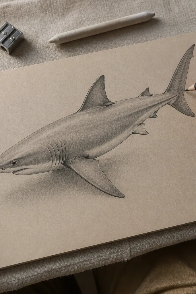
Fin bases are where you prove the fin has depth. This step adds a small shadow under each fin base so the fin looks attached to a curved body. Without these base shadows, fins look like flat shapes stuck on top. You’ll shade a tight wedge under the fin where it meets the body and soften outward. That tiny change makes the whole drawing look more dimensional immediately.
1) Choose 4B for base shadows and lightly shade directly under the fin base. 2) Keep the darkest spot closest to where the fin touches the body. 3) Feather the shadow outward with a stump or blending finger using light pressure. 4) Re-draw the fin rim edge slightly darker so the shadow doesn’t erase the fin shape.
Pro tipUse a small piece of paper as a shield so your shading stays within the fin base area.
AvoidDon’t shade the entire fin underside — focus on the base pocket.
21. Side Contour Cleanup With One Pass Linework
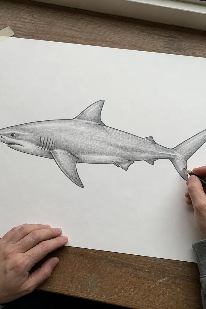
Before you add final details, clean your silhouette. This step replaces messy contour lines with one clean pass so the shark reads clearly. You’re not redrawing everything — you’re selecting the best outline line and committing to it. Clean contours make your shading look intentional instead of accidental. After this, your shark looks more designed, not just shaded. It also helps you see where value needs strengthening.
1) Lightly erase construction marks and weak lines so only your main silhouette remains. 2) Re-draw the top contour and bottom contour with HB, keeping pressure consistent. 3) Darken only the most important edges: fin outer rims and the head outer silhouette. 4) Step back and check the silhouette — if a curve looks off, fix it now before texture.
Use a slower hand speed for the silhouette. Quick lines wobble and kill realism.
Don’t keep multiple overlapping outline lines — that makes the drawing look dirty.
22. Final Wet-Skin Contrast With Selective Darkening
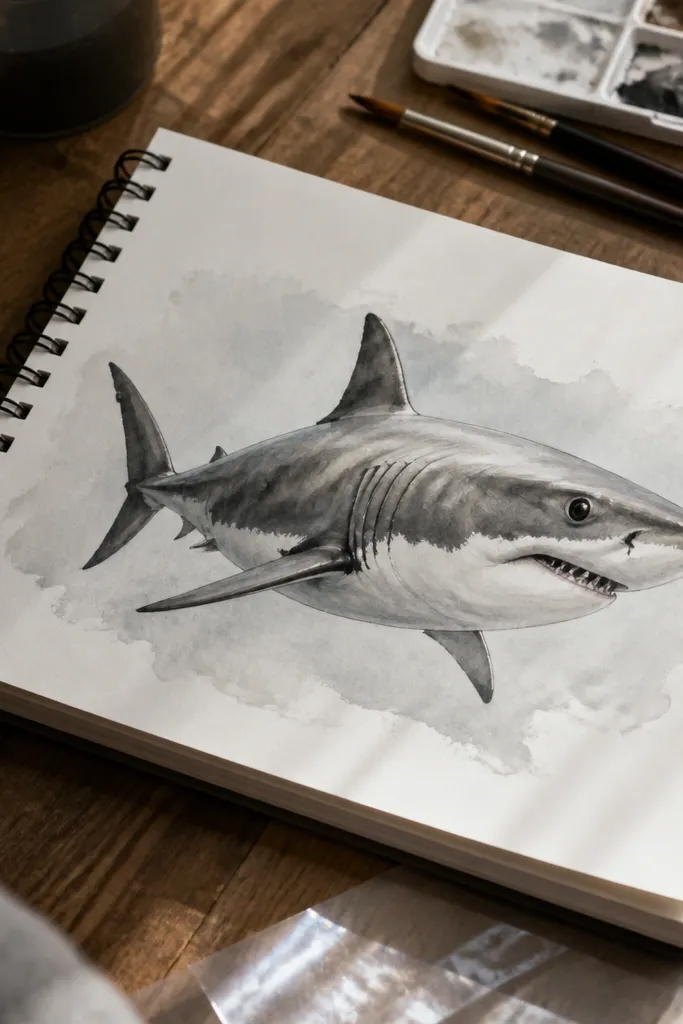
Realistic sharks have contrast hotspots, not uniform darkness. This step adds a few strategic dark accents: under the gill shadow, along the dorsal rim, and near the mouth corner. Then you protect your highlights by not blending them away. That selective contrast creates a wet, dimensional look. It’s also the fastest way to make your drawing look “real” without adding new anatomy. Keep it limited so the overall value plan stays readable.
1) Pick 3 accent zones: gill underside shadow, dorsal outer rim, and mouth corner cavity edge. 2) Darken those zones with 6B, using short strokes to avoid heavy smears. 3) Blend the edges of each accent lightly so it transitions into midtones. 4) Lift and protect the existing highlight spots on the snout and belly strip.
If the drawing looks too dark overall, lift highlights first. Then darken only the three accent zones again.
Don’t keep darkening until the whole shark becomes one tone.
23. Background Water Tint to Make the Shark Pop
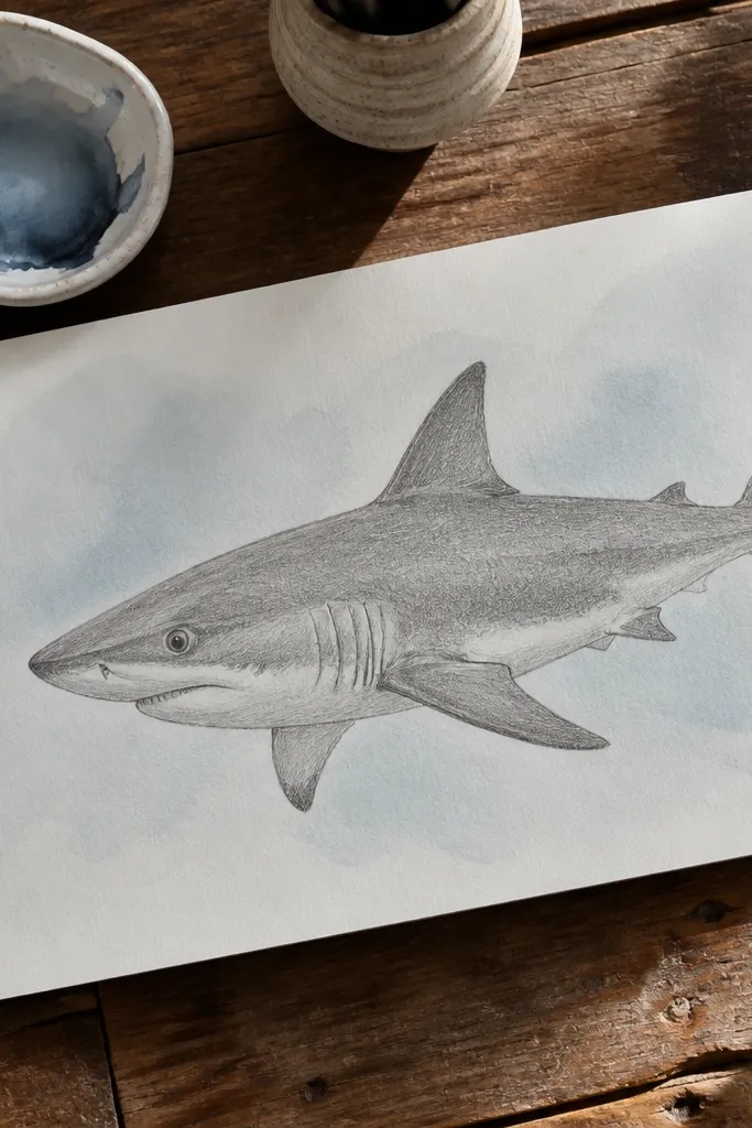
A realistic shark looks better when the background has a gentle tone. This step adds a soft water tint behind the drawing so your dark values and highlights pop. Use a light wash or very light shading so you don’t compete with the shark’s form. Keep the edges around the silhouette clean. The result looks more like a finished illustration, and it also helps you judge whether your values are strong enough. This is the aesthetic finish that makes the drawing photogenic.
1) Choose a light gray-blue or cool gray tone using a diluted pencil or watercolor wash. 2) Apply the tint behind the shark only, leaving the shark lines and values untouched. 3) Feather the tint outward so it’s darker near the shark and lighter farther away. 4) Let it dry, then do one final contour cleanup if any tint touched your silhouette.
Tint the background after you finish shading. That prevents muddy blending across your shark skin texture.
Don’t color the background so dark that it flattens the shark’s value contrast.
24. Raking Light Edges With a Clear-Gel Gloss Pass
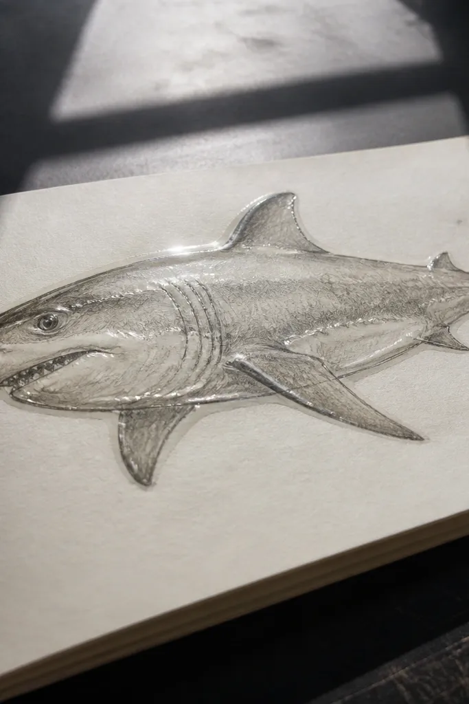
Realistic sharks look wet because the light catches the raised edges and the thin film of water on top of the skin. This section adds a controlled gloss pass that only goes on the contour lines you already established, so the shark reads 3D instead of looking flat or uniformly shiny. You get photogenic results because specular highlights create strong separation between the dark side band and the light belly strip. This is beginner-friendly because it uses a clear gel medium and a light touch, not complex rendering. Plan on 20-35 minutes for this step, and it fits sketchbooks, marker paper, and mixed-media pages where you want that “just under the surface” look.
1) Mix a clear gel medium with a tiny drop of water for a smooth, brushable consistency, then test it on scrap paper in the same pencil/ink style you used for the shark. 2) With a soft brush or a small foam brush, paint a narrow highlight band along the brightest edge rules you already laid down: the upper spine curve, the dorsal fin leading edge, the tail fork ridge, and the belly sweep. Keep each highlight 2-4 mm wide and stop before you reach the center of each plane so you do not haze the whole drawing. 3) Let it dry completely, then add a second, thinner highlight pass only where the edge turns toward the light direction you set in your value map.
Pro tipUse a scrap “edge strip” to match your highlight width before you touch the real shark. If the gel looks milky, it’s too wet — dab the brush on paper towel once before painting.
AvoidDon’t flood the drawing — glossy gel spread across large areas turns your shading muddy.
25. Ink-Stamped Pores and Scratch Marks for Skin Texture
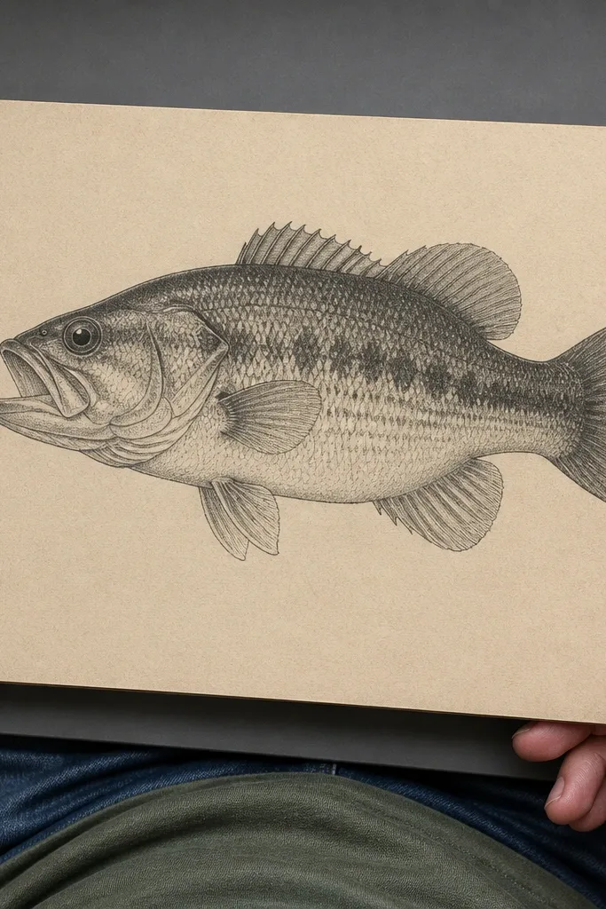
A realistic shark drawing needs micro-contrast — tiny marks that break up smooth gradients without turning the skin into random noise. This step adds ink-stamped pores and short scratch marks in the exact zones where shark skin shows texture: around the gill line, fin bases, and the darker side band. It makes the drawing look more tactile and less like a clean cartoon because the texture sits on top of your values and catches light unevenly. This works with pencil, fineliner, and watercolor-like washes because you control density with a stamp, not by drawing every mark by hand. It takes about 25-45 minutes and suits anyone who wants the shark to look “real” in close-up photos, especially on social posts or portfolio scans.
1) Tear a small piece from a foam sponge or use the corner of a makeup sponge, then dab it into diluted black ink or waterproof ink thinned slightly with water until it leaves a faint speckle. 2) Stamp lightly in three bands: a tight cluster around the gill line S-curve, a ring of marks at each fin base shadow, and a sparse scatter across the dark side band only. Keep the density highest where you already have darker edges, and taper it off toward the belly strip so you preserve the countershading. 3) Add a few deliberate 5-15 mm scratch lines with a fine pen using short strokes that follow the body direction, then stop — fewer marks look sharper than a full scribble.
Pro tipMake one “density test” square first. If the stamp reads as solid black, thin the ink more and stamp on a separate scrap until you see individual specks.
AvoidDon’t texture the belly strip heavily — it kills the smooth light plane you built with your value map.



