
1. Coral Garden Turtle with Bubble Halo
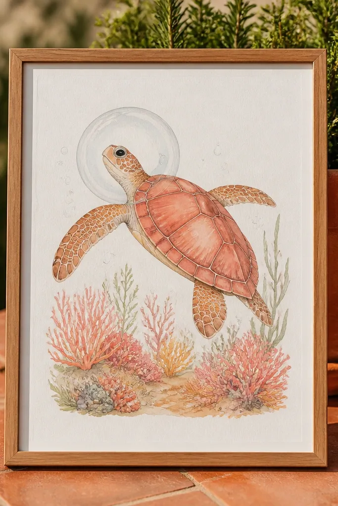
This themed Turtle Drawing is pretty because the coral gives you a repeating pattern to draw, while the bubble halo frames the turtle’s face like a logo. The turtle stays simple on purpose: clean shell outline, scutes shaded in two tones, and flippers angled outward as if it’s floating. For the look, use warm coral colors in the background and keep the shell slightly cooler so it pops. It works great on white paper and also photographs well because the bubbles create bright negative space.
Start by sketching the shell oval and head triangle, then place the flippers as two teardrops that curve toward the bubbles. Add coral tufts behind the shell — draw 6 to 10 short curved “fingers” that vary in height. Then draw a halo ring of bubbles around the head: 10 to 14 circles of different sizes, spaced evenly. Finally, shade the shell with a light base, then add mid-tone scute wedges and a darker shadow under the flippers.
Leave bubble centers uncolored so they read as glassy highlights in photos.
Don’t shade the whole shell evenly — scutes need clear separation or the drawing looks muddy.
2. Surfboard Sticker Turtle in Black and Cream
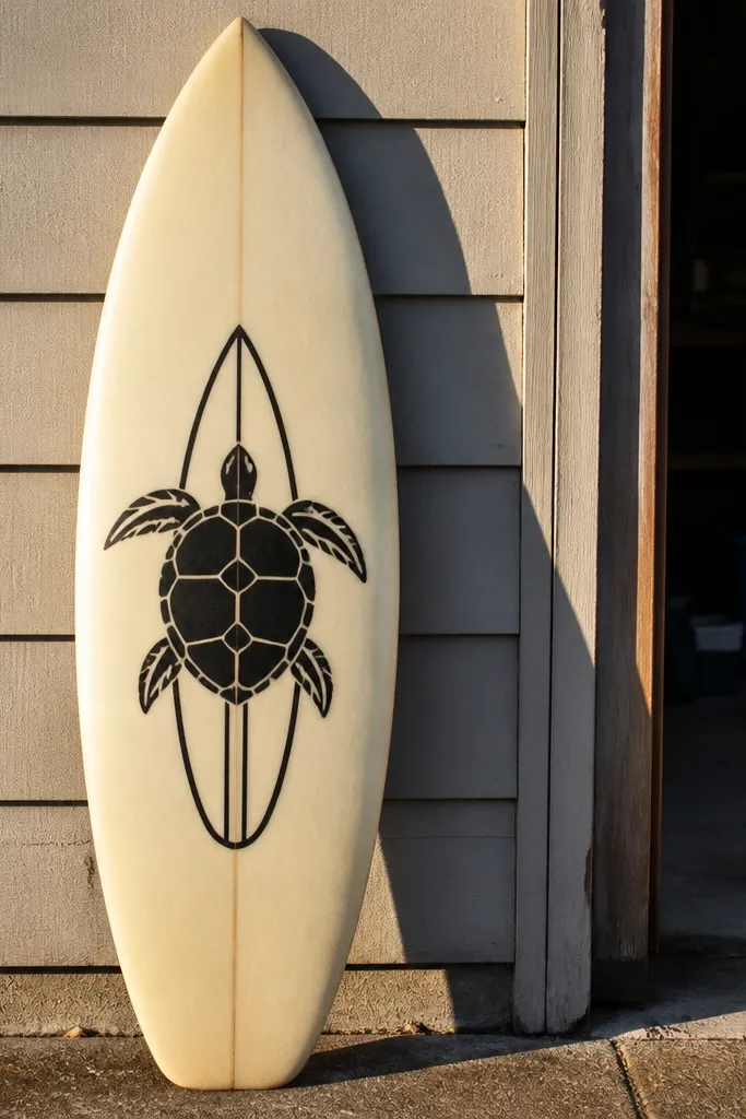
If you want an aesthetic that looks like a real sticker, this one is your fastest win. The turtle is bold, high-contrast, and simplified: thick outline, minimal scute lines, and a surfboard graphic behind it. Keep the background cream and the turtle black so it photographs cleanly. This theme also teaches you control — you’ll practice reducing details without losing the turtle’s identity. It’s perfect for quick weekend sessions and for filling a sketchbook page without overworking it.
Draw a surfboard outline in the background first, angled slightly to the right. Then sketch the turtle on top using the 3-shape base: shell oval, head triangle, and two flippers as teardrops. Ink the outer contour with a fineliner, then add only 6 to 8 scute lines on the shell. Add simple waves behind the turtle: 3 to 5 curved lines that stay light. Color the surfboard in cream tones and keep the turtle mostly black with a tiny gray under the shell.
Pro tipUse a black pen for the silhouette and a softer pencil (2B) only for one shadow area under the shell.
AvoidAvoid adding lots of tiny scute markings — the sticker look disappears when the lines get busy.
3. Neon Night Turtle with Star Speckle
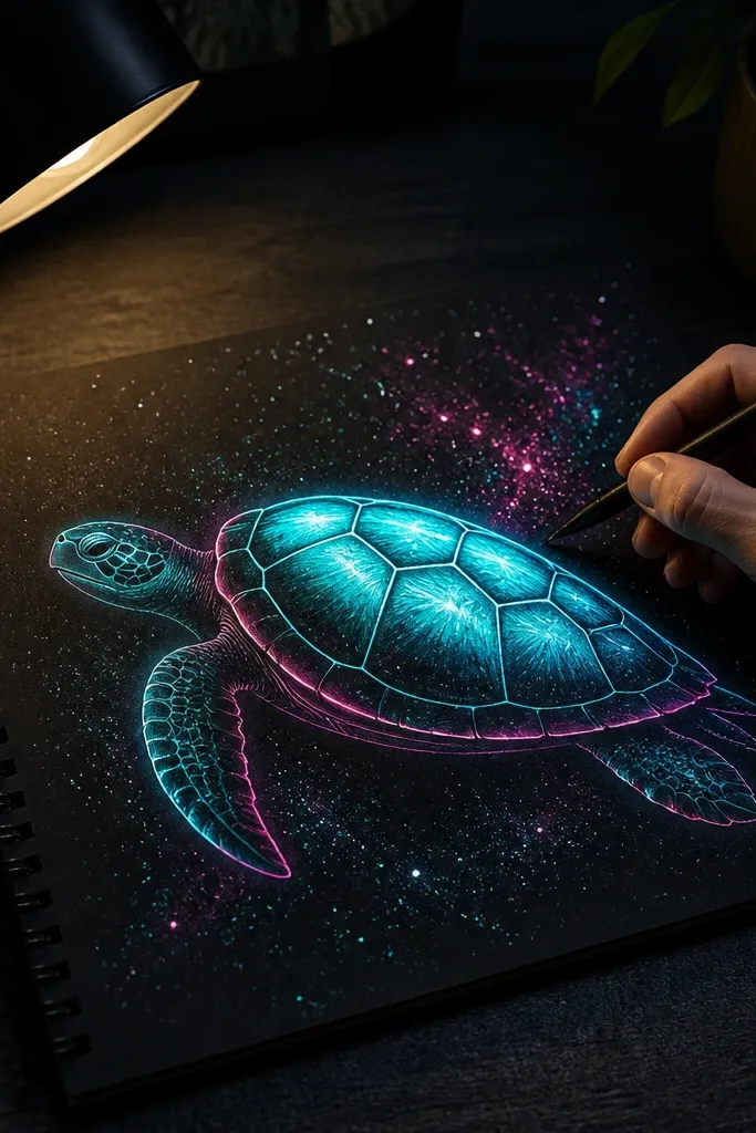
This themed Turtle Drawing looks electric because the turtle sits on a dark field and you highlight edges with neon color. The turtle shell becomes the “glow” by using a light inner value and a darker outer rim. Draw a few star clusters and let them overlap the turtle background, not the turtle outline. The result is a graphic, poster-like sketch that stands out in a grid of your drawings. It’s also forgiving because neon hides small construction mistakes.
Start with a dark background wash using diluted navy or black watercolor, leaving the turtle area slightly lighter so it reads first. Sketch the turtle lightly in pencil, then ink the outline and main scute lines. Color the shell with a neon green or teal mid-tone, and add a thin neon rim on the outer edge. Add star speckle using a toothbrush flick or a white gel pen: 25 to 40 tiny dots. Finish by drawing 2 to 3 larger stars as hollow circles with a colored center.
Keep the neon colors for edges and midtones, not the entire background — that’s what keeps the turtle readable.
Don’t color over your outline before it’s dry — you’ll lose crisp edges and the glow effect turns flat.
4. Beach Sign Turtle with Hand-Lettered Waves
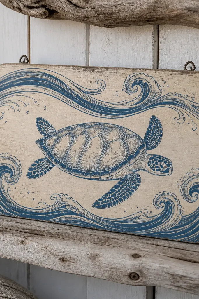
This one is aesthetic because typography gives your drawing a finished poster feel. The turtle is centered and calm, while the hand-lettered waves create motion across the page. Use a sign shape behind the turtle so the composition looks intentional: a rounded rectangle or a slightly arched board. Keep the shell pattern consistent, then vary the wave lines so the viewer sees rhythm. It’s a great choice if your sketches look “pretty but unfinished” because text and layout fix that instantly.
Draw a rounded sign board behind the turtle, leaving a 1-inch margin on all sides. Sketch the turtle in the center, then add a simple wave banner across the sign using 5 to 7 long curves. Hand-letter a short phrase like “SEA TURTLE” or just “TIDE” in block capitals, keeping letters tall and narrow. Shade the shell with two tones and add a dark shadow under the chin and flippers. Color the sign with warm sand tones and keep the turtle slightly darker so it reads against the background.
Pro tipWrite your letters with pencil first, then trace with a fine marker so the baseline stays clean.
AvoidDon’t crowd the text — leave at least one wave curve between the turtle and the lettering.
5. Mangrove Roots Turtle with Rippling Water Lines
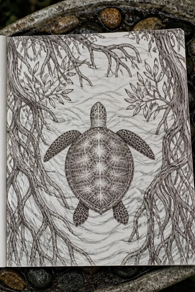
This themed Turtle Drawing looks grounded and calm. Mangrove roots give you organic shapes that frame the turtle, and rippling water lines add movement without clutter. The turtle shell stays the hero, so you keep its scutes clear and the background lines lighter. This setup also teaches atmospheric separation: darker turtle, lighter water, and roots that sit behind. It’s photogenic because you get a strong foreground/background layering.
Sketch the turtle first with the shell oval and head triangle, then place it slightly above the center. Draw mangrove roots behind it as looping lines that taper downward, adding 6 to 10 root strands. Add water ripples across the lower half: 7 to 12 parallel curved lines, spaced evenly. Shade the shell with a mid-tone and add a darker edge shadow along the bottom. Finish by lightly coloring roots with muted greens and keep the ripples a pale blue-gray.
Make the ripples thinner than the turtle outline so the turtle stays the focus.
Don’t draw roots in the same line weight as the turtle — that flattens the depth.
6. Kelp Forest Turtle with Ribbon Flippers
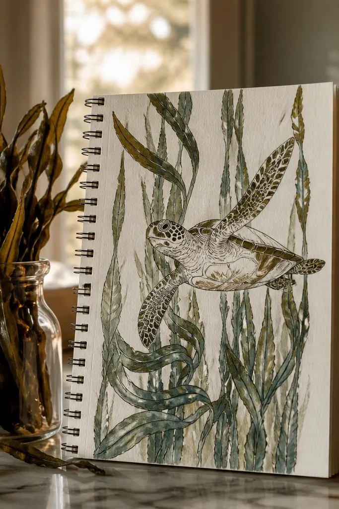
Kelp is the easiest way to make a turtle look like it’s moving. The vertical lines create energy, and you can stretch the flippers into ribbon shapes so the drawing feels dynamic. This themed Turtle Drawing is also forgiving: if your kelp lines vary, it still looks natural. For the aesthetic, keep the kelp darker and the turtle shell lighter so it reads as foreground. The overall effect is a clean underwater poster that’s easy to photograph.
Draw 10 to 14 kelp stalks behind the turtle, using long curved lines that lean left or right. Sketch the turtle in front, but make the flippers slightly more elongated and curved, like ribbons. Add a few leaf fronds at the top of each kelp stalk with short V-shaped cuts. Shade the shell with three zones: light base, mid scute wedges, and a darker underside under the flippers. Color the kelp in deep green and the shell in a cooler teal or gray-green.
Pro tipLet one kelp stalk overlap the shell edge lightly to sell the depth.
AvoidDon’t over-detail every kelp leaf — 3 to 5 frond clusters are enough.
7. Vintage Postcard Turtle with Sepia Wash
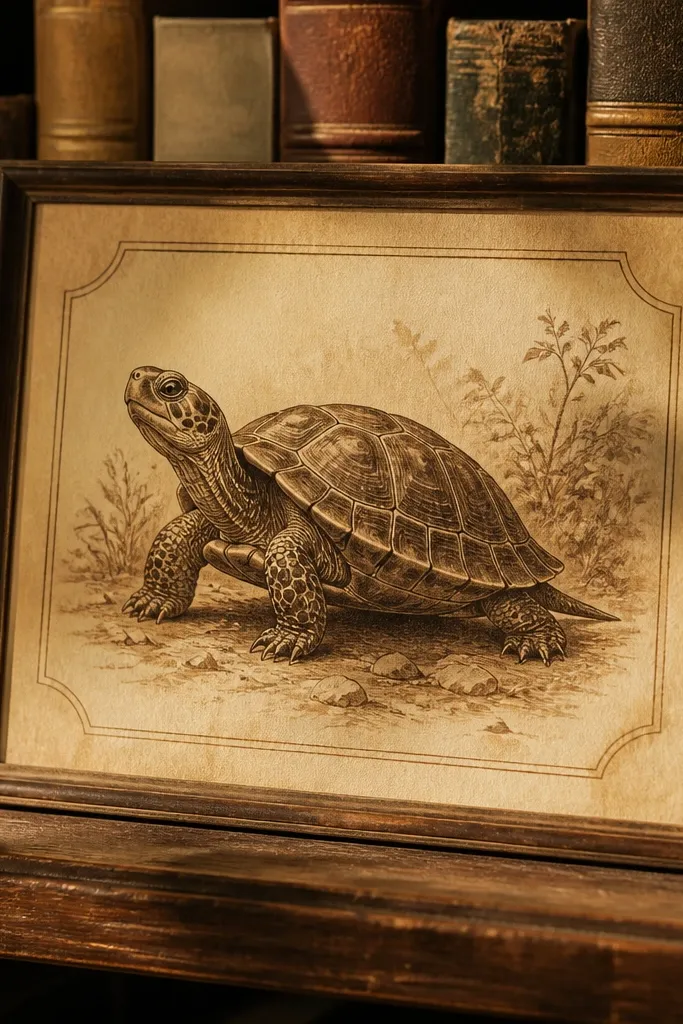
This theme is pretty because sepia makes line work look older and more intentional. The turtle drawing stays crisp, while the background has subtle texture like paper grain. Use a postcard frame so the composition looks complete even with minimal color. It’s also a good way to practice controlled light shading — sepia rewards clean edges and gentle tones. Photograph it on a flat surface with window light; the paper texture will show.
Draw a postcard rectangle with a thin border, leaving extra space for a fake stamp in the top right. Sketch the turtle in the center and ink the outline plus 7 to 9 scute lines. Apply a sepia wash behind the turtle, then lightly shade the shell with warm gray pencil. Add faint waves at the bottom using 3 thick curved lines and 2 thin ones. Finish by drawing a small “POSTCARD” text line and a simple cancellation mark over the stamp area.
Pro tipUse a light eraser to lift highlights from the wash so the turtle edges look sharper.
AvoidDon’t go too dark with the wash — if the background is heavy, the turtle loses contrast.
8. Watercolor Resist Turtle with Dry Brush Spots
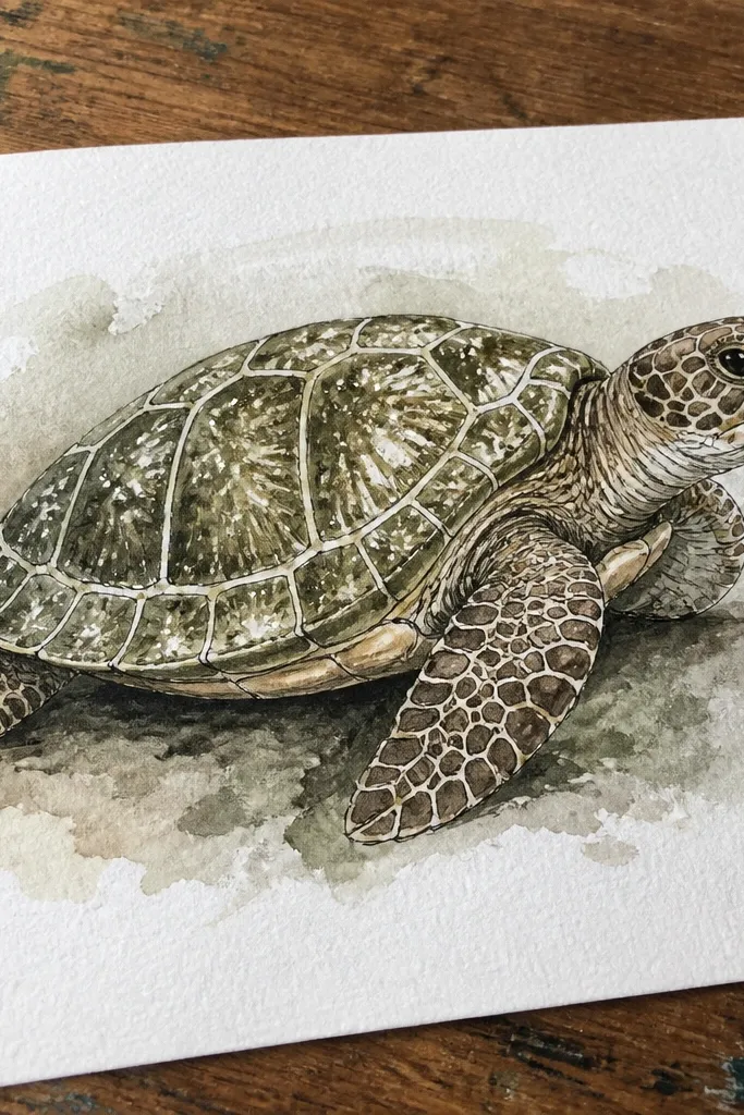
This themed Turtle Drawing looks artsy because watercolor texture lives on top of your line work. The resist idea keeps highlights crisp on the shell, and dry brush spots mimic natural scute texture. You end up with a turtle that looks more alive than a flat colored sketch. The key is controlling the wash — too much paint smears details. This is a great project if you want a painterly look without losing the turtle’s structure.
Start by sketching the turtle lightly and inking the outline. Mix a light watercolor wash for the shell base and paint around your scute lines, leaving some white paper for highlights. If you have resist tools, dab white crayon or masking fluid lightly on a few scute areas, then paint over with a mid-tone teal. After the paint dries, add dry brush texture using a nearly dry brush and darker green pigment. Finish with a thin pencil or pen line to define flipper edges.
Test your dry brush on scrap paper first so the speckles are the size you want.
Don’t flood the shell area — watercolor pooling kills the crisp scute look.
9. Comic Panel Turtle with Speech Bubble Kelp
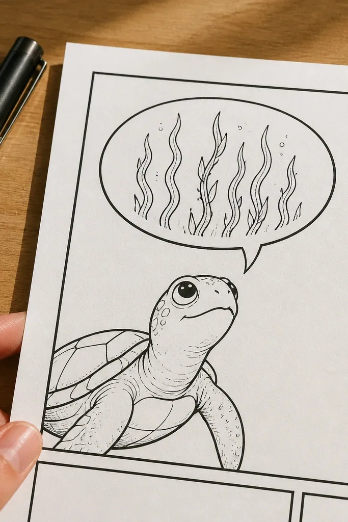
Comics make drawings look instantly finished, and this themed Turtle Drawing uses that trick without turning into clutter. Your turtle is the character, the speech bubble is the scene, and kelp lines inside the bubble create motion. Use thick panel borders and a clean speech bubble outline so it looks like a single graphic moment. The turtle shell is shaded simply so the comic elements stay readable. This is great if you want a playful aesthetic that still follows good anatomy.
Draw a comic panel border first, like a square frame with a 1/4-inch margin. Sketch the turtle centered and ink the outline with a bold pen. Create a speech bubble above the turtle, but shape the bubble tail like a little kelp stem. Fill the bubble with 6 to 10 curved kelp lines and a few leaf fronds. Add a short word in the bubble using block capitals, then shade the shell with one mid-tone and a darker underside shadow.
Keep speech bubble lettering large enough to read at phone distance — comics fail when text is too small.
Don’t add extra sound effects everywhere — one “POOF” or none keeps it clean.
10. Geometric Turtle with Patterned Shell Tiles
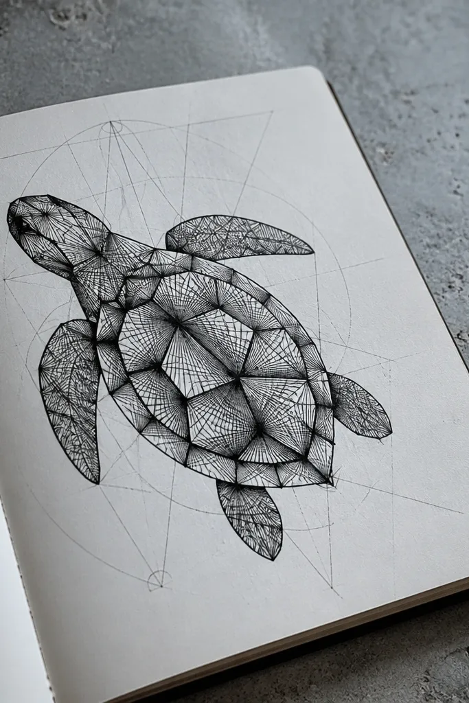
This themed Turtle Drawing looks sharp because the shell is built from tiles. Instead of soft scutes, you draw angular wedge patterns that catch light and create a modern graphic feel. The flippers stay slightly rounded so the geometry doesn’t look robotic. It’s a good choice for a sketchbook page photo because the pattern gives high-contrast detail. You also learn a useful skill: translating organic anatomy into structured design.
Sketch the turtle normally in pencil, keeping the shell oval and flippers teardrop-shaped. Lightly draw a grid across the shell oval using 5 to 7 vertical and 3 to 4 horizontal guideline lines. Turn each grid cell into a tile: draw diagonal lines or chevrons inside each tile, then connect lines to keep the pattern smooth around the curve. Shade tile groups with two colors or two pencil values, leaving some tiles light. Ink the outer contour last so the pattern edges stay crisp.
Pro tipUse a ruler for the shell grid lines, but freehand the tile interiors so it doesn’t look mechanical.
AvoidAvoid overcrowding the entire shell with tiny tiles — bigger tile shapes read better on camera.
11. Sunset Horizon Turtle with Color-Block Sky
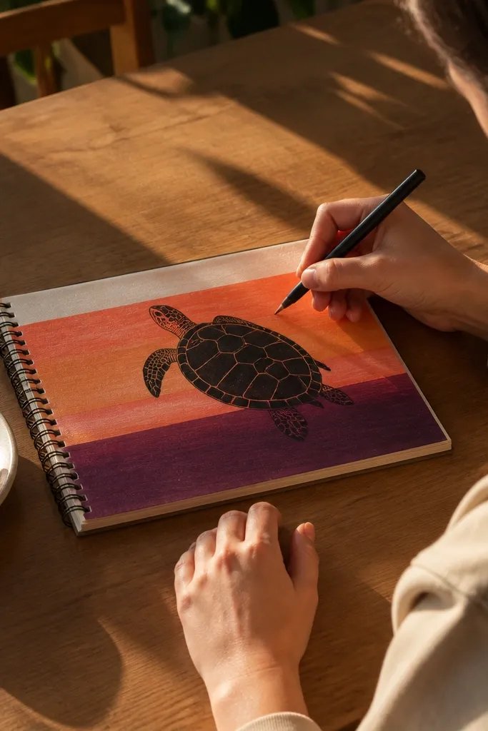
Color blocks make a turtle look graphic and instantly photogenic. This themed Turtle Drawing uses a simple turtle silhouette layered over a sunset gradient built from thick horizontal bands. The shell gets subtle shading, but the sky does most of the work visually. It’s clean, modern, and doesn’t require heavy rendering. If you struggle with backgrounds, this gives you a repeatable system: draw the horizon bands first, then place the turtle on top.
Paint or color the sky using 5 horizontal bands: pale peach, coral, orange-red, magenta, and a deep purple at the top. Keep each band about 1/2 to 3/4 inch tall depending on your page. Sketch the turtle in the lower third with the shell oval and head triangle, then ink the outline. Shade the shell with a light base and add darker scute wedges. Add a simple reflection line under the turtle using 3 to 4 short curves that match the turtle’s silhouette.
Use thicker markers or paint for the sky bands so they read as bold shapes in photos.
Don’t blend the sky too smoothly — the banding is the aesthetic.
12. Mandala Shell Turtle with Symmetry Lines
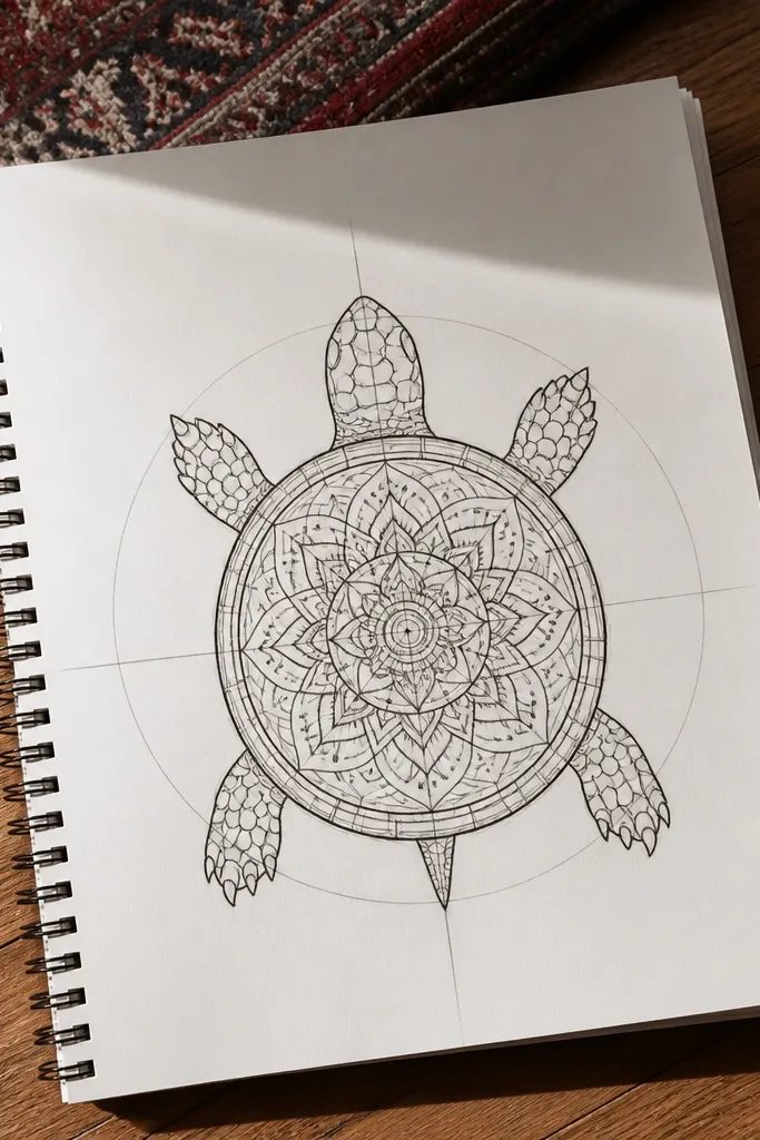
Mandala patterns turn a turtle into a centerpiece. This themed Turtle Drawing keeps the turtle anatomy simple but transforms the shell into a symmetrical design with repeating petals and dots. Symmetry makes it look intentional even when you’re still learning. Use thin lines for inner pattern and a slightly thicker outline for the turtle silhouette. The background can be plain so the shell pattern grabs attention. It’s a great “wow” page without needing a complex scene.
Sketch the turtle first and lightly mark the shell centerline and a horizontal guideline across the shell oval. Divide the shell into 4 to 6 wedge sections by drawing curved symmetry lines that follow the shell shape. In each wedge, draw a repeating motif: a teardrop petal ring, then small dot clusters, then a tiny swirl. Keep the head and flippers plain with only 3 to 4 scute lines. Ink everything, then add one mid-tone pencil shade under the shell edge.
Pro tipWork in wedges — complete one wedge, then copy it to the next using the guidelines.
AvoidDon’t decorate the head and flippers with mandala detail — the shell needs to be the only busy area.
13. Monochrome Ink Turtle with Crosshatch Depth
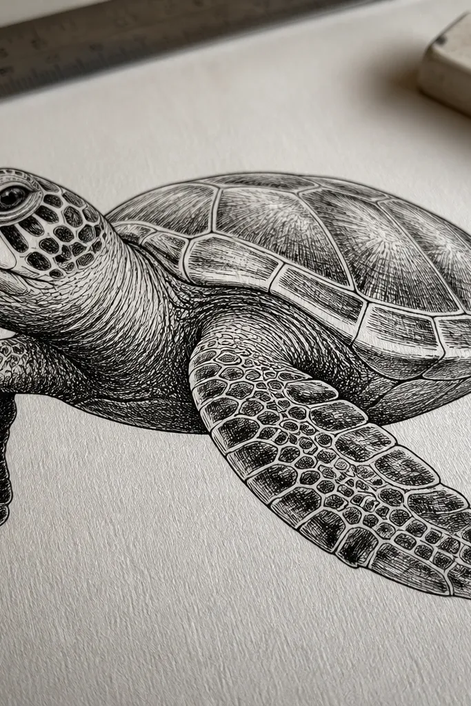
This themed Turtle Drawing looks expensive because crosshatching creates depth with only black ink. The turtle reads as dimensional even without color. Focus your shading on three places: under the chin, the underside of each flipper, and between scutes on the shell. Crosshatching also makes your lines feel controlled rather than sketchy. Photograph it with raking light if you can, but normal light still works because the texture is visible.
Ink the turtle outline first with a fineliner, then add simple scute lines without shading yet. Choose one direction for crosshatching, like diagonal lines leaning right. Shade the shell scutes by layering diagonal lines, then add a second direction layer (diagonal leaning left) only in the darkest zones. Shade flipper undersides with fewer strokes so the shell stays the darkest. Leave the top shell edge mostly light so the turtle has a highlight.
Pro tipUse a thicker pen for the outer contour and a thinner one for crosshatch so the texture doesn’t overpower the form.
AvoidAvoid random crosshatch directions — it makes the turtle look grainy instead of sculpted.
14. Tropical Fruit Sea Turtle with Pineapple Pattern
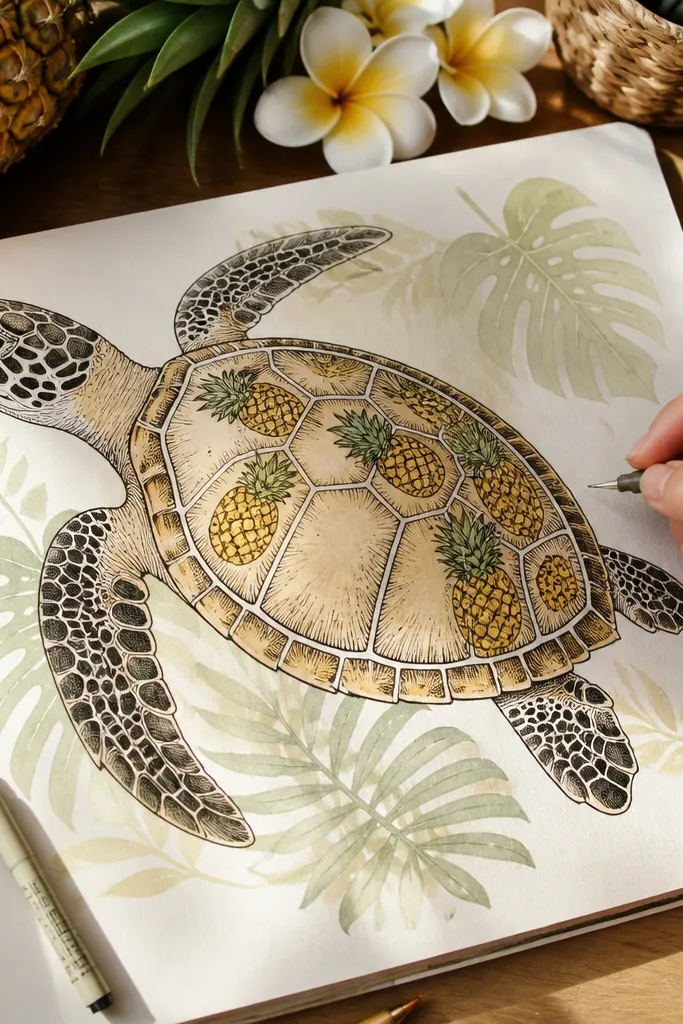
This is a fun themed Turtle Drawing that still looks clean because you limit the “fruit” pattern to accents. The shell gets a pineapple motif on a few scutes, while the background has tropical leaves in a simple silhouette style. The turtle remains recognizable, not swallowed by the theme. It’s photogenic because the pineapple yellow pops against teal and green. Works well for marker coloring and for fast weekend output.
Sketch the turtle and ink the outline. On the shell, pick 3 to 4 scute areas and draw pineapple shapes: a small oval with zig-zag “spikes” at the top. Add a few tropical leaf silhouettes behind the turtle using long curved leaf stems and 5 to 7 leaf blades. Color the background leaves darker green and the pineapple accents a bright yellow with a light orange tint. Shade the shell with a teal mid-tone and keep the pineapple areas slightly lighter.
Pro tipKeep pineapple motifs spaced so each one stays readable in a photo thumbnail.
AvoidDon’t color every scute pineapple — it turns into noise and kills the turtle form.
15. Paper Cutout Turtle with Drop Shadow
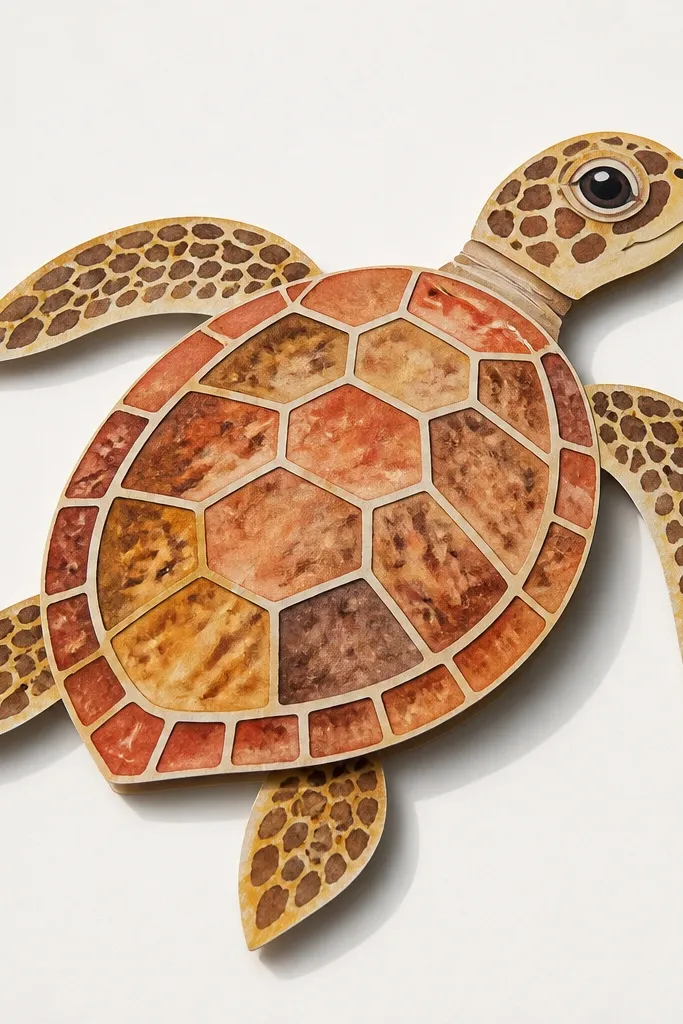
This themed Turtle Drawing looks like craft art because it uses layering and a fake paper shadow. The turtle is drawn, then separated into layers: shell, flippers, and head, each with slightly different color tones. The background stays plain so the layered effect pops. It’s also an easy way to make your drawing look more “designed” without complicated shading. Perfect for scanning or photographing because the edges are crisp.
Draw the turtle outline and then separate it into three shapes on the paper: shell body, flippers, and head. Color each layer slightly different: shell in teal, flippers in darker green, head in gray-green. Add a drop shadow by tracing the outer edge again offset 1/8 to 1/4 inch down-right and coloring that shadow in a gray-blue. Place the layers mentally (or physically if you cut) so they overlap consistently. Finally, draw 6 to 10 scute lines on the shell layer and keep the shadow untextured.
Offset the shadow by the same amount everywhere so it looks like one lighting direction.
Don’t use a shadow that’s the same color as the background — the layered look disappears.
16. Ocean Floor Turtle with Pebble Texture
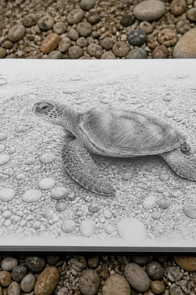
A textured ocean floor makes a turtle feel grounded. This themed Turtle Drawing uses pebble dot patterns and sand shading so the viewer reads a scene, even if the turtle stays mid-simple. The shell gets value shading, while the floor is mostly texture. The aesthetic is earthy and tactile, and it photographs well because dot patterns show up clearly. It’s also a good project for using up small scraps of pencil shading and marker dots.
Sketch the turtle in the upper half so there’s room for the floor. Ink the outline and add scute lines lightly. Draw the ocean floor as a curved band across the bottom third, then fill it with pebble dots: 80 to 120 small circles, varying sizes. Shade sand by adding a light wash or pencil tone under the turtle belly and around the flippers. Color the floor in warm beige, then add darker pebble dots using a gray or brown marker.
Vary pebble density: denser dots near the turtle, sparser near the edges.
Don’t texture the entire page — keep the texture concentrated on the floor band.
17. Rainy Window Turtle with Drip Lines
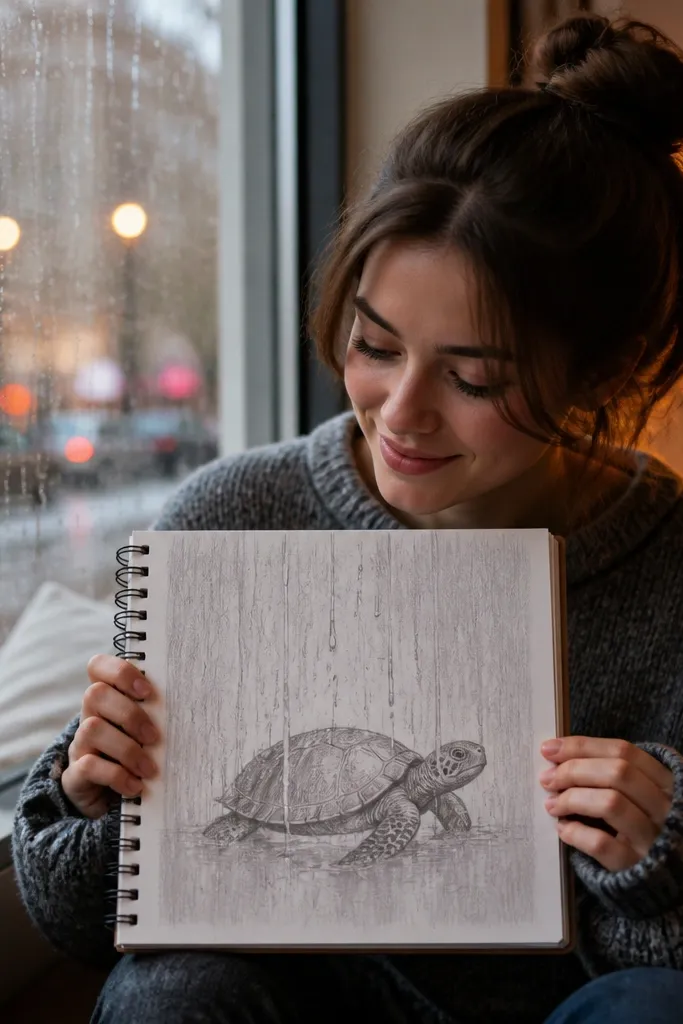
This theme looks cozy and cinematic. The turtle stays clean and slightly foggy, while the background adds vertical rain drips and a soft blur feel through light shading. The aesthetic is in the contrast: crisp outline against messy rain lines. It’s also a clever way to practice gradients without heavy blending — you can fake fog with light pencil smudges around the turtle edges. Photograph against a light background so the drips read clearly.
Sketch and ink the turtle with clean lines, then lightly pencil a fog halo around it using soft 2B shading. Draw a few window frame lines or a simple border so it reads as a window scene. Add rain drips: 20 to 35 vertical lines that vary in length, then add tiny droplets at the ends. Shade the turtle underside slightly darker, but keep the top shell edge light. Color with muted blues and grays; add a pale highlight strip on the shell.
Use an eraser to lift tiny fog highlights near the shell edges so it looks wet, not smudged.
Avoid dark rain lines everywhere — keep the drip strokes lighter than your turtle outline.
18. Turtle Shell Map with Compass Rose Background
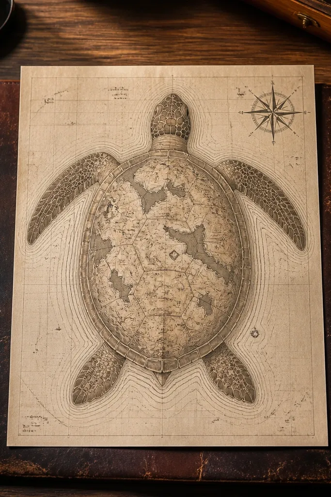
Map design gives you structure and a built-in aesthetic. This themed Turtle Drawing turns the shell into “coastline” shapes and adds a compass rose so the page feels like an old chart. The turtle stays centered and clear, while the background has clear graphic elements. It’s photogenic because compass lines create strong symmetry and the shell map lines add detail without needing color. You can do it with pencil only for a clean, vintage look.
Draw a turtle in pencil and ink the outline. On the shell, draw 4 to 6 curved coastline paths that follow scute boundaries, like irregular waves. Add dotted navigation lines across the background: 3 to 4 diagonal dashed lines. Draw a compass rose behind the turtle — a circle with 8 arrow points and a smaller inner circle. Label directions with simple letters (N, E, S, W) in small block text, then shade the turtle with two pencil values: light on top, darker under flippers.
Pro tipKeep the compass rose lines thin and let the turtle outline be the thickest line on the page.
AvoidDon’t add too many labels — two direction labels and one dotted route are enough.
19. Underwater Sticker Set Turtle Trio on One Page
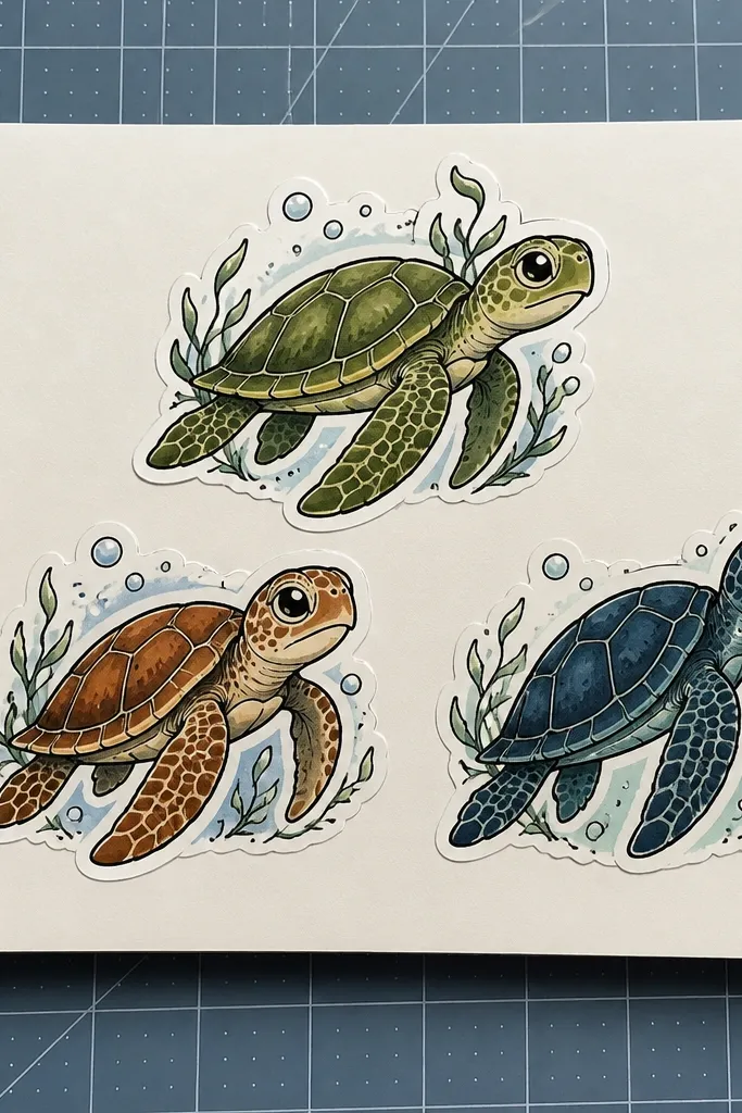
This themed Turtle Drawing is about producing a set, not one perfect turtle. Three turtles on one page gives you variety in themes while keeping a consistent style. Make them sticker-like: bold outlines, minimal scute lines, and tiny background elements behind each turtle. The page becomes instantly shareable because it looks like a coordinated mini-collection. It also trains you to keep proportions consistent across multiple drawings, which is the hardest part of making a “set” look professional.
Plan the page layout first: draw a 3-column or triangle arrangement using light pencil guidelines. Sketch three turtles using the same 3-shape construction, slightly different poses for variety. Ink each turtle with a bold pen and add 6 to 8 scute lines only. Add a different tiny theme behind each: one bubble halo, one kelp strip, one wave band. Color lightly with markers and keep backgrounds simple so the turtles remain readable.
Use the same pen for all three outlines so the line weight stays consistent across the set.
Don’t change anatomy per turtle — keep the shell oval and head shape consistent.
20. Sea Turtle Moonlit Crest with Crescent Shadow
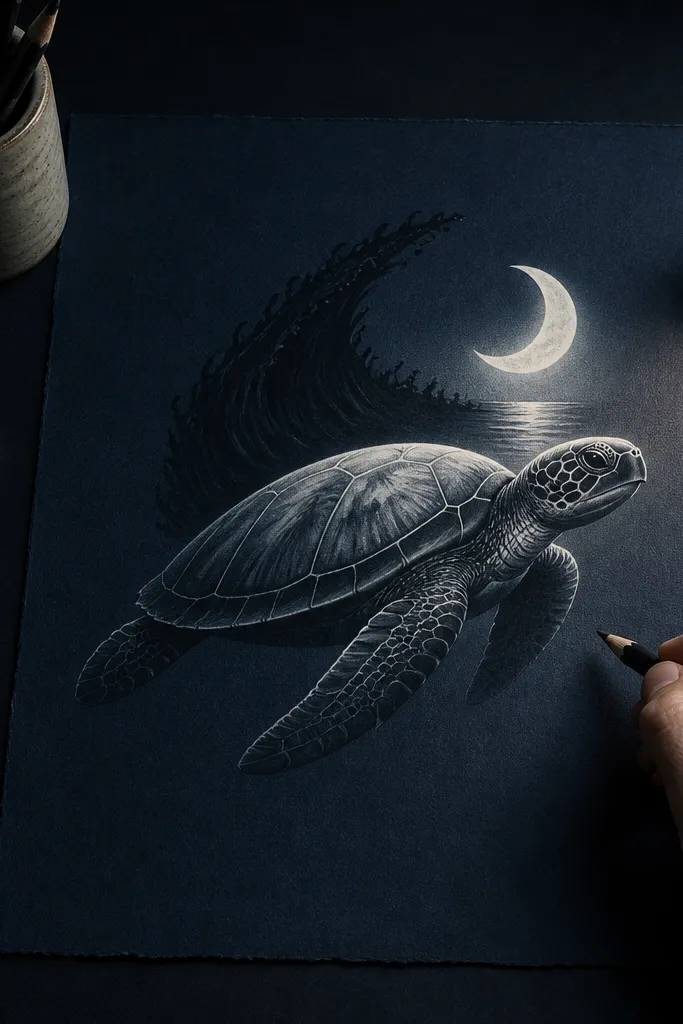
Moonlight makes turtles look dramatic without adding complexity. This themed Turtle Drawing uses a crescent moon and a dark crest shadow behind the turtle to create depth. The shell is shaded with a single direction highlight so it reads as glossy in the night palette. It’s also a strong choice if you want a cohesive look across multiple themed drawings because night palettes are easy to repeat. Keep the background sparse and let the moon shape do the heavy lifting.
Draw a crescent moon in the upper left and shade the rest of the sky in a deep blue tone. Sketch the turtle in the lower center, then ink the outline and main scute lines. Add a dark water crest behind the turtle: 3 to 5 curved shapes that rise and fall like waves. Shade the shell with light base and darker scute wedges, keeping one highlight area on the top edge. Add a faint reflection line under the turtle using two thin curves and a light gray-blue wash.
Pro tipPlace the crescent shadow so it touches the turtle shell edge — that’s what makes the scene feel lit from one source.
AvoidAvoid cluttering the background with extra stars — one moon and a few wave shapes are enough.



