
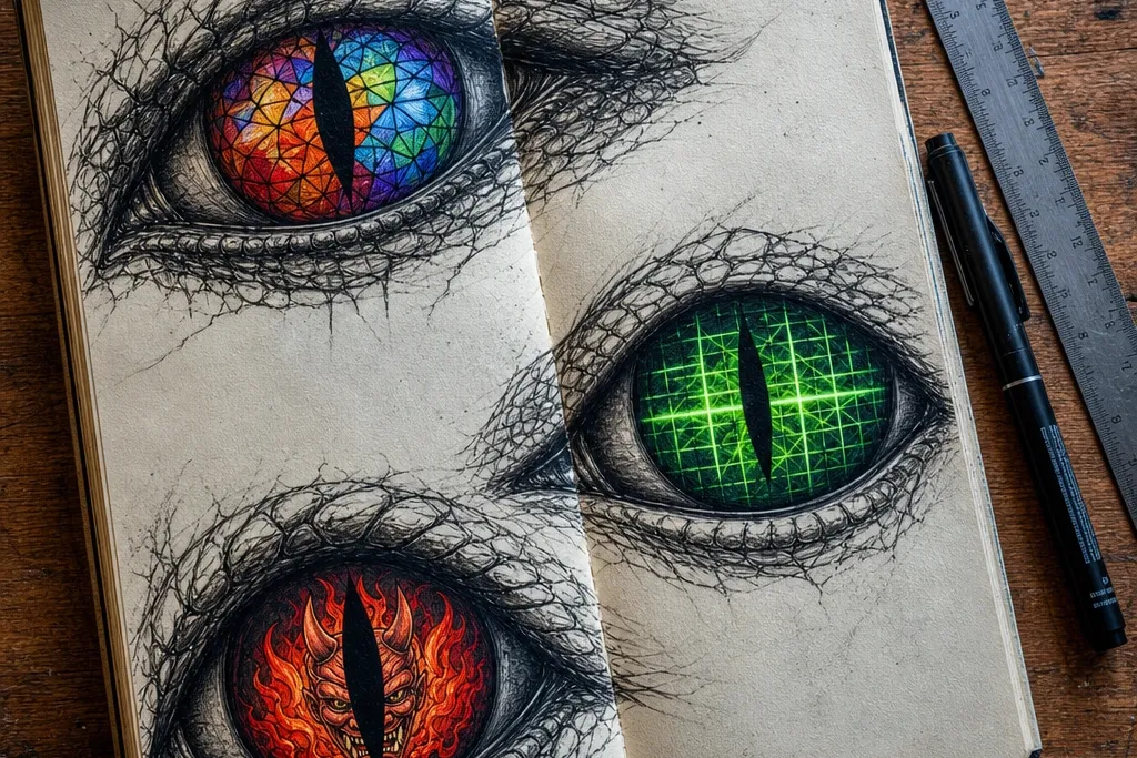
1. Stained-glass pupil with lead-line iris
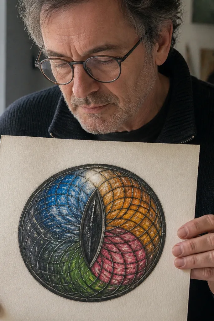
Start by sketching two almond eyes and lightly marking a center vertical guideline for each. Then draw 4-6 angular “glass panes” inside the pupil area, using a fineliner for thick lead lines. Color each pane with marker or colored pencil, leaving tiny white gaps to simulate glass borders. Finish by adding a small white gel highlight and a thin darker ring around the iris to sharpen the shape.
This design makes the eyes look like a real artifact, not just colored circles. The stained-glass effect comes from “lead” lines that separate color cells, so your drawing automatically gains structure and depth. Keep the iris mostly dark with 3-5 colored panes, then let a bright highlight sit near the top edge of each pupil. It looks best on a simple mask face because the eyes do the heavy lifting.
AvoidDon’t color over your lead lines or blend them — the separation is the whole look.
Pro tipUse a slightly thicker pen for the lead lines so the panes read from a distance.
2. Neon circuit lashes and grid iris
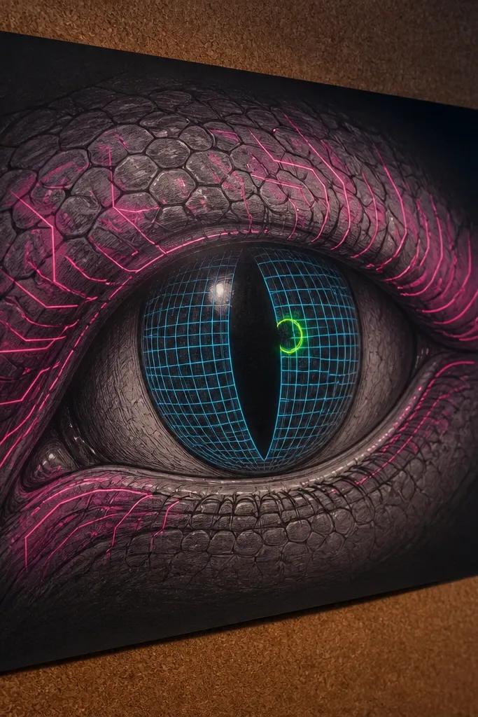
Lightly outline the iris with a darker ring, then draw a perspective grid inside it using a ruler or edge of a sketchbook. Add small circuit traces around the eye edge: short angled lines that follow the lash direction. Color the grid with marker, then trace the circuit lines again with a brighter gel pen for glow. Finish with two highlights: one small dot near the top and a short streak angled toward the outer corner.
If you want a futuristic, poster-ready vibe, this is the one. The grid iris gives you a crisp structure, while neon circuit lashes add movement and attitude. Pick a main neon color (blue or magenta) and one supporting color (cyan or lime) so it stays readable. The eyes look great even with a minimal mask outline because the circuit pattern acts like a frame.
AvoidSkip full-color flooding; heavy coloring kills the “neon line” read.
Pro tipDo the grid first, then draw circuits on top so you don’t muddy the pattern.
3. Oni flame pupil with ember gradient
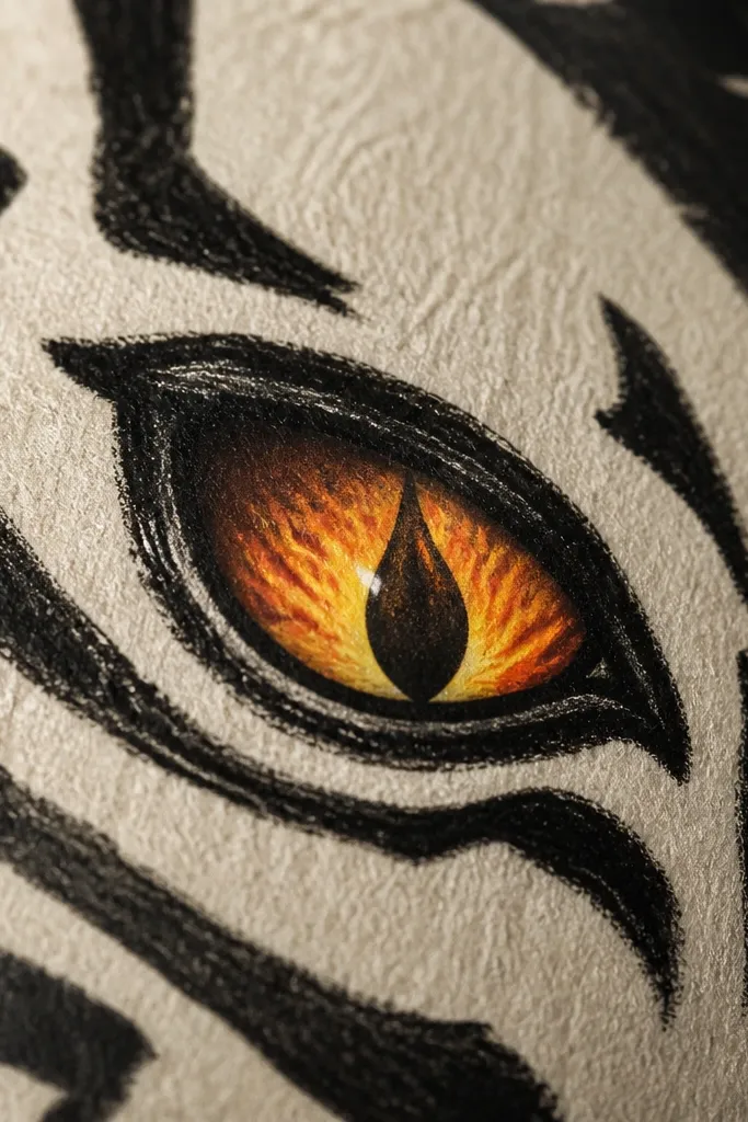
This gives snake eyes a supernatural punch without making the face complicated. Flame-shaped pupils naturally create contrast because you can taper dark-to-hot colors from the center outward. The ember gradient makes the eyes feel alive, and the flame edges hide small drawing imperfections. Works especially well if you’re drawing a front-facing portrait where viewers will lock onto the eyes.
Sketch the pupil as a flame silhouette: wider at the base, pointed at the top, mirrored for both eyes. Shade the flame edge darker first, then blend toward bright orange and yellow near the inner center. Add tiny ember dots around the flame tip using a white gel pen with a faint orange marker underneath. Outline the iris with a thin black line so the flame shape stays crisp.
Use a limited palette: black, deep brown, orange, and yellow. Fewer colors look more intentional.
Don’t draw flames as perfect curls; uneven edges read more like hand-inked fire.
4. Watercolor ink bloom iris with wet-on-wet edges
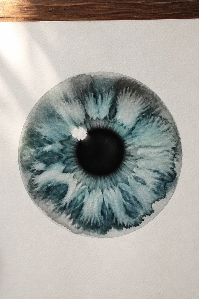
Draw the eye shape and keep the iris area uncolored for now. Wet the iris area lightly with clean water using a small brush, then drop in one diluted ink or watercolor wash and let it spread. Add a darker ring at the outer iris edge once the wash settles, then lift a highlight with a damp brush tip. When dry, add a thin fineliner outline and a small white gel highlight dot.
This one is for the soft-aesthetic crowd who still wants dramatic eyes. Watercolor blooms create organic texture inside the iris, which makes the eyes feel atmospheric instead of flat. Keep the mask lines clean and let the watercolor do the chaos in the iris only. The result looks great on paper that can handle pigment lift, like cold-press sketchbook sheets.
AvoidDon’t add multiple heavy washes at once; you’ll lose control and the iris turns muddy.
Pro tipTest your ink spread on scrap paper — different brands bloom at different speeds.
5. Carbon fiber iris with crosshatch texture
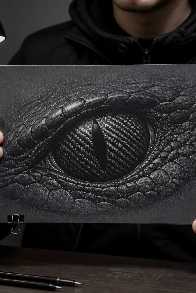
Start with a dark gray iris wash or colored pencil base, leaving the top highlight area lighter. Draw diagonal hatch lines across the iris, then add a second set at a different angle so you get a woven grid. Vary line thickness: heavier lines near the outer iris, lighter lines near the center. Add a tight black outline around the iris and a crisp white highlight streak to finish.
Carbon fiber texture makes the eyes look technical and sharp, which fits a masked ninja vibe. The key is building a repeating pattern that catches light through value, not just line density. Use a dark gray base, then crosshatch with slightly different spacing to mimic the weave. This idea reads well in black-and-gray drawings and still looks clean when printed.
AvoidDon’t overdo the pattern into the pupil — it should get simpler toward the center.
Pro tipKeep the weave pattern slightly tighter at the outer edge; it makes the eye shape feel round.
6. Star-map pupil with tiny constellation dots
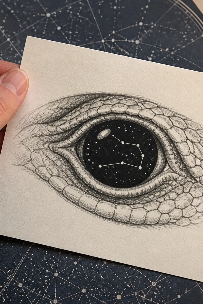
This turns the eyes into a mini sky chart, and it looks amazing because stars are inherently photogenic. The “themed” part is the constellation structure — even simple line connections make it feel intentional. Use a dark base, sprinkle tiny dots, then connect a few with thin lines. Keep the rest of the face simple so the star map stays the focal point.
Sketch the pupil as a circular area inside the iris, then darken it with a near-black pencil or marker. Add tiny star dots using a white gel pen, but vary dot sizes so it doesn’t look like confetti. Draw 3-5 thin constellation lines that curve slightly, keeping them off-center so the eyes feel like they’re looking out at you. Finish with a bright highlight dot near the top-left of each eye and a darker ring around the iris.
Use a reference for constellation placement if you want it to feel “real” — even one real pattern makes it look designed.
Don’t add too many stars; 20-40 dots per eye is enough for a readable pattern.
7. Pearl-and-chrome iris with double specular highlights
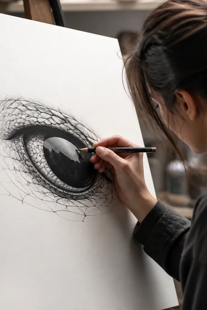
Color the iris with a soft gradient from dark outer ring to slightly lighter inner ring using colored pencil. Add a pale pearly wash (light gray with a touch of blue) in the center, then blend edges gently. Place two highlights: one small dot near the top and one short elongated streak toward the outer corner. Outline the iris with a medium-dark pencil so the shine doesn’t bleed.
This is a polished, high-contrast look that screams “attention to detail.” Pearl-chrome eyes feel expensive because your viewer sees both a soft glow (pearl) and a hard shine (chrome). It’s also forgiving: you can keep the drawing simple and still get a premium finish by nailing the highlight placement. Works well for clean line art and colored pencil shading.
AvoidDon’t smear with a blending stump into the highlights; the shine needs clean edges.
Pro tipKeep highlights symmetrical in position, even if the iris texture varies slightly.
8. Samurai armor pattern iris with etched lines
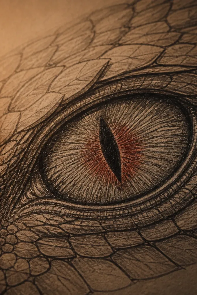
Draw the iris as a circle area inside the eye, then add a dark outer ring for depth. Sketch faint radial guide lines from the center outward, then draw etched “engraving” lines that cross those guides like metal tooling. Use slightly thicker lines near the outer ring and thinner lines toward the center. Add a single highlight dot and a small curved shadow under the upper lash line.
Armor texture makes the eyes look like they belong to a character with serious gear. The “etched” look comes from thin linework that follows a subtle radial pattern, like engraved metal. It reads well in monochrome drawings and gives you a strong aesthetic even if you only use black, gray, and one accent. Great for portraits where you want the eyes to feel rugged, not cute.
AvoidDon’t make the pattern too uniform; vary line direction and density.
Pro tipUse a 0.3 or 0.35 fineliner for the engraving so the lines stay crisp.
9. Velvet shadow iris with charcoal smudge gradients
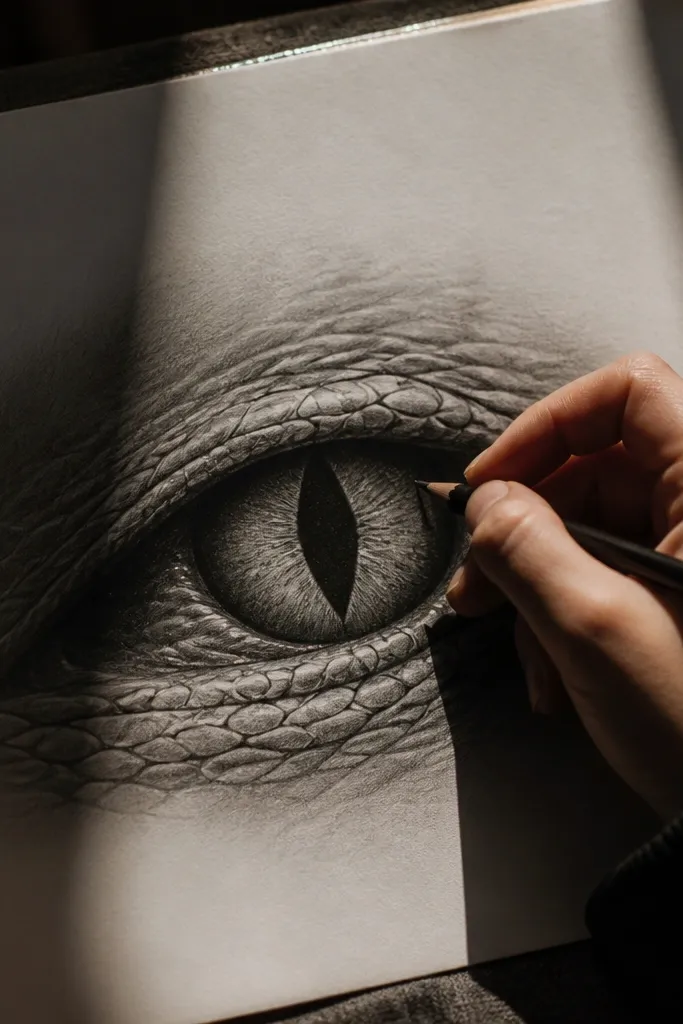
Sketch the eye and shade the iris with charcoal, but leave a crescent area for the highlight. Use a blending tool lightly for the gradient — stop once the iris has a smooth-to-dark transition. Add a deeper charcoal layer around the inner pupil area so the pupil feels sunken. Reinforce the iris outline with a harder pencil or fineliner, then place a small white gel highlight at the top.
This one makes the eyes look deep and heavy, like the character is hiding emotion behind shadow. Charcoal smudges create a velvet effect that looks dramatic in photos, especially with side lighting. Keep the pupil darker than the iris by a full value step, so the eye shape doesn’t flatten. It’s best for artists who like messy textures but still want control.
AvoidDon’t over-blend the pupil; if it gets too smooth, the eye loses its depth.
Pro tipFixative helps a lot if you plan to photograph it; it prevents charcoal dust from smearing later.
10. Koi ripple iris with ink waves and scale dots
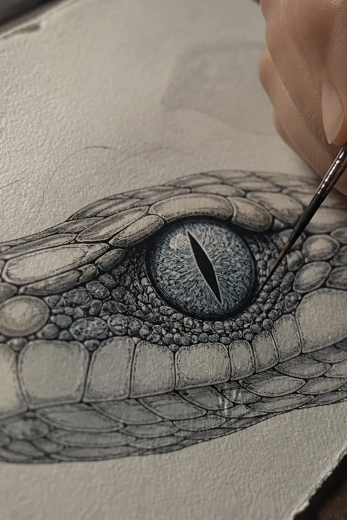
Draw the iris and outline it with a darker line. Inside, draw 3-5 curved ripple bands that flow diagonally across the iris, like water moving past. Add small scale dots on one or two bands only so it doesn’t turn busy. Color the ripples lightly with a wash or marker tint, then add a highlight dot and a thin dark under-lash shadow.
Koi ripples give you a graceful, decorative eye that still reads as intense. The ripple lines create motion, while tiny scale dots add a tactile detail that catches light. Keep the color muted and let the ink lines do the work — this keeps the look classy rather than cartoony. It’s a strong pick if you want a themed drawing that stands out in a feed of mostly flat-color eyes.
AvoidDon’t fill the entire iris with dots; use dots as accents, not wallpaper.
Pro tipMake ripple bands wider near the edges and narrower toward the center for a rounder eye.
11. Glitch-error iris with broken scanlines
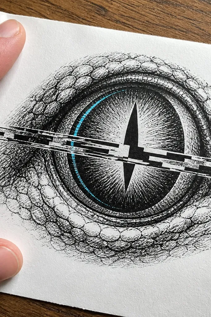
Start with a normal iris base in dark gray or black, then draw a single horizontal band across the iris where the glitch will live. Offset that band by drawing it twice: once in a dark tone and once in your accent color, slightly shifted left or right. Add broken scanlines within the band using short horizontal segments. Finish with a crisp iris outline and a small white highlight dot that stays unglitched.
This is the “digital vandalism” look that still works as a clean drawing. Offset scanlines create the illusion of misalignment, which adds energy to the pupils. The aesthetic stays readable when the glitch happens in a controlled band across the iris rather than everywhere. It pairs well with black ink and a single electric accent color.
AvoidDon’t glitch the highlight; it should look like real light reflecting, not a filter effect.
Pro tipKeep the glitch band narrow — 20-30% of the iris width — so it looks intentional.
12. Crescent moon iris with ink halo
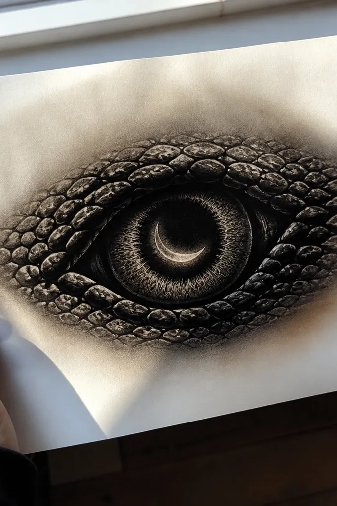
Sketch the iris and add a crescent moon shape inside it, leaving a thin gap around the crescent edge. Color the crescent with a light gray or pale blue, then shade the outer iris dark. Build the halo by circling the crescent with a soft ink wash — keep it uneven so it looks hand-made. Add a clean highlight dot and a thin dark ring around the iris to frame it.
Moon-themed eyes are simple but striking when you do the halo right. The crescent shape gives a clear silhouette, and the ink halo makes the iris look like it’s glowing from within. This design is great for small formats like sticker sheets because the shape reads at a glance. Keep the rest of the eye dark so the moon stands out.
AvoidDon’t over-darken the halo; if it turns gray-brown, the moon stops reading.
Pro tipUse a damp brush to feather the halo edge, then let it dry before adding outlines.
13. Obsidian crack pupil with branching fractures
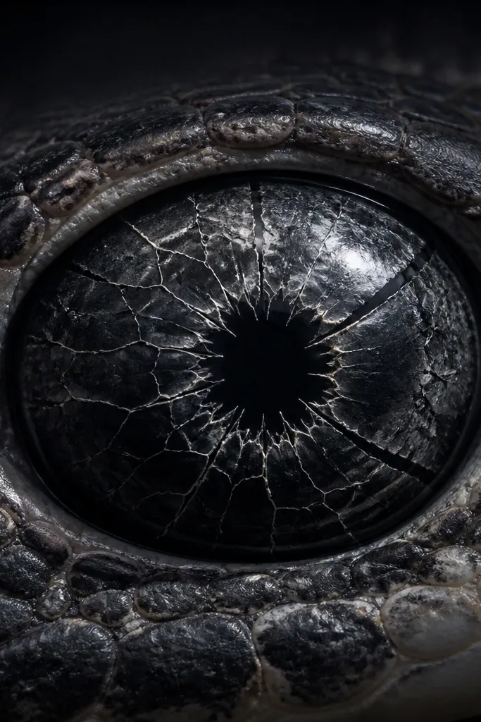
Crack textures make eyes look like stone — tough, cold, and visually satisfying. The trick is to draw cracks as branches that start near the pupil center and split outward, then add tiny bright “edge glow” lines. This makes the pupil feel deeper than a flat black circle. It’s also a great choice if you want a themed look that stays dramatic in grayscale.
Draw the pupil as a deep black shape, then lightly mark a few crack starting points near the center. Use a fine pen to draw branching fracture lines outward, keeping them irregular and varying thickness. Add a faint accent color only along the crack edges — thin, like a rim light — then fill the rest of the crack with dark gray. Place a single highlight dot near the top and outline the iris for contrast.
Keep crack lines off the iris outline so they don’t merge into the eye border.
Don’t draw cracks symmetrically; real stone fractures look messy.
14. Rose smoke iris with ink mist and tiny petals
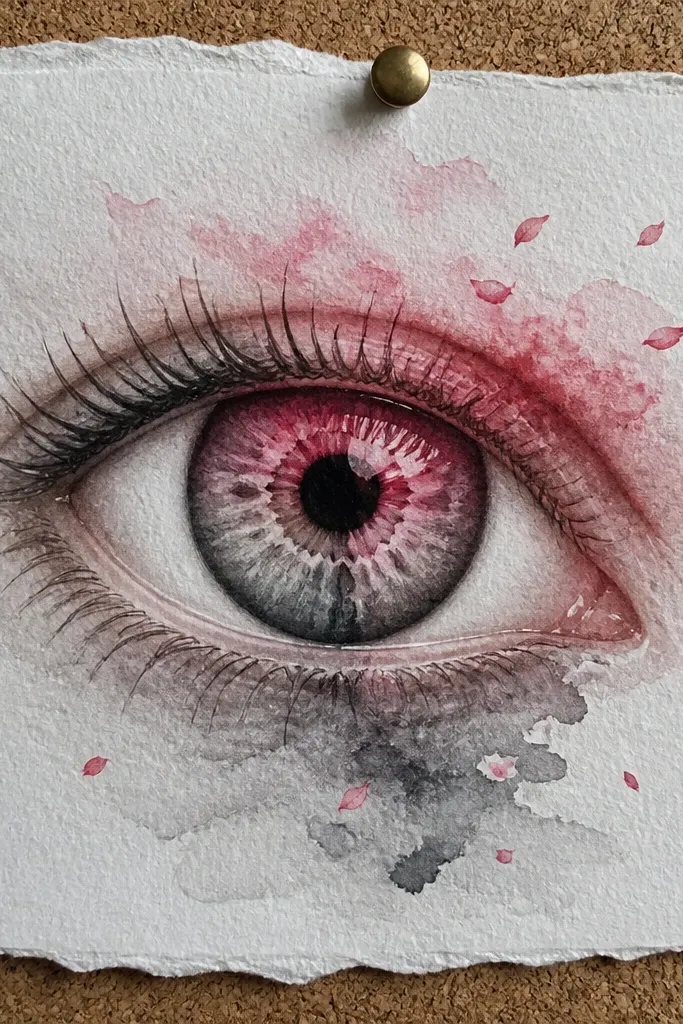
Base the iris with a dark gray wash, leaving the upper iris slightly lighter. Add rose-colored ink or watercolor in wisps, then blend the edges with a damp brush so it looks like smoke. Add 6-10 tiny petal flecks using a fine brush or colored pencil, placing them near the wisps. Finish with a high-contrast outline and a small white highlight dot.
This one gives a pretty, aesthetic twist without turning the eyes into cartoon fluff. Rose smoke looks good because mist textures are naturally photogenic and the petal flecks add a delicate focal detail. Keep the rose color concentrated in the upper half of the iris so it doesn’t look like a blob. It’s a strong option for artsy sketchbooks and poster-style drawings.
AvoidDon’t place petal flecks evenly across the iris — clumping looks more natural.
Pro tipUse a limited rose palette: one pink tone and one muted purple. Two tones look more intentional than five.
15. Tiger stripe iris with ink brush strokes
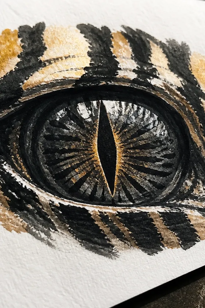
Shade the iris with a warm dark base, like dark umber or charcoal gray. Draw 5-7 tiger stripes across the iris using a brush pen or a brush with ink, letting some edges taper. Add a thin warm highlight line on one or two stripes so the pattern reads in photos. Place the pupil highlight near the top and outline the iris with a darker pencil so the stripes don’t bleed.
Tiger stripes make the eyes look predatory and graphic. The aesthetic works because stripes give you instant rhythm, and ink brush strokes create natural variation that looks alive. Keep the stripes mostly dark with a small warm accent near the center so the eye doesn’t turn flat black. This is one of the easiest ways to make snake eyes look intense while still staying within a simple drawing process.
AvoidDon’t draw stripes all the way to the highlight; the shine needs clean space.
Pro tipUse fewer, thicker stripes if you want readability on smaller prints.



