
1. Mint Leaf Frame Tree Frog
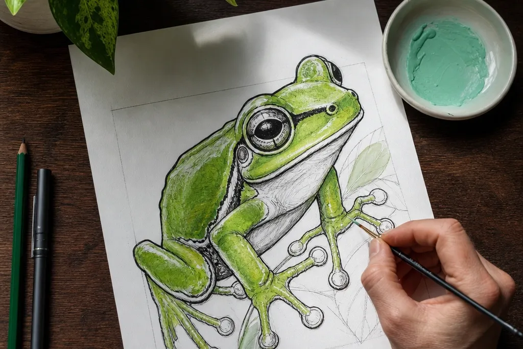
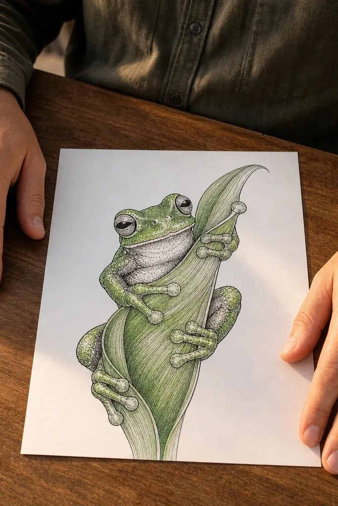
Start by sketching a simple leaf outline like a teardrop with two pointed ends at the top and bottom. Then draw the frog on top of the leaf, with toe pads spread wide and a small belly curve for volume. Color the leaf first (mint base, darker vein lines), then color the frog (bright green base, pale belly spots, and a black outline around the frog silhouette). Finish by adding a thin highlight on the frog’s upper cheek and a shadow line under the belly.
This one looks polished because the leaf frame creates a clear boundary around the frog. Draw the frog slightly off-center so the toes and belly spots feel like they’re reaching into the composition. Use a mint-green leaf with darker veins and keep the frog body a brighter green than the leaf so it pops. The final look is graphic and clean, which makes it perfect for prints, cards, or a page you want to photograph.
AvoidDon’t color the leaf and frog with the same green — the whole point is contrast.
Pro tipPress lightly for the first leaf veins, then darken only the main three veins so it doesn’t get muddy.
2. Sticker-Style Frog on Bold Color Block
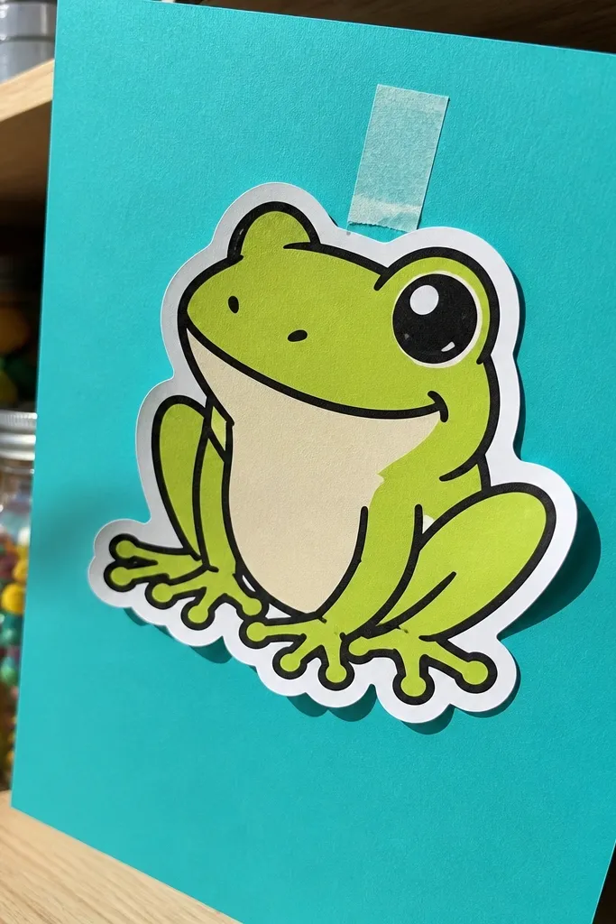
Trace a rectangle background on your paper and fill it with a flat color using marker or crayon. Sketch the frog in a cartoon pose — round belly, slightly raised front toes, and a small head bump. Outline the frog with a black gel pen, then add just three interior marks: toe pad dots, belly curve, and one eye highlight. Color the frog body with one main green and one darker green for shading under the belly and along the legs.
Sticker-style drawings look good because they’re built for bold edges and simple shapes. You’ll get that “printable” look by making the frog a clean cutout: thick black outline, minimal interior detail, and one highlight spot on the eye. Choose one background color block that contrasts with the frog, like teal with lime green or cream with deep green. This is one of the fastest ways to get something that looks intentional instead of sketchy.
AvoidAvoid adding lots of tiny freckles or texture — sticker style needs fewer marks to stay crisp.
Pro tipLet the background dry fully before you outline — wet marker bleeds into gel pen lines.
3. Watercolor Circle Window Frog
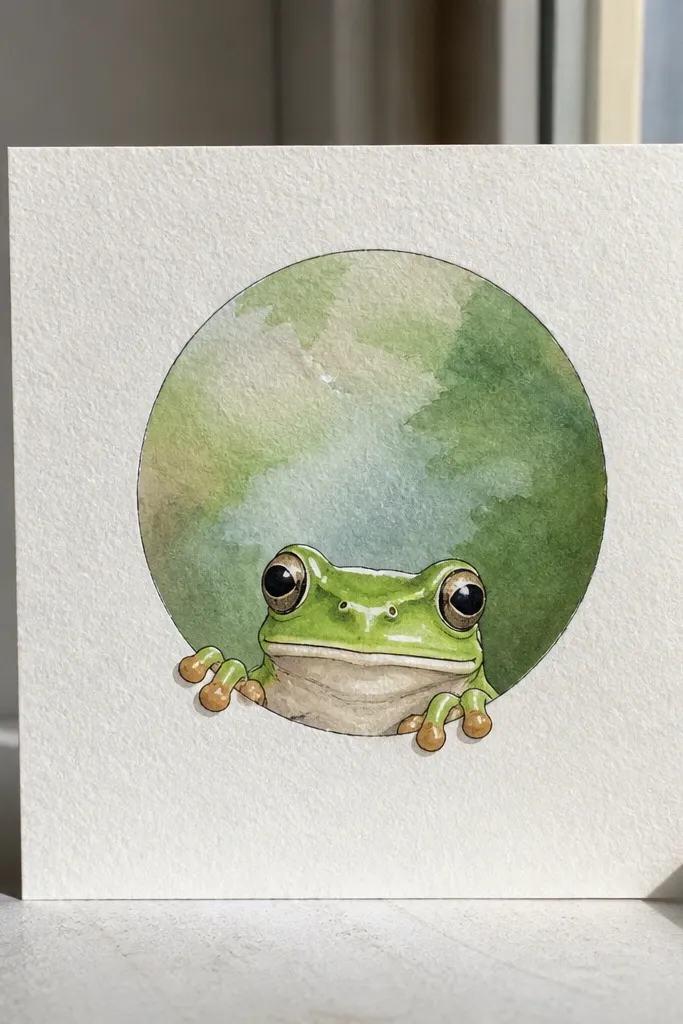
Wet just the inside of a pencil-drawn circle with clean water, then apply two washes: one for the background (like pale sky blue or soft gray) and one for a leaf-green tint near the bottom. Let it sit until it’s mostly dry, then draw the frog on top with a pencil sketch. Ink the frog outline and toe pads with a fine black pen, then add watercolor only for the frog’s body: green wash with a darker shadow under the belly. Finish with a tiny white gel pen highlight on the eye and toe pads.
A watercolor circle frame makes the frog feel like it’s peeking through a window. The beauty here is the controlled mess: soft washes behind the frog, crisp details on the frog itself. Keep the frog edges darker with a pen so the watercolor blur doesn’t swallow the shape. This idea looks great on white paper and photographs well because the circle frame gives a natural focal point.
AvoidDon’t watercolor the frog first — you’ll lose the clean toe-pad shapes.
Pro tipUse thicker paper if you can — watercolor circles look better when edges don’t feather.
4. Graphite Leaf Silhouette Frog
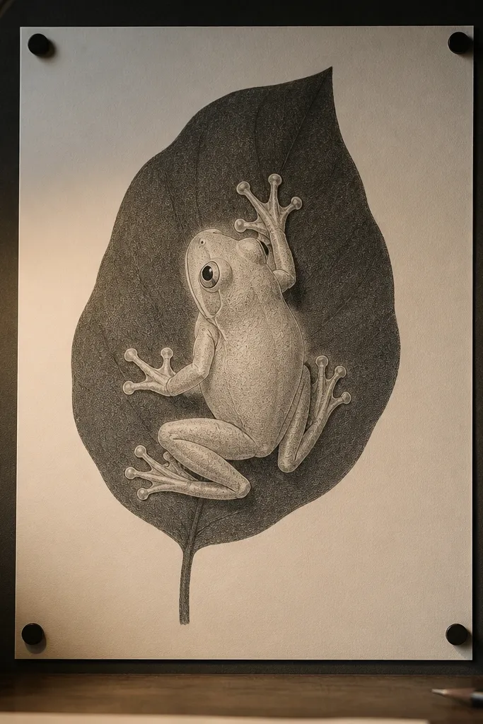
Sketch a large leaf silhouette behind the frog using a light pencil outline, then shade the leaf with charcoal or a very dark graphite block. Draw the frog in front with lighter pencil lines so it stays readable. Blend the frog belly with a tissue or blending stump, keeping toe pads slightly lighter for shape. Add darker graphite under the legs and along the underside of the body, then sharpen the outlines with a mechanical pencil.
This is the “quiet aesthetic” version: graphite and charcoal give you depth without needing color. The frog looks dimensional because you’ll use soft shading on the belly and crisp edges on the toe pads. Pair a dark leaf silhouette background with a lighter frog so the contrast reads instantly. It works for minimalist walls, journal covers, and monochrome prints.
AvoidDon’t over-blend the toes — toe pad edges should stay sharper than the belly shading.
Pro tipUse a kneaded eraser to carve out tiny highlights on the frog belly — it makes it look glossy.
5. Sunlit Frog on Curved Branch Arc
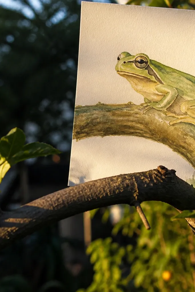
Draw a curved branch line across the paper, thicker at the left and thinner at the right. Sketch the frog perched on top, facing slightly toward the light source you’ll mark. Color the shadow side of the frog with darker green and the highlight side with a lighter green plus a warm yellow glaze at the top of the head and shoulders. Add a thin warm shadow on the branch under the frog and a few branch texture lines with a darker brown pencil.
This idea looks bright and “outdoor” because the curved branch arc creates motion and the sun highlight gives a clear mood. The frog’s toe pads gripping the branch makes the drawing feel real, even if the style is simple. Use warm yellow or peach for the highlight side and deeper green for the shadow side. It’s great for practice if you want to learn lighting in a way that still looks cute.
AvoidAvoid using only one green tone — the whole look depends on highlight vs shadow.
Pro tipMark the light with a tiny sun dot before coloring — it prevents random shadows.
6. Neon Green Frog with Black Splatter Background
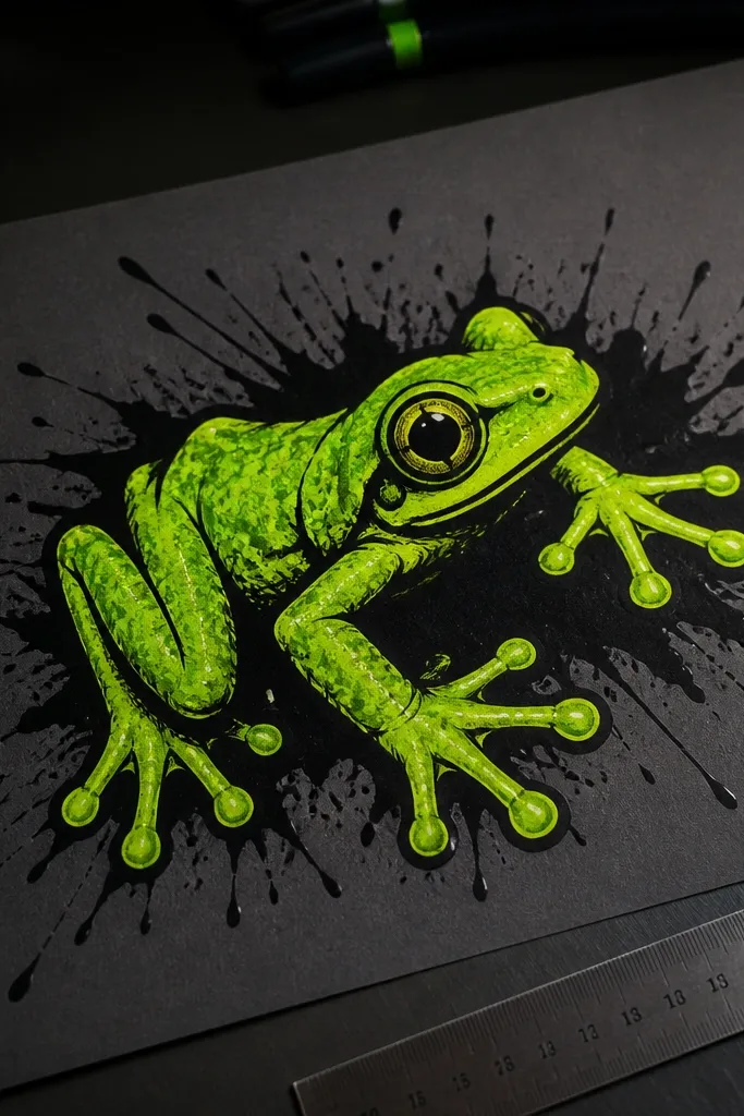
Choose dark paper and sketch the frog lightly with pencil, then ink it with a thick black marker or pen. Color the frog with neon green marker, leaving the belly slightly lighter. Add a few darker green accents under the legs and along the sides of the body. Flick black paint or ink splatter behind the frog carefully, then add a white gel pen highlight on the eye and toe pads for extra contrast.
Neon frogs look loud and stylish, and the splatter background makes the composition feel energetic. This one is built for dark paper or near-black backgrounds because neon green pops hard. Keep the frog outline extra thick so the toe pads don’t get lost against the splatter. The result is a street-art vibe that still reads as a tree frog, not an abstract blob.
AvoidDon’t splatter over the frog outline — cover the frog with a scrap sheet while you paint.
Pro tipUse a toothbrush or stiff brush for splatter control and practice once on scrap paper.
7. Patterned Belly Spot Frog with Checker Leaf
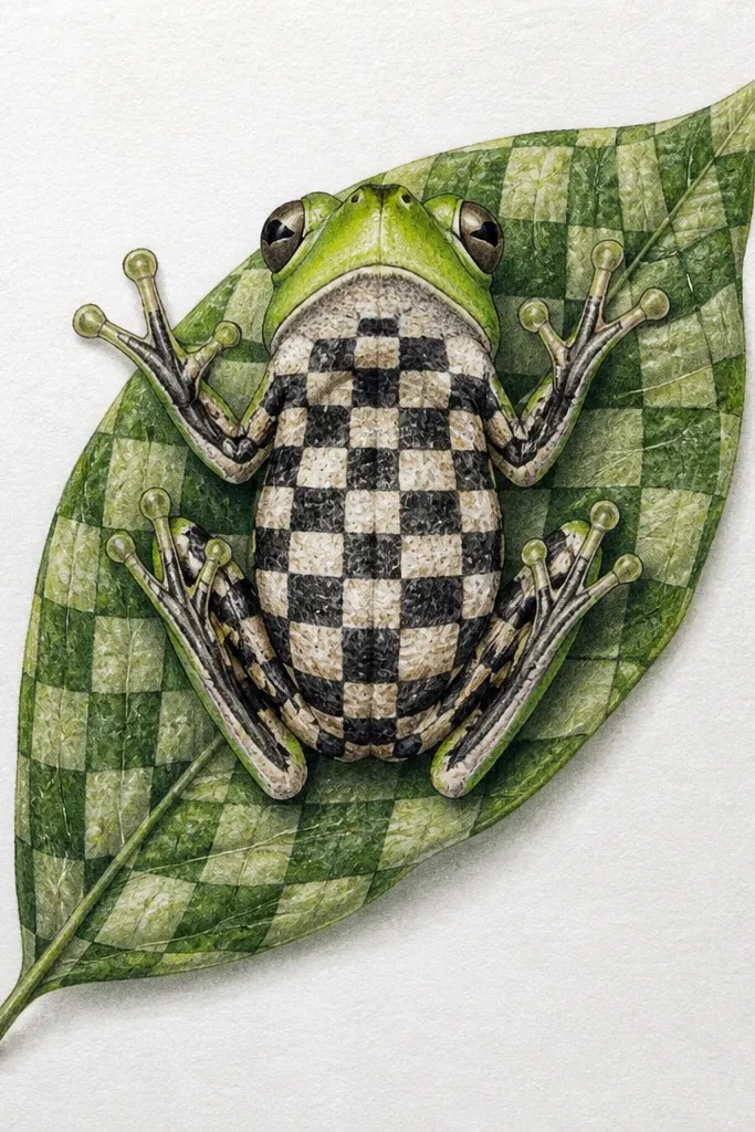
Draw a leaf shape large enough to hold the checkerboard, then lightly grid it with pencil. Fill the leaf with alternating squares using two greens (one light, one dark). Sketch the frog sitting on the leaf, keeping the belly area centered. Color the frog body solid green, then add belly spots as small circles or ovals in a lighter shade. Outline everything with a fine black pen, then add a single shadow under the frog to anchor it to the leaf.
This drawing is photogenic because the belly pattern becomes the focal point, and the checkerboard leaf gives a clean graphic rhythm. The frog still looks like a frog because the toe pads and head shape are accurate, but the interior details are playful. Use one pattern only — checker leaf OR spotted belly — so the page doesn’t turn into visual noise. It’s a great option when you want “cute and modern” instead of realistic.
AvoidDon’t add extra patterns to the legs or eyes — one pattern is plenty.
Pro tipKeep checker squares the same size — uneven squares make the background look messy.
8. Minimal Line Art Frog with One Color Wash
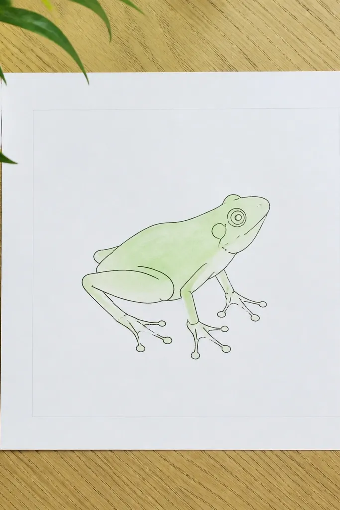
Sketch the frog with one continuous confident line, then reinforce the outline with a black fineliner. Add toe pads with a few distinct arcs so they look like soft discs rather than random bumps. Wet only the frog body area lightly, then apply a light green watercolor wash, leaving the belly slightly paler. Add a darker green wash under the belly and along the legs in a thin band. Let dry, then use the fineliner again to sharpen toe pad edges.
Minimal line art works because it relies on gesture and spacing, not heavy coloring. The frog looks elegant and crisp when the lines are consistent and the wash is limited to the body. Use one light green wash and keep the background white. This style is also forgiving: you can fix proportions by adjusting line thickness and adding small toe pad shapes.
AvoidDon’t wash the background — the white space is what makes the frog look clean.
Pro tipUse a round brush tip for the wash so it stays inside the toe pad shapes.
9. Sakura Branch Frog with Pink Blossoms
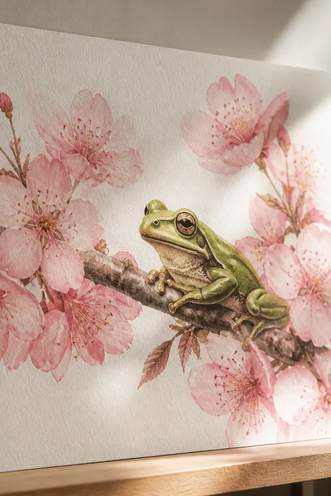
Draw a thin branch curve across the page, then sketch the frog perched near the center. Outline the frog and add toe pads holding the branch. Color the frog with green markers or watercolor: light green base, darker green shadow under the belly, and pale belly spots. For blossoms, draw 5-petal shapes in pink, then lightly wash them so they overlap. Add tiny yellow dots in the blossom centers and a soft shadow line beneath the frog on the branch.
This one looks gorgeous because the blossoms add softness while the frog stays sharp and detailed. The contrast between pink petals and green frog makes the drawing feel balanced and “finished.” Keep the frog mostly solid green with darker accents, then make the blossoms airy and semi-transparent. It’s a pretty combo for seasonal art, but the technique works year-round with any flower color.
AvoidDon’t outline every blossom with thick black — thin lines look more delicate.
Pro tipKeep blossom petals small and varied in size — it makes the cluster feel natural.
10. Pastel Frog on Striped Leaf Background
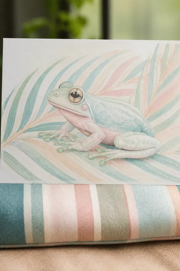
Draw a leaf-shaped background and fill it with horizontal stripes using two pastel greens (like mint and sage). Sketch the frog on top with a slightly rounded belly and clear toe pads. Color the frog body with a pastel green base, then shade under the belly with a slightly darker sage. Add tiny belly spots in near-white or pale yellow. Finish by using a fine pen to outline the frog and darken the toe pad discs so they pop against the stripes.
Striped backgrounds look good because they create movement behind the frog without adding clutter. Pastel frogs look sweet and airy, especially when the stripes are soft and low-contrast. The frog still needs clear toe pad shapes, so don’t skip the pads just because the colors are light. This idea is great for nursery decor styles and scrapbook pages that need color but not heavy detail.
AvoidDon’t make stripes too dark — then the frog stops being the main subject.
Pro tipUse a light hand on the stripes and save darker marks for the frog outline.
11. Ink Wash Frog with Wet-On-Wet Veins
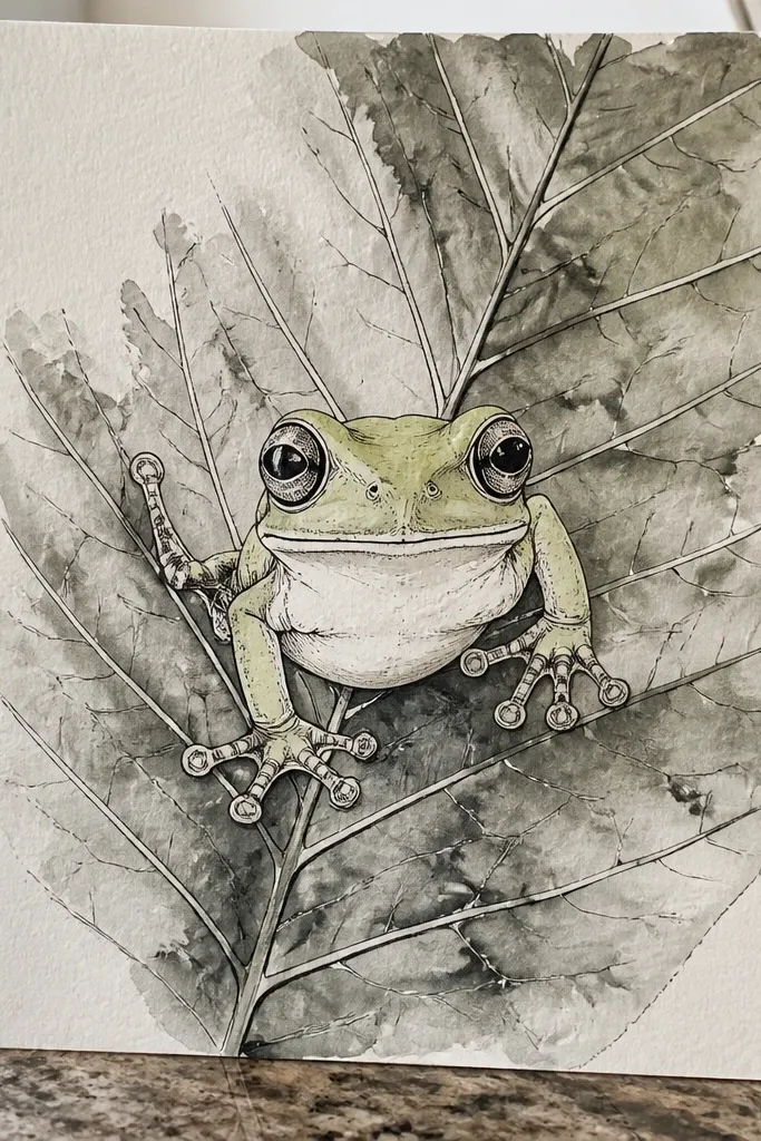
Wet-on-wet ink veins look gorgeous because they create natural-looking flow instead of stiff lines. This idea pairs a crisp frog outline with a leaf background that has movement. Use ink wash for the leaf and lightly wash the frog body, then keep the toe pads defined with pen. The contrast between controlled lines and fluid background makes it feel artsy without being hard to execute.
Pencil sketch a leaf behind the frog and lightly draw the frog shape on top. Wet the leaf area with clean water, then drop in ink for the leaf veins so they bloom outward. Let it settle for a minute, then ink the frog outline and toe pads with a fine brush pen. Add a light green ink wash to the frog body, keeping the belly slightly lighter. Once dry, reinforce the toe pad edges and add a small ink shadow under the frog belly.
Control ink bloom by using less water than you think — too much water turns everything gray.
Don’t flood the whole page with ink — you want the frog and leaf to separate.
12. Color Pencil Realism Frog with Glossy Toe Pads
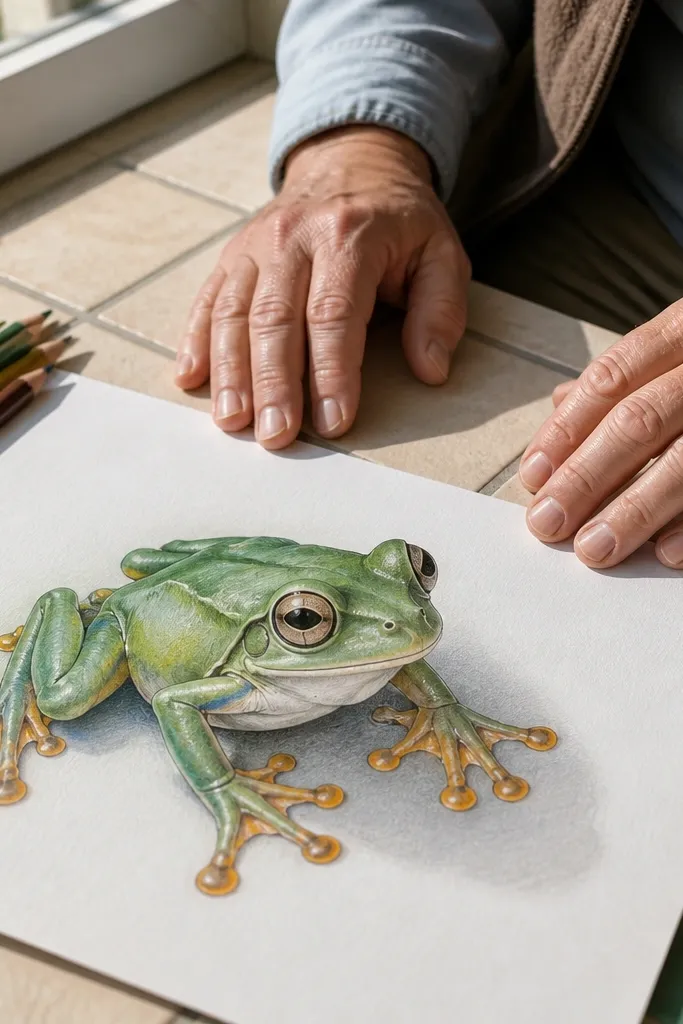
Sketch the frog with a light HB pencil, then map the toe pads as rounded discs with slight overlap. Build the frog body with layered greens: start with a mid green, then add darker green under the legs and along the sides. Use a lighter pencil for the belly and add pale spots with light pressure. For toe pads, shade around the edge with a darker green, then leave a narrow highlight gap and draw tiny highlight lines with a white gel pen. Blend gently with colorless blender pencil if you have one.
If you want a more realistic look that still feels aesthetic, glossy toe pads make the difference. Color pencil realism works because you can layer tones gradually and keep edges sharp. This idea focuses on the hands and feet — toe pads with fine highlight lines — while the body stays simpler. It looks great in daylight photos because pencil texture catches light.
AvoidDon’t smudge the toe pad highlights — they should stay crisp.
Pro tipSharpen your pencil often — toe pad edges look cleanest with a fine point.
13. Night Sky Frog with Starry Leaf
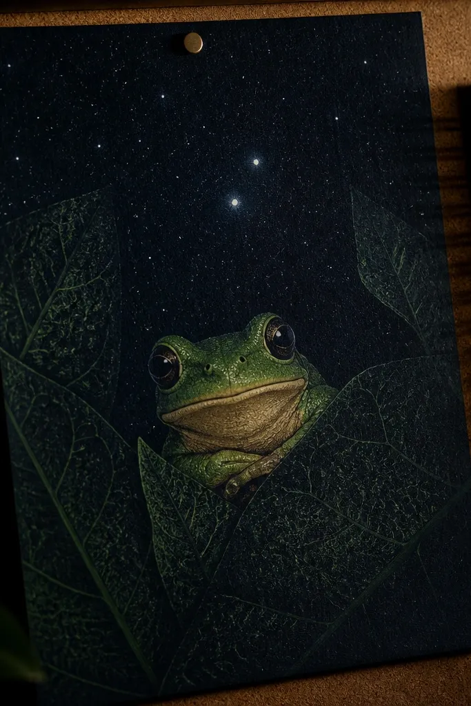
Create a dark background with navy or black marker, then flick white gel pen dots or watered white paint for stars. Draw a leaf in the foreground and color it with deep green, leaving lighter patches for highlights. Sketch the frog sitting on the leaf and outline it with a fine black pen. Color the frog with green layers and add a lighter belly plus toe pad discs. Finish by adding a few tiny white highlights on the toe pads and a thin shadow under the frog on the leaf.
This one looks dramatic and cute at the same time. The dark night background makes the frog’s green feel deeper, and the starry leaf texture adds a “magical” vibe without needing fancy effects. Keep the stars small and scattered behind the frog, then add a couple of brighter star dots near the head to pull attention upward. It’s a strong choice for art that needs to look striking in a photo.
AvoidDon’t put stars on top of the frog — keep them behind so the frog stays readable.
Pro tipUse a toothpick to place star dots — it keeps the sizes consistent.
14. Geometric Hexagon Frog on Leaf Mosaic
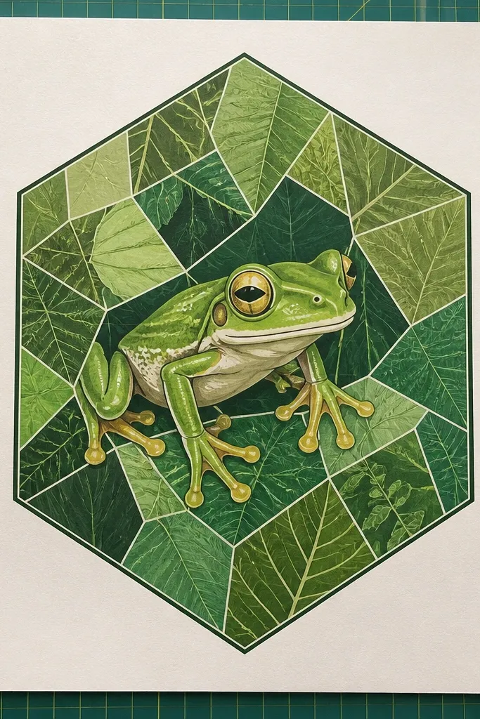
Draw a honeycomb pattern of hexagons lightly across the paper, then darken only a few outlines so it doesn’t look busy. Color alternating hexagons with 3 greens maximum and add tiny leaf-vein lines in only 2-3 hexagons to keep it crisp. Sketch the frog in the center hexagon cluster, with toe pads touching the hexagon edges for a “mosaic” feel. Outline the frog with a bold black pen and add belly spots in a lighter tone. Add one shadow under the frog that follows the hexagon shape edges.
Geometric framing makes the frog feel modern and design-y. Hexagons are forgiving because they guide your placement and keep the composition balanced. Use green shades in each hexagon and keep the frog centered with clean outlines. This idea looks great as a poster-style drawing because the geometry creates structure and the frog adds charm.
AvoidDon’t color every hexagon with detail — let the frog be the only detailed element.
Pro tipKeep hexagon lines straight with a ruler — angled mess makes the whole piece look sloppy.
15. Red-Eyed Frog on Emerald Frame with White Spots
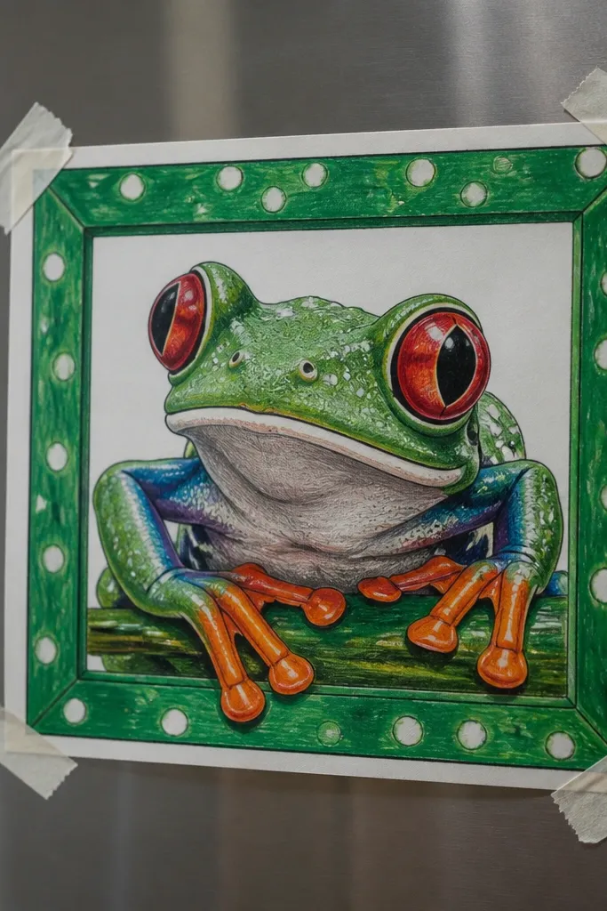
Draw a thick rectangular or rounded-rectangle frame around your paper area and color it emerald green. Sketch the frog inside the frame with a slight head tilt, then outline with a black fineliner. Color the frog body with a mid green base and add darker green shading under the belly. Paint or marker the eye with red, then add a tiny black pupil and a white highlight dot. Add a few white spots on the belly and legs, then finish with a soft shadow beneath the frog on the frame floor.
A red eye makes a tree frog drawing instantly more interesting, and the emerald frame makes it look like a finished artwork. This style works because the eye is a focal point and the white spots give crisp contrast against the green. Keep the frog body shape simple, then use clean outlines and controlled spot placement. It’s bold enough for wall art and simple enough to finish quickly.
AvoidAvoid using red anywhere else besides the eye — it keeps the eye from losing impact.
Pro tipSpot placement looks best when you cluster them in two areas: belly center and upper legs.



